This section outlines the elements you can customize within the Government Record Verification module to match your brand while preserving Incode's core UX. It clarifies which areas are flexible, such as text and brand colors, and which elements remain fixed to ensure consistency, accessibility, and reliable verification logic across platforms.
Government Record Verification
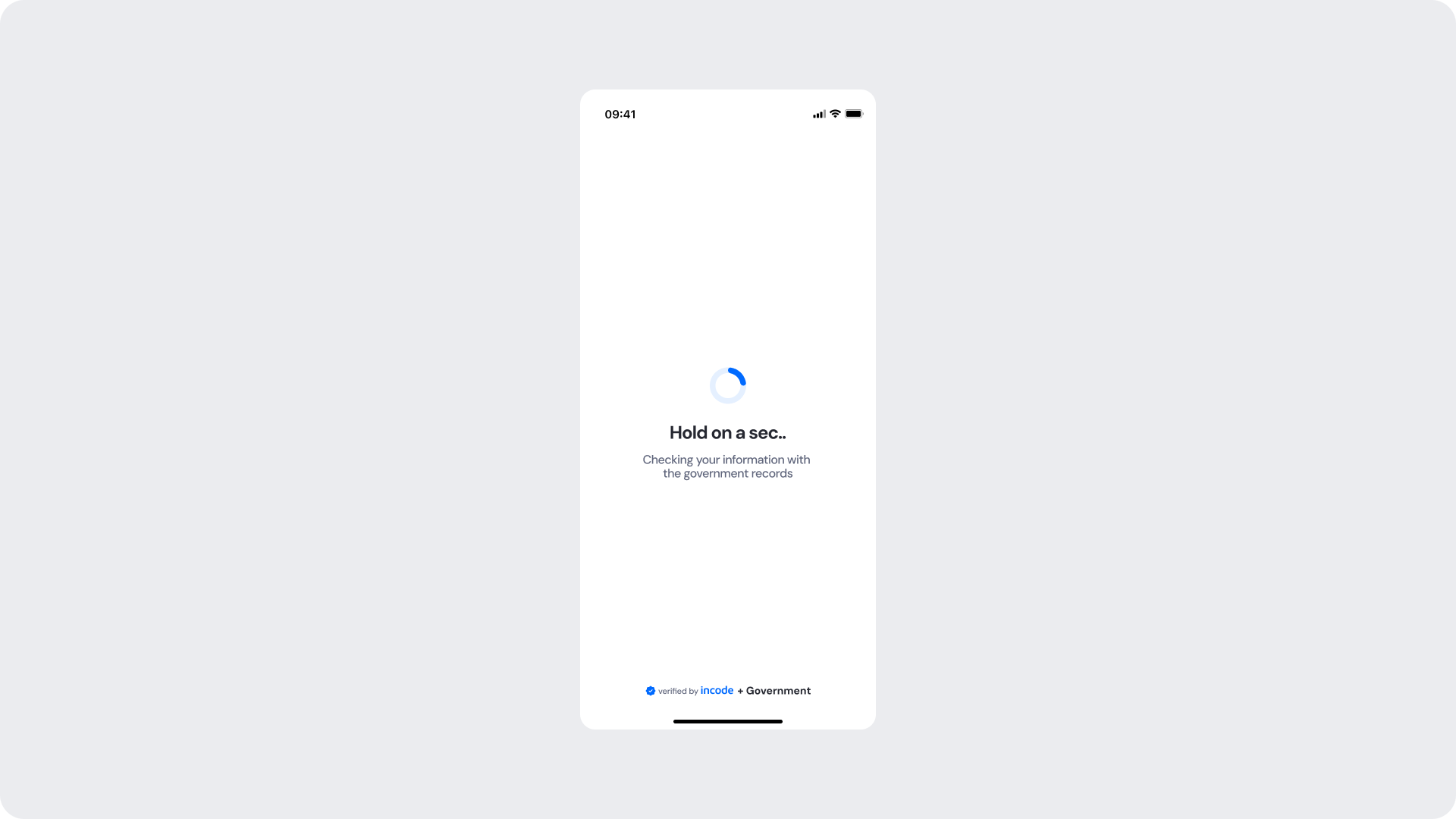
This screen appears while the module runs a background check against the corresponding government entity records. A spinner and status message keep the user informed while the operation completes.
Customizable Elements
| Area |
What can be customized |
Notes |
| Title text |
Loading message ("Hold on a sec..") |
Fully localizable; should remain concise. |
| Subtitle text |
Supporting message ("Checking your information with the government records") |
Tone can match your brand voice; should reference the government check for transparency. |
| Spinner accent color |
Primary spinner stroke |
Uses brand tokens; must remain visually clear. |
| Spinner background color |
Secondary spinner stroke |
Should maintain contrast with accent. |
| Background Color |
Screen background |
Must preserve readability and contrast. |
| Footer |
"Verified by Incode + Government" line |
Optional but strongly recommended for trust and transparency. |
Fixed Elements
| Element |
Why it is fixed |
| Verification logic |
Must remain consistent for accurate government record comparison. |
| Processing flow timing |
Linked to backend processing; cannot be shortened or skipped. |
| Spinner animation style |
Standardized across SDK for performance and recognizability. |
| Spacing & safe areas |
Required for device consistency. |
| Minimum contrast |
Required for accessibility and compliance. |
Token Refearence
| UI Element |
Token |
Value |
| Background |
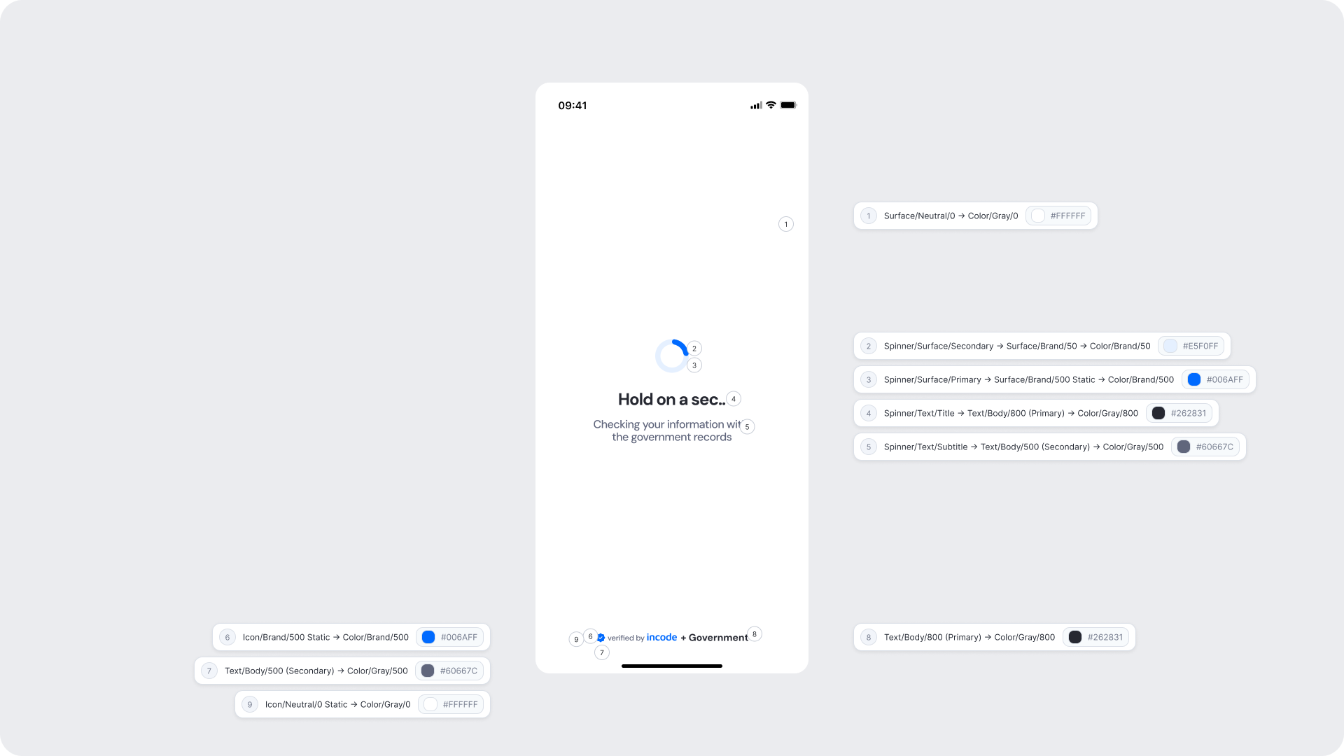
Surface/Neutral/0 → Color/Gray/0 |
#FFFFFF |
| Spinner background |
Spinner/Surface/Secondary → Surface/Brand/50 → Color/Brand/50 |
#E5F0FF |
| Spinner accent |
Spinner/Surface/Primary → Surface/Brand/500 Static → Color/Brand/500 |
#006AFF |
| Title text |
Spinner/Text/Title → Text/Body/800 (Primary) → Color/Gray/800 |
#262831 |
| Subtitle text |
Spinner/Text/Subtitle → Text/Body/500 (Secondary) → Color/Gray/500 |
#60667C |
| Footer brand text |
Icon/Brand/500 Static → Color/Brand/500 |
#006AFF |
| Footer secondary text |
Text/Body/500 (Secondary) → Color/Gray/500 |
#60667C |
| Footer icon |
Icon/Neutral/0 Static → Color/Gray/0 |
#FFFFFF |
Design Notes
- Keep copy short and specific — users should understand verification is actively happening against government records.
- The subtitle must reference the government records source to build trust and reduce uncertainty during the wait.
- Avoid adding imagery or additional UI elements that may distract from the verification state.
Success Screen
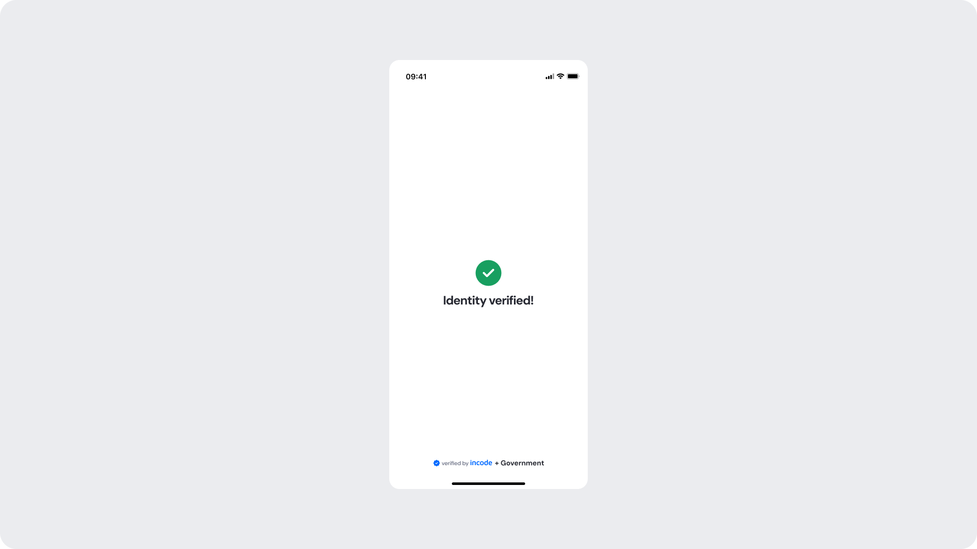
Shown when the identity data has been successfully matched against the government records, confirming that verification passed. The user receives a clear visual confirmation before the flow continues to the next step.
Customizable Elements
| Area |
What can be customized |
Notes |
| Title text |
Success message ("Identity verified!") |
Fully localizable. |
| Status icon |
Green checkmark |
Can replace with custom success icon; must remain clearly positive. |
| Background color |
Full-screen background |
Keep high contrast with icon and text. |
| Footer |
"Verified by Incode + Government" line |
Optional but strongly recommended. |
Fixed Elements
| Element |
Why it is fixed |
| Verification logic |
Must reflect actual backend result; not customizable. |
| Status color mapping |
Green = positive; required for consistent semantics. |
| Icon placement |
Ensures clarity and recognition. |
Token Reference
| UI Element |
Token |
Value |
| Background |
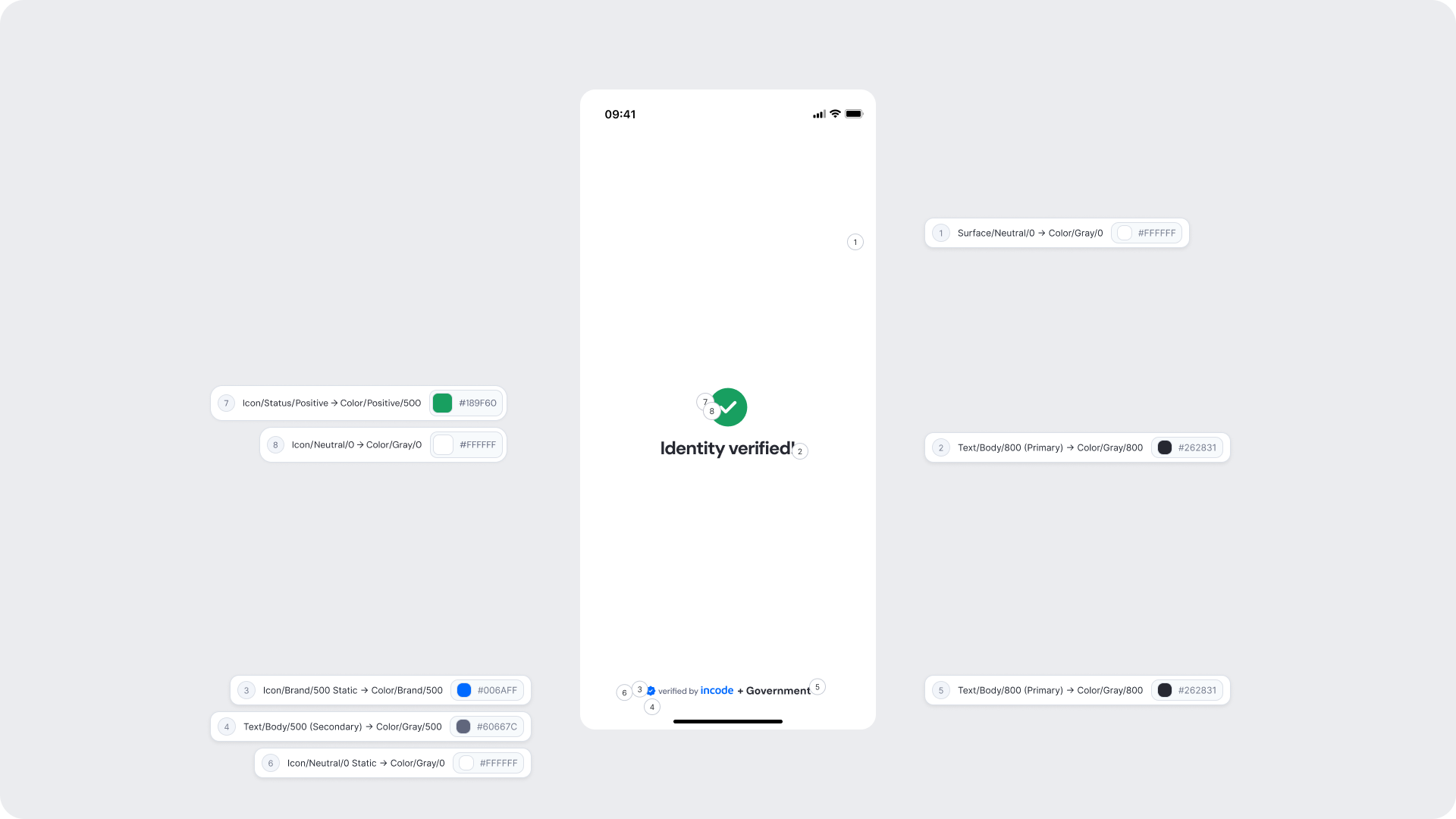
Surface/Neutral/0 → Color/Gray/0 |
#FFFFFF |
| Title text |
Text/Body/800 (Primary) → Color/Gray/800 |
#262831 |
| Status icon background |
Icon/Status/Positive → Color/Positive/500 |
#189F60 |
| Status icon (checkmark) |
Icon/Neutral/0 → Color/Gray/0 |
#FFFFFF |
| Footer brand text |
Icon/Brand/500 Static → Color/Brand/500 |
#006AFF |
| Footer secondary text |
Text/Body/500 (Secondary) → Color/Gray/500 |
#60667C |
| Footer icon |
Icon/Neutral/0 Static → Color/Gray/0 |
#FFFFFF |
Design Notes
- Keep messaging short and reassuring; users should feel confident before proceeding.
- The green checkmark and clean layout reinforce the positive outcome without additional explanation needed.
- Background should remain clean to keep focus on the confirmation.
Error
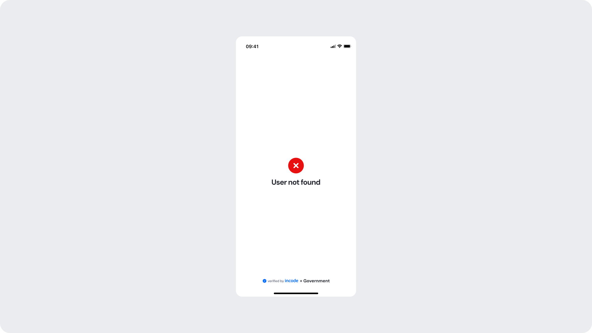
Shown when no matching record is found for the provided identity data in the government registry. The user is informed with a clear error message and the flow cannot continue until the issue is addressed.
Customizable Elements
| Area |
What can be customized |
Notes |
| Title text |
Error message ("User not found") |
Fully localizable; tone should be neutral and non-blaming. |
| Status icon |
Error indicator |
Can be replaced; must remain clearly negative. |
| Background color |
Full screen |
Must support strong contrast. |
| Footer |
"Verified by Incode + Government" line |
Optional but recommended. |
Fixed Elements
| Element |
Why it is fixed |
| Error logic |
Must accurately reflect the government record lookup result. |
| Status color mapping |
Red = negative; required for clarity and consistency. |
| Title hierarchy |
Emphasizes the issue clearly. |
Token Reference
| UI Element |
Token |
Value |
| Background |
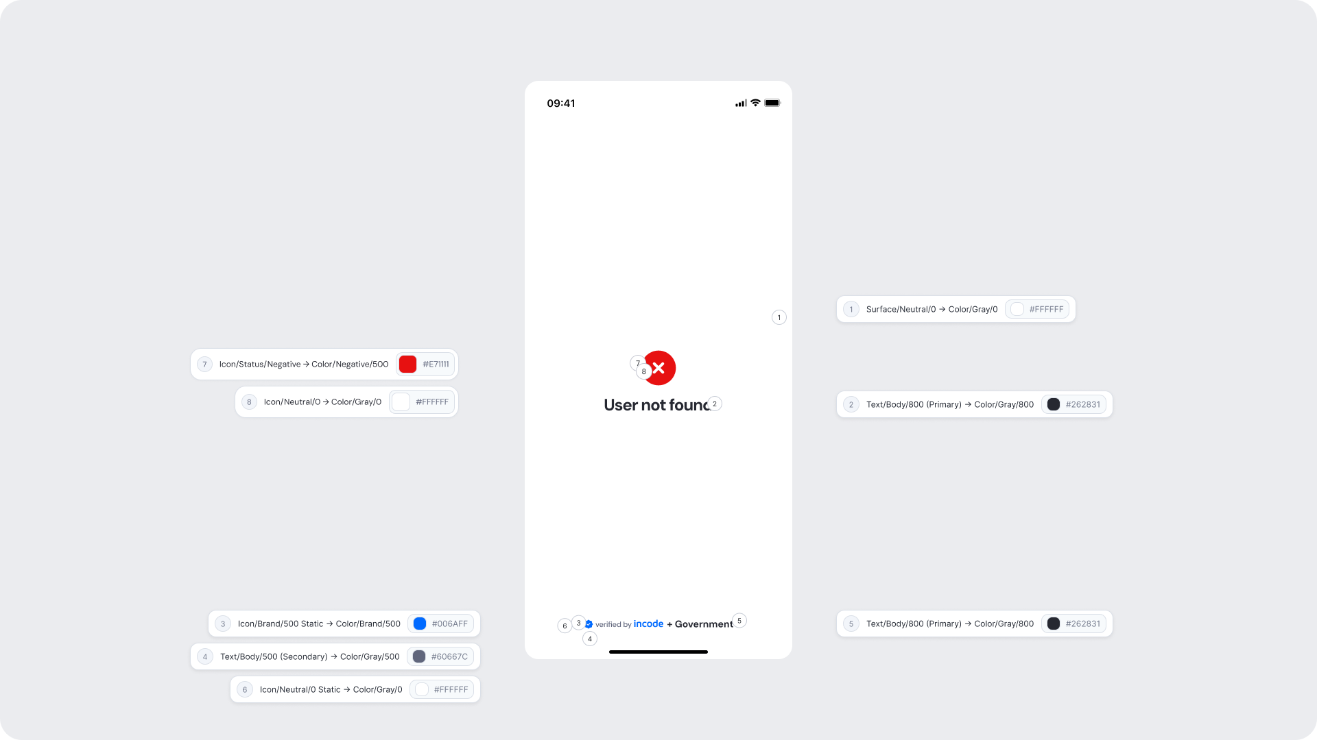
Surface/Neutral/0 → Color/Gray/0 |
#FFFFFF |
| Title text |
Text/Body/800 (Primary) → Color/Gray/800 |
#262831 |
| Status icon background |
Icon/Status/Negative → Color/Negative/500 |
#E71111 |
| Status icon (X mark) |
Icon/Neutral/0 → Color/Gray/0 |
#FFFFFF |
| Footer brand text |
Icon/Brand/500 Static → Color/Brand/500 |
#006AFF |
| Footer secondary text |
Text/Body/500 (Secondary) → Color/Gray/500 |
#60667C |
| Footer icon |
Icon/Neutral/0 Static → Color/Gray/0 |
#FFFFFF |
Design Notes
- Error messaging should be clear, direct, and action-oriented without technical language.
- Users should understand the issue at a glance and know what to do next.
- Maintain consistent spacing and visual hierarchy for readability.