This section outlines the elements you can customize within the Electronic Signature module to match your brand while preserving Incode’s core UX. It clarifies which areas are flexible, such as text, illustrations, and brand colors and which elements remain fixed to ensure consistency, accessibility, and optimal capture performance across platforms.
Signature canva
The Signature Canvas screen is the entry point of the Electronic Signature module. It presents the user with a blank drawing area and clearly communicates that they must draw their signature using a finger or mouse to proceed.
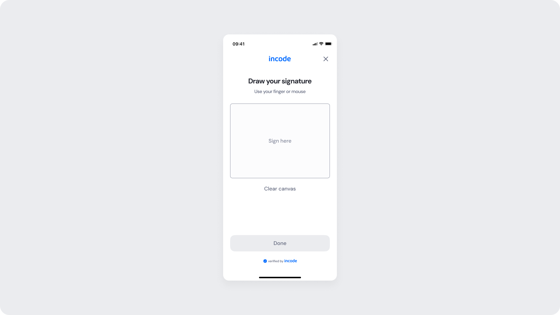
Customizable Elements
| Area |
What can be customized |
Notes |
| Text |
Title ("Draw your signature"), instruction text, placeholder ("Sign here"), button text, badge textt |
Fully localizable; tone and terminology can be adapted to match brand voice. |
| Canvas |
Border style, background color, placeholder text and color |
Canvas dimensions remain consistent; styling can be adapted to match brand design. |
| Background Color |
Screen background |
Must maintain strong contrast with inputs, text, and CTAs for accessibility compliance. |
| Buttons (CTA) |
Button label (“Done”), background color, text color |
Uses brand tokens |
| Brand Colors |
Header text, accent color, input focus state, status indicators |
Applied via design tokens; avoid reducing clarity in critical validation states. |
Fixed Elements
| Element |
Why it is fixed |
| Canva input detection |
Stroke detection logic ensures a valid signature is captured before submission is allowed. |
| CTA state behavior |
"Done" button remains disabled until a signature stroke is detected, preventing empty submissions. |
| Processing flow behavior |
Prevents duplicate submissions and manages loading states during signature capture. |
| Text hierarchy |
Maintains clear task communication and visual clarity within the flow. |
| WCAG contrast requirements |
Mandatory for accessibility compliance and inclusive user experience. |
Token Reference
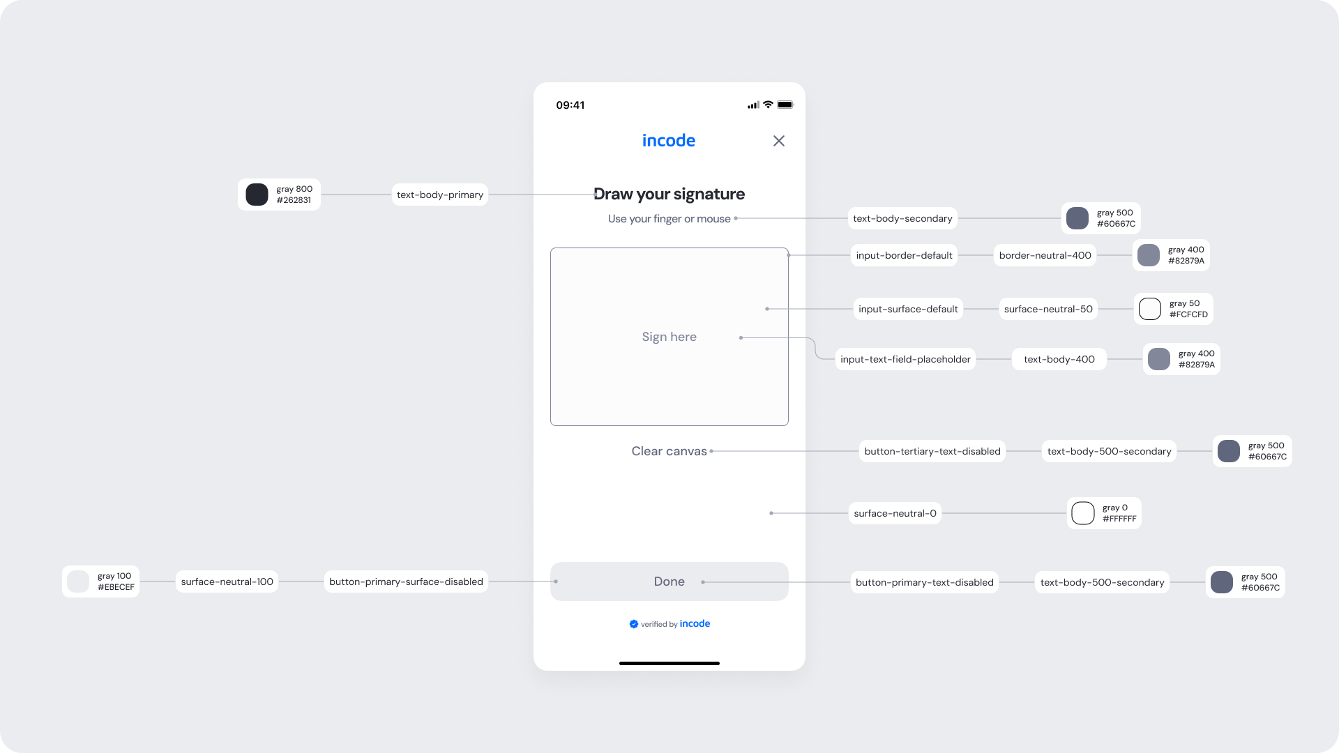
| UI Element |
Token |
Raw Value |
| Title text (Draw your signature) |
text-body-primary |
#262831 |
| Instruction text (Use your finger or mouse) |
text-body-secondary |
#60667C |
| Canvas border |
input-border-default |
#82879A |
| Canvas surface |
input-surface-default |
#FCFCFD |
| Placeholder text (Sign here) |
input-text-field-placeholder |
#82879A |
| Clear canvas text (disabled) |
button-tertiary-text-disabled |
#60667C |
| Background surface |
surface-neutral-0 |
#FFFFFF |
| Button background (disabled) |
button-primary-surface-disabled |
#EBECEF |
| Button text (disabled) |
button-primary-text-disabled |
#60667C |
Design Notes
- Keep field labels and helper text concise to reduce cognitive load.
- Use brand colors sparingly for focus states and primary CTAs to maintain clarity.
- Preserve sufficient color contrast across all states (idle, focus, error, disabled).
Signature Filled
This state appears after the user has drawn their signature on the canvas. It provides visual feedback for the captured input and confirms the signature is ready to submit. The canvas displays the drawn signature, replacing the placeholder text. The "Clear canvas" link is now active and visually highlighted, allowing the user to erase and redraw.
The "Done" button is fully enabled, allowing the user to submit the signature for processing.
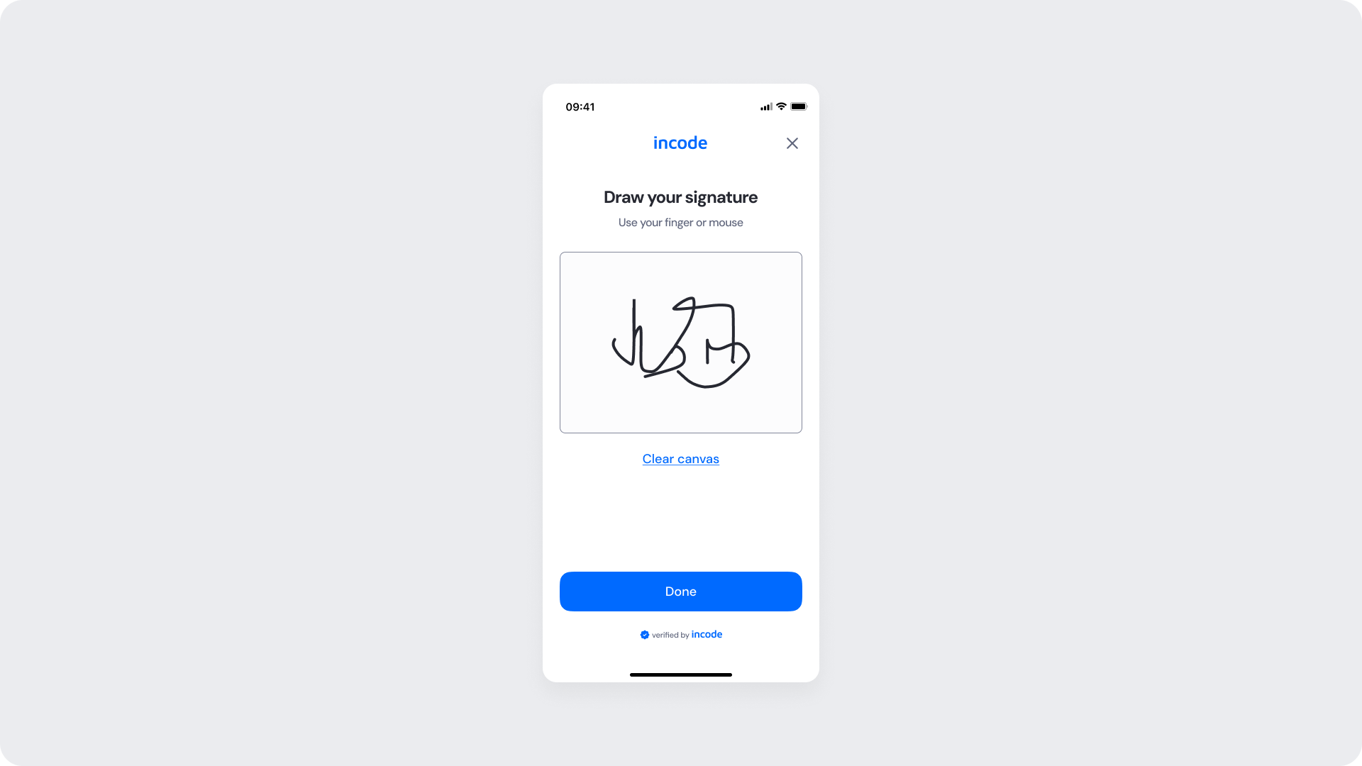
Customizable Elements
| Area |
What can be customized |
Notes |
| Text Elements |
Title, instruction text, "Clear canvas" label, button text, badge text |
Fully localizable. Tone and terminology can align with brand and regulatory requirements. |
| Color Styling |
Background, input surfaces, text color, focus state, CTA background and text color |
Applied via design tokens. Must maintain accessibility contrast standards. |
| CTA Label |
Primary button text (e.g., “Done”) |
Editable; action meaning must remain consistent with flow behavior. |
| Icons & Logo |
Brand logo and informational/status icons |
Visual style may follow brand guidelines; placement remains consistent. |
| Localization |
All textual content |
Supports full localization. Layout should accommodate text expansion. |
Fixed Elements
| Element |
Why it is fixed |
| Signature rendering |
The drawn signature is displayed as captured to ensure accuracy and legal validity. |
| CTA enabled behavior |
"Done" button is enabled only when a valid signature is present on the canvas. |
| Component spacing & safe areas |
Ensures cross-device consistency and accessibility. |
| Text hierarchy |
Maintains clear task communication and visual structure. |
| WCAG contrast requirements |
Mandatory for accessibility compliance. |
Token Reference
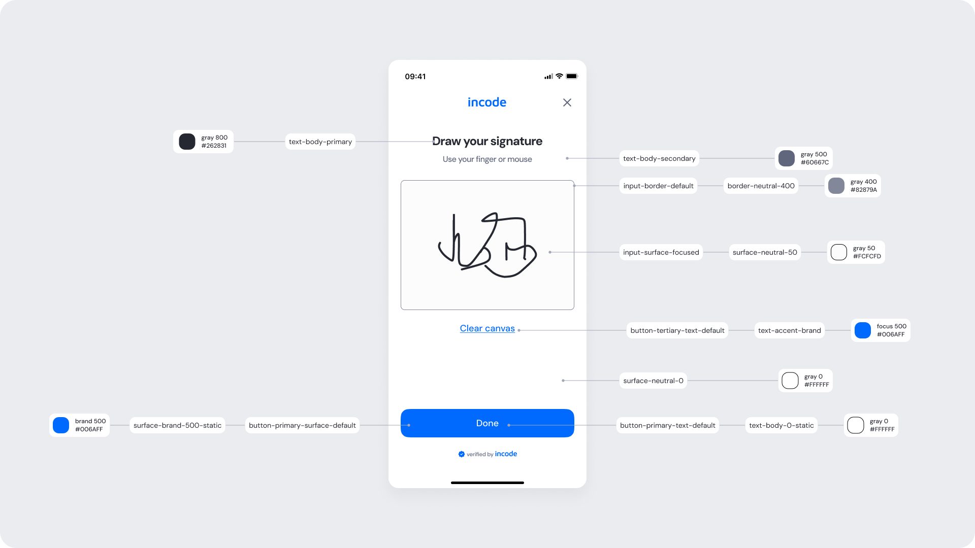
| UI Element |
Token |
Raw Value |
| Title text (Draw your signature) |
text-body-primary |
#262831 |
| Instruction text (Use your finger or mouse) |
text-body-secondary |
#60667C |
| Canvas border |
input-border-default |
#82879A |
| Canvas surface |
input-surface-focused |
#FCFCFD |
| Clear canvas text |
button-tertiary-text-default |
#006AFF |
| Background surface |
surface-neutral-0 |
#FFFFFF |
| Button background (Done) |
button-primary-surface-default |
#006AFF |
| Button text (Done) |
button-primary-text-default |
#FFFFFF |
Design notes
- Keep the layout clear and vertically structured to reduce cognitive load.
- The active "Clear canvas" link provides visual feedback that the canvas contains a valid signature and can be reset.
- The enabled "Done" button signals readiness to submit, using a distinct color shift from its disabled state to reinforce interactivity.
Success
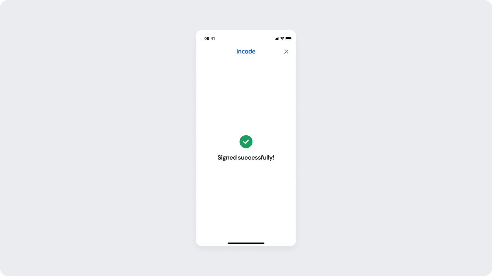
Final confirmation screen of the Electronic Signature module. After the user taps "Done," the system processes the signature and displays a green checkmark icon along with a "Signed successfully!" message.
This screen confirms that the signature has been captured and the process is complete.
Customizable Elements
| Area |
What can be customized |
Notes |
| Text Elements |
Title, success message, footer text |
Fully localizable. Wording can align with brand tone and regulatory language. |
| Color Styling |
Background, text color, success icon color, CTA color |
Applied via design tokens. Must maintain accessibility contrast, even in disabled states. |
| Localization |
All text content |
Supports full translation. Layout should account for text expansion. |
Fixed Elements
| Element |
Why it is fixed |
| Processing flow logic |
Controlled by backend verification services; cannot be modified at UI level. |
| Form structure hierarchy |
Field order and grouping remain standardized for consistency. |
| WCAG contrast requirements |
Accessibility compliance is mandatory, including disabled and loading states. |
Token Reference
| UI Element |
Token |
Raw Value |
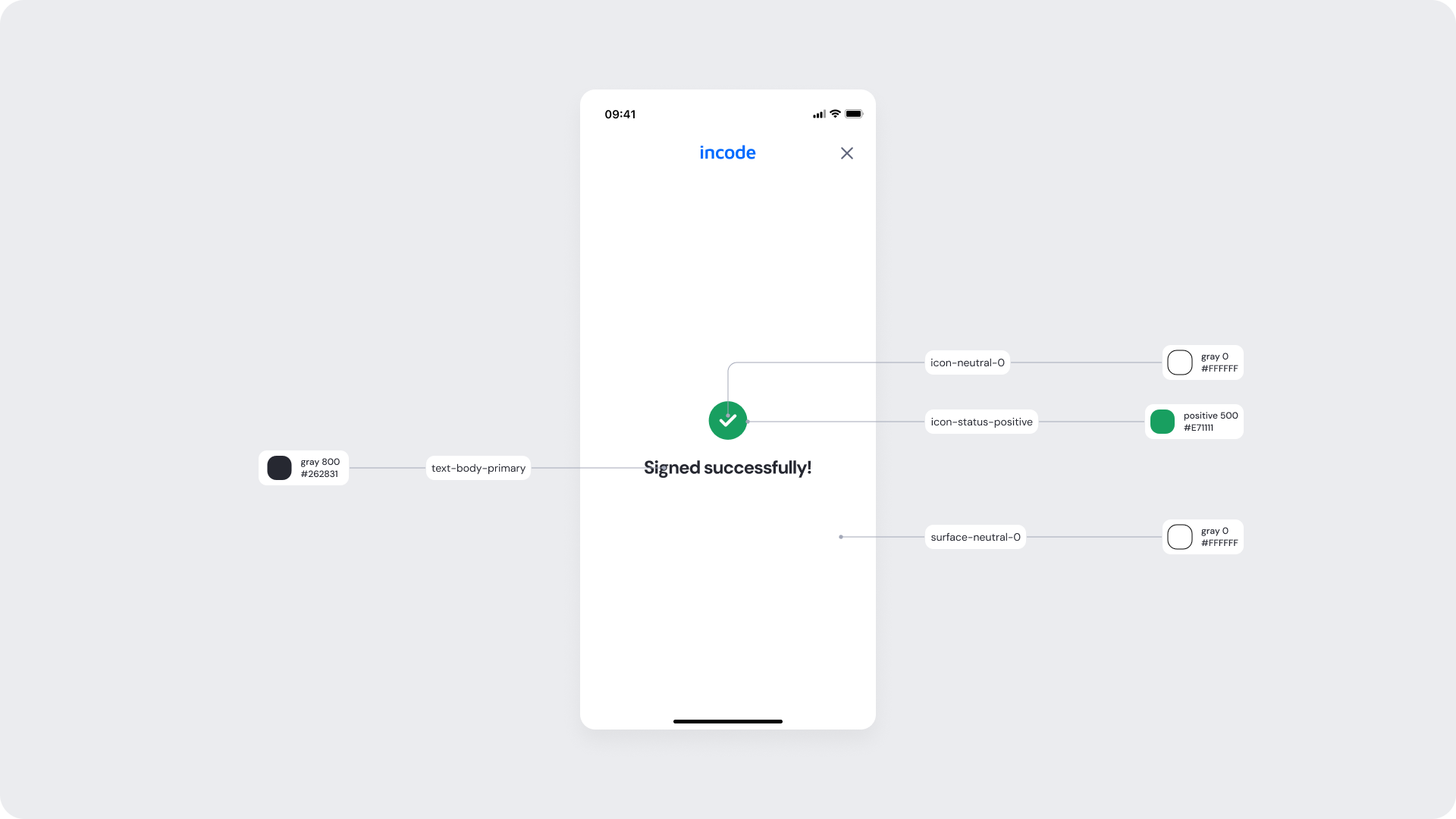
| Success icon (check - fill) |
icon-status-positive |
#17B26A |
| Success icon (check - mark) |
icon-neutral-0 |
#FFFFFF |
| Title text (Signed successfully!) |
text-body-primary |
#262831 |
| Background surface |
surface-neutral-0 |
#FFFFFF |
Design notes
- Preserve layout stability when switching to loading state.
- Maintain accessible contrast for spinner and disabled elements.