This section outlines the elements you can customize within the Upload Digital ID module to match your brand while preserving Incode's core UX. It clarifies which areas are flexible, such as text, illustrations, and brand colors, and which elements remain fixed to ensure consistency, accessibility, and reliable document processing across platforms.
Tutorial Screen
The Intro Screen prepares the user for the Upload Digital ID step, explains what type of document is required, and sets clear expectations before the user selects a file.
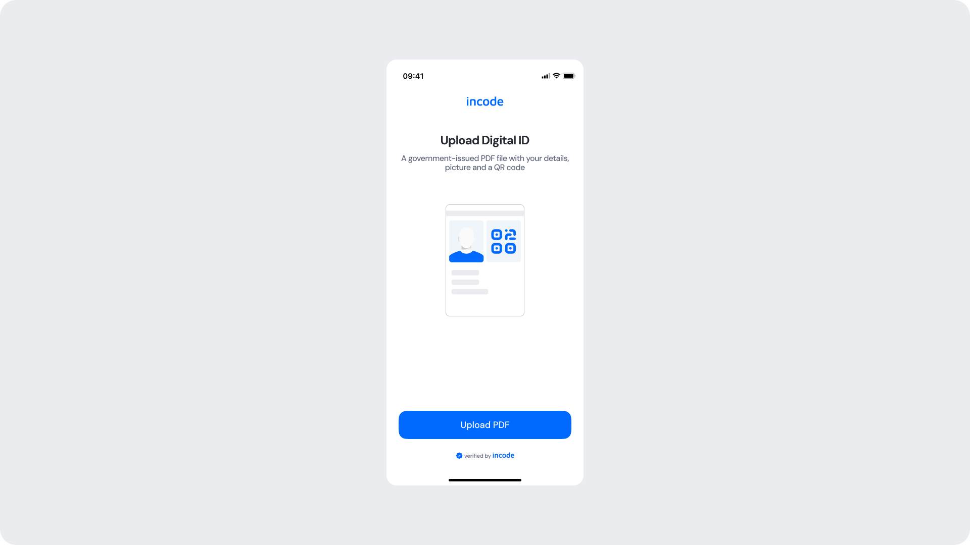
Customizable Elements
| Area |
What can be customized |
Notes |
| Text |
Title, subtitle, descriptive line |
Fully localizable; tone can be adapted to your brand voice. |
| Illustration |
Digital ID illustration |
Can be replaced or recolored using brand tokens. |
| Button |
Label, color, radius |
Must follow platform guidelines. |
| Background Color |
Screen background |
Must maintain strong contrast with text and elements. |
| Brand Colors |
Header text, accent color |
Uses brand tokens. |
| Footer |
"Verified by Incode" line |
Optional but recommended for trust and product consistency. |
Fixed Elements
| Element |
Why it is fixed |
| File type requirement (PDF) |
Required to ensure consistent document processing. |
| Component spacing & safe areas |
Required for device compatibility and visual stability. |
| Text hierarchy |
Optimized to communicate requirements clearly. |
| Close icon position |
Standardized across all modules for consistent navigation. |
| WCAG contrast requirements |
Mandatory for accessibility and regulatory compliance. |
Token Refearence
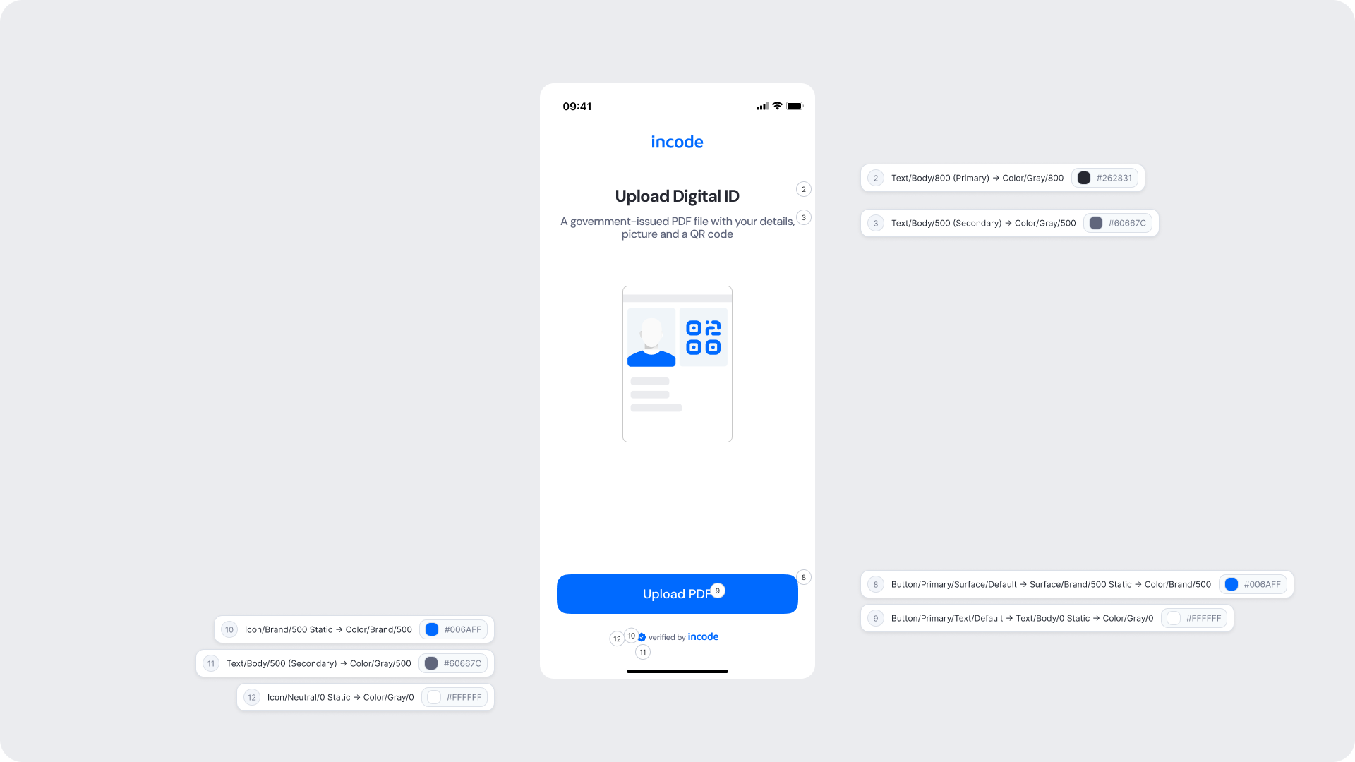
| UI Element |
Token |
Value |
| Brand name |
Icon/Brand/500 Static → Color/Brand/500 |
#006AFF |
| Title text |
Text/Body/800 (Primary) → Color/Gray/800 |
#262831 |
| Subtitle text |
Text/Body/500 (Secondary) → Color/Gray/500 |
#60667C |
| Button background |
Button/Primary/Surface/Default → Surface/Brand/500 Static → Color/Brand/500 |
#006AFF |
| Button text |
Button/Primary/Text/Default → Text/Body/0 Static → Color/Gray/0 |
#FFFFFF |
| Footer text |
Text/Body/500 (Secondary) → Color/Gray/500 |
#60667C |
| Footer icon |
Icon/Brand/500 Static → Color/Brand/500 |
#006AFF |
| Close icon |
Icon/Neutral/0 Static → Color/Gray/0 |
#FFFFFF |
| Background |
Surface/Neutral/0 |
#FFFFFF |
Design Notes
- Keep instructions clear and specific about the required file type and format.
- The illustration should reinforce what document the user needs to locate before proceeding.
- Ensure tap targets meet accessibility guidelines.ns.
Review Document Screen
The Review Document Screen allows the user to confirm they have selected the correct file before proceeding. It displays a preview of the uploaded PDF and the filename, with options to continue or replace the file.
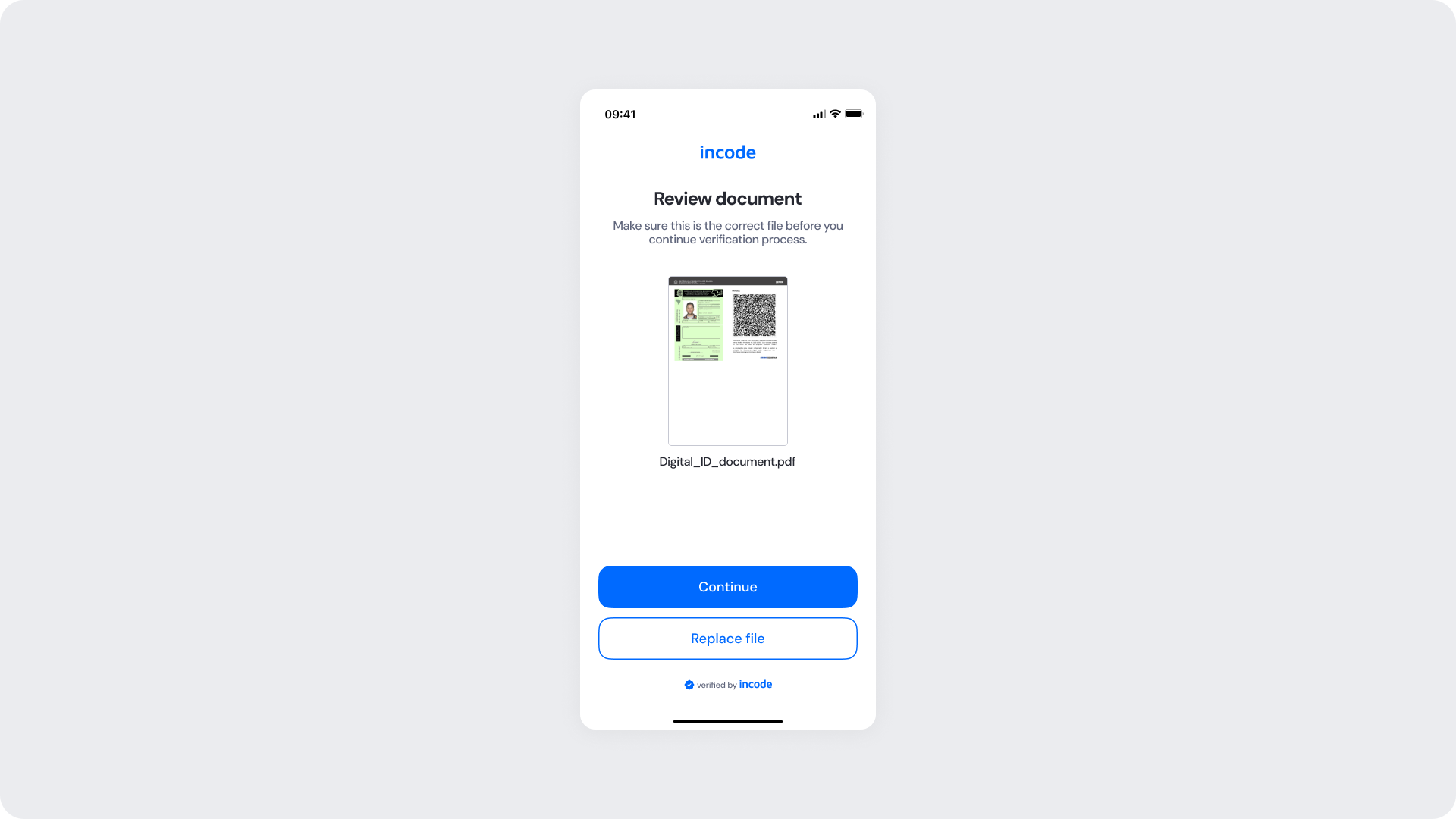
Customizable Elements
| Area |
What can be customized |
Notes |
| Text |
Title, subtitle, confirmation prompt |
Fully localizable. |
| Button — Continue |
Label, color, radius |
Must follow platform guidelines. |
| Button — Replace file |
Label, color, radius |
Must remain visually distinct from the primary action. |
| Background Color |
Screen background |
Must maintain contrast with preview and text. |
| Brand Colors |
Header text, accent color |
Uses brand tokens. |
| Footer |
"Verified by Incode" line |
Optional but recommended. |
Fixed Elements
| Element |
Why it is fixed |
| Document preview |
Required so users can confirm the correct file was selected. |
| Filename display |
Provides essential reference for the user before submission. |
| Button placement |
Standardized across modules. |
| Close icon position |
Standardized across all modules for consistent navigation. |
| WCAG contrast requirements |
Mandatory for accessibility and regulatory compliance. |
Token Reference
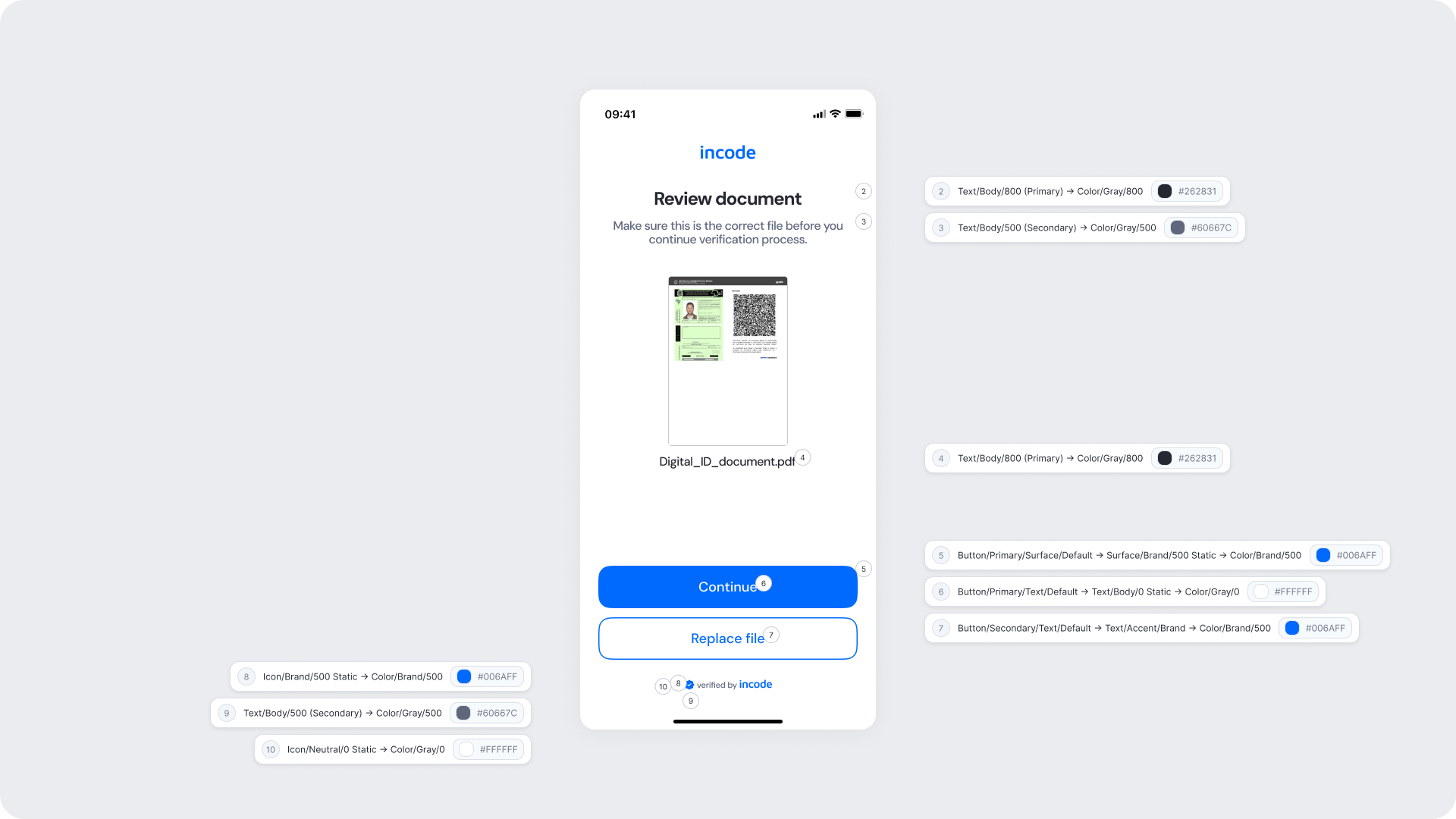
| UI Element |
Token |
Value |
| Brand name |
Icon/Brand/500 Static → Color/Brand/500 |
#006AFF |
| Title text |
Text/Body/800 (Primary) → Color/Gray/800 |
#262831 |
| Subtitle text |
Text/Body/500 (Secondary) → Color/Gray/500 |
#60667C |
| Filename text |
Text/Body/800 (Primary) → Color/Gray/800 |
#262831 |
| Button background (Continue) |
Button/Primary/Surface/Default → Surface/Brand/500 Static → Color/Brand/500 |
#006AFF |
| Button text (Continue) |
Button/Primary/Text/Default → Text/Body/0 Static → Color/Gray/0 |
#FFFFFF |
| Button text (Replace file) |
Button/Secondary/Text/Default → Text/Accent/Brand → Color/Brand/500 |
#006AFF |
| Footer text |
Text/Body/500 (Secondary) → Color/Gray/500 |
#60667C |
| Footer icon |
Icon/Brand/500 Static → Color/Brand/500 |
#006AFF |
| Close icon |
Icon/Neutral/0 Static → Color/Gray/0 |
#FFFFFF |
| Background |
Surface/Neutral/0 |
#FFFFFF |
Design Notes
- Keep messaging focused on helping the user confirm their selection.
- The Replace file button must remain clearly available so users can correct mistakes without friction.
- Maintain clear visual separation between the primary and secondary actions.
Analyzing Screen
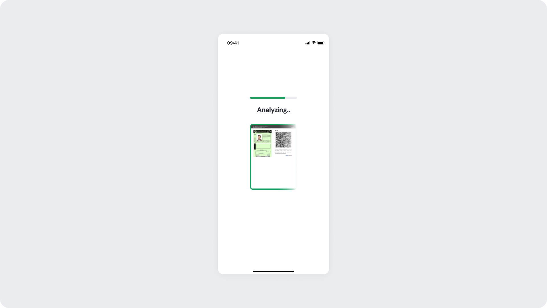
The Analyzing Screen is shown while the module processes the uploaded PDF and extracts identity data and QR code information. It keeps users informed during the operation with a progress indicator and a document preview.
Customizable Elements
| Area |
What can be customized |
Notes |
| Title text |
Processing message ("Analyzing..") |
Fully localizable; should remain concise. |
| Progress indicator color |
Accent and background stroke |
Uses brand tokens; must remain visually clear. |
| Document border color |
Preview frame accent |
Uses status positive token. |
| Background Color |
Screen background |
Must preserve readability and contrast. |
Fixed Elements
| Element |
Why it is fixed |
| Document preview |
Provides visual continuity from the review step. |
| Processing flow timing |
Linked to backend processing; cannot be shortened or skipped. |
| Progress indicator style |
Standardized across SDK for performance and recognizability. |
| Spacing & safe areas |
Required for device consistency. |
| Minimum contrast |
Required for accessibility and compliance. |
Token Reference
| UI Element |
Token |
Value |
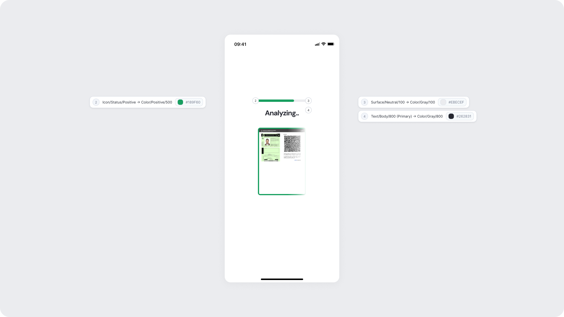
| Progress bar accent |
Icon/Status/Positive → Color/Positive/500 |
#189F60 |
| Progress bar background |
Surface/Neutral/100 → Color/Gray/100 |
#EBECEF |
| Title text |
Text/Body/800 (Primary) → Color/Gray/800 |
#262831 |
| Document border |
Icon/Status/Positive → Color/Positive/500 |
#189F60 |
| Background |
Surface/Neutral/0 |
#FFFFFF |
Design Notes
- Keep copy short to minimize cognitive load during the wait.
- Avoid adding imagery or additional UI elements that may distract from the processing state.
- The green border on the document preview reinforces that the file was accepted and is being processed.
Success Screen
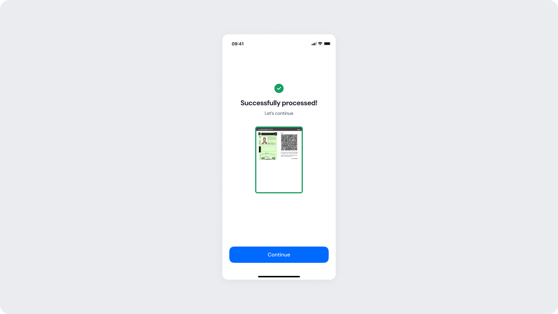
If the document is successfully processed and identity data extracted, the user moves into the Success state. This screen provides clear confirmation before they continue to the next step in the flow.
Customizable Elements
| Area |
What can be customized |
Notes |
| Title text |
Success message ("Successfully processed!") |
Fully localizable. |
| Subtitle text |
Supporting message ("Let's continue") |
Tone can match your brand voice. |
| Status icon |
Green checkmark |
Can replace with custom success icon; must remain clear. |
| Document border color |
Preview frame accent |
Uses status positive token. |
| Button |
Label, color, radius |
Must follow platform guidelines. |
| Background color |
Full-screen background |
Keep high contrast with icon and text. |
Fixed Elements
| Element |
Why it is fixed |
| Success logic |
Must reflect actual backend validation; not customizable. |
| Status color mapping |
Green = positive; required for consistent semantics. |
| Icon placement |
Ensures clarity and recognition. |
| Button placement |
Standardized across modules. |
Token Reference
| UI Element |
Token |
Value |
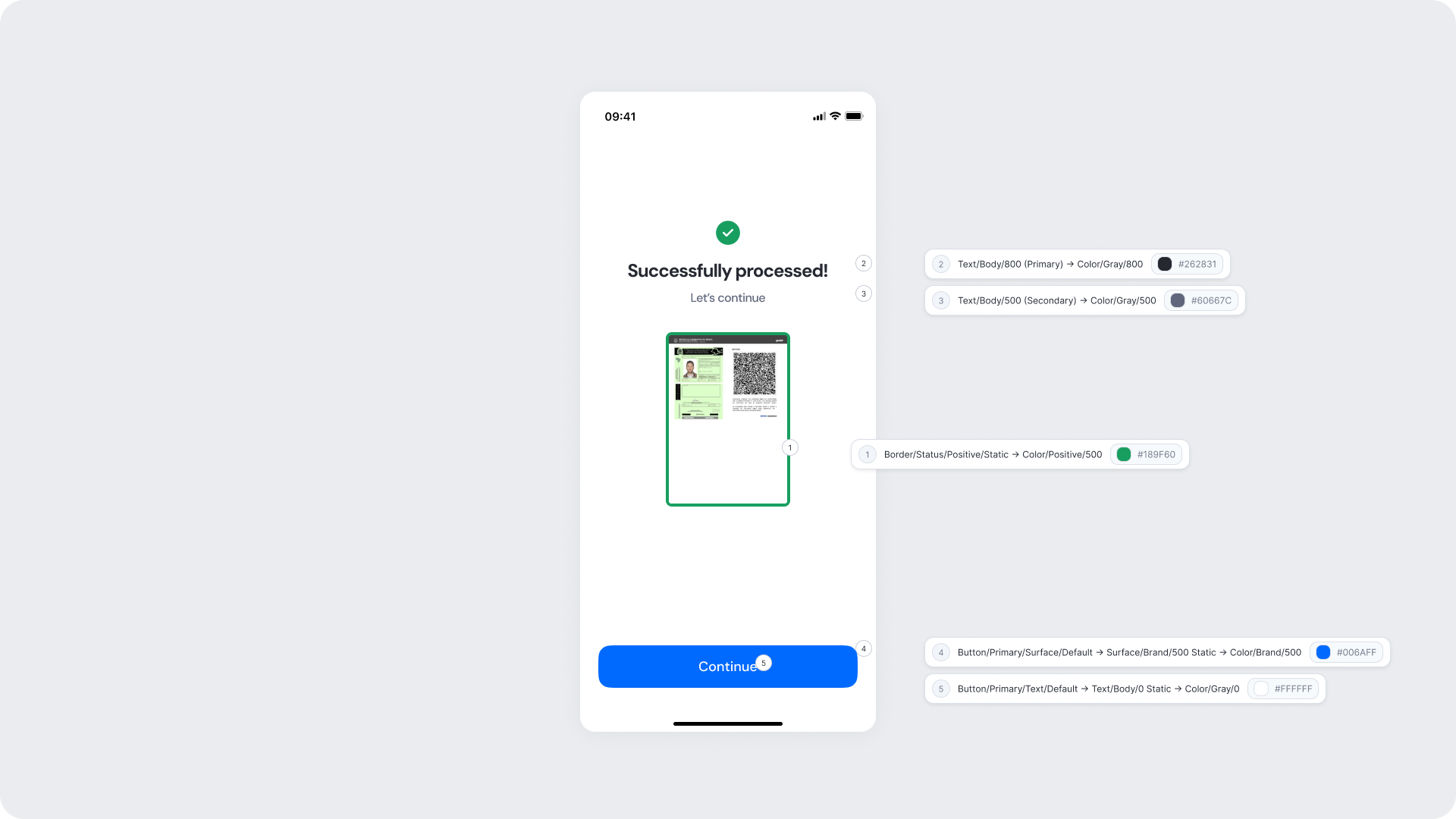
| Document border |
Border/Status/Positive/Static → Color/Positive/500 |
#189F60 |
| Title text |
Text/Body/800 (Primary) → Color/Gray/800 |
#262831 |
| Subtitle text |
Text/Body/500 (Secondary) → Color/Gray/500 |
#60667C |
| Button background |
Button/Primary/Surface/Default → Surface/Brand/500 Static → Color/Brand/500 |
#006AFF |
| Button text |
Button/Primary/Text/Default → Text/Body/0 Static → Color/Gray/0 |
#FFFFFF |
| Background |
Surface/Neutral/0 |
#FFFFFF |
Design Notes
- Keep messaging short and reassuring; users should feel confident before proceeding.
- The green border and checkmark icon reinforce the positive outcome consistently.
- Ensure the button uses the brand 500 color to provide a clear next step with strong visual prominence.
Error Screen
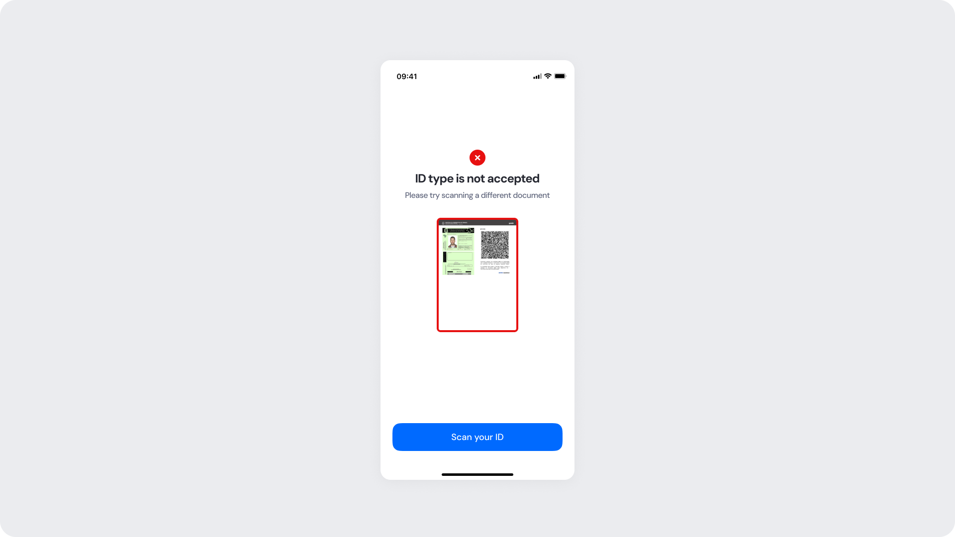
Error screens appear when the system cannot process the uploaded document. This screen informs the user that the file they uploaded is not a supported digital ID type and prompts them to try a different document. While text and styling can be branded, the error itself is fixed, as it reflects the outcome of the document validation and cannot be altered or removed.
Customizable Elements
| Area |
What can be customized |
Notes |
| Title text |
Error message ("ID type is not accepted") |
Fully localizable; tone should be neutral and non-blaming. |
| Subtitle text |
Supporting message |
Fully localizable. |
| Status icon |
Error indicator |
Can be replaced; must remain clearly negative. |
| Button |
Label, color, radius |
Action should guide the user to retry with the correct document. |
| Background color |
Full screen |
Must support strong contrast. |
Fixed Elements
| Element |
Why it is fixed |
| Error logic |
Must accurately reflect the document validation result. |
| Status color mapping |
Red = negative; required for clarity and consistency. |
| Title hierarchy |
Emphasizes the issue clearly. |
| Button placement |
Consistent across modules. |
Token Reference
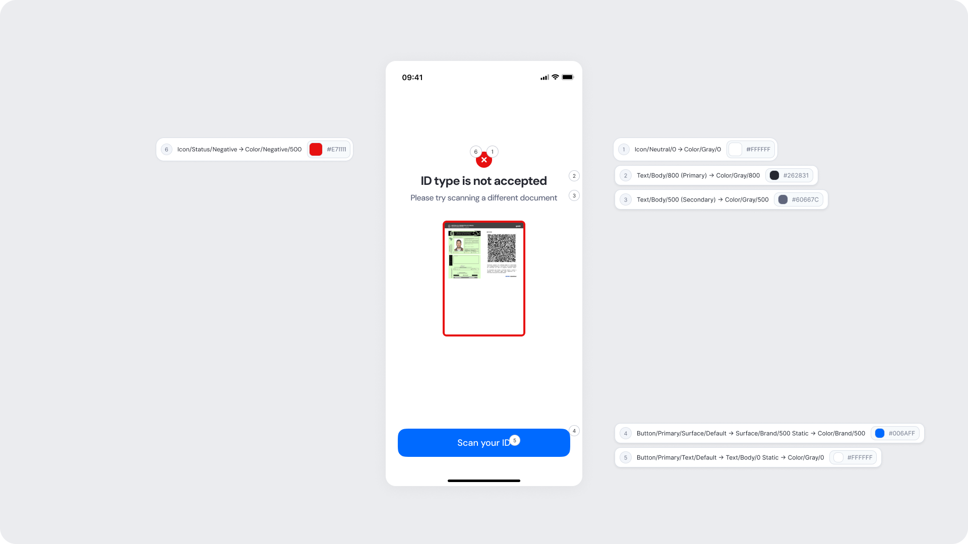
| UI Element |
Token |
Value |
| Status icon background |
Icon/Status/Negative → Color/Negative/500 |
#E71111 |
| Icon (X mark) |
Icon/Neutral/0 → Color/Gray/0 |
#FFFFFF |
| Title text |
Text/Body/800 (Primary) → Color/Gray/800 |
#262831 |
| Subtitle text |
Text/Body/500 (Secondary) → Color/Gray/500 |
#60667C |
| Button background |
Button/Primary/Surface/Default → Surface/Brand/500 Static → Color/Brand/500 |
#006AFF |
| Button text |
Button/Primary/Text/Default → Text/Body/0 Static → Color/Gray/0 |
#FFFFFF |
| Background |
Surface/Neutral/0 |
#FFFFFF |
Design Notes
- Error messaging should be clear, direct, and action-oriented.
- Avoid technical language; users should understand the issue at a glance.
- Maintain consistent spacing and visual hierarchy for readability.