The Advanced Signature module includes complete Figma specifications documenting spacing, layout rules, typography tokens, and language variants. These specs ensure consistency across platforms and allow localized versions of the UI to scale without breaking the layout.
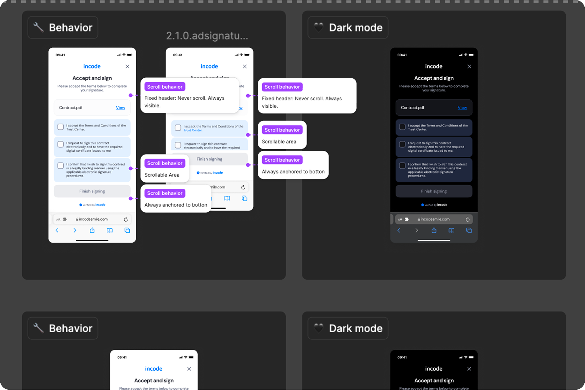
Responsiveness & Viewport Adaptation
The Advanced Signature module is fully responsive and adapts seamlessly to a wide range of device sizes and aspect ratios. The layout is designed to remain consistent and predictable whether the user is on a small phone, large phone, foldable device, or tablet.
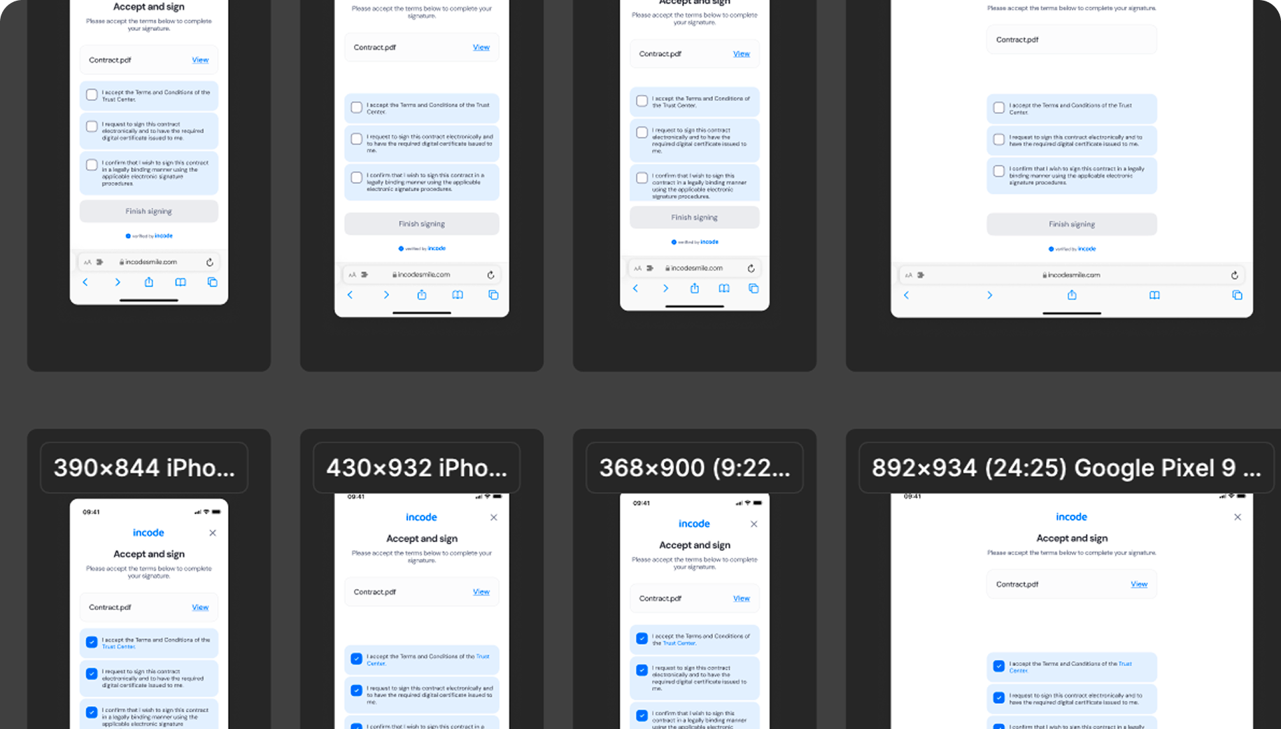
How the layout adapts across devices
| Breakpoint | Behavior |
|---|---|
| Small phones (e.g., iPhone SE) | UI elements adjust vertically; images scale down to maintain visibility |
| Standard phones (iPhone 12–16) | Full layout shown; spacing and hierarchy remain consistent |
| Tall/narrow Android devices | Vertical spacing is redistributed; title and images remain pinned to the top |
| Foldables (e.g., Pixel Fold) | Larger images and more balanced white space; content remains centered |
| Tablets | Increased layout margins; silhouette scales proportionally |
| Desktop web | Centered layout with controlled max-width; additional safe area padding |
What is responsive (and customizable)
| Element | Responsive Behavior | Customizable |
|---|---|---|
| Images size | Scale proportionally by viewport height | No |
| Title text | Remains centered in the layout and pinned at the top | Yes, text is fully localizable |
| Buttons | Width adjusts to container, vertical spacing adapts | Color & text |
| Footer / watermark | Pinned to bottom safe area | Optional |
| Background surfaces | Expand to full viewport | Yes |
| Header area | Scales padding according to device safe insets | Limited (color only) |
What remains fixed across breakpoints
| Element | Reason |
|---|---|
| Matching logic & detection | Must remain consistent for accuracy |
| Minimum text size | Required for readability & WCAG compliance |
| Minimum tap target sizes | Ensures accessibility on mobile |
| Overall hierarchy | Prevents cognitive load at different sizes |
Design Notes
- The images always remain the dominant elements, regardless of screen size.
- Horizontal spacing is fluid; vertical spacing uses fixed-safe thresholds.
- Avoid adding custom UI above or below the module, it may break alignment.
- Multiline text is handled gracefully, but avoid extremely long localized strings.
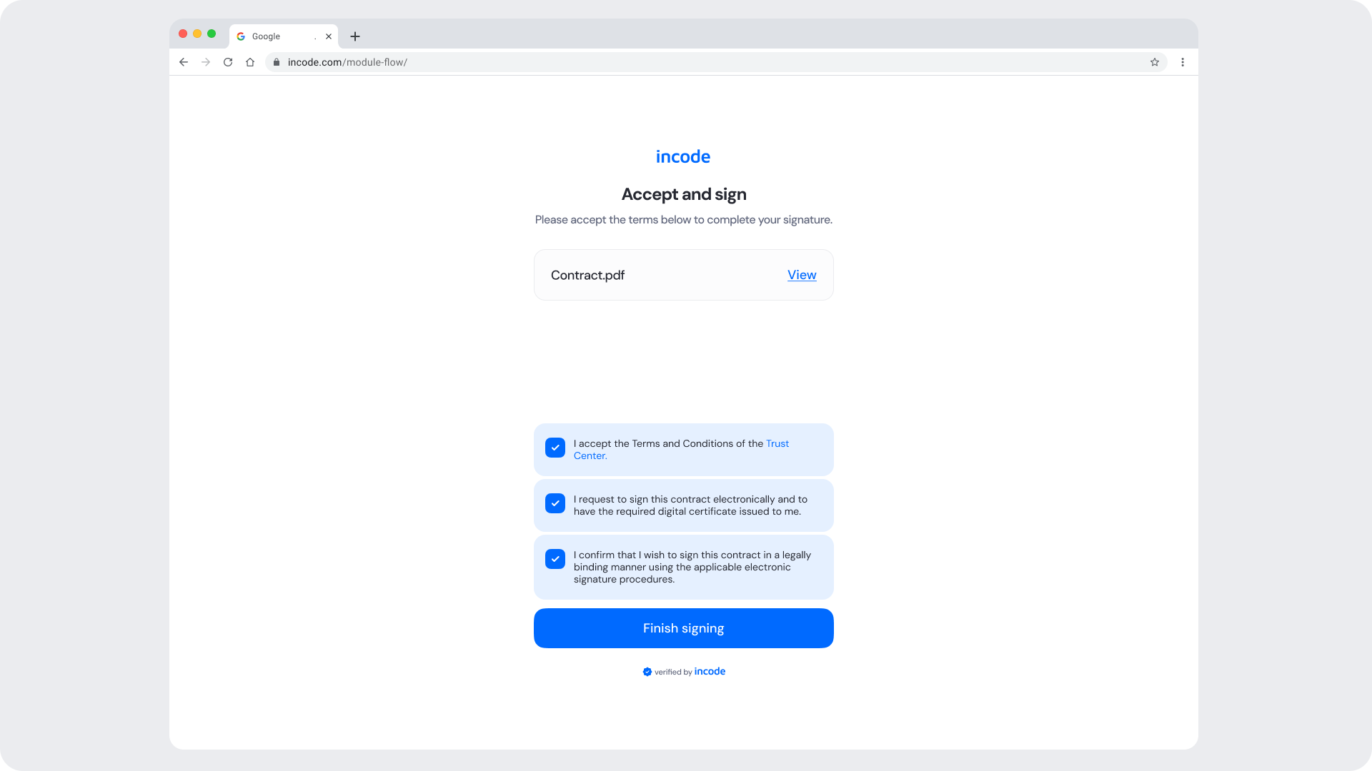
Desktop & Tablet Guidelines
The module is fully responsive and adapts gracefully to larger viewports. The Figma file includes guidelines for layout adjustments, safe areas, proportion scaling, and interaction differences between touch and pointer-based devices.
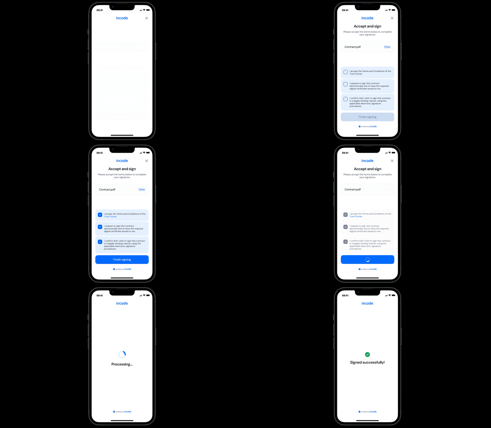
Prototype & Transitions
Advanced Signature includes predefined transition rules and micro-interactions that ensure a smooth user experience from the image comparison, to the successful and error states. Timing, easing, and animation guidelines are documented directly in Figma prototypes.
Localization
The Advanced Signature module supports full localization and is designed to adapt to languages with different lengths, line breaks, and reading patterns. The Figma file includes examples for long, short, and multi-line translations to ensure layouts remain stable across regions.
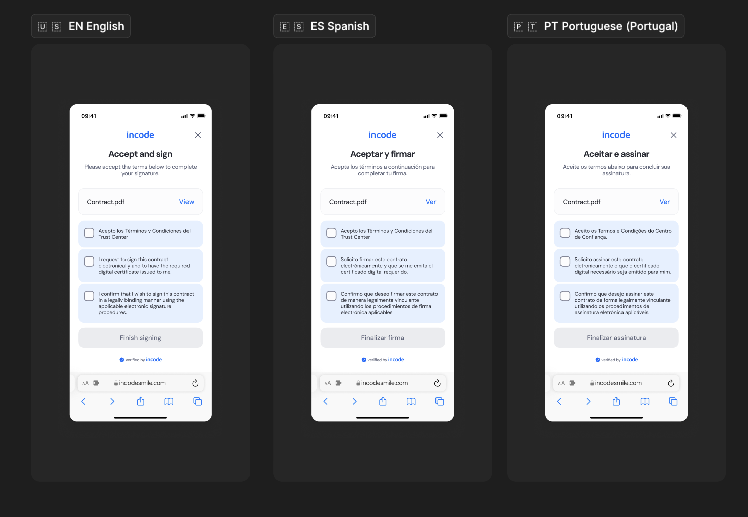
Key considerations:
- All user-facing text is fully localizable.
- UI adjusts to prevent truncation and maintain readability.
- Spacing and vertical rhythm adapt to accommodate longer languages.
- Buttons and CTAs automatically expand to fit translated labels.
- Ensure localized strings preserve clarity and follow regulatory requirements when applicable.
- Incode supports a variety of languages