This section outlines the elements you can customize within the Phone Number Input module to match your brand while preserving Incode’s core UX. It clarifies which areas are flexible, such as text, and brand colors and which elements remain fixed to ensure consistency, accessibility, and optimal capture performance across platforms.
This screen represents the initial state of the Phone Number Input flow. The user is prompted to enter their phone number and country code. At this stage, no input is provided, and the Continue button is disabled.
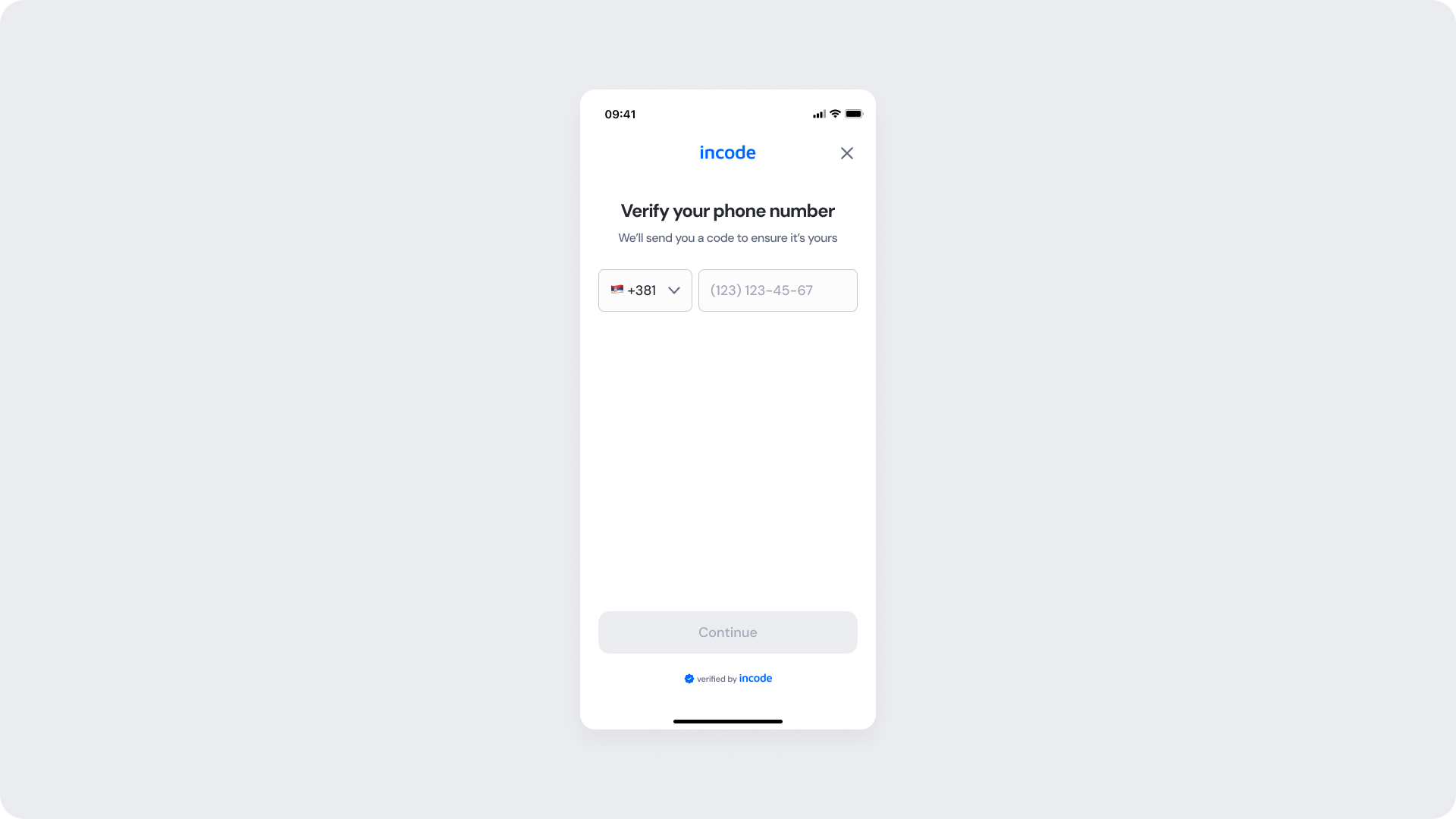
Customizable Elements
| Area |
What can be customized |
Notes |
| Text |
Title, subtitle, button label |
Fully localizable; tone can be adapted |
| Input Field |
Border, background, placeholder color |
Must follow contrast and accessibility guidelines |
| Brand Colors |
Header, buttons, and accent elements |
Uses Incode token structure for consistency |
| Buttons |
Label, color states (enabled/disabled) |
Must meet WCAG contrast ratio |
Fixed Elements
| Element |
Why it is fixed |
| Layout structure |
Ensures alignment across onboarding modules |
| Input field shape and proportions |
Must remain consistent with other form modules |
| Spacing & safe areas |
Optimized for readability and touch ergonomics |
| Font hierarchy |
Maintains visual clarity across all device sizes |
| Close icon position |
Standardized for user familiarity |
| WCAG minimum contrast |
Mandatory for accessibility compliance |
Token Reference
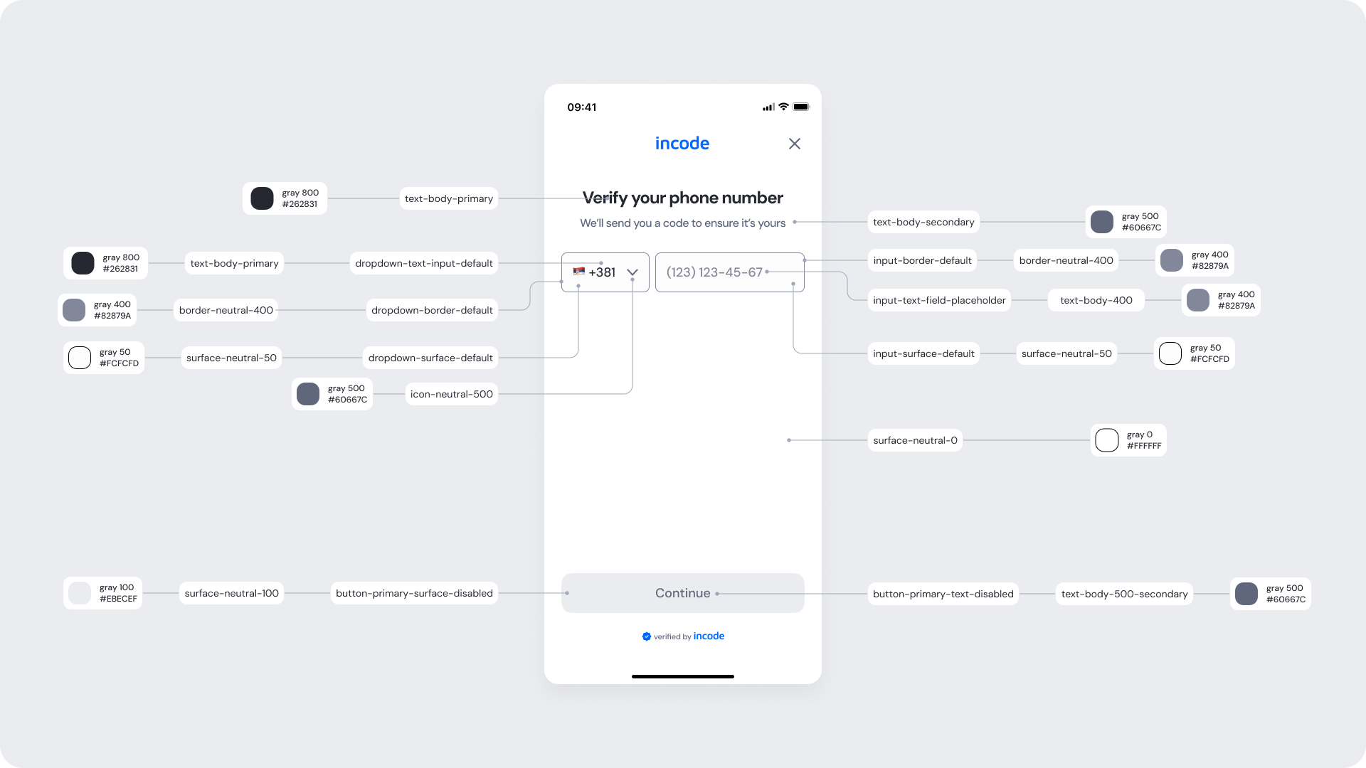
| UI Element |
Token |
Raw Value |
| Title text |
text-body-primary |
#262831 |
| Subtitle text |
text-body-secondary |
#60667C |
| Input placeholder |
input-text-field-placeholder |
#A3A8B8 |
| Input border |
input-border-default |
#EBECEF |
| Input surface |
input-surface-default |
#FCFCFD |
| Dropdown text |
dropdown-text-input-default |
#262831 |
| Dropdown border |
dropdown-border-default |
#EBECEF |
| Button background (disabled) |
button-primary-surface-disabled |
#EBECEF |
| Button text (disabled) |
button-primary-text-disabled |
#A3A8B8 |
Design Notes
- If customizing text, ensure clarity and brevity (e.g., “Enter your number” instead of “Please provide your mobile phone”).
- When adjusting button color, maintain strong contrast for accessibility.
This screen represents the focused input state of the Phone Number Input module.
When the user begins typing, the input field becomes highlighted with the focused border color, and the Continue button activates once the phone number is valid. This state communicates interaction and readiness to proceed.
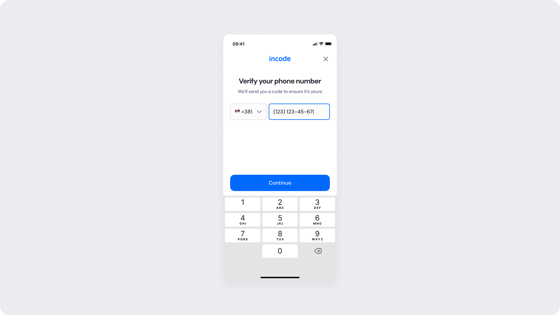
Customizable Elements
| Area |
What can be customized |
Notes |
| Text |
Title, subtitle, button label |
Fully localizable; tone can be adapted |
| Input Field (Focused) |
Border color, surface, placeholder text |
Must meet accessibility and contrast requirements |
| Dropdown (Country Code) |
Icon, border, and surface colors |
Uses shared input styles and tokens |
| Brand Colors |
Button and active states |
Derived from brand token system |
| Buttons |
Label, enabled/disabled colors |
Must align with WCAG standards |
Fixed Elements
| Element |
Why it is fixed |
| Layout structure |
Maintains alignment and consistency across modules |
| Input shape and field height |
Standardized for usability and accessibility |
| Spacing & padding |
Optimized for touch and visual rhythm |
| Typography hierarchy |
Ensures consistent information hierarchy |
| Button dimensions |
Fixed to meet platform accessibility requirements |
| WCAG minimum contrast |
Required for certification and compliance |
Token Reference
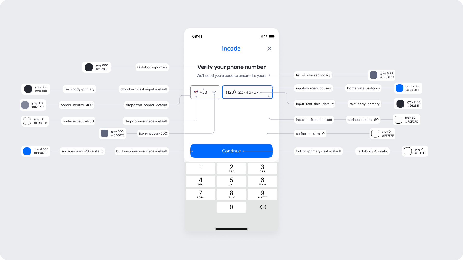
| UI Element |
Token |
Raw Value |
| Title text |
text-body-primary |
#262831 |
| Subtitle text |
text-body-secondary |
#60667C |
| Input border (focused) |
input-border-focused |
#006AFF |
| Input text |
input-text-field-default |
#262831 |
| Input surface (focused) |
input-surface-focused |
#FCFCFD |
| Dropdown text |
dropdown-text-input-default |
#262831 |
| Dropdown border |
dropdown-border-default |
#EBECEF |
| Button background (enabled) |
button-primary-surface-default |
#006AFF |
| Button text (enabled) |
button-primary-text-default |
#FFFFFF |
| Background surface |
surface-neutral-0 |
#FFFFFF |
Design Notes
- You can adjust the focus color to match your brand, but ensure it remains visually distinct from error states.
- If modifying typography, preserve visual differences between title, subtitle, and input to maintain clarity.
- Always test your custom color scheme in light and dark modes for accessibility consistency.
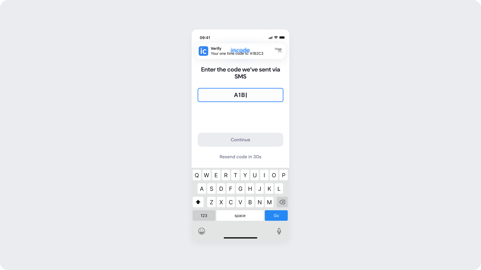
OTP Entry Screen (Focused State)
This screen appears after the user enters their phone number and the system sends a one-time passcode (OTP) via SMS.
The user is prompted to enter the code in a series of clearly separated fields. As the input fields gain focus, the borders and surfaces adapt to indicate active interaction. A countdown below the button communicates when the user can resend the code.
Customizable Elements
| Area |
What can be customized |
Notes |
| Text |
Title, helper text, countdown label |
Fully localizable; supports dynamic values (e.g., countdown) |
| OTP Fields |
Border and text color in focused state |
Must maintain accessibility contrast and clarity |
| Buttons |
Label, color states (disabled/enabled) |
Must meet WCAG 2.1 contrast requirements |
| Resend Code Text |
Color, hover/press state |
Uses tertiary text token, consistent with interaction patterns |
| Brand Colors |
Primary accent and focus color |
Derived from brand-500 and related tokens |
Fixed Elements
| Element |
Why it is fixed |
| Input field layout |
Ensures consistency across all OTP verification steps |
| Field spacing |
Optimized for readability and tap accuracy |
| Countdown behavior |
Fixed duration to standardize retry experience |
| Button placement |
Standard alignment for visual rhythm and reachability |
| Typography hierarchy |
Maintains cross-platform readability |
| WCAG minimum contrast |
Required for accessibility certification |
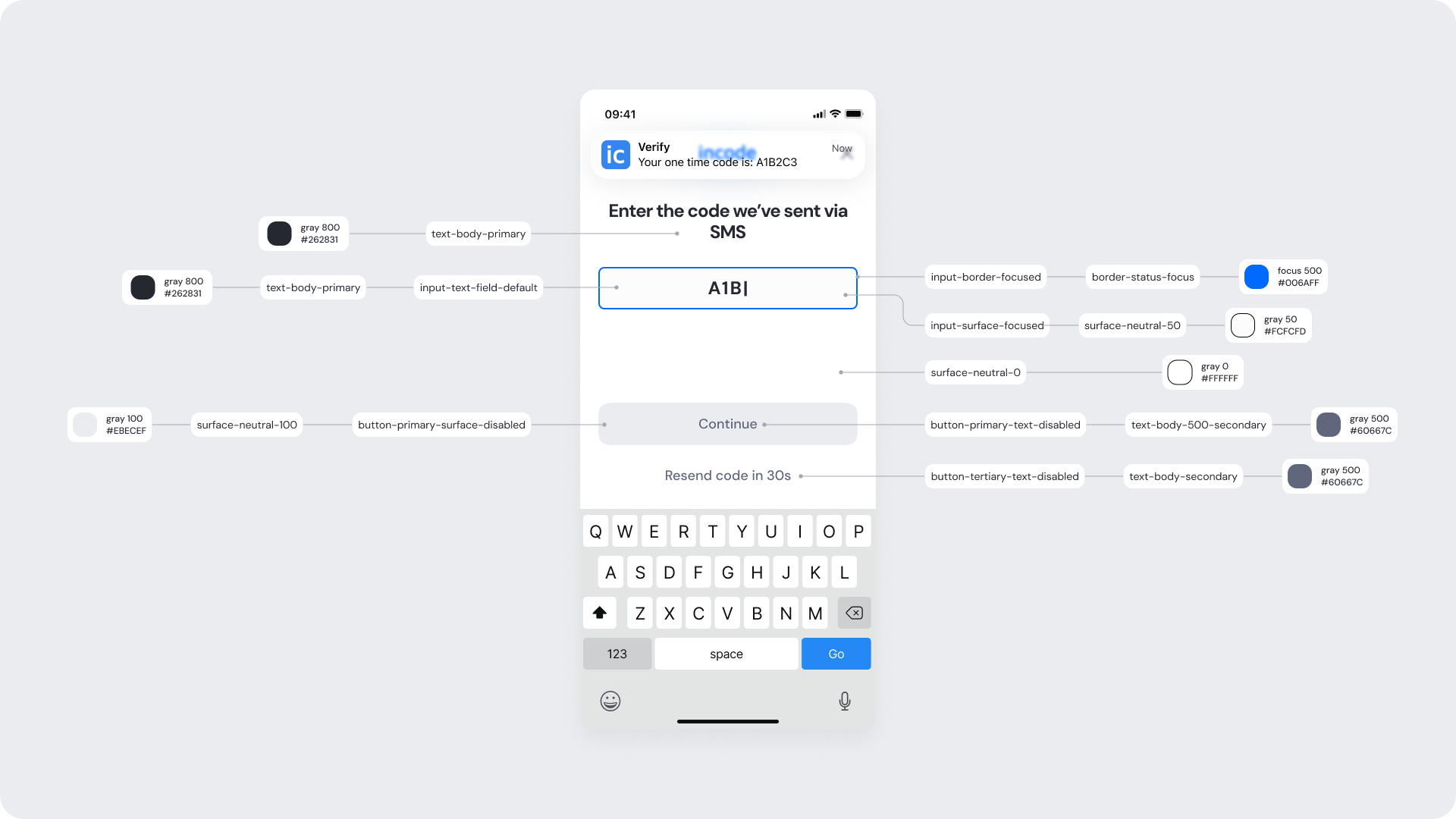
Token Reference
| UI Element |
Token |
Raw Value |
| Title text |
text-body-primary |
#262831 |
| OTP input border (focused) |
input-border-focused |
#006AFF |
| OTP input text |
input-text-field-default |
#262831 |
| OTP input surface (focused) |
input-surface-focused |
#FCFCFD |
| Button background (disabled) |
button-primary-surface-disabled |
#EBECEF |
| Button text (disabled) |
button-primary-text-disabled |
#A3A8B8 |
| Resend code text |
button-tertiary-text-disabled |
#60667C |
| Countdown timer text |
text-body-secondary |
#60667C |
| Background surface |
surface-neutral-0 |
#FFFFFF |
Design Notes
- You can adjust the focus color to match your brand, but ensure it remains visually distinct from error states.
- If modifying typography, preserve visual differences between title, subtitle, and input to maintain clarity.
- Always test your custom color scheme in light and dark modes for accessibility consistency.
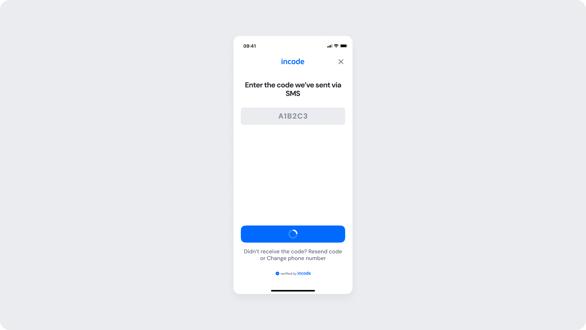
OTP Checking (Verification Loading) Screen
This screen represents the verification state of the Phone Number Input module. After the user submits the one-time passcode (OTP), the system verifies the input. The interface locks input field and transitions the button to a loading spinner, indicating that validation is in progress.
During this state, interaction is temporarily disabled until the verification completes.
Customizable Elements
| Area |
What can be customized |
Notes |
| Text |
Title and helper text |
Fully localizable; tone can be adapted |
| OTP Fields (Disabled) |
Border, background, and text color |
Should visually indicate a non-editable state |
| Buttons |
Spinner color, background, and text |
Spinner inherits brand color for visual consistency |
| Resend / Change Number Text |
Color and link state |
Uses tertiary text token |
| Brand Colors |
Button and header accents |
Derived from brand-500 and brand-400 tokens |
Fixed Elements
| Element |
Why it is fixed |
| Layout structure |
Ensures consistency across all verification states |
| Button position |
Aligned for accessibility and predictable interaction flow |
| Input layout and spacing |
Maintains readability during transition states |
| Loading spinner size |
Standardized for cross-platform consistency |
| Typography hierarchy |
Maintains readability and balance |
| WCAG minimum contrast |
Ensures accessible visual design |
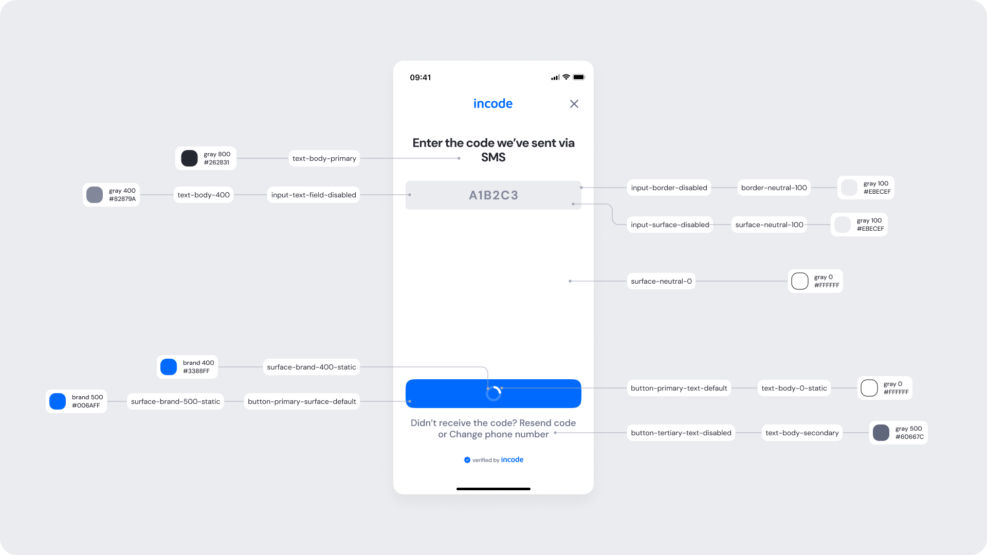
Token Reference
| UI Element |
Token |
Raw Value |
| Title text |
text-body-primary |
#262831 |
| OTP input text (disabled) |
input-text-field-disabled |
#A3A8B8 |
| OTP input border (disabled) |
input-border-disabled |
#EBECEF |
| OTP input surface (disabled) |
input-surface-disabled |
#EBECEF |
| Button background (default/loading) |
button-primary-surface-default |
#006AFF |
| Button text (default/loading) |
button-primary-text-default |
#FFFFFF |
| Spinner accent |
surface-brand-400-static |
#3388FF |
| Resend/change number text |
button-tertiary-text-disabled |
#60667C |
Design Notes
- Avoid introducing additional text or loaders elsewhere on the screen.
- If modifying color schemes, ensure that disabled input states remain visibly distinct.
Success Screen
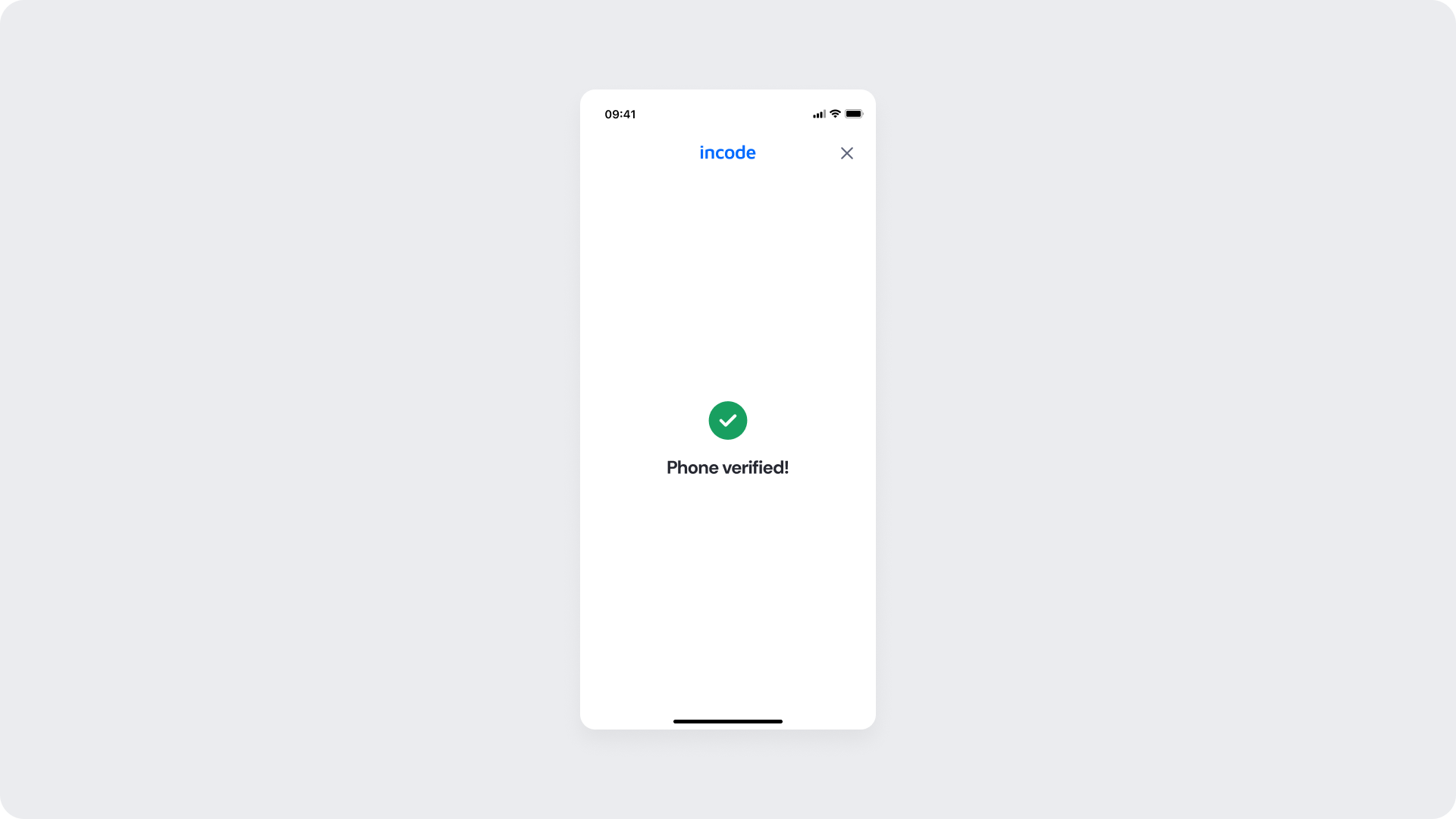
This screen appears after the user’s phone number has been successfully verified.
It provides a clear confirmation of success before the flow transitions to the next module or completion step.
The layout is intentionally minimal to maintain focus on the success feedback.
Customizable Elements
| Area |
What can be customized |
Notes |
| Text |
Confirmation message |
Fully localizable; tone can be adapted |
| Success Icon |
Color and animation |
Must use approved positive color tokens |
| Brand Colors |
Header and accent |
Based on brand-500 values |
| Background |
Color and safe area padding |
Must preserve contrast and clarity |
Fixed Elements
| Element |
Why it is fixed |
| Layout structure |
Ensures consistent feedback presentation across modules |
| Icon size and position |
Optimized for recognition and accessibility |
| Text alignment |
Central alignment for visual balance |
| Typography hierarchy |
Maintains brand consistency and readability |
| WCAG minimum contrast |
Required for accessibility compliance |
Token Reference
| UI Element |
Token |
Raw Value |
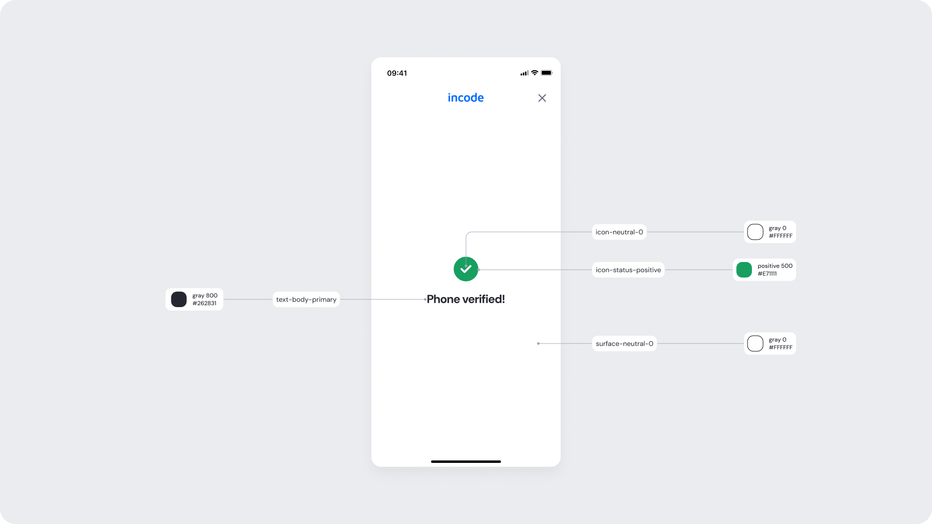
| Title text |
text-body-primary |
#262831 |
| Success icon |
icon-status-positive |
#189F60 |
| Background surface |
surface-neutral-0 |
#FFFFFF |
Design Notes
- Keep the confirmation text short and positive; don’t include instructions or next steps here.
- If using customized colors, ensure they don’t reduce the contrast of the success message or icon.
OTP Error Screen
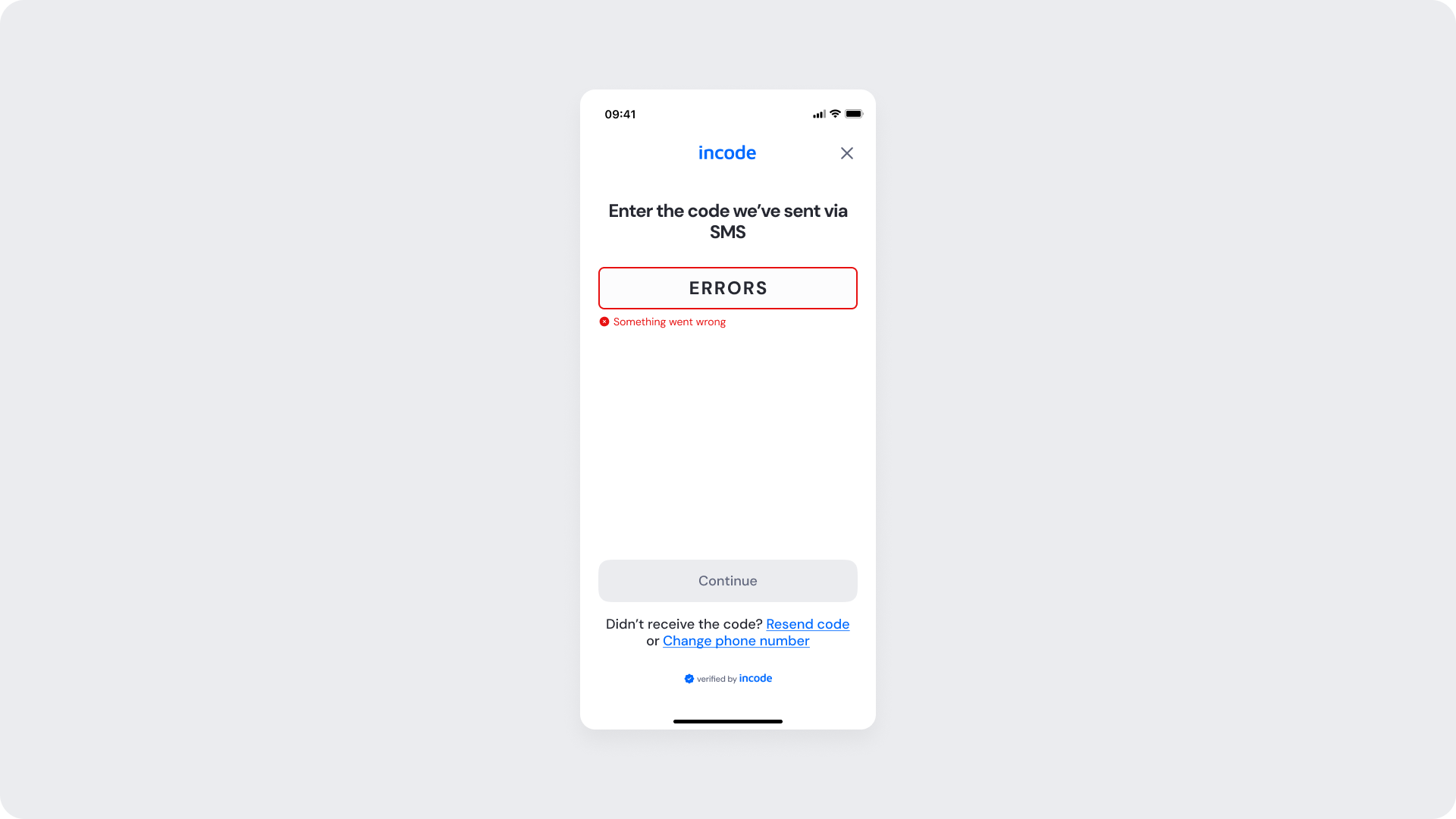
This screen appears when the user enters an incorrect or expired code.
It provides immediate visual feedback through red highlight states and an error message.
The interface allows the user to resend the code or change their phone number before attempting verification again.
Customizable Elements
| Area |
What can be customized |
Notes |
| Text |
Error message and helper text |
Fully localizable; keep concise and polite tone |
| Input Fields (Error) |
Border, background, text color |
Must maintain strong color contrast for accessibility |
| Error Icon |
Color |
Uses negative (error) status color token |
| Buttons |
Label, color state |
Maintain clear disabled and active visual distinction |
| Links (Resend / Change Email) |
Color and hover states |
Use brand accent color for recognition |
| Brand Colors |
Header and accents |
Should align with existing brand color tokens |
Fixed Elements
| Element |
Why it is fixed |
| Layout structure |
Maintains consistency across OTP states |
| Input field shape and spacing |
Optimized for error visibility |
| Button placement |
Standardized for user familiarity |
| Typography hierarchy |
Preserves consistent hierarchy and legibility |
| Error message position |
Fixed to align directly below input fields |
| WCAG minimum contrast |
Required for accessibility compliance |
Token Reference
| UI Element |
Token |
Raw Value |
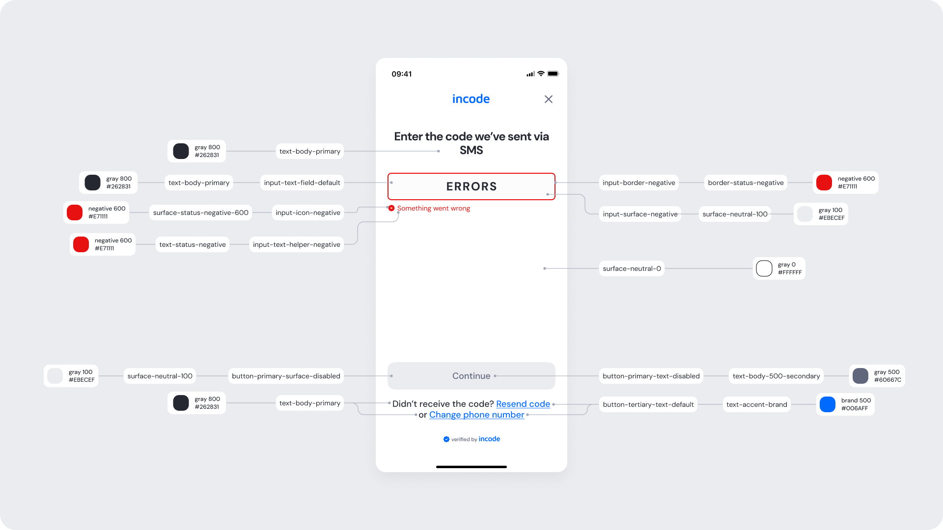
| Title text |
text-body-primary |
#262831 |
| Error border |
input-border-negative |
#E71111 |
| Error surface |
input-surface-negative |
#EBECEF |
| Error text |
input-text-helper-negative |
#E71111 |
| Error icon |
input-icon-negative |
#E71111 |
| Input text (default) |
input-text-field-default |
#262831 |
| Button background (disabled) |
button-primary-surface-disabled |
#EBECEF |
| Button text (disabled) |
button-primary-text-disabled |
#A3A8B8 |
| Links (Resend / Change Email) |
button-tertiary-text-default |
#006AFF |
| Background surface |
surface-neutral-0 |
#FFFFFF |
Design Notes
- Error messaging should remain concise — don’t overload users with explanations.
- Avoid replacing the red border with icons alone; border color communicates immediacy effectively.