This section outlines the elements you can customize within the NFC Scan module to match your brand while preserving Incode's core UX. It clarifies which areas are flexible, such as text and brand colors, and which elements remain fixed to ensure consistency, accessibility, and reliable chip reading across platforms.
NFC chip presence
The optional entry screen that asks the user whether the NFC chip symbol is visible on their passport cover. Two actions are presented: "No" routes the user out of the NFC flow, and "Yes" proceeds to the scan tutorial.
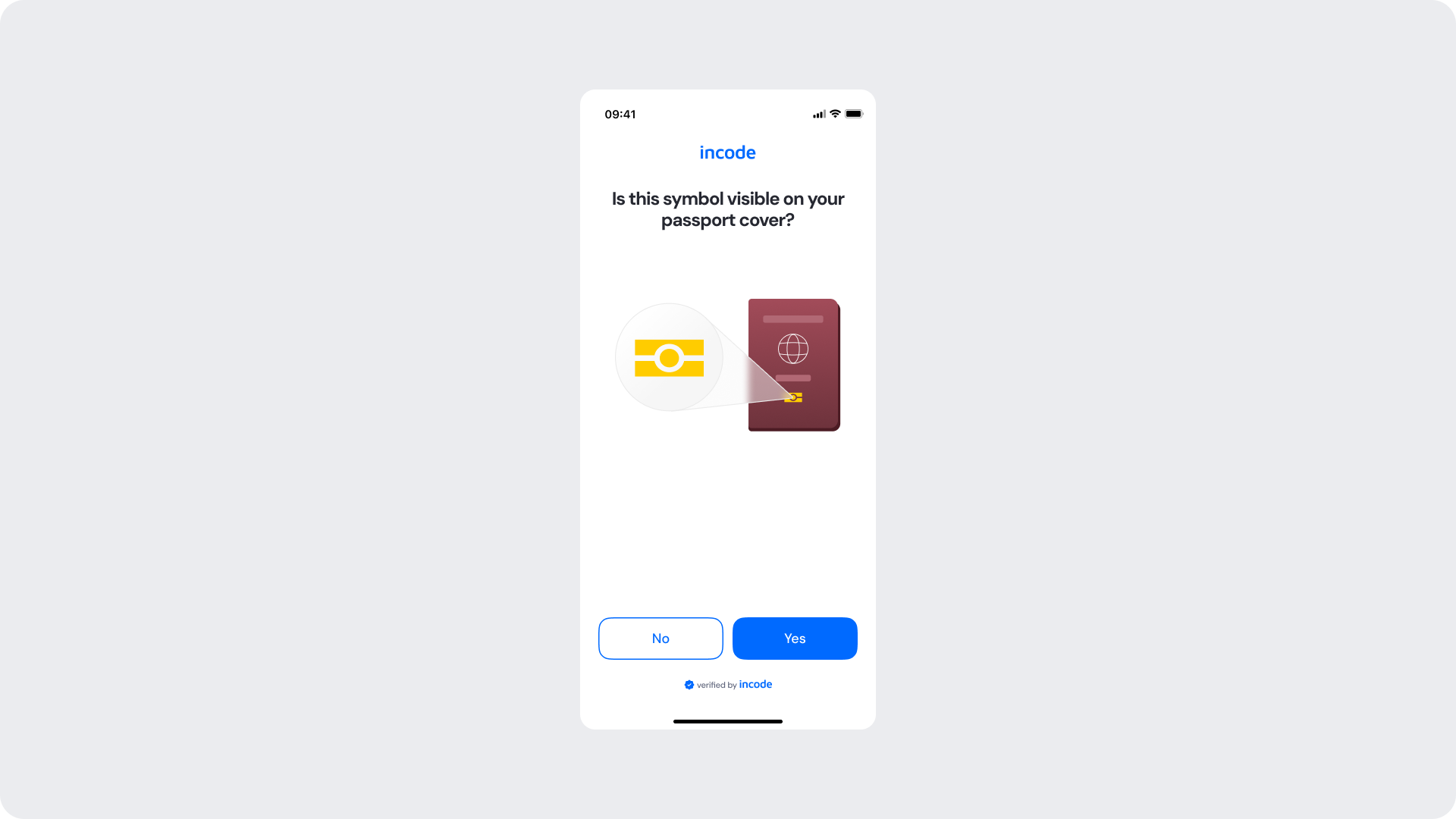
Customizable Elements
| Area |
What can be customized |
Notes |
| Text |
Title, question text |
Fully localizable; tone can be adapted to your brand voice. |
| Button — No |
Label, border color, radius |
Must remain visually distinct from the primary action. |
| Button — Yes |
Label, color, radius |
Uses primary brand color. |
| Background Color |
Screen background |
Must maintain strong contrast with text and elements. |
| Brand Colors |
Header text, button accent |
Uses brand tokens. |
| Footer |
"Verified by Incode" line |
Optional but recommended for trust and product consistency. |
Fixed Elements
| Element |
Why it is fixed |
| Yes / No binary choice |
Required to correctly gate the NFC flow; cannot be collapsed into a single action. |
| NFC symbol illustration |
Must remain recognizable to help users identify the chip on their document. |
| Component spacing & safe areas |
Required for device compatibility and visual stability. |
| WCAG contrast requirements |
Mandatory for accessibility and regulatory compliance. |
Token Reference
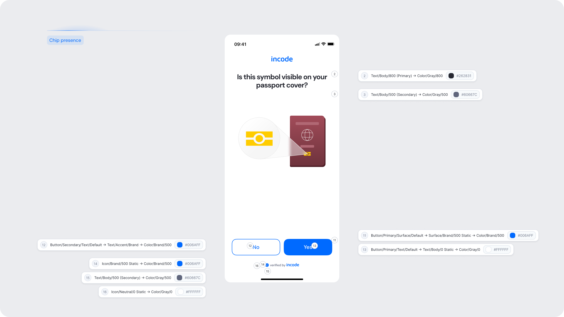
| UI Element |
Token |
Value |
| Background |
Surface/Neutral/0 → Color/Gray/0 |
#FFFFFF |
| Title text |
Text/Body/800 (Primary) → Color/Gray/800 |
#262831 |
| Subtitle text |
Text/Body/500 (Secondary) → Color/Gray/500 |
#60667C |
| Button — No text |
Button/Secondary/Text/Default → Text/Accent/Brand → Color/Brand/500 |
#006AFF |
| Button — Yes background |
Button/Primary/Surface/Default → Surface/Brand/500 Static → Color/Brand/500 |
#006AFF |
| Button — Yes text |
Button/Primary/Text/Default → Text/Body/0 Static → Color/Gray/0 |
#FFFFFF |
| Brand icon |
Icon/Brand/500 Static → Color/Brand/500 |
#006AFF |
| Footer icon |
Icon/Brand/500 Static → Color/Brand/500 |
#006AFF |
| Footer text |
Text/Body/500 (Secondary) → Color/Gray/500 |
#60667C |
| Footer background |
Icon/Neutral/0 Static → Color/Gray/0 |
#FFFFFF |
Design Notes
- The question must be phrased clearly so users without technical knowledge can identify the NFC symbol on their document.
- "Yes" should always be the primary (filled) button to guide the happy path.
- The NFC symbol illustration is a functional reference — do not replace it with a decorative asset.
Tutorial
The screen that prepares the user before the scan begins. The user is instructed to hold their phone close to the front cover of their passport and taps "Start scanning" to initiate the session.
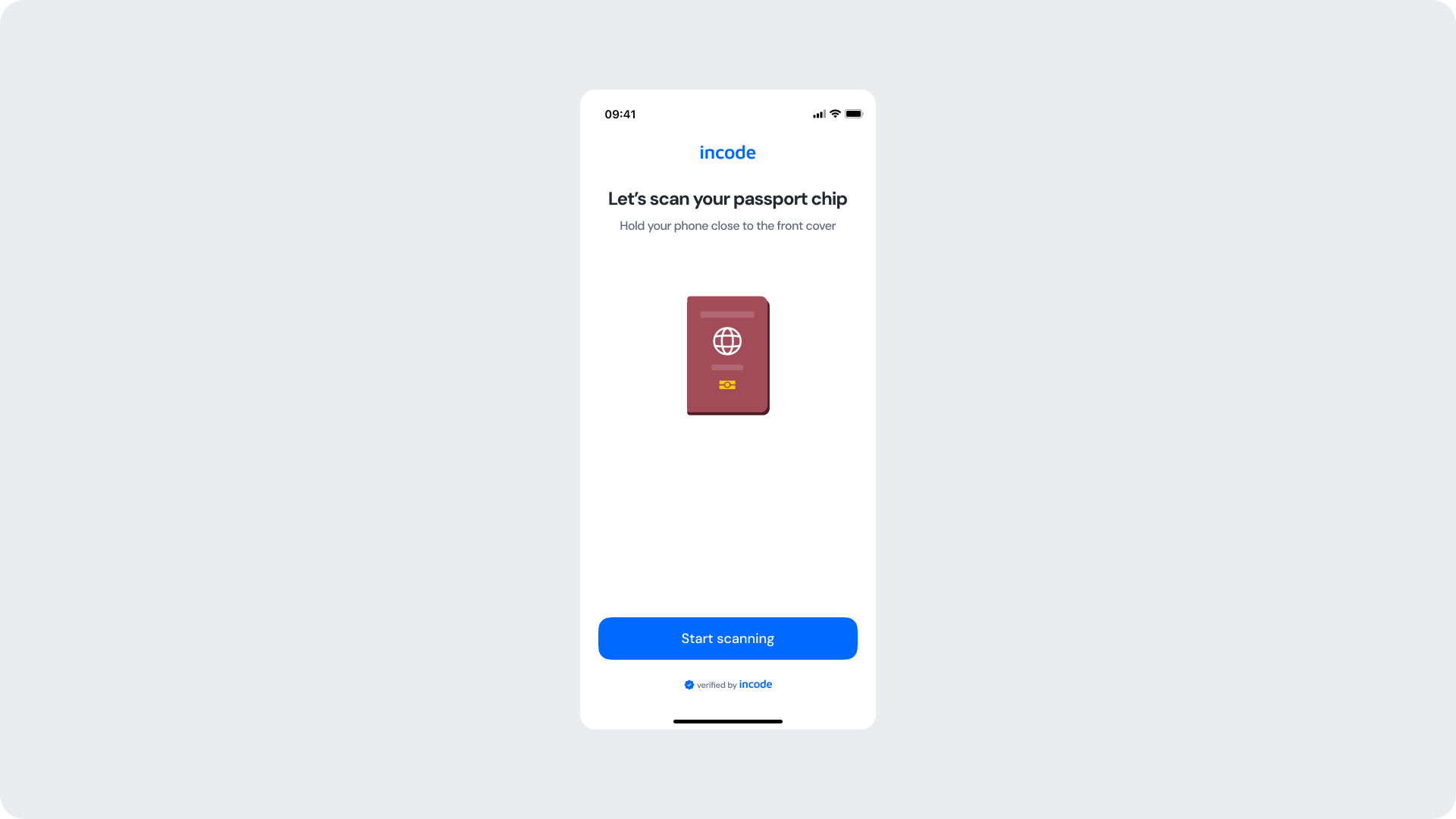
Customizable Elements
| Area |
What can be customized |
Notes |
| Text |
Title, subtitle |
Fully localizable; should remain instructional and concise. |
| Button — Start scanning |
Label, color, radius |
Uses primary brand color. |
| Background Color |
Screen background |
Must maintain contrast with content. |
| Brand Colors |
Header text, button accent |
Uses brand tokens. |
| Footer |
"Verified by Incode" line |
Optional but recommended. |
Fixed Elements
| Element |
Why it is fixed |
| Passport illustration |
Must show the correct document positioning to guide the user accurately. |
| Single primary CTA |
The scan can only be initiated by the user; no auto-advance is permitted. |
| Component spacing & safe areas |
Required for device compatibility and visual stability. |
| WCAG contrast requirements |
Mandatory for accessibility and regulatory compliance. |
Token Reference
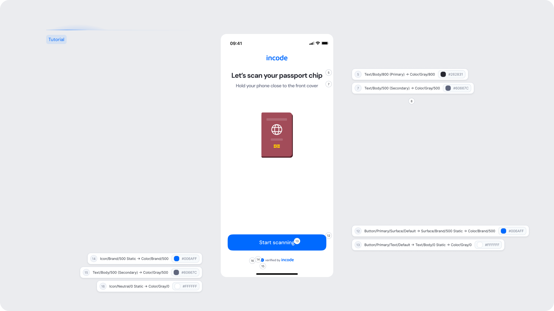
| UI Element |
Token |
Value |
| Background |
Surface/Neutral/0 → Color/Gray/0 |
#FFFFFF |
| Title text |
Text/Body/800 (Primary) → Color/Gray/800 |
#262831 |
| Subtitle text |
Text/Body/500 (Secondary) → Color/Gray/500 |
#60667C |
| Button — Start scanning background |
Button/Primary/Surface/Default → Surface/Brand/500 Static → Color/Brand/500 |
#006AFF |
| Button — Start scanning text |
Button/Primary/Text/Default → Text/Body/0 Static → Color/Gray/0 |
#FFFFFF |
| Brand icon |
Icon/Brand/500 Static → Color/Brand/500 |
#006AFF |
| Footer icon |
Icon/Brand/500 Static → Color/Brand/500 |
#006AFF |
| Footer text |
Text/Body/500 (Secondary) → Color/Gray/500 |
#60667C |
Design Notes
- Keep the instruction brief — the user needs to understand one action: hold the phone against the passport cover.
- Do not add extra steps or supplementary CTAs that could delay the user from starting the scan.
Scanning
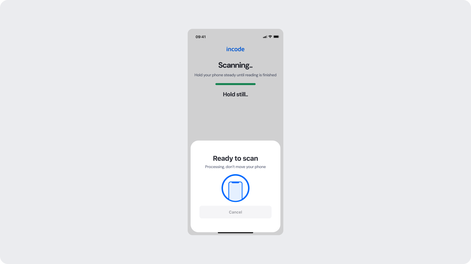
Shown while the module is actively listening for and reading the NFC chip. A progress bar and "Hold still.." message keep the user informed. A bottom sheet displays real-time processing status and a Cancel option.
Customizable Elements
| Area |
What can be customized |
Notes |
| Title text |
Scanning state title ("Scanning..") |
Fully localizable. |
| Subtitle text |
Supporting instruction |
Should reinforce the hold-still guidance. |
| Progress bar color |
Active fill color |
Uses success/brand token; must remain clearly visible. |
| Hold still label |
Bold status label |
Fully localizable. |
| Bottom sheet title |
"Ready to scan" |
Fully localizable. |
| Bottom sheet subtitle |
"Processing, don't move your phone" |
Fully localizable. |
| Background Color |
Screen and bottom sheet background |
Must maintain contrast. |
| Button — Cancel |
Label, color, radius |
Should be visually de-emphasized relative to the scan state. |
Fixed Elements
| Element |
Why it is fixed |
| Progress bar behavior |
Tied to actual chip read progress; cannot be faked or accelerated. |
| Bottom sheet pattern |
Standardized scan UX across the SDK. |
| Cancel availability |
Must always be present to allow safe exit. |
| Spacing & safe areas |
Required for device consistency. |
| WCAG contrast requirements |
Mandatory for accessibility and compliance. |
Token Reference
| UI Element |
Token |
Value |
| Background (top area) |
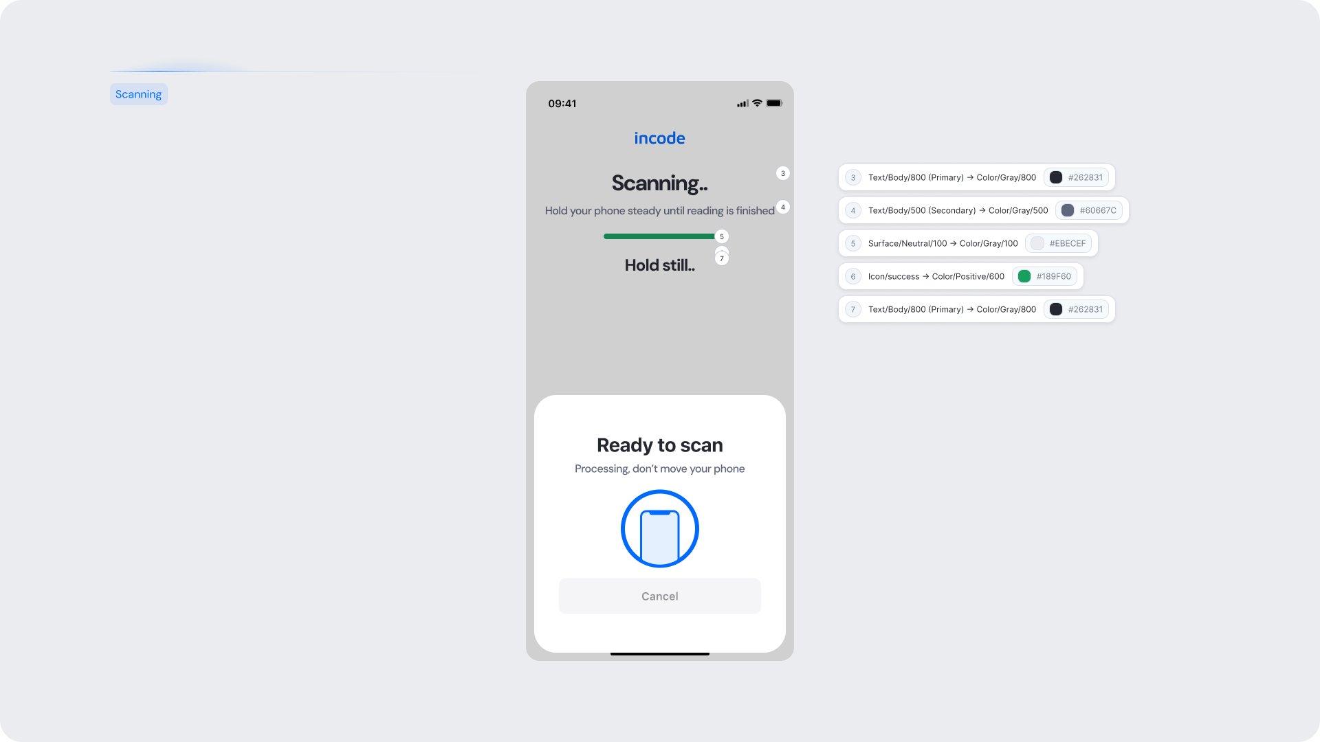
Surface/Neutral/100 → Color/Gray/100 |
#EBECEF |
| Title text |
Text/Body/800 (Primary) → Color/Gray/800 |
#262831 |
| Subtitle text |
Text/Body/500 (Secondary) → Color/Gray/500 |
#60667C |
| Progress bar track |
Surface/Neutral/100 → Color/Gray/100 |
#EBECEF |
| Progress bar fill |
Icon/success → Color/Positive/600 |
#189F60 |
| Hold still label |
Text/Body/800 (Primary) → Color/Gray/800 |
#262831 |
| Bottom sheet background |
Surface/Neutral/0 → Color/Gray/0 |
#FFFFFF |
| Bottom sheet title |
Text/Body/800 (Primary) → Color/Gray/800 |
#262831 |
| Bottom sheet subtitle |
Text/Body/500 (Secondary) → Color/Gray/500 |
#60667C |
Design Notes
- The progress bar is the primary trust signal during the scan — ensure its fill color meets contrast requirements against the background.
- "Hold still.." copy is critical; do not replace with passive messaging that fails to reinforce the physical requirement.
- The Cancel button should be accessible but visually secondary to avoid accidental taps.
Try again
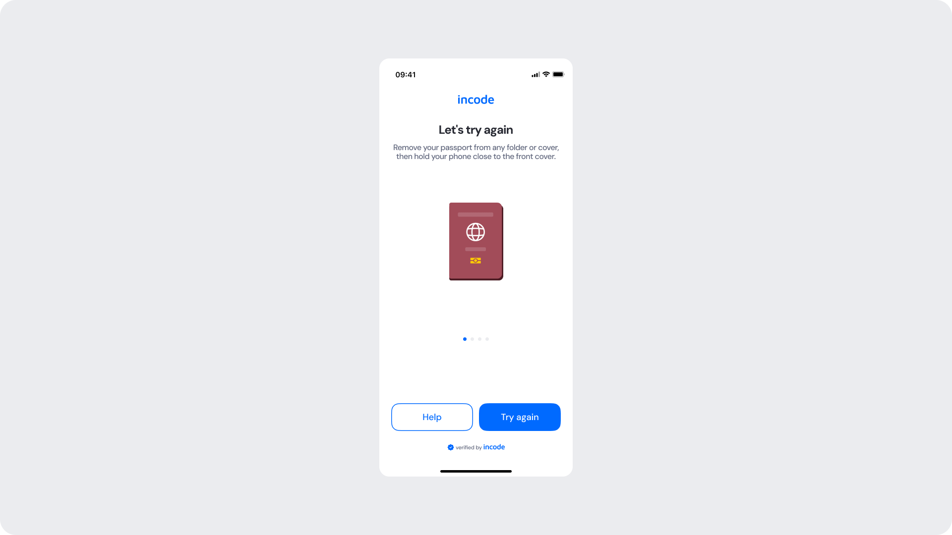
Shown when a scan attempt fails. The user is given troubleshooting tips via a swipeable carousel and offered two actions: Help (opens Common Issues) and Try again (returns to the scan).
Customizable Elements
| Area |
What can be customized |
Notes |
| Title text |
"Let's try again" |
Fully localizable; tone should remain encouraging. |
| Subtitle text |
Troubleshooting instruction |
Fully localizable. |
| Carousel indicators |
Active and inactive dot colors |
Active uses brand token. |
| Button — Help |
Label, border color, radius |
Should be visually secondary. |
| Button — Try again |
Label, color, radius |
Uses primary brand color. |
| Background Color |
Screen background |
Must maintain contrast. |
| Brand Colors |
Header text, carousel dot, button accent |
Uses brand tokens. |
| Footer |
"Verified by Incode" line |
Optional but recommended. |
Fixed Elements
| Element |
Why it is fixed |
| Retry logic |
Must route the user back to the active scan session. |
| Help path |
Must lead to the Common Issues screen; cannot be removed. |
| Passport illustration |
Must show the same document reference as the tutorial for consistency. |
| Carousel content |
Troubleshooting tips are product-defined; layout must not suppress them. |
| WCAG contrast requirements |
Mandatory for accessibility and compliance. |
Token Reference
| UI Element |
Token |
Value |
| Background |
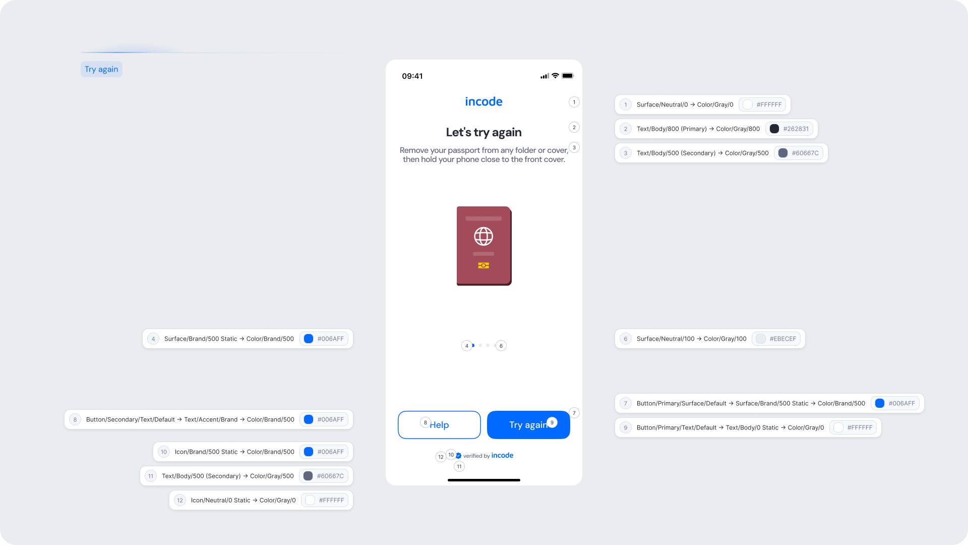
Surface/Neutral/0 → Color/Gray/0 |
#FFFFFF |
| Title text |
Text/Body/800 (Primary) → Color/Gray/800 |
#262831 |
| Subtitle text |
Text/Body/500 (Secondary) → Color/Gray/500 |
#60667C |
| Carousel dot (active) |
Surface/Brand/500 Static → Color/Brand/500 |
#006AFF |
| Carousel dot (inactive) |
Surface/Neutral/100 → Color/Gray/100 |
#EBECEF |
| Button — Help text |
Button/Secondary/Text/Default → Text/Accent/Brand → Color/Brand/500 |
#006AFF |
| Button — Try again background |
Button/Primary/Surface/Default → Surface/Brand/500 Static → Color/Brand/500 |
#006AFF |
| Button — Try again text |
Button/Primary/Text/Default → Text/Body/0 Static → Color/Gray/0 |
#FFFFFF |
| Brand icon |
Icon/Brand/500 Static → Color/Brand/500 |
#006AFF |
| Footer icon |
Icon/Brand/500 Static → Color/Brand/500 |
#006AFF |
| Footer text |
Text/Body/500 (Secondary) → Color/Gray/500 |
#60667C |
Design Notes
- "Let's try again" framing keeps the tone supportive. Avoid error-heavy language that may cause the user to abandon the flow.
- The carousel is a key UX element — ensure dot indicators are sized and spaced for easy touch interaction.
Common Issues
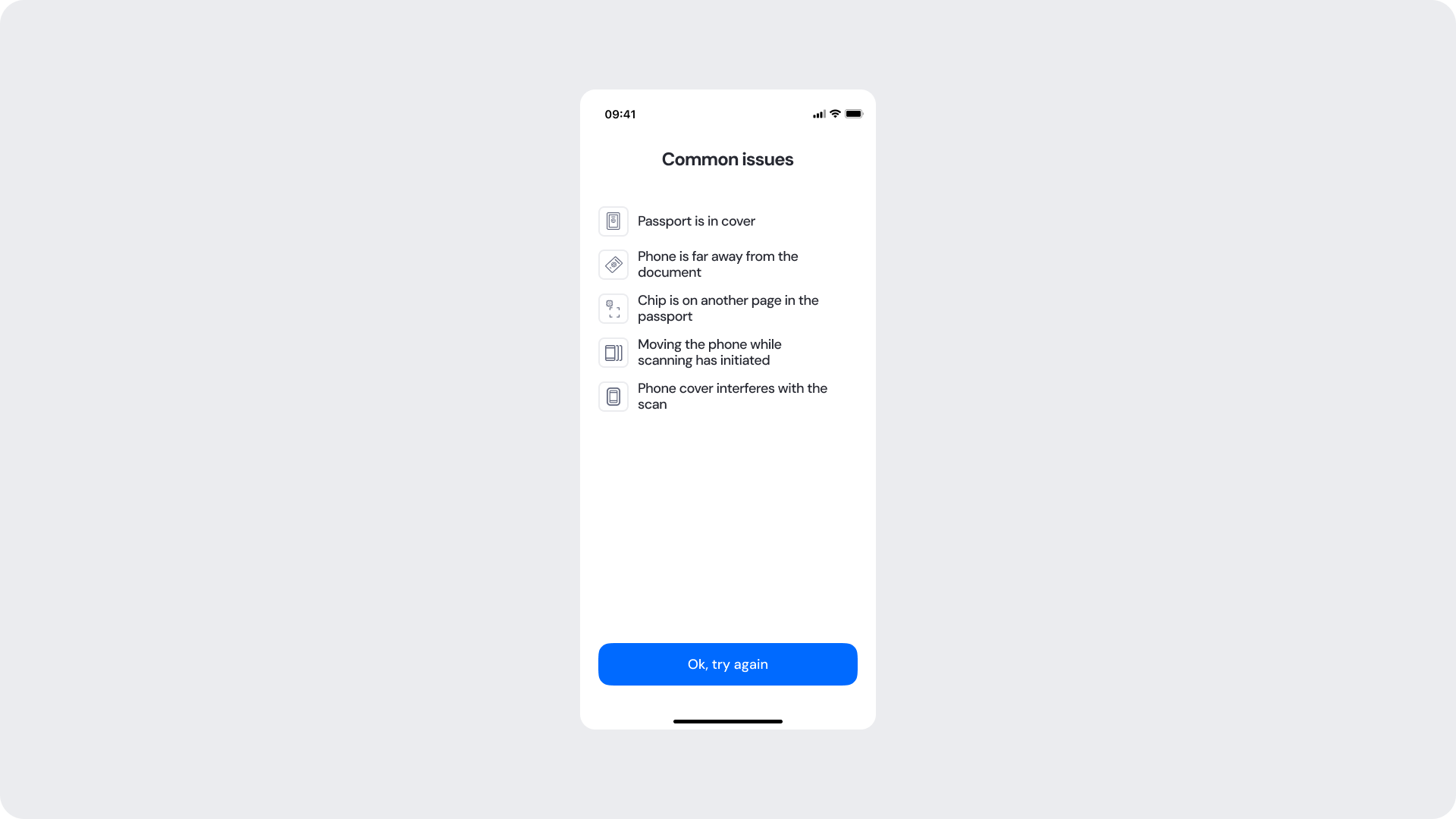
Shown when the user taps "Help" from the Try Again screen. A list of the most frequent reasons a scan fails is displayed, with a single "Ok, try again" CTA to return the user to the scan flow.
Customizable Elements
| Area |
What can be customized |
Notes |
| Title text |
"Common issues" |
Fully localizable. |
| Issue list text |
Individual issue labels |
Fully localizable; keep each item short and scannable. |
| Issue icons |
Per-row icons |
Can be replaced; must remain clearly associated with the issue. |
| Button — Ok, try again |
Label, color, radius |
Uses primary brand color. |
| Background Color |
Screen background |
Must maintain contrast. |
Fixed Elements
| Element |
Why it is fixed |
| Issue list content |
Product-defined based on the most common real-world failure causes. |
| Single CTA |
Must route back to the scan; no secondary exit should be provided here. |
| List structure |
Icon + label pattern required for scannability and accessibility. |
| WCAG contrast requirements |
Mandatory for accessibility and compliance. |
Token Reference
| UI Element |
Token |
Value |
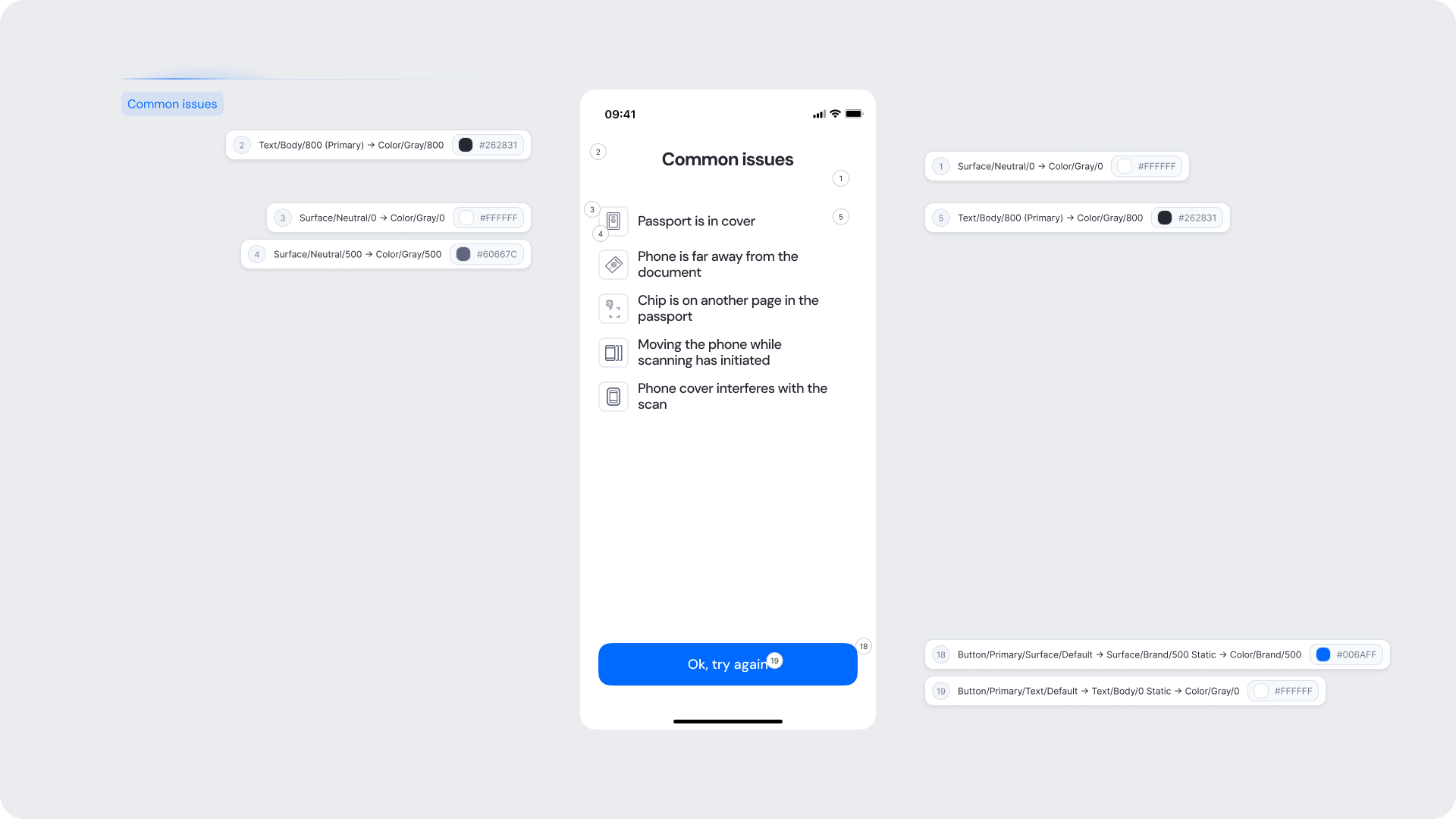
| Background |
Surface/Neutral/0 → Color/Gray/0 |
#FFFFFF |
| Title text |
Text/Body/800 (Primary) → Color/Gray/800 |
#262831 |
| Issue row background |
Surface/Neutral/0 → Color/Gray/0 |
#FFFFFF |
| Issue row separator |
Surface/Neutral/500 → Color/Gray/500 |
#60667C |
| Issue icon |
Surface/Neutral/500 → Color/Gray/500 |
#60667C |
| Issue label text |
Text/Body/800 (Primary) → Color/Gray/800 |
#262831 |
| Button — Ok, try again background |
Button/Primary/Surface/Default → Surface/Brand/500 Static → Color/Brand/500 |
#006AFF |
| Button — Ok, try again text |
Button/Primary/Text/Default → Text/Body/0 Static → Color/Gray/0 |
#FFFFFF |
Design Notes
- Issue labels should be plain language, not technical error codes.
- Each row should be immediately scannable — users should be able to identify their problem within 2–3 seconds.
- Avoid adding a back button or secondary CTA that could increase drop-off.
Verifying Identity
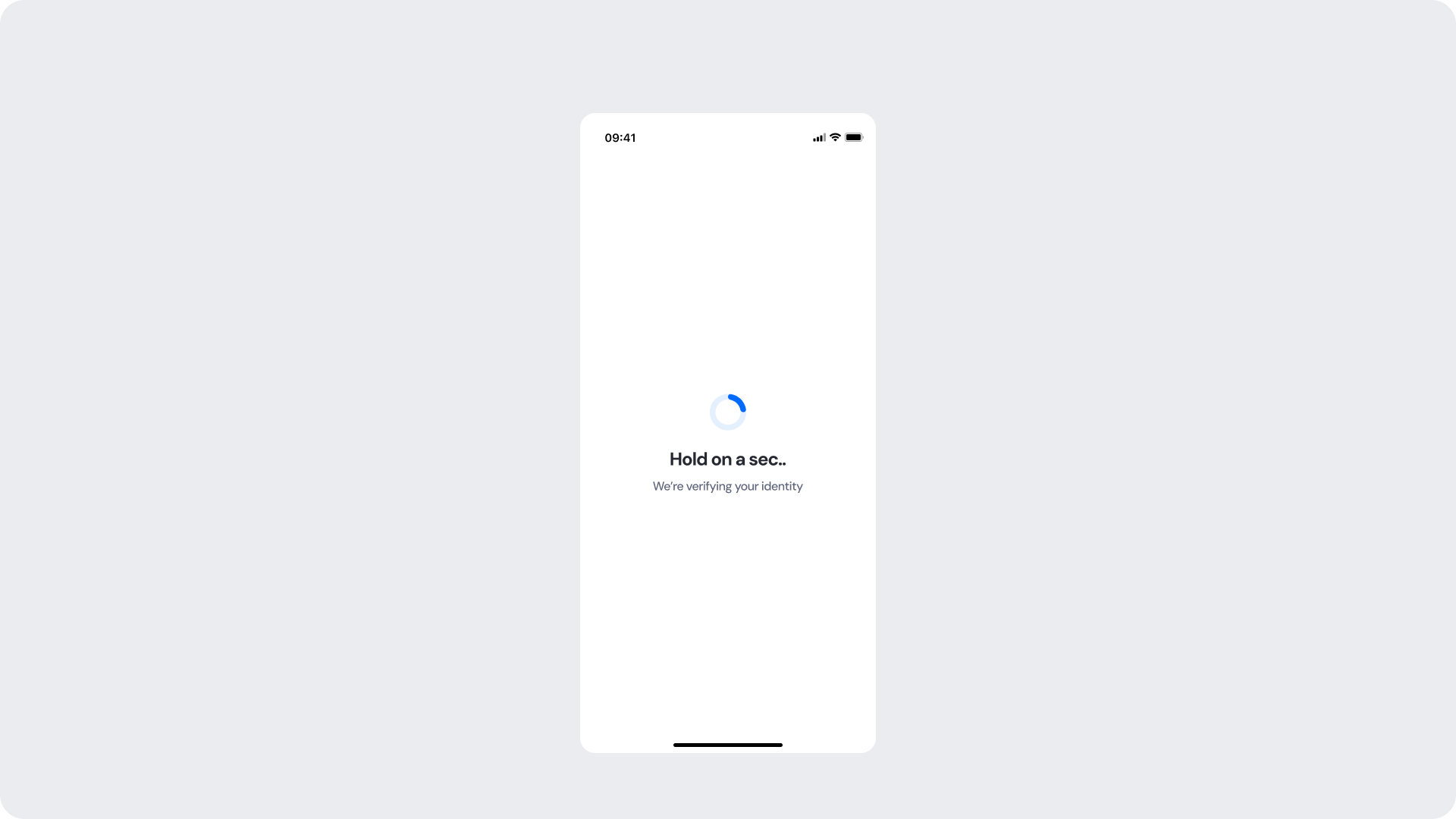
Shown after a successful chip read while the system processes and verifies the extracted data. A loading spinner and status message keep the user informed.
Customizable Elements
| Area |
What can be customized |
Notes |
| Title text |
"Hold on a sec.." |
Fully localizable; should remain short and reassuring. |
| Subtitle text |
"We're verifying your identity" |
Fully localizable. |
| Spinner accent color |
Primary spinner stroke |
Uses brand token; must remain visually clear. |
| Spinner background color |
Secondary spinner stroke |
Should maintain contrast with accent. |
| Background Color |
Screen background |
Must preserve readability and contrast. |
Fixed Elements
| Element |
Why it is fixed |
| Processing flow timing |
Linked to backend verification; cannot be shortened or skipped. |
| Spinner animation style |
Standardized across SDK for performance and recognizability. |
| Spacing & safe areas |
Required for device consistency. |
| Minimum contrast |
Required for accessibility and compliance. |
Token Reference
| UI Element |
Token |
Value |
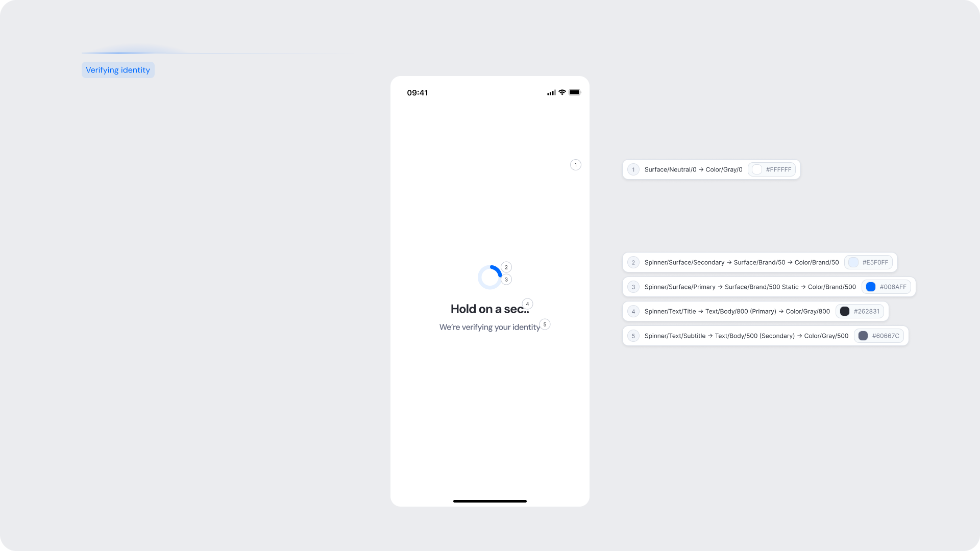
| Background |
Surface/Neutral/0 → Color/Gray/0 |
#FFFFFF |
| Spinner background |
Spinner/Surface/Secondary → Surface/Brand/50 → Color/Brand/50 |
#E5F0FF |
| Spinner accent |
Spinner/Surface/Primary → Surface/Brand/500 Static → Color/Brand/500 |
#006AFF |
| Title text |
Spinner/Text/Title → Text/Body/800 (Primary) → Color/Gray/800 |
#262831 |
| Subtitle text |
Spinner/Text/Subtitle → Text/Body/500 (Secondary) → Color/Gray/500 |
#60667C |
Design Notes
- Keep copy short to minimize cognitive load during the wait.
- Use the subtitle to set clear expectations about what is happening in the background.
- Avoid adding buttons or interactive elements during this state.
Identity Verified
Shown when the identity has been successfully verified following the NFC scan. The user receives a clear visual confirmation with a green checkmark before the flow advances to the next step.
Customizable Elements
| Area |
What can be customized |
Notes |
| Confirmation text |
"Identity successfully verified" |
Fully localizable; tone should be positive and conclusive. |
| Success icon color |
Green checkmark background |
Uses positive/success token. |
| Background Color |
Screen background |
Must maintain contrast with content. |
Fixed Elements
| Element |
Why it is fixed |
| Auto-advance behavior |
Screen advances automatically; no CTA is required or permitted. |
| Success icon shape |
Standardized across the SDK for visual consistency. |
| Status color mapping |
Green = positive; required for consistent semantics. |
| WCAG contrast requirements |
Mandatory for accessibility and compliance. |
Token Reference
| UI Element |
Token |
Value |
| Background |
Surface/Neutral/0 → Color/Gray/0 |
#FFFFFF |
| Success icon background |
Icon/Status/Positive → Color/Positive/500 |
#189F60 |
| Success icon checkmark |
Icon/Neutral/0 Static → Color/Gray/0 |
#FFFFFF |
| Confirmation text |
Text/Body/800 (Primary) → Color/Gray/800 |
#262831 |
Design Notes
- This screen is intentionally minimal — the confirmation message and icon are the only elements needed.
- Do not add additional copy, CTAs, or decorative elements that could distract from the success state.
- The green icon must remain high-contrast against the white background.