This section outlines the elements you can customize within the ID Capture module to match your brand while preserving Incode’s core UX. It clarifies which areas are flexible, such as text, illustrations, and brand colors and which elements remain fixed to ensure consistency, accessibility, and optimal capture performance across platforms.
Tutorial Screen
The Tutorial Screen prepares the user for the ID Capture step. It introduces the action, provides the necessary context, and sets expectations before the camera is activated.
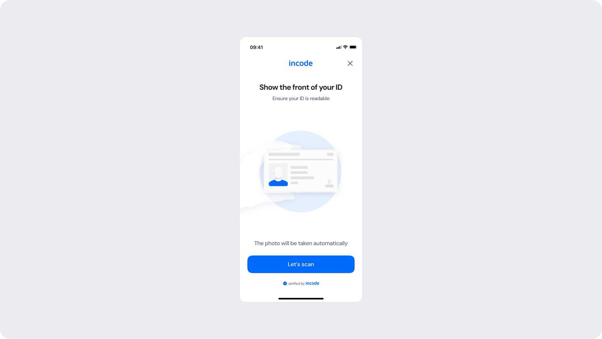
Customizable Elements
| Area |
What can be customized |
Notes |
| Text |
Title, subtitle, body text |
Fully localizable; tone can be adapted |
| Illustration |
Colors or full replacement |
Must remain clear and represent a face |
| Brand Colors |
Header, highlight elements, button |
Uses brand tokens |
| Buttons |
Label, color, radius |
Must follow platform guidelines |
| Footer |
“Verified by Incode” line |
Optional but recommended |
Fixed Elements
| Element |
Why it is fixed |
| Layout structure |
Ensures consistency across modules |
| Spacing & safe areas |
Required for device compatibility |
| Text hierarchy |
Optimized for readability |
| WCAG minimum contrast |
Mandatory |
Token Reference
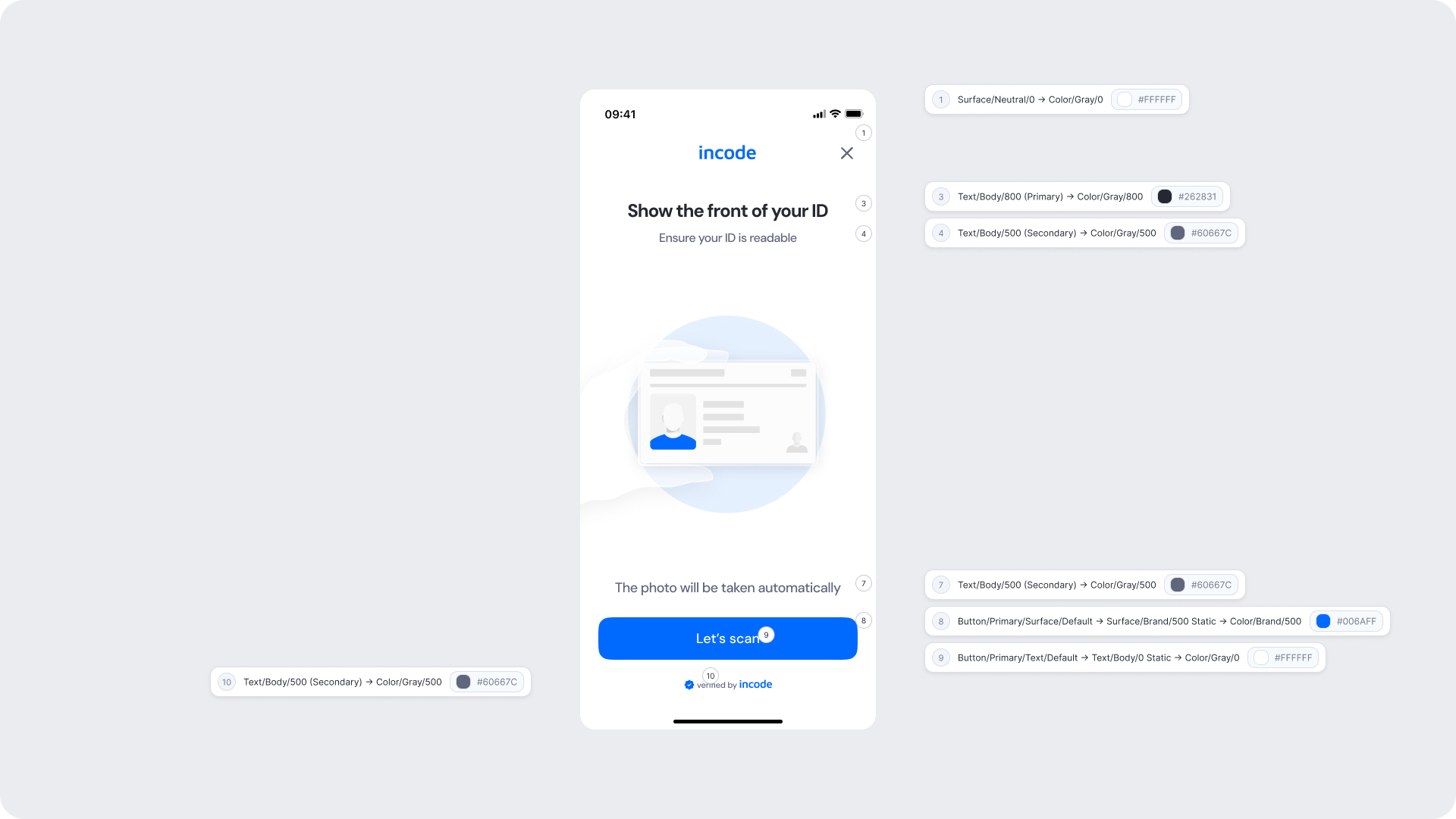
| UI Element |
Token |
Value |
| Background |
Surface/Neutral/0 |
#FFFFFF |
| Title text |
Text/Body/800 (Primary) |
#262831 |
| Subtitle text |
Text/Body/500 (Secondary) |
#60667C |
| Helper text |
Text/Body/500 (Secondary) |
#60667C |
| Button background |
Button/Primary/Surface/Default |
#006AFF |
| Button text |
Button/Primary/Text/Default |
#FFFFFF |
| Footer text |
Text/Body/500 (Secondary) |
#60667C |
Design Notes
- Keep copy short to minimize cognitive load.
- The illustration uses brand 50 and brand 500 to reinforce brand identity without overwhelming the UI.
- Ensure tap targets meet accessibility guidelines.
- Maintain clear focus states for keyboard and screen reader users (Web).
Fake Permission Screen
The Fake Permission Screen is shown before the operating system displays its native camera permission modal. It prepares the user, explains why camera access is required, and significantly reduces the likelihood of users denying permission. This step increases trust and prevents interruptions during the ID Capture flow.
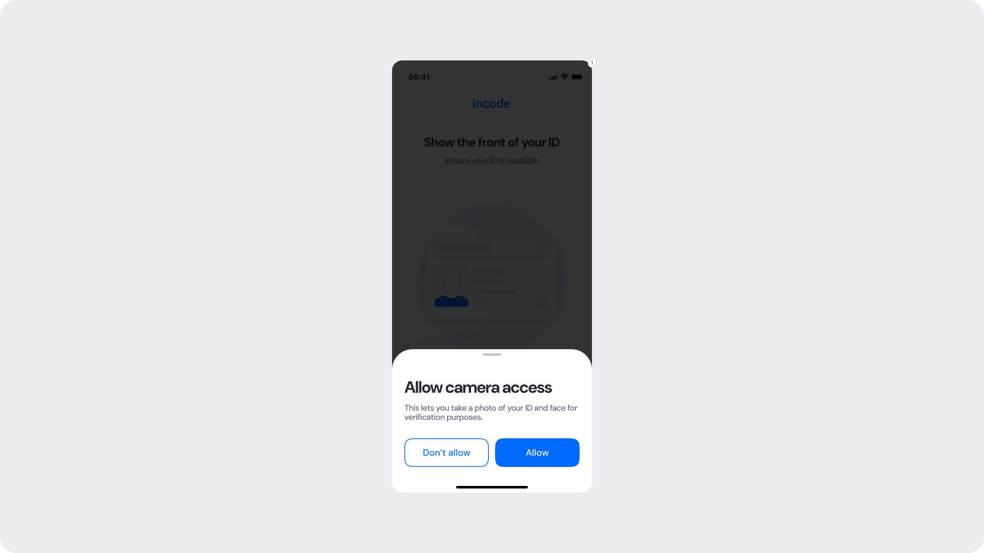
Customizable Elements
| Area |
What can be customized |
Notes |
| Text |
Title, subtitle, permission explanation |
Fully localizable; tone should remain reassuring |
| Buttons |
Label (“Allow”, “Don’t allow”), color, radius |
Must maintain primary/secondary hierarchy |
| Brand Colors |
Button accents, icon color, text accents |
Uses brand tokens |
| Modal Surface |
Background color, elevation, corner radius |
Must remain high-contrast and readable |
| Link/Help Text |
“Learn more” or similar supportive text |
Optional; can adapt tone based on compliance needs |
Fixed Elements
| Element |
Why it is fixed |
| Background dim opacity |
Indicates OS-level permission flow; needed for clarity |
| Modal position |
Standardized centered layout for all modules |
| Button hierarchy |
Mirrors OS expectations; prevents accidental “Don’t allow” taps |
| Safety text hierarchy |
Ensures user comprehension before OS prompt |
| Spacing & safe areas |
Required for device consistency |
| WCAG minimum contrast |
Mandatory |
Token Reference
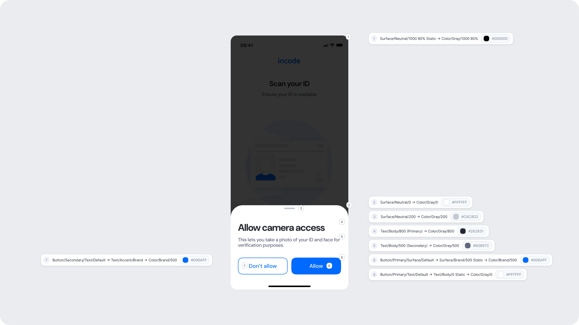
| UI Element |
Token |
Value |
| Background (overlay) |
Surface/Neutral/1000 80% Static |
#000000 |
| Modal background |
Surface/Neutral/0 |
#FFFFFF |
| Divider / handle |
Surface/Neutral/200 |
#D6CBD2 |
| Title text |
Text/Body/800 (Primary) |
#262831 |
| Subtitle text |
Text/Body/500 (Secondary) |
#60667C |
| Primary button |
Button/Primary/Surface/Default |
#006AFF |
| Primary button text |
Button/Primary/Text/Default |
#FFFFFF |
| Secondary button text |
Button/Secondary/Text/Default |
#006AFF |
Design Notes
- The pre-permission modal reduces drop-off by providing context before the OS permission.
- Maintain a clear hierarchy between primary (Allow) and secondary (Don’t allow) actions.
- Keep the dim overlay consistent to align with OS modal expectations.
- Ensure high contrast between modal, text, and background elements.
- Avoid adding extra steps or interaction on this screen.
Capture Screens
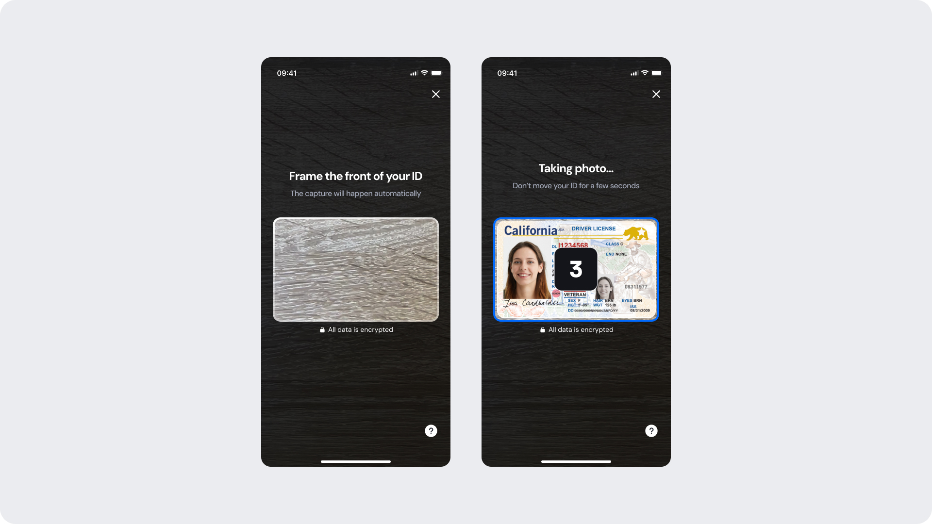
During capture, the user aligns their ID within the frame, and the system evaluates real-time conditions such as glare, blur, lighting, and edge visibility. When all conditions are met, the photo is taken automatically.
Colors and text on screen can be customized to match your brand, while the capture frame and auto-capture behavior remain fixed to preserve system accuracy.
Customizable Elements
| Area |
What can be customized |
Notes |
| Text |
Instruction and helper text (e.g., “Fill the frame with your ID”, “Taking photo…”) |
Fully localizable |
| Brand Colors |
Countdown, borders, and progress indicators |
Controlled via design tokens |
| Background |
Dark or neutral surfaces |
Must maintain sufficient contrast |
| Iconography |
Help and info icons |
Color can be customized only |
| Footer |
“All photos are encrypted” or “Verified by Incode” line |
Optional |
Fixed Elements
| Element |
Why it is fixed |
| ID frame shape & safe area |
Ensures correct edge and glare detection |
| Auto-capture behavior |
Guarantees consistency across devices |
| Detection logic |
Required for accurate system-level validation |
| Layout & hierarchy |
Preserves visual and functional consistency |
| Minimum contrast |
Required for accessibility compliance |
| Countdown behavior |
Animation and timing remain fixed |
Token Reference
| UI Element |
Token |
Value |
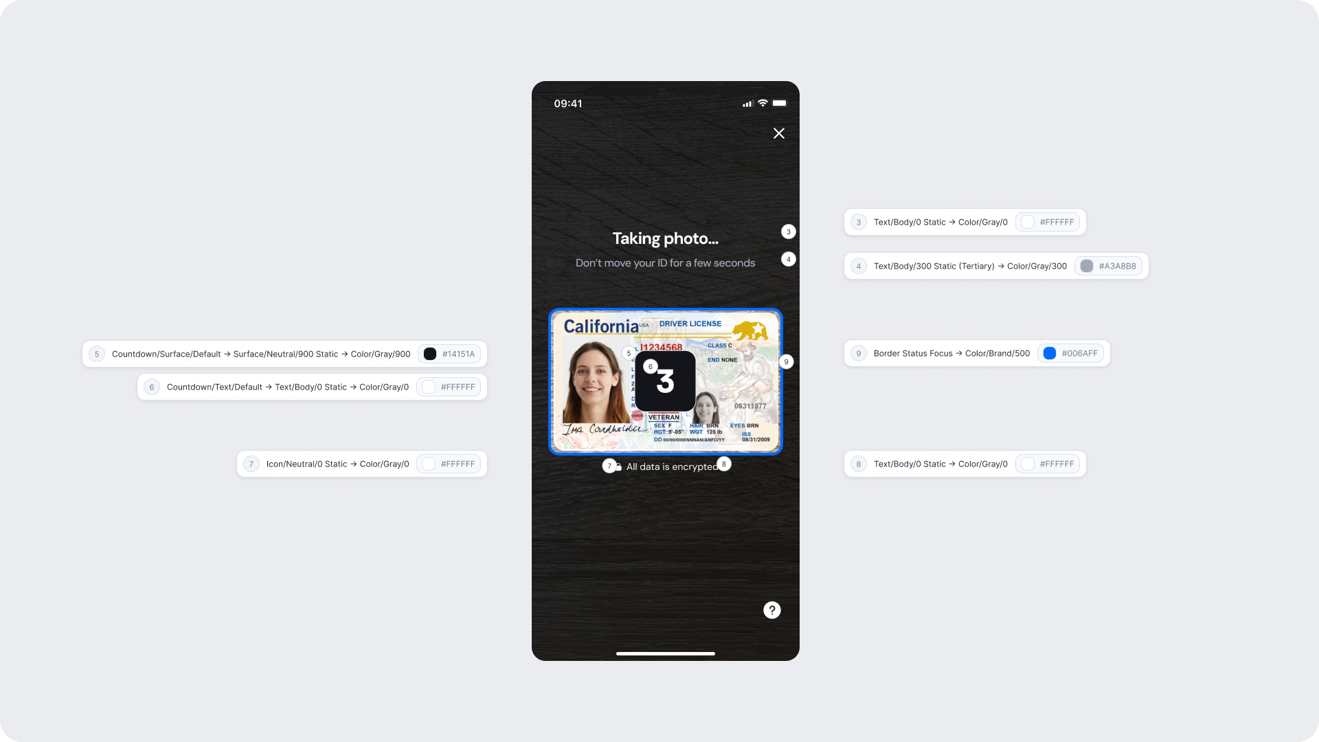
| Background |
Surface/Neutral/900 Static |
#14151A |
| Primary text |
Text/Body/0 Static |
#FFFFFF |
| Secondary text |
Text/Body/300 Static (Tertiary) |
#A3A8B8 |
| Icon |
Icon/Neutral/0 Static |
#FFFFFF |
| Countdown background |
Countdown/Surface/Default |
#14151A |
| Countdown text |
Countdown/Text/Default |
#FFFFFF |
| Focus border |
Border/Status/Focus |
#006AFF |
| Helper text |
Text/Body/0 Static |
#FFFFFF |
Design Notes
- The ID frame shape is fixed and cannot be altered, as it ensures correct alignment and document edge detection.
- The progress and countdown indicators must retain their default behavior and timing to maintain capture consistency.
- Apply brand colors subtly—use them for accents like borders or buttons, but avoid overpowering the document preview area.
- Keep instruction text short and direct, guiding users with clear, actionable phrases (e.g., “Fill the frame with your ID”).
- Maintain high contrast and accessible tap areas for key controls such as the help icon or retry button
Manual Capture
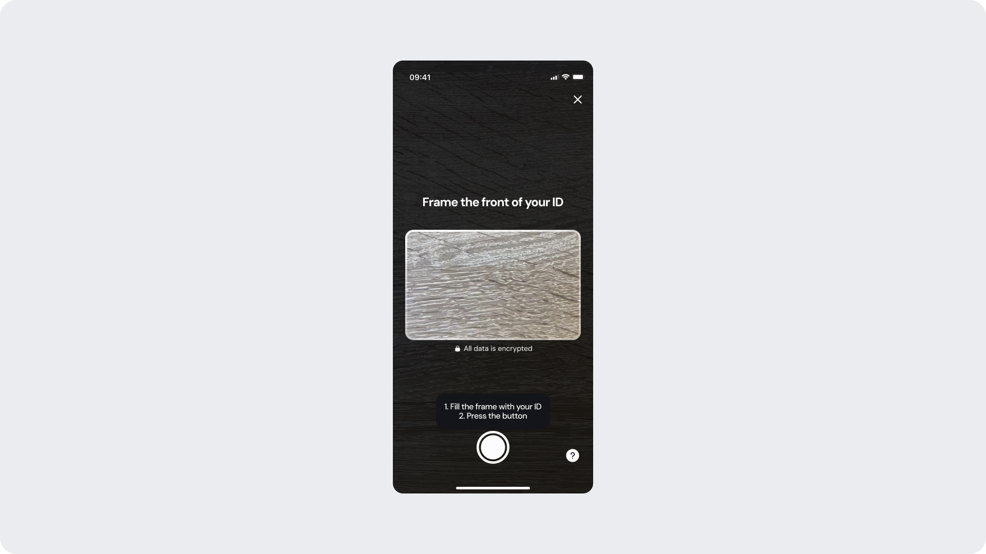
Manual capture is triggered after a period of inactivity (default: 30 seconds) when automatic detection conditions are not met. In this mode, the user aligns their ID within the capture frame and presses the button manually.
This ensures users can complete verification even in low light, complex backgrounds, or edge-case scenarios where auto-capture cannot trigger.
Customizable Elements
| Area |
What can be customized |
Notes |
| Text |
Instructional text (e.g., “Fill the frame with your ID”, “Press the button to capture”) |
Fully localizable |
| Button |
Color, label, radius, and icon color |
Must comply with accessibility and tap-target standards |
| Brand Colors |
Border, header, and accent elements |
Driven by brand tokens |
| Background |
Dark or neutral surfaces |
Must maintain sufficient contrast for ID visibility |
| Icons |
Help/info icons |
Only icon color may be customized |
| Footer |
“All photos are encrypted” or “Verified by Incode” |
Optional |
Fixed Elements
| Element |
Why it is fixed |
| ID frame shape and position |
Ensures accurate alignment and detection |
| Manual button placement |
Ensures reachability and consistency across devices |
| Detection logic fallback |
Manual mode always follows auto-mode failure |
| Layout spacing & safe zones |
Maintains visual and interaction consistency |
| Accessibility contrast |
Must meet WCAG AA requirements |
| Button size & touch area |
Required for usability and accessibility compliance |
Token Reference
| UI Element |
Token |
Value |
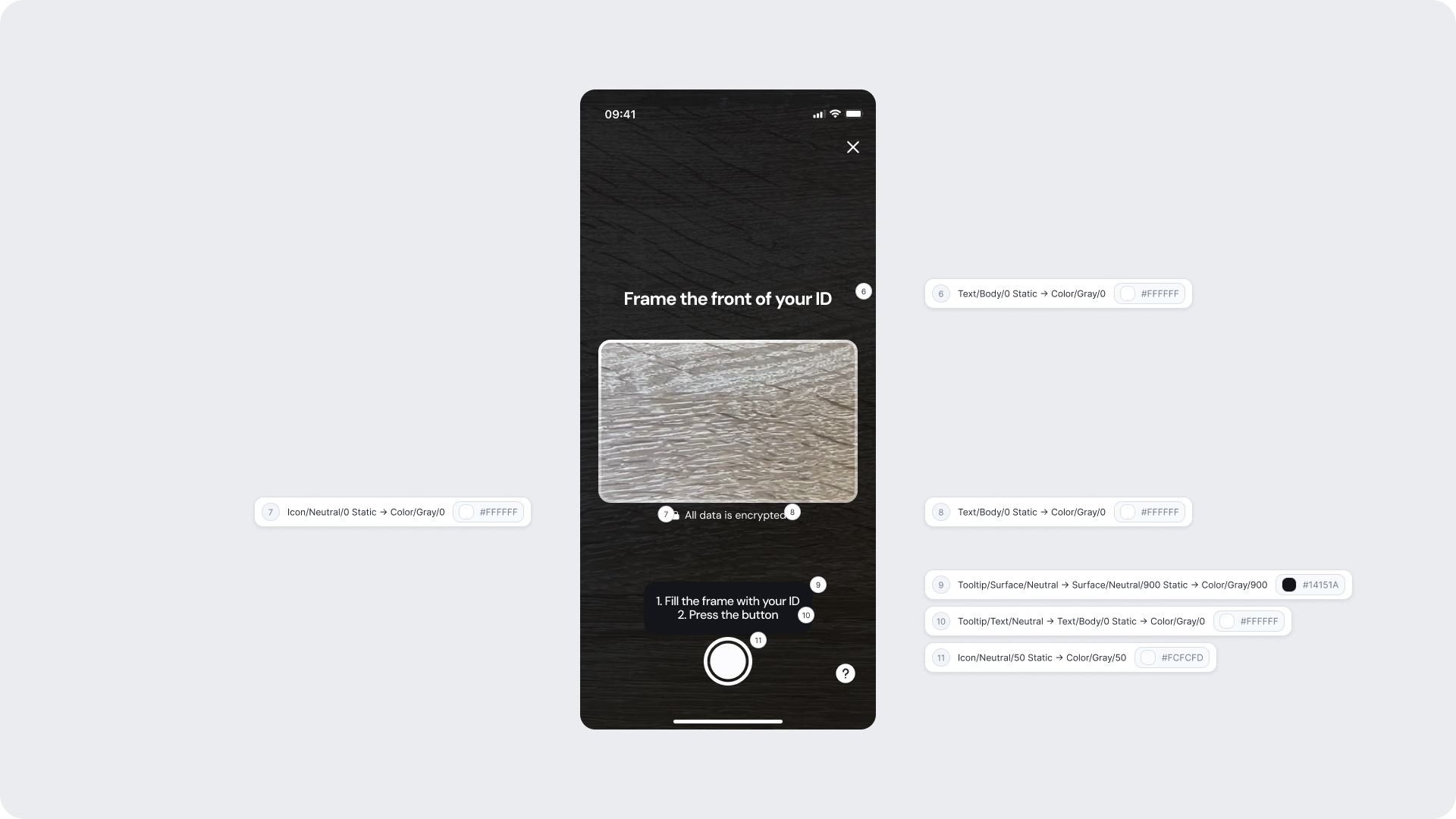
| Background |
Surface/Neutral/900 Static |
#14151A |
| Primary text |
Text/Body/0 Static |
#FFFFFF |
| Instruction text |
Text/Body/0 Static |
#FFFFFF |
| Icon |
Icon/Neutral/0 Static |
#FFFFFF |
| Tooltip background |
Tooltip/Surface/Neutral |
#14151A |
| Tooltip text |
Tooltip/Text/Neutral |
#FFFFFF |
| Secondary icon |
Icon/Neutral/50 Static |
#CFCFD0 |
| Helper text |
Text/Body/0 Static |
#FFFFFF |
Design Notes
- The ID frame must remain fixed in shape to preserve detection accuracy.
- Manual capture should always appear as a fallback after auto-capture timeout, never as a default.
- Apply brand color accents sparingly (e.g., borders or buttons) to keep focus on the document.
- Keep instructional copy short and directive (e.g., “Fill the frame and tap capture”).
- Maintain clear tap areas and legible text for accessibility on all device size
ID Capture Complete (Analzying & Success)
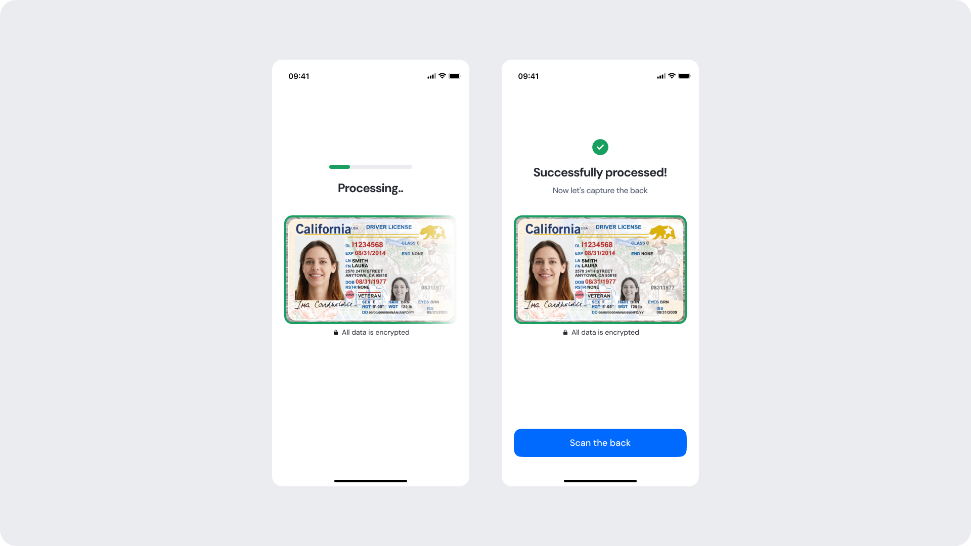
Once the ID photo is captured — either automatically or manually — the user transitions to the Analyzing and Success screens. These stages reassure users that their ID is being securely processed and confirm when the image has passed all validation checks. Both the progress indicators and confirmation visuals can be adapted to match your brand identity..
Customizable Elements
| Area |
What can be customized |
Notes |
| Text |
“Analyzing…”, “Successfully processed!”, “Now let’s capture the back” |
Fully localizable |
| Brand Colors |
Progress bar, success icon, and action button |
Must follow brand tokens |
| Surfaces |
Background and card surfaces |
Must ensure clarity and contrast against ID image |
| Button |
Color, label, and radius (e.g., Scan the back) |
Must meet accessibility standards |
| Footer |
“All photos are encrypted” or “Verified by Incode” |
Optional |
| Animation |
Progress fill color transitions |
Only color may change; timing and animation curve are fixed |
Fixed Elements
| Element |
Why it is fixed |
| Progress bar behavior |
Maintains consistent feedback rhythm across capture steps |
| Success timing |
Ensures users clearly see confirmation before advancing |
| Layout structure |
Standardized for readability and predictable UX |
| Minimum contrast |
Required for WCAG AA compliance |
| Animation pattern |
Fixed to preserve continuity and visual stability across modules |
Token Reference
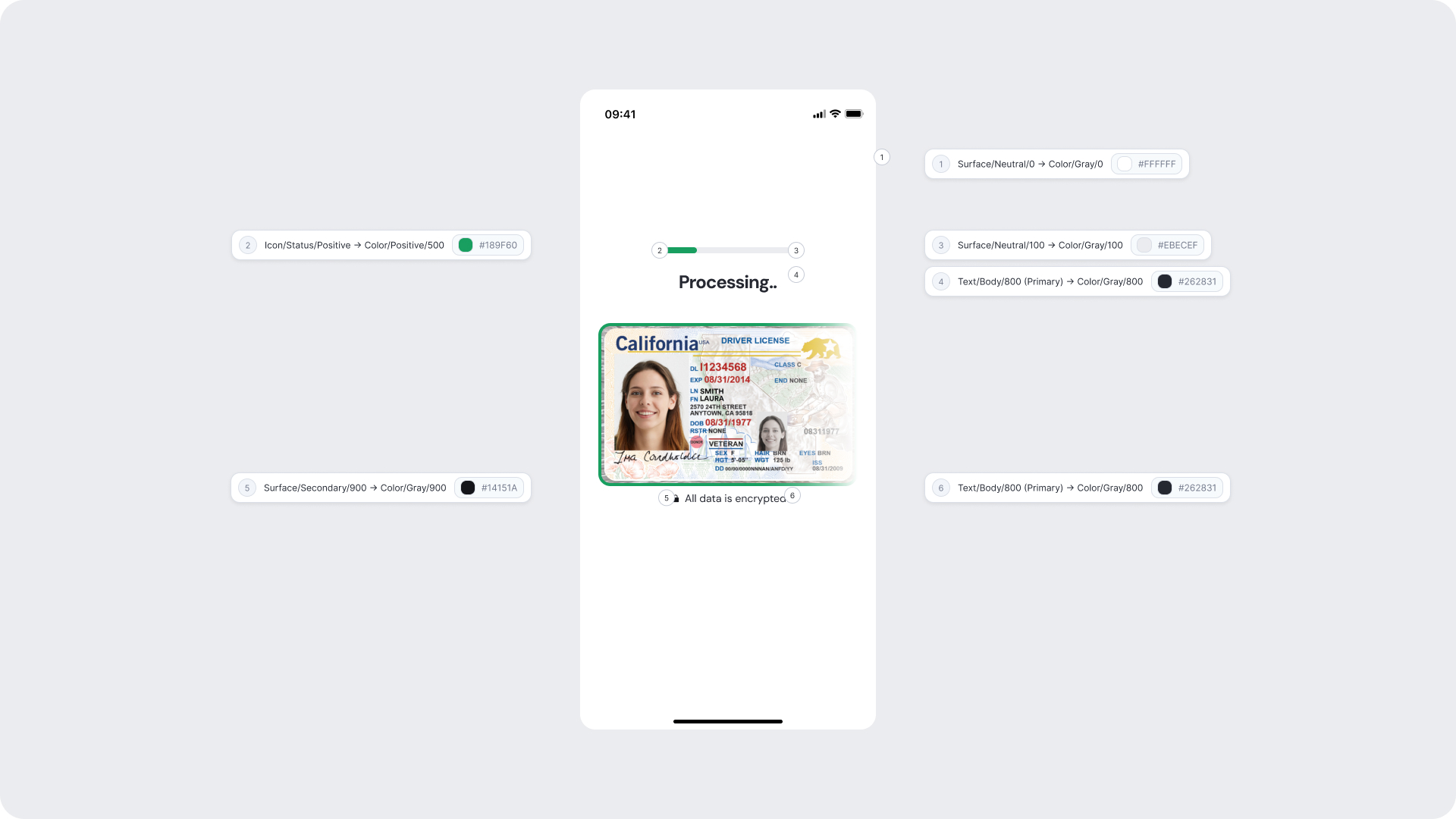
| UI Element |
Token |
Value |
| Background |
Surface/Neutral/0 |
#FFFFFF |
| Progress bar (active) |
Icon/Status/Positive |
#10B060 |
| Card background |
Surface/Neutral/100 |
#EBECEF |
| Primary text |
Text/Body/800 (Primary) |
#262831 |
| Secondary surface |
Surface/Secondary/900 |
#14151A |
| Helper text |
Text/Body/800 (Primary) |
#262831 |
Design Notes
- The progress bar and success icon should use brand-positive tones but remain subtle to avoid visual clutter.
- The ID image always remains centered and visible throughout both stages — never obscured by overlays or text.
- Keep status text brief and affirmative (“Analyzing…”, “Success!”) for faster comprehension.
- Maintain high-contrast text against the background and avoid overlaid color effects on ID photos.
- Button CTAs should appear only on success (e.g., Scan the back or Continue), never during analysis.
Error Screens
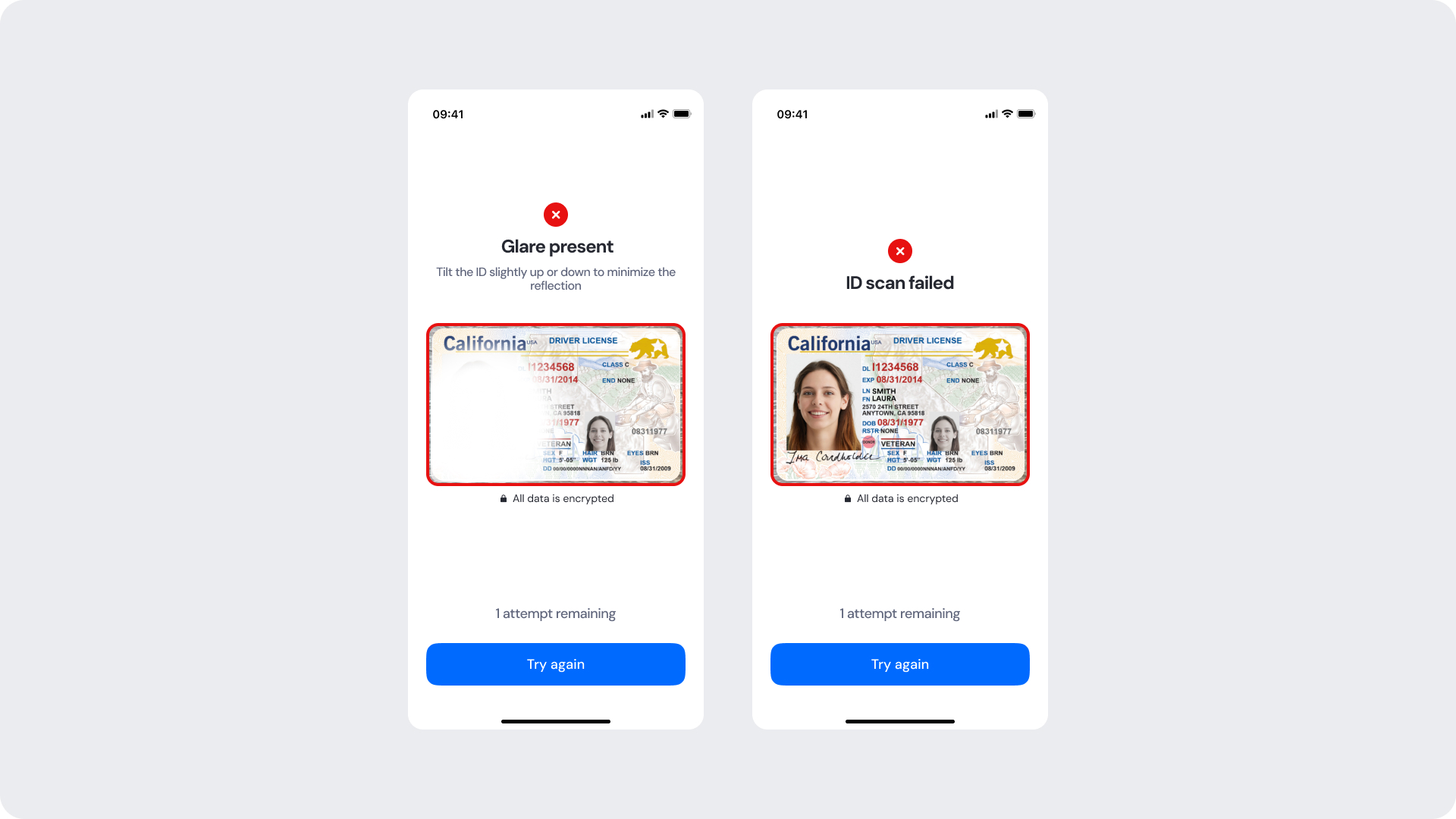
Error screens appear when an issue occurs during ID capture, such as glare, blur, cut-off edges, or when all capture attempts have been exhausted. While text and visual styling can be customized, the error event types are system-defined and cannot be removed or altered.
Customizable Elements
| Area |
What can be customized |
Notes |
| Text |
Error titles, descriptions, and remaining attempts text |
Fully localizable |
| Buttons |
CTA label (“Try again”, “Continue”), button color, and radius |
Must maintain clear primary/secondary hierarchy |
| Brand Colors |
Header, accent colors, and button colors |
Should follow brand token system |
| Icons |
Warning/error icon color |
Only color may change — shapes are fixed |
| Background |
Light or neutral backgrounds |
Must maintain strong contrast with text and icons |
| Footer |
“All photos are encrypted” or “Verified by Incode” |
Optional |
Fixed Elements
| Element |
Why it is fixed |
| Error event types |
Linked to detection logic; cannot be reordered or removed |
| Error icon shapes |
Maintains universal recognition and visual consistency |
| Error layout structure |
Standardized for clarity and predictable behavior |
| “Attempts remaining” logic |
Ensures accuracy and reliable retry tracking |
| Final error behavior |
Must transition to manual review once attempts are exhausted |
| Accessibility contrast |
Must comply with WCAG AA for readability |
Token Reference
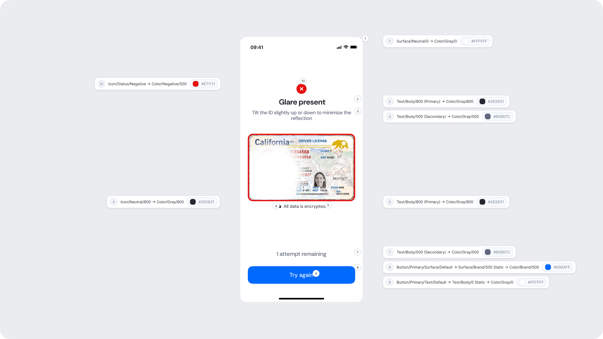
| UI Element |
Token |
Value |
| Background |
Surface/Neutral/0 |
#FFFFFF |
| Error icon |
Icon/Status/Negative |
#FF1111 |
| Title text |
Text/Body/800 (Primary) |
#262831 |
| Subtitle text |
Text/Body/500 (Secondary) |
#60667C |
| Helper text |
Text/Body/800 (Primary) |
#262831 |
| Secondary text |
Text/Body/500 (Secondary) |
#60667C |
| Focus icon |
Icon/Neutral/800 |
#262831 |
| Button background |
Button/Primary/Surface/Default |
#006AFF |
| Button text |
Button/Primary/Text/Default |
#FFFFFF |
Design Notes
- Error messaging should remain clear, direct, and action-oriented.
- Maintain consistent spacing and visual hierarchy for readability.
- “Try again” should always feel like the primary action when applicable.
- Final error screens should not offer a retry, only a “Continue” action guiding users into manual review logic.
- Avoid long or overly technical messages; users should understand the issue at a glance.
- Include the ID image preview where possible — it helps users understand what went wrong.