This section outlines the elements you can customize within the Geolocation module to match your brand while preserving Incode’s core UX. It clarifies which areas are flexible, such as text, illustrations, and brand colors and which elements remain fixed to ensure consistency, accessibility, and optimal capture performance across platforms.
Geo Not Determined Screen
This screen appears when the module first requests permission to access the user's current location. It’s the initial state, shown before any user action.
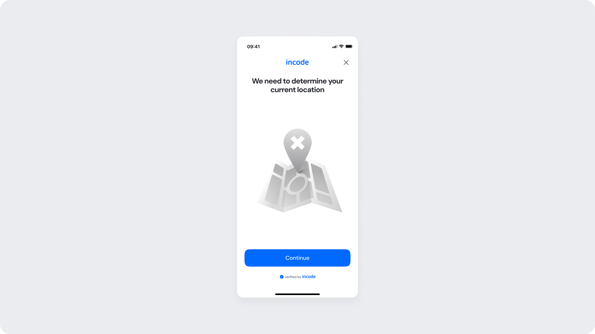
Customizable Elements
| Area |
What can be customized |
Notes |
| Text |
Title, subtitle, button label |
Fully localizable; tone can be adapted |
| Illustration |
Colors or full replacement |
Must represent a map/location theme |
| Brand Colors |
Illustration accent, button, header |
Uses brand tokens |
| Buttons |
Label, color |
Must follow platform and WCAG standards |
| Footer |
“Verified by Incode” text |
Optional but recommended for transparency and trust |
Fixed Elements
| Element |
Why it is fixed |
| Layout structure |
Ensures consistency across onboarding modules |
| Illustration style |
Must remain consistent with location flow visuals |
| Spacing & safe areas |
Required for device compatibility |
| Text hierarchy |
Optimized for readability |
| Close icon position |
Standardized for user familiarity |
| WCAG minimum contrast |
Mandatory for accessibility compliance |
Token Reference
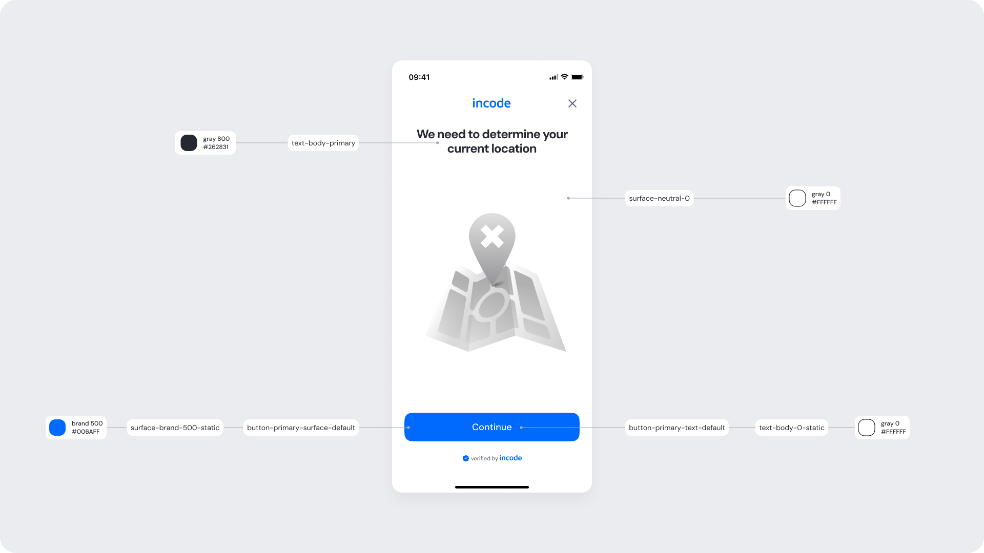
| UI Element |
Token |
Raw Value |
| Title text |
text-body-primary |
#262831 |
| Background |
surface-neutral-0 |
#FFFFFF |
| Button background |
button-primary-surface-default |
#006AFF |
| Button text |
button-primary-text-default |
#FFFFFF |
Design Notes
- Keep copy short to minimize cognitive load.
- The illustration establishes the concept of location with neutral tones to maintain focus on the button.
- The “verified by Incode” footer reinforces authenticity subtly, maintaining accessibility contrast.
Allow Location Access Screen – Native
Displayed on native platforms when the user denies access to location. It guides them to grant permission manually via device settings or skip the step.
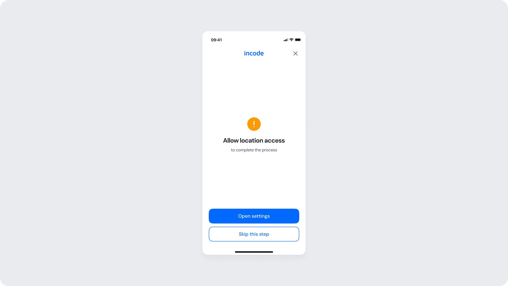
Customizable Elements
| Area |
What can be customized |
Notes |
| Text |
Title, subtitle, button labels (“Open settings”, “Skip this step”) |
Fully localizable |
| Icons |
Warning icon color |
Must preserve meaning and accessibility contrast |
| Brand Colors |
Buttons, links, highlight elements |
Uses brand tokens |
| Buttons |
Label, color |
Must follow platform and WCAG standards |
Fixed Elements
| Element |
Why it is fixed |
| Layout structure |
Maintains visual continuity with other modules |
| Warning icon shape |
Represents universal alert pattern |
| Button spacing & placement |
Optimized for tap targets |
| Text hierarchy |
Follows global UX standards |
| Close icon position |
Consistent across modules |
| WCAG minimum contrast |
Required for readability and compliance |
Token Reference
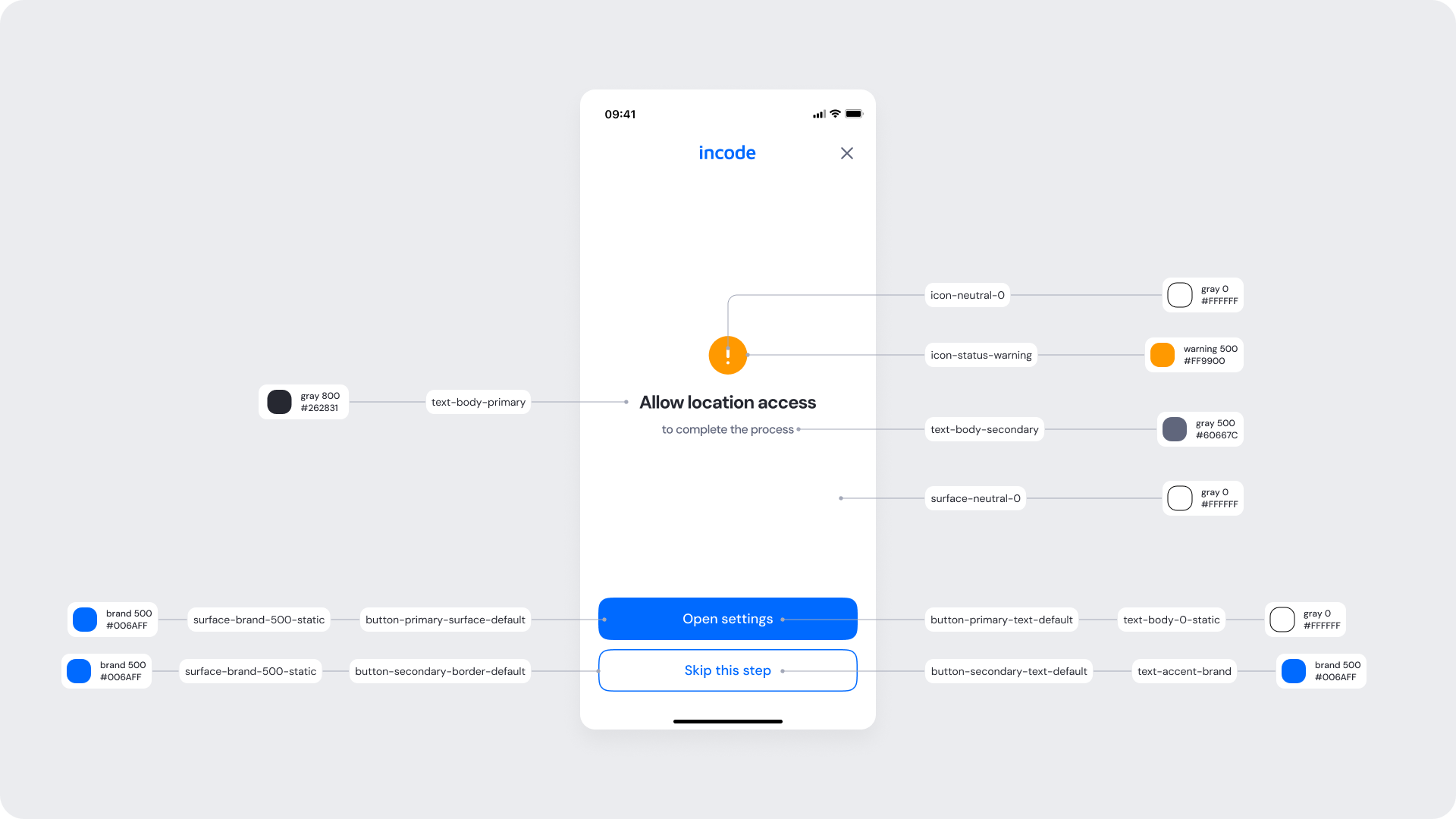
| UI Element |
Token |
Raw Value |
| Title text |
text-body-primary |
#262831 |
| Subtitle text |
text-body-secondary |
#60667C |
| Warning icon |
icon-status-warning |
#FF9900 |
| Background |
surface-neutral-0 |
#FFFFFF |
| Primary button background (“Open settings”) |
button-primary-surface-default |
#006AFF |
| Primary button text |
button-primary-text-default |
#FFFFFF |
| Secondary button border (“Skip this step”) |
button-secondary-border-default |
#006AFF |
| Secondary button text |
text-accent-brand |
#006AFF |
Design Notes
- The layout mirrors other SDK modules for predictable UX and user familiarity.
- Maintain a clear hierarchy between primary and secondary actions.
- The warning icon (icon-status-warning) provides immediate visual feedback but remains minimal to avoid alarm.
Allow Location Access Screen – Web
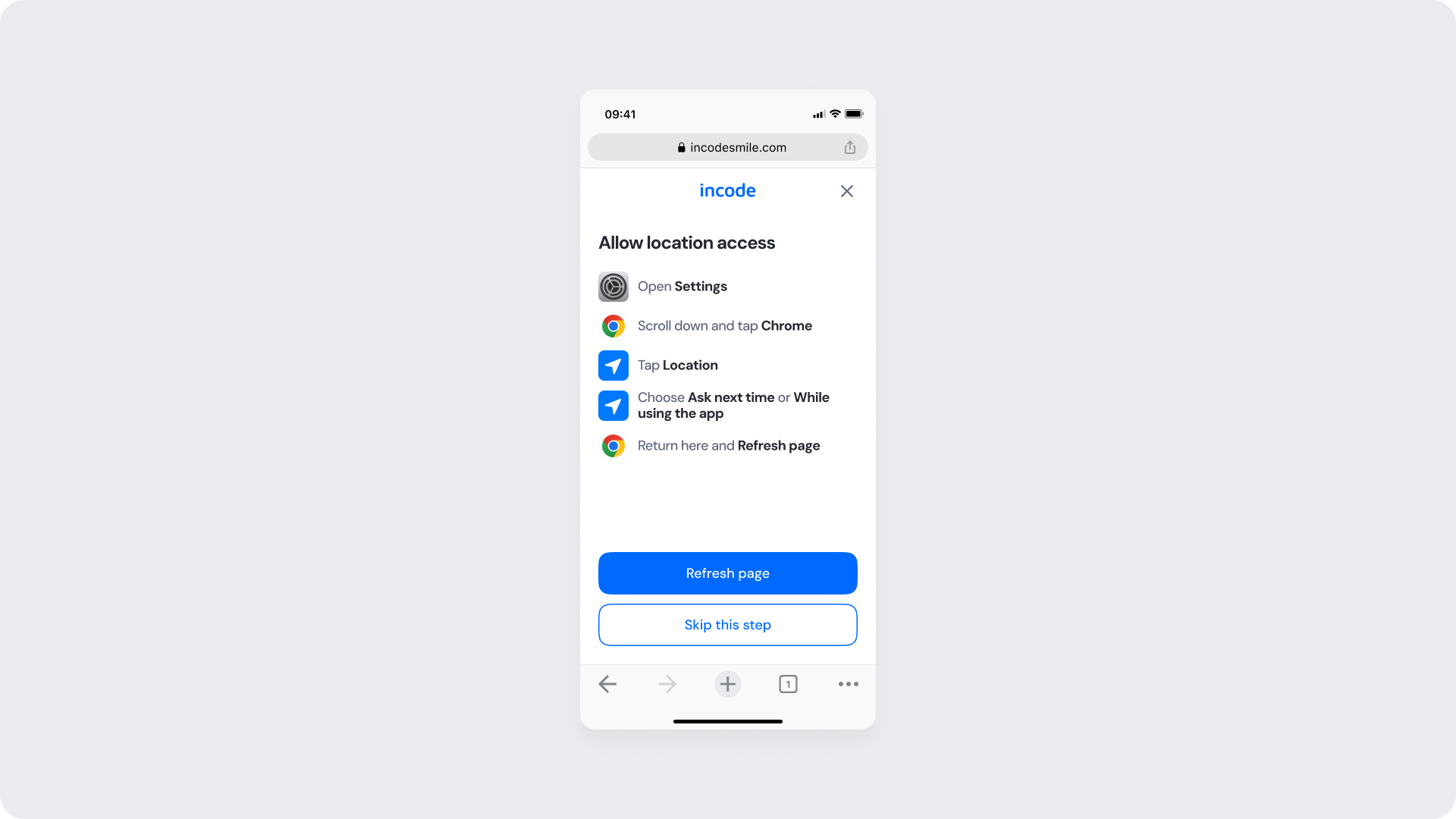
This screen provides detailed, step-by-step instructions to enable location permissions in browser settings (for web flows).
Customizable Elements
| Area |
What can be customized |
Notes |
| Instruction Text |
Steps and phrasing (“...tap Chrome”, “Tap Location”) |
Fully localizable; must remain short and effective |
| Icons |
Colors, style, or illustration replacement |
Must clearly indicate action steps |
| Brand Colors |
Buttons and highlights |
Uses brand tokens |
| Buttons |
Label and color (“Refresh page”, “Skip this step”) |
Must follow platform and WCAG standards |
Fixed Elements
| Element |
Why it is fixed |
| Layout structure |
Keeps parity between web and native flows |
| Step order |
Required for browser permission accuracy |
| Text hierarchy |
Ensures clarity of instructions |
| Button placement |
Optimized for quick completion |
| WCAG minimum contrast |
Required for web accessibility standards |
Token Reference
| UI Element |
Token |
Raw Value |
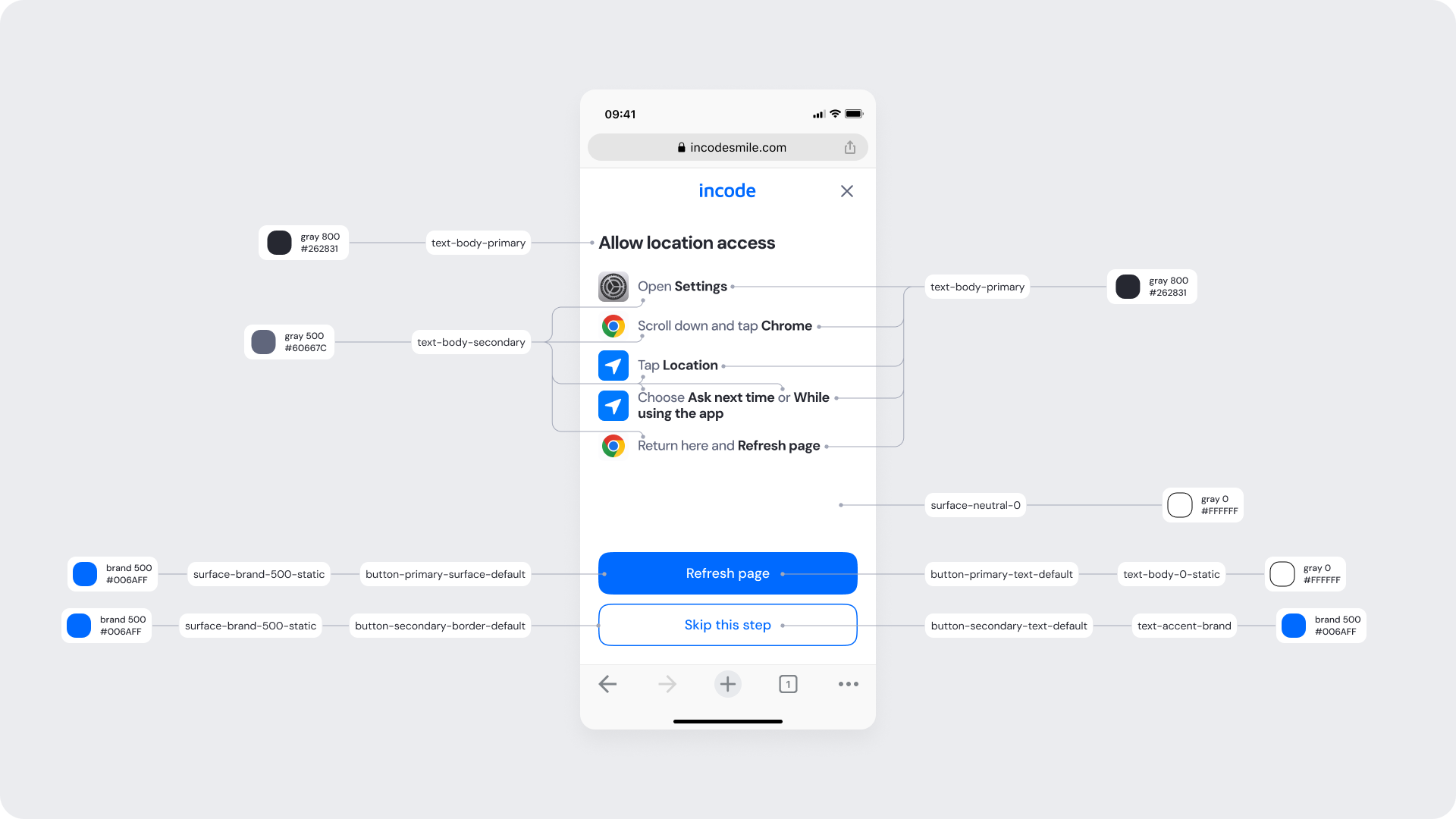
| Title text |
text-body-primary |
#262831 |
| Instruction text |
text-body-primary |
#262831 |
| Highlighted text (“Chrome”, “While using the app”) |
text-body-secondary |
#60667C |
| Background |
surface-neutral-0 |
#FFFFFF |
| Primary button background (“Refresh page”) |
button-primary-surface-default |
#006AFF |
| Primary button text |
button-primary-text-default |
#FFFFFF |
| Secondary button border (“Skip this step”) |
button-secondary-border-default |
#006AFF |
| Secondary button text |
text-accent-brand |
#006AFF |
Design Notes
- This screen is tailored for browser-based flows where system permissions differ from native.
- Highlighted phrases (“Chrome”, “While using the app”) use text-body-secondary for emphasis while preserving scanability.
- Layout presents a step-by-step visual hierarchy: clear numbered or iconographic instructions with consistent vertical spacing.
- Visual rhythm relies on consistent spacing between icon + text pairs for each instruction row.
- Minimal use of color outside the brand blue keeps the attention on interactive elements and icons.
Geo Determined Screen
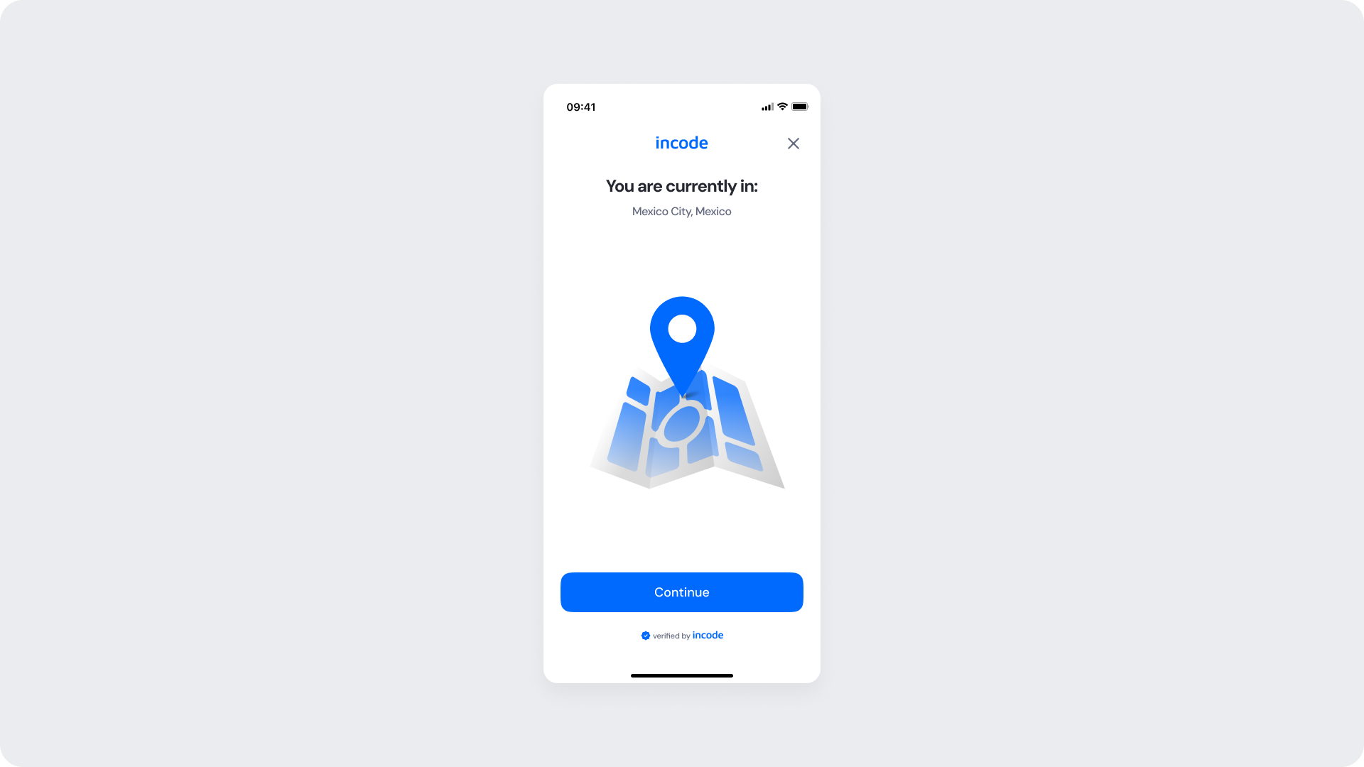
Shown once the system successfully determines the user’s location. It confirms the current detected city and country before proceeding to the next step.
Customizable Elements
| Area |
What can be customized |
Notes |
| Text |
Title (“You are currently in:”), button label |
Fully localizable |
| Illustration |
Colors or full replacement |
Must clearly represent location confirmation |
| Brand Colors |
Illustration accent, button background, highlights |
Uses brand tokens |
| Buttons |
Label and color |
Must follow platform and WCAG standards |
| Footer |
“Verified by Incode” text |
Optional but recommended for consistency, transparency and trust |
Fixed Elements
| Element |
Why it is fixed |
| Layout structure |
Maintains consistency with other verification modules |
| Spacing & alignment |
Optimized for layout consistency |
| Text hierarchy |
Required for readability and hierarchy |
| Close icon position |
Standardized for familiarity |
| WCAG minimum contrast |
Required for web accessibility standards |
Token Reference
| UI Element |
Token |
Raw Value |
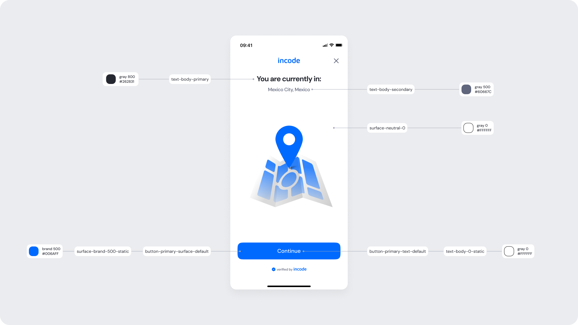
| Title text |
text-body-primary |
#262831 |
| Subtitle text (location name) |
text-body-secondary |
#60667C |
| Background |
surface-neutral-0 |
#FFFFFF |
| Button background |
button-primary-surface-default |
#006AFF |
| Button text |
button-primary-text-default |
#FFFFFF |
Design Notes
- Represents the confirmation state — a positive closure before transition to the next module.
- The Continue button keeps the same placement and styling as in the initial screen for consistency.
- The location pin illustration reinforces successful completion using brand color for recognition and continuity.