In V1, Fiscal QR OCR offers a basic scanning experience with minimal user guidance, no dedicated intro screen with contextual illustrations, and limited customization options. The scanning flow runs with standard camera behavior and generic feedback states.
In V2, Fiscal QR OCR delivers a significantly improved experience with a dedicated intro screen, context-specific QR illustrations, live scanning feedback through frame color states, inline error handling, and full alignment with the token-based design system — resulting in a clearer, more guided, and more brandable flow.
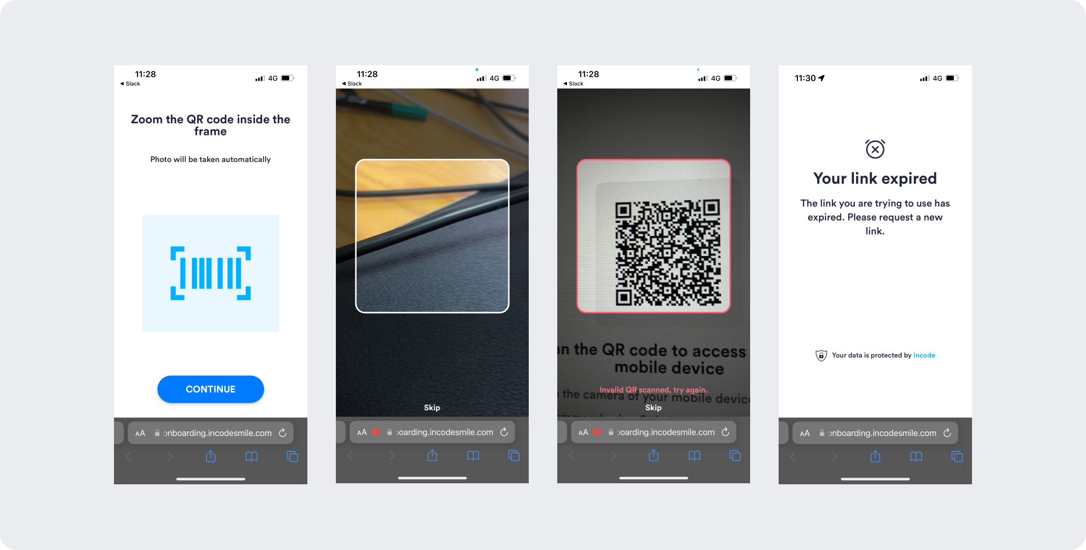
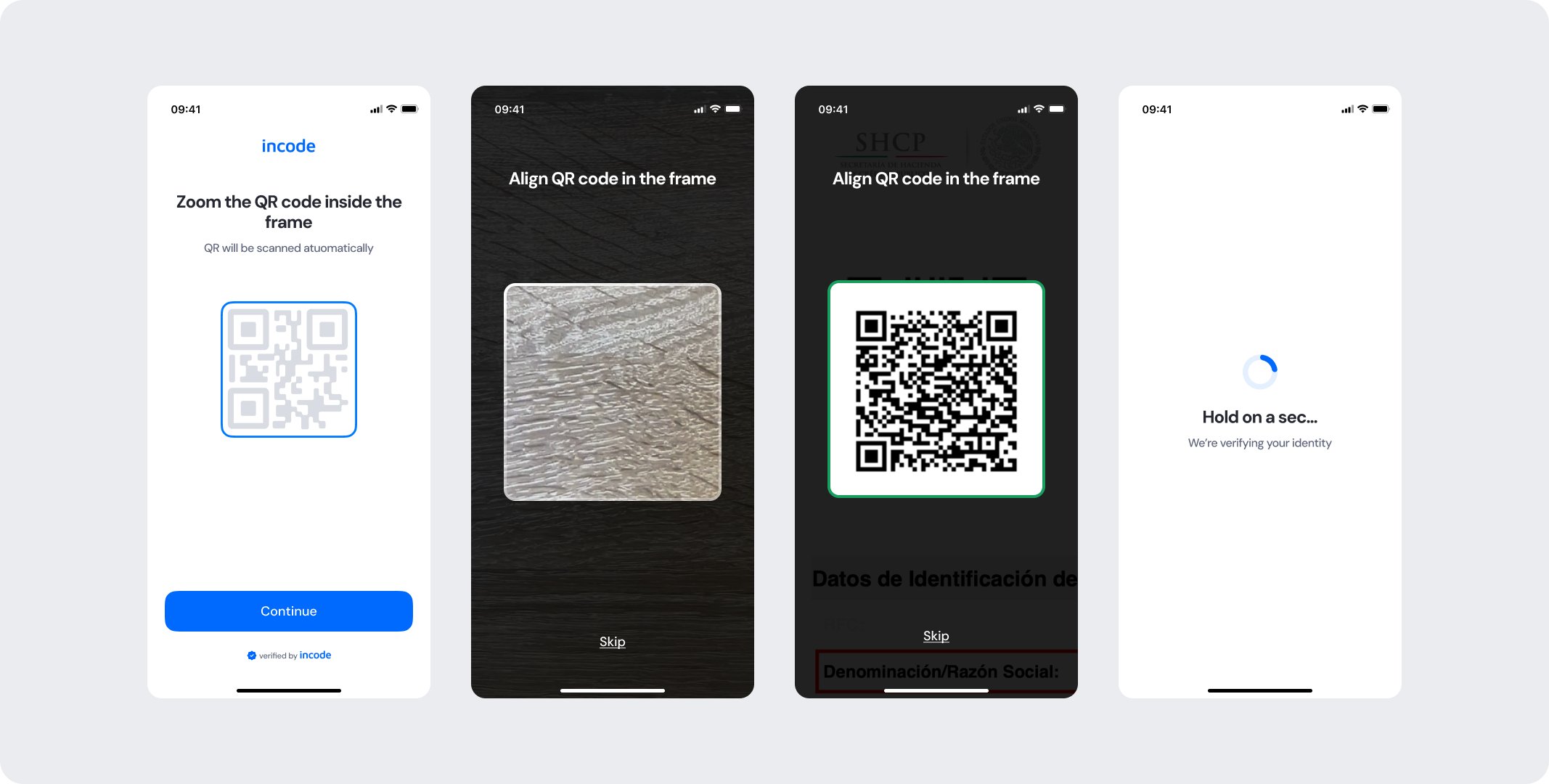
Feature Comparison
Functional capabilities of the module (objective features only; no UX or performance differences).
| Capabilities | V1 | V2 | Notes |
|---|---|---|---|
| QR code scanning | ✅ | ✅ | Both versions scan and decode fiscal QR codes automatically when the code is detected. |
| Error states | ✅ | ✅ | Both versions cover general error cases that users can encounter. |
| Customization options | ❌ | ✅ | V1 provides limited customization options, while V2 allows full control over text, colors, buttons, illustrations, and behavior. |
| Documentation completeness | ❌ | ✅ | V2 provides complete, standardized documentation coverage. |
Behavior Differences
How the module behaves during runtime.
| Behavior | V1 | V2 | Notes |
|---|---|---|---|
| Tutorial behavior | Basic visual of standard QR code layout | Dedicated intro screen with a fiscal QR illustration providing context specific to the document | V2 is intuitive and directs the user's focus toward the scanning instructions with a more relevant visual reference. |
| Scanning experience | Native camera experience | Custom camera view with a QR targeting frame, live detection feedback, and inline error hints | V2 uses a custom scanning experience with instruction text, a color-coded positioning frame, and inline error messaging. |
| Detection feedback | No live feedback during scanning | Real-time frame color state indicating whether a QR code is being searched for, found, or rejected | V2 actively communicates scanning progress so users understand what the module is doing at each moment. |
| State transitions | Default transitions | Specifically designed screen-by-screen transitions for smoothness | V2 includes transition guidelines as part of the module documentation package. |
Customization Overview
Customization in V2 is significantly simpler and more consistent across modules.
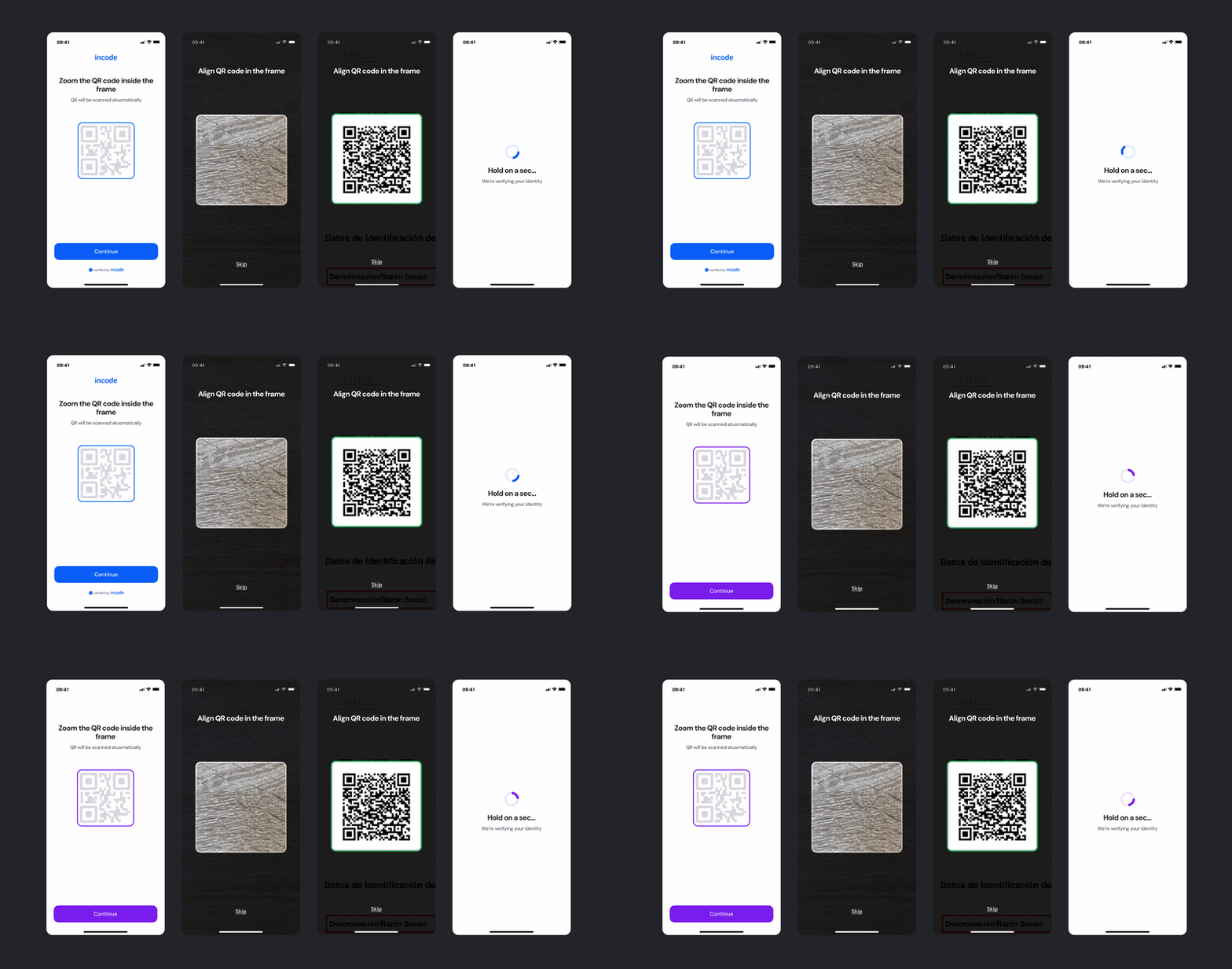
Instead of having isolated configuration options per screen or component, V2 uses a unified token-based system that allows developers to control visuals, behaviors, and experience patterns with fewer parameters and predictable outcomes.
This means:
- Less engineering work to override UI elements
- Consistent branding across modules
- Predictable behavior when changing settings
- Reduced risk of breaking flows
- Clear separation between visual tokens and experience configuration
V2 also centralizes all customization options under a single structure, so developers always know where to look and what they can modify. This includes the QR illustration color, scanning frame border color states, button styles, instructional text, and error message styling — making it straightforward to align the module with your brand without affecting core scanning and detection logic.