This section outlines the elements you can customize within the Fiscal QR OCR module to match your brand while preserving Incode's core UX. It clarifies which areas are flexible, such as text, scanning frame colors, and brand colors, and which elements remain fixed to ensure consistency, accessibility, and reliable QR detection logic across platforms.
Tutorial Screen
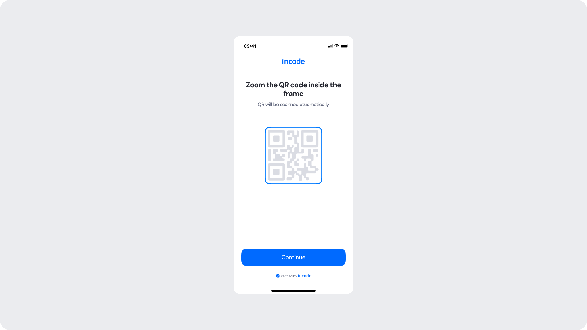
This screen prepares the user for the QR scanning step. It displays a dedicated illustration of a fiscal QR code and provides instructions on how to position the document before proceeding.
Customizable Elements
| Area |
What can be customized |
Notes |
| Title text |
Screen title ("Zoom the QR code inside the frame") |
Fully localizable; should remain clear and action-oriented. |
| Subtitle text |
Supporting instruction ("QR will be scanned automatically") |
Tone can match your brand voice; should remain informative. |
| QR illustration |
Fiscal QR code illustration |
Can be recolored using brand tokens. |
| QR frame border color |
Illustration frame stroke |
Uses brand tokens. |
| Button |
Label, color, radius |
Must follow platform guidelines. |
| Background Color |
Screen background |
Must maintain strong contrast with text and elements. |
| Brand Colors |
Header text, accent color |
Uses brand tokens. |
| Footer |
"Verified by Incode" line |
Optional but recommended for trust and product consistency. |
Fixed Elements
| Element |
Why it is fixed |
| QR detection logic |
Must remain consistent for accurate fiscal QR code scanning. |
| Component spacing & safe areas |
Required for device compatibility and visual stability. |
| Text hierarchy |
Optimized to communicate requirements clearly. |
| WCAG contrast requirements |
Mandatory for accessibility and regulatory compliance. |
Token Refearence
| UI Element |
Token |
Value |
| Background |
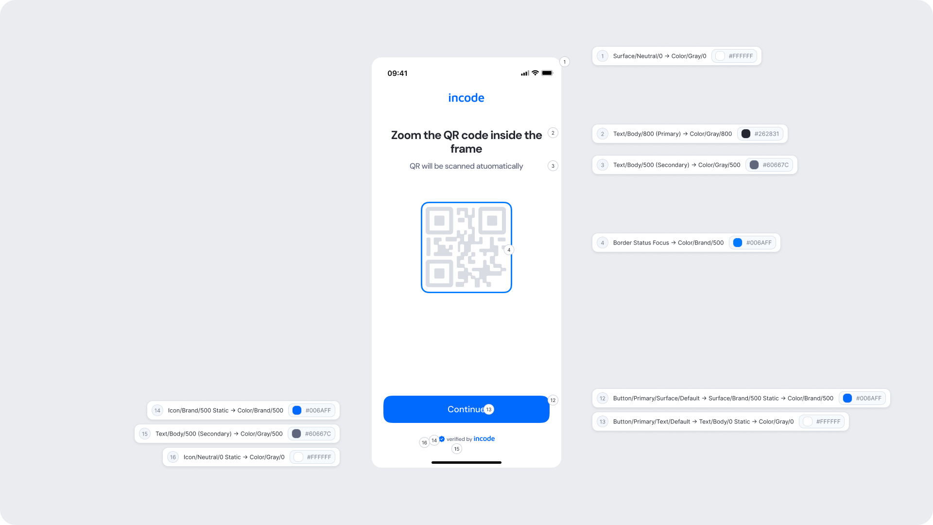
Surface/Neutral/0 → Color/Gray/0 |
#FFFFFF |
| Title text |
Text/Body/800 (Primary) → Color/Gray/800 |
#262831 |
| Subtitle text |
Text/Body/500 (Secondary) → Color/Gray/500 |
#60667C |
| QR frame border |
Border Status Focus → Color/Brand/500 |
#006AFF |
| Button background |
Button/Primary/Surface/Default → Surface/Brand/500 Static → Color/Brand/500 |
#006AFF |
| Button text |
Button/Primary/Text/Default → Text/Body/0 Static → Color/Gray/0 |
#FFFFFF |
| Footer text |
Text/Body/500 (Secondary) → Color/Gray/500 |
#60667C |
| Footer icon |
Icon/Brand/500 Static → Color/Brand/500 |
#006AFF |
| Close icon |
Icon/Neutral/0 Static → Color/Gray/0 |
#FFFFFF |
Design Notes
- Keep the instruction text concise and specific — users should immediately understand what type of document and QR code is expected.
- The QR code illustration should reinforce what the user needs to locate on their document before proceeding.
- Ensure tap targets meet accessibility guidelines.
Ready to Scan
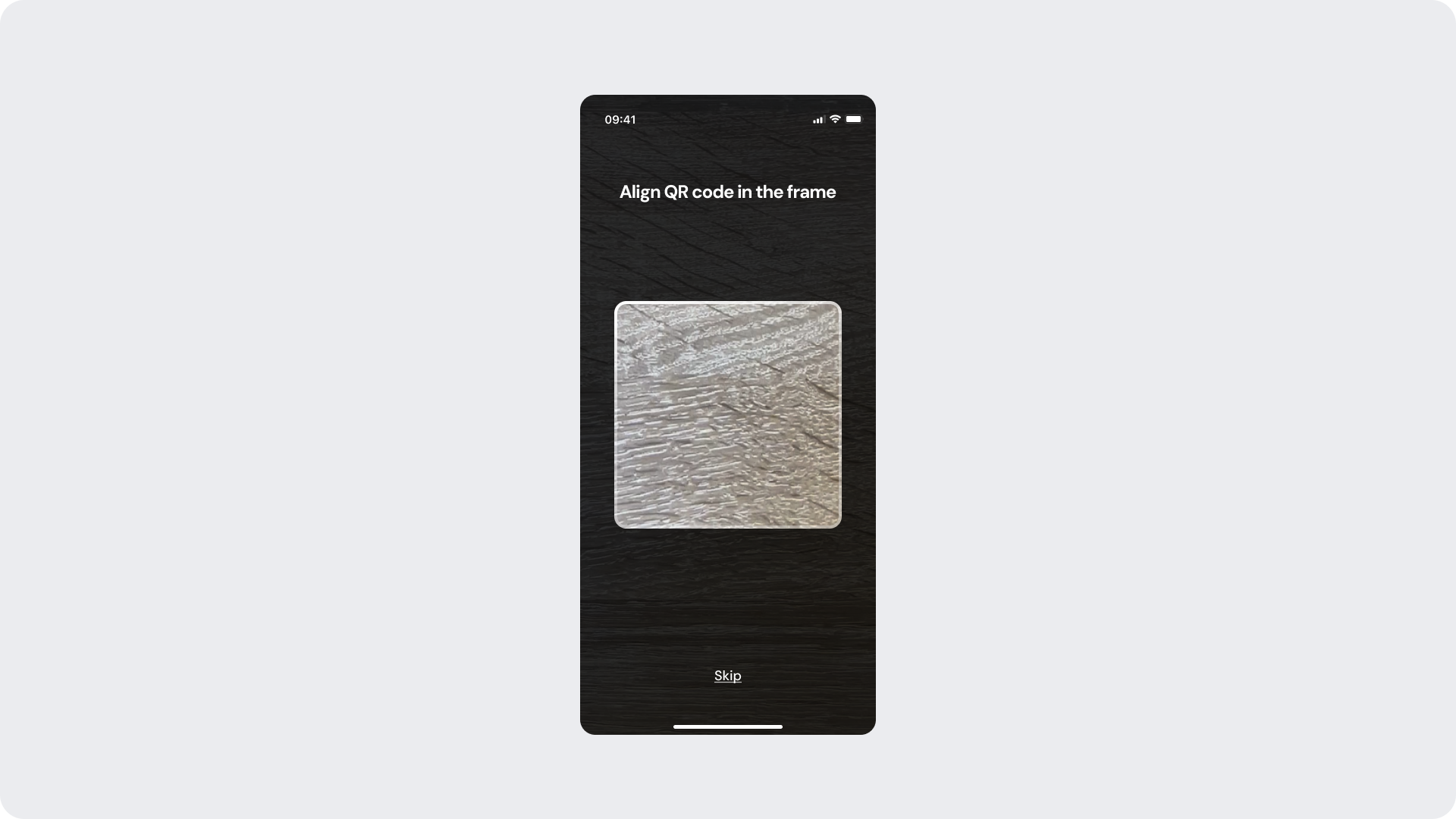
This screen appears when the camera is active and the module is waiting for the user to align a fiscal QR code within the scanning frame. The frame is in its neutral/searching state.
Customizable Elements
| Area |
What can be customized |
Notes |
| Title text |
Scanning instruction ("Align QR code in the frame") |
Fully localizable; should remain clear and action-oriented. |
| Skip button |
Label, color |
Action should allow the user to exit the scanning flow if needed. |
| Background |
Camera view overlay |
Dark background is standard for camera screens. |
Fixed Elements
| Element |
Why it is fixed |
| Camera view |
Live camera feed required for QR code detection. |
| Scanning frame shape and position |
Required for accurate QR code alignment and detection. |
| Frame color states |
Blue = searching, green = detected, red = error. Logic is fixed; colors can be updated via tokens. |
| QR detection logic |
Must remain consistent for accurate fiscal QR code scanning. |
| Spacing & safe areas |
Required for device consistency. |
Token Reference
| UI Element |
Token |
Value |
| Title text |
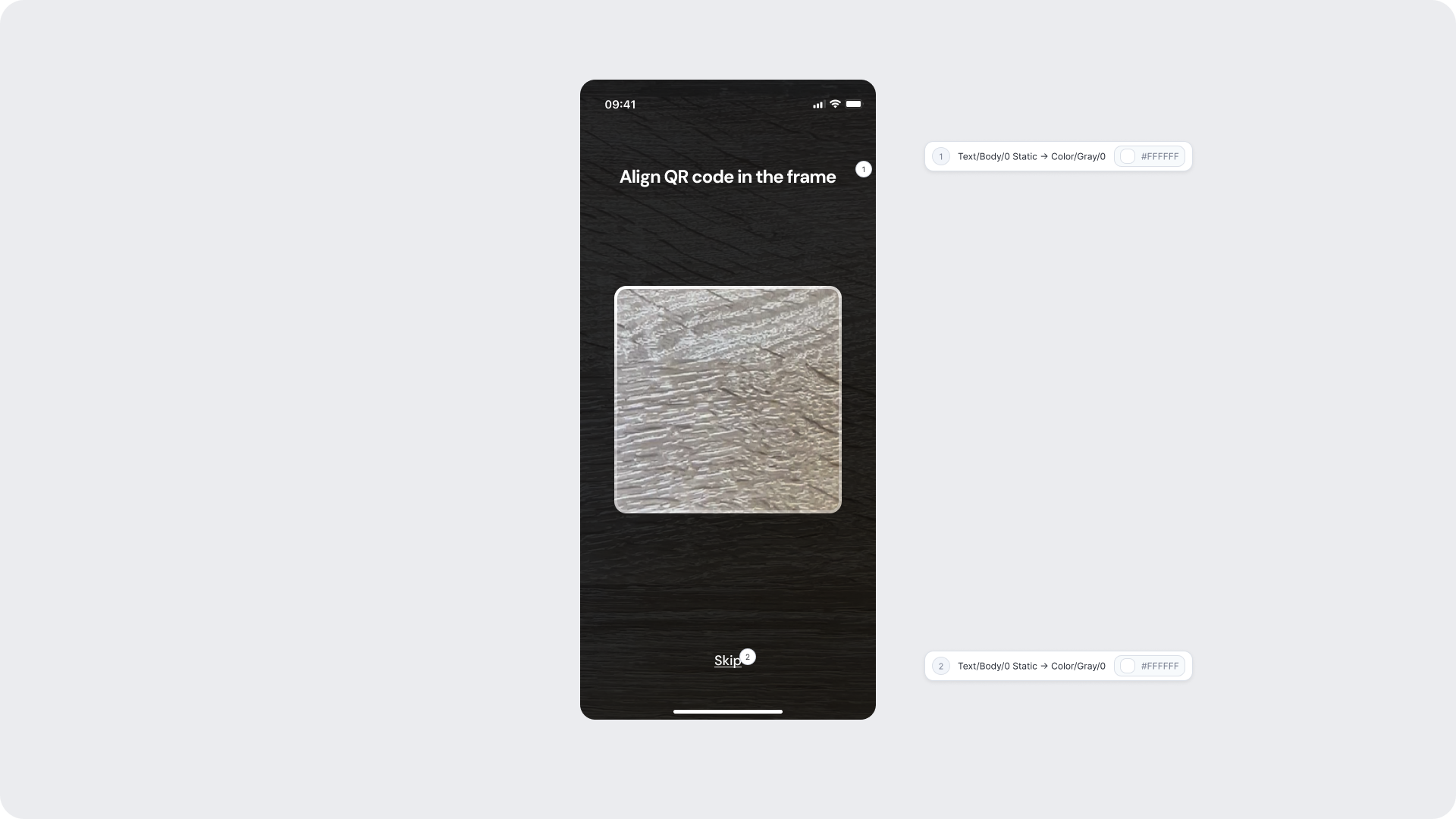
Text/Body/0 Static → Color/Gray/0 |
#FFFFFF |
| Skip button text |
Text/Body/0 Static → Color/Gray/0 |
#FFFFFF |
Design Notes
- Keep messaging short and reassuring; users should feel confident before proceeding.
- The green checkmark and clean layout reinforce the positive outcome without additional explanation needed.
- Background should remain clean to keep focus on the confirmation.
Scanning - QR Detected
This state is shown automatically when the camera successfully detects a fiscal QR code within the scanning frame. The frame border transitions to green to communicate that detection was successful and data extraction is in progress.
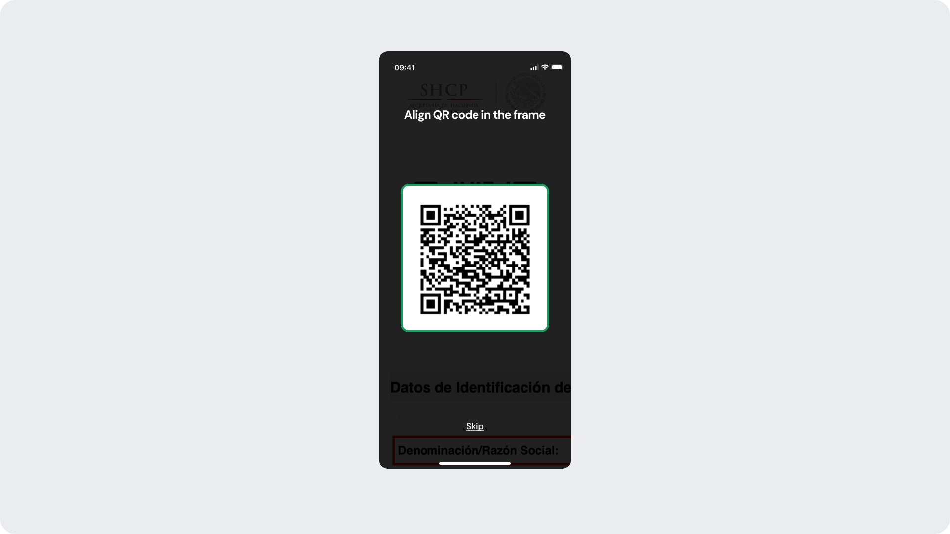
Customizable Elements
| Area |
What can be customized |
Notes |
| Title text |
Scanning instruction text |
Fully localizable. |
| Skip button |
Label, color |
Remains available during detection. |
| Frame border color (detected state) |
Green border on successful detection |
Uses positive status token. |
Fixed Elements
| Element |
Why it is fixed |
| Detection trigger |
Frame color changes automatically upon successful QR detection; cannot be manually triggered. |
| Status color mapping |
Green = detected/success; required for consistent user feedback. |
| QR detection logic |
Must remain consistent for accurate data extraction. |
Token Reference
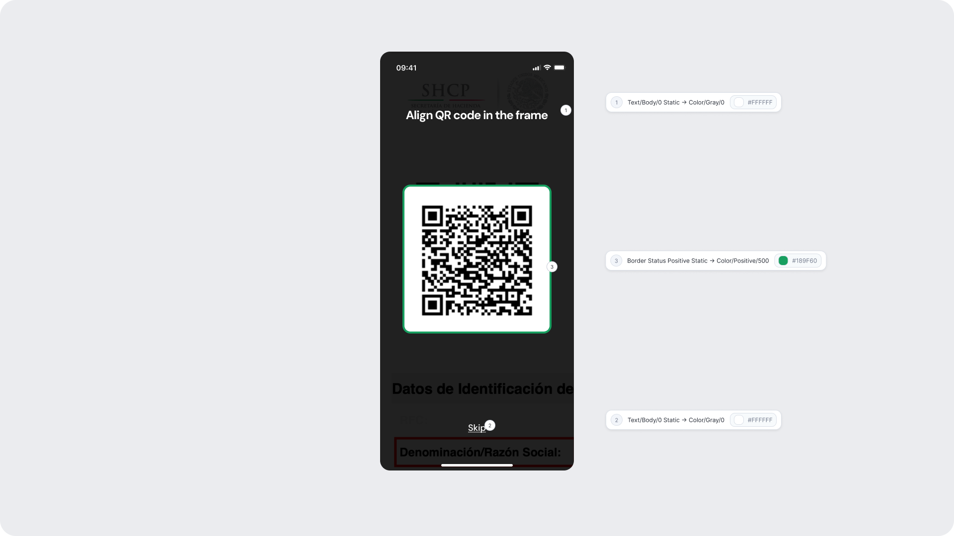
| UI Element |
Token |
Value |
| Title text |
Text/Body/0 Static → Color/Gray/0 |
#FFFFFF |
| Frame border (detected) |
Border Status Positive Static → Color/Positive/500 |
#189F60 |
| Skip button text |
Text/Body/0 Static → Color/Gray/0 |
#FFFFFF |
Design Notes
- The green frame transition happens automatically — no additional UI elements or animations should be added to this state.
- Keep the interface clean to allow users to focus on holding the document steady while data is being extracted.ity.
Error — Invalid QR Code
Shown inline within the scanning screen when the detected QR code does not correspond to a valid fiscal document. The frame border changes to red and an error message appears below the frame, allowing the user to reposition and retry without leaving the screen.
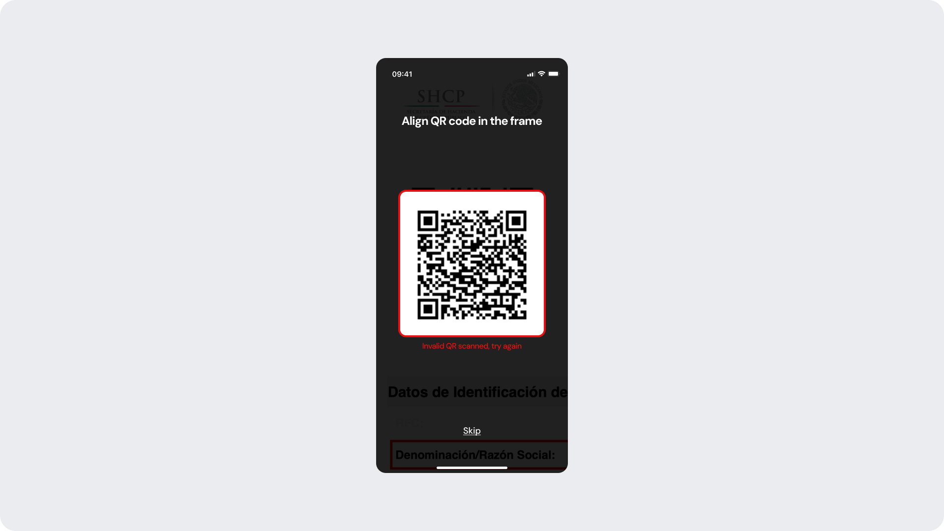
Customizable Elements
| Area |
What can be customized |
Notes |
| Title text |
Scanning instruction text |
Fully localizable. |
| Inline error message text |
Error feedback ("Invalid QR scanned, try again") |
Fully localizable; tone should be neutral and instructive. |
| Frame border color (error state) |
Red border on invalid detection |
Uses negative status token. |
| Skip button |
Label, color |
Action remains available to exit the flow. |
Fixed Elements
| Element |
Why it is fixed |
| Error logic |
Must accurately reflect the QR validation result. |
| Status color mapping |
Red = negative/invalid; required for clarity and consistency. |
| Inline error placement |
Positioned directly below the frame for clear attribution. |
Token Reference
| UI Element |
Token |
Value |
| Title text |
Text/Body/0 Static → Color/Gray/0 |
#FFFFFF |
| Frame border (error) |
Border Status Negative → Color/Negative/500 |
#E71111 |
| Inline error text |
Text/Status/Negative → Color/Negative/500 |
#E71111 |
| Skip button text |
Text/Body/0 Static → Color/Gray/0 |
#FFFFFF |
Design Notes
- Error messaging should be clear, direct, and action-oriented — users should understand they need to try a different QR code without feeling blamed.
- The red frame provides immediate visual feedback; pair it with the inline text to ensure accessibility.
Error — Link Expired
Shown as a full-screen state when the onboarding session link the user is trying to access has expired. The user is informed of the issue and prompted to request a new link to continue the process.
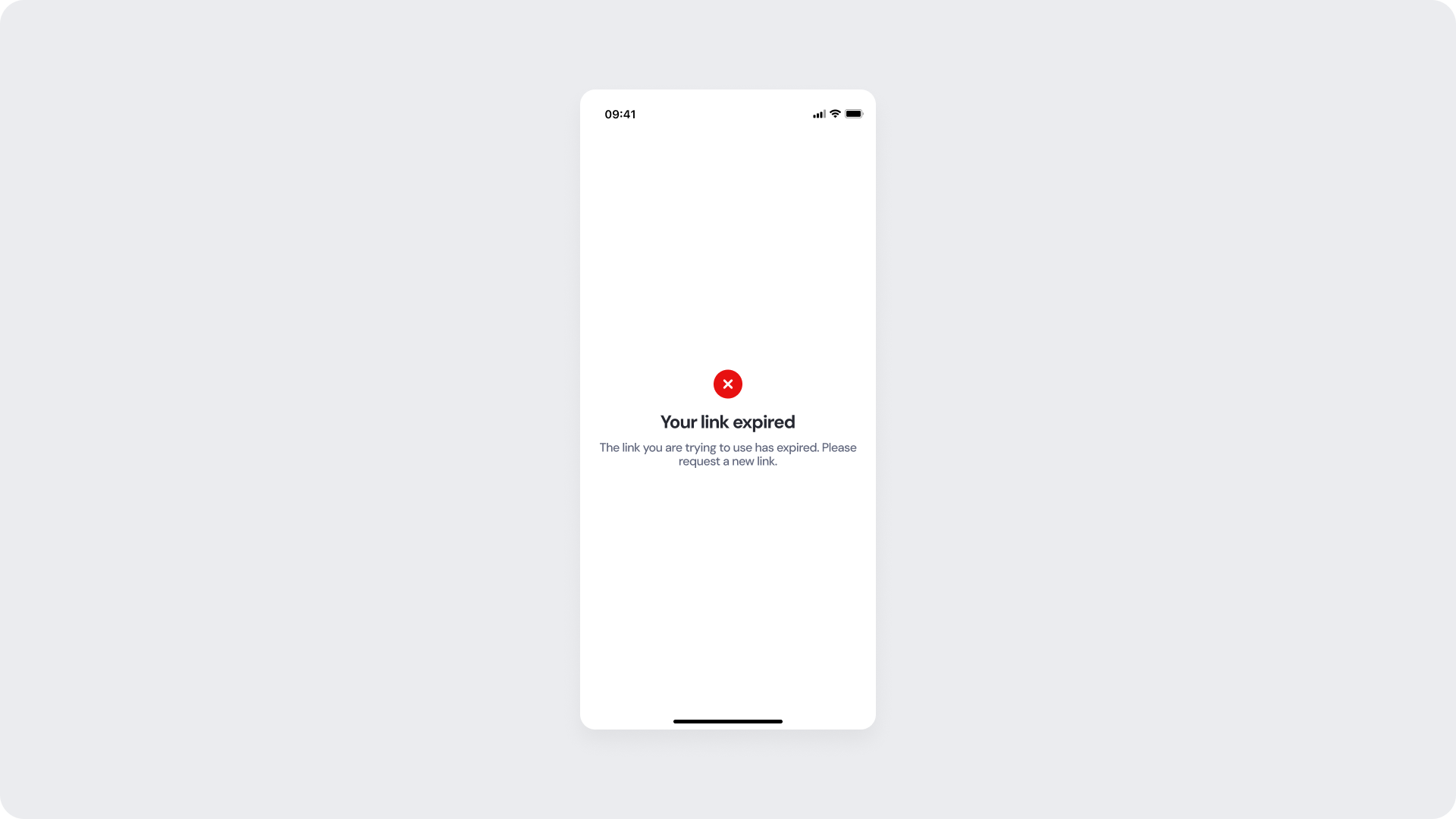
Customizable Elements
| Area |
What can be customized |
Notes |
| Title text |
Error message ("Your link expired") |
Fully localizable; tone should be neutral and non-blaming. |
| Subtitle text |
Supporting detail |
Fully localizable. |
| Status icon |
Error indicator |
Can be replaced; must remain clearly negative. |
| Background color |
Full screen |
Must support strong contrast. |
Fixed Elements
| Element |
Why it is fixed |
| Session expiry logic |
Must accurately reflect the session state; cannot be bypassed. |
| Status color mapping |
Red = negative; required for clarity and consistency. |
| Title hierarchy |
Emphasizes the issue clearly. |
Token Reference
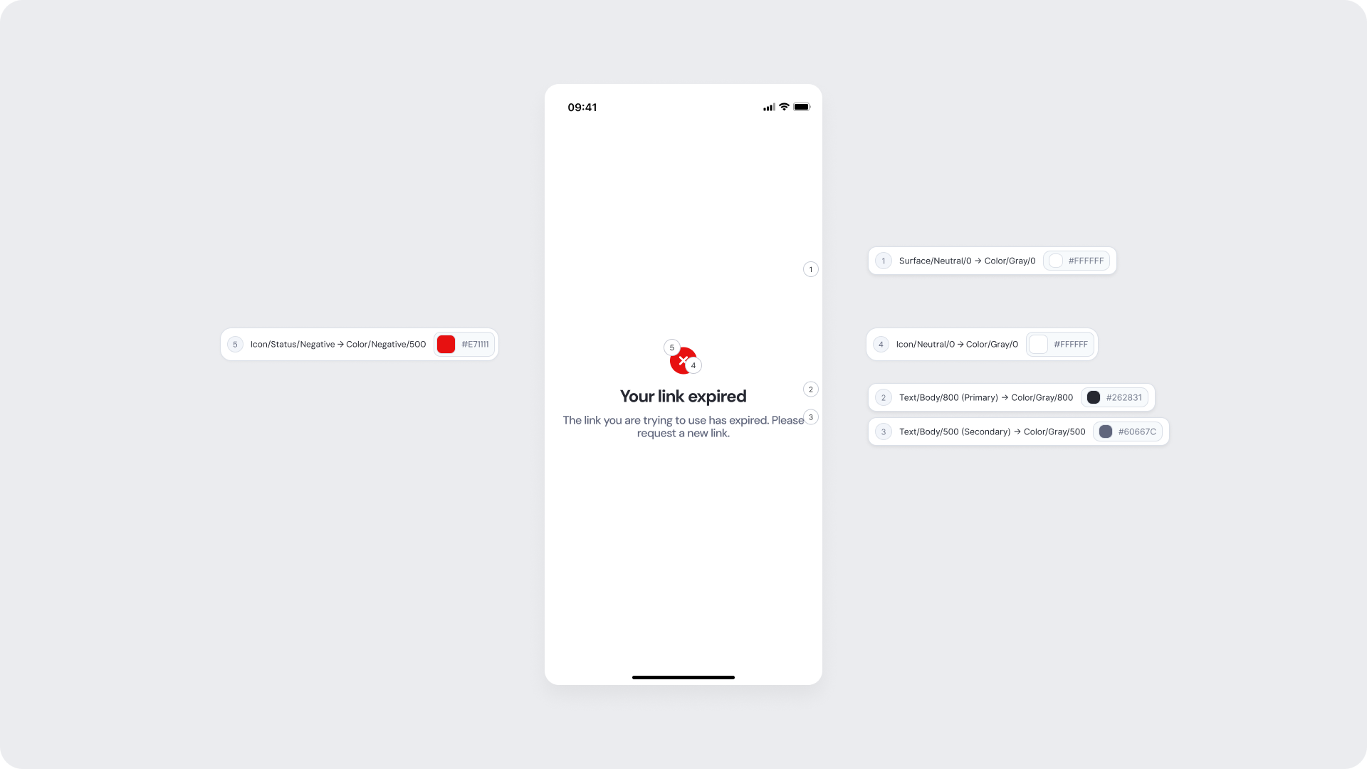
| UI Element |
Token |
Value |
| Background |
Surface/Neutral/0 → Color/Gray/0 |
#FFFFFF |
| Title text |
Text/Body/800 (Primary) → Color/Gray/800 |
#262831 |
| Subtitle text |
Text/Body/500 (Secondary) → Color/Gray/500 |
#60667C |
| Status icon background |
Icon/Status/Negative → Color/Negative/500 |
#E71111 |
| Status icon (X mark) |
Icon/Neutral/0 → Color/Gray/0 |
#FFFFFF |
Design Notes
- Messaging should be clear and guide the user toward a concrete next step — requesting a new link.
- Avoid technical language; the user should understand the issue immediately.
- Maintain consistent spacing and visual hierarchy for readability.