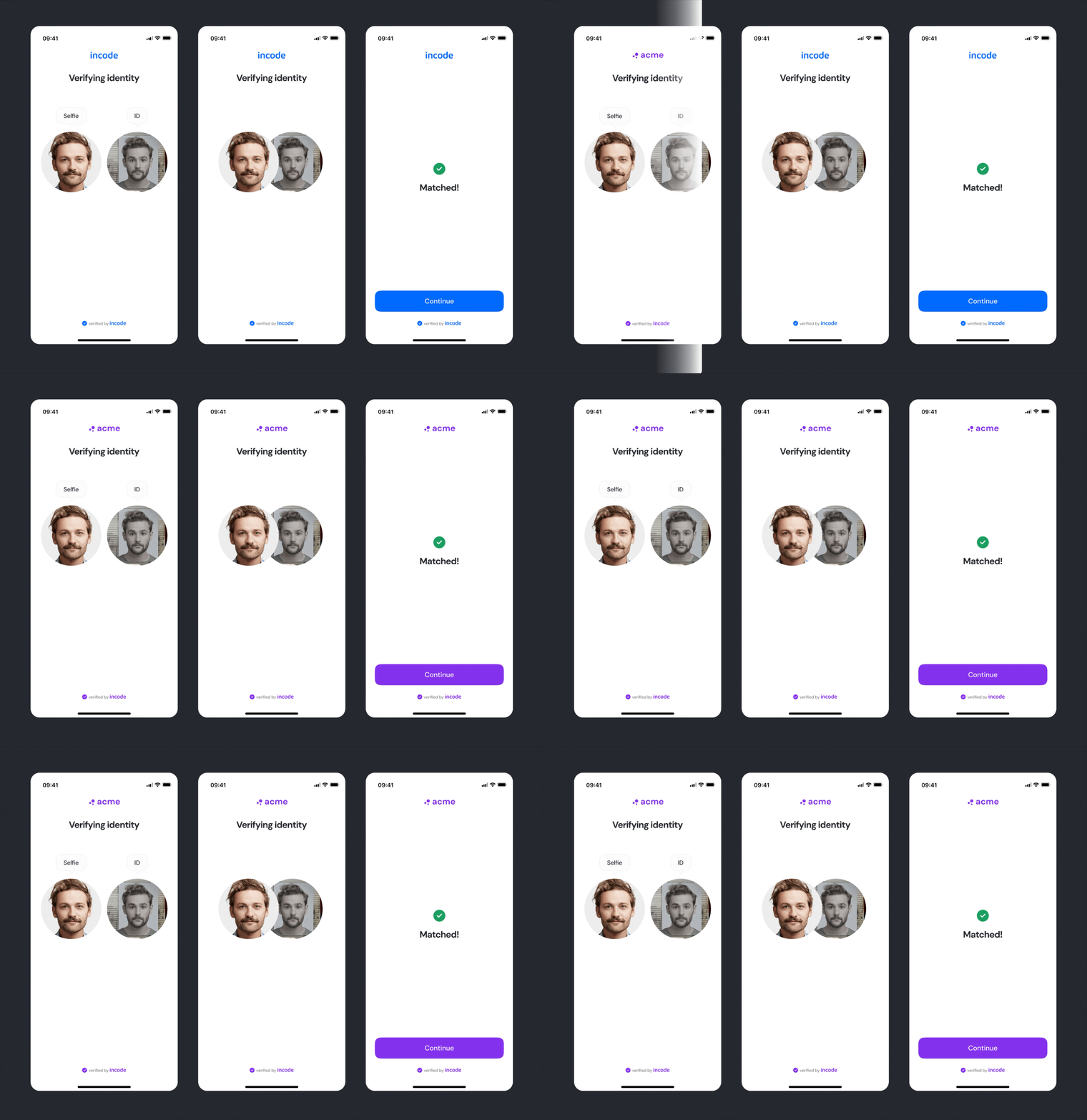
This section outlines the elements you can customize within the Face Match module to match your brand while preserving Incode’s core UX. It clarifies which areas are flexible — such as text, brand colors, and buttons — and which elements remain fixed to ensure consistency, accessibility, and a trustworthy result presentation across platforms.
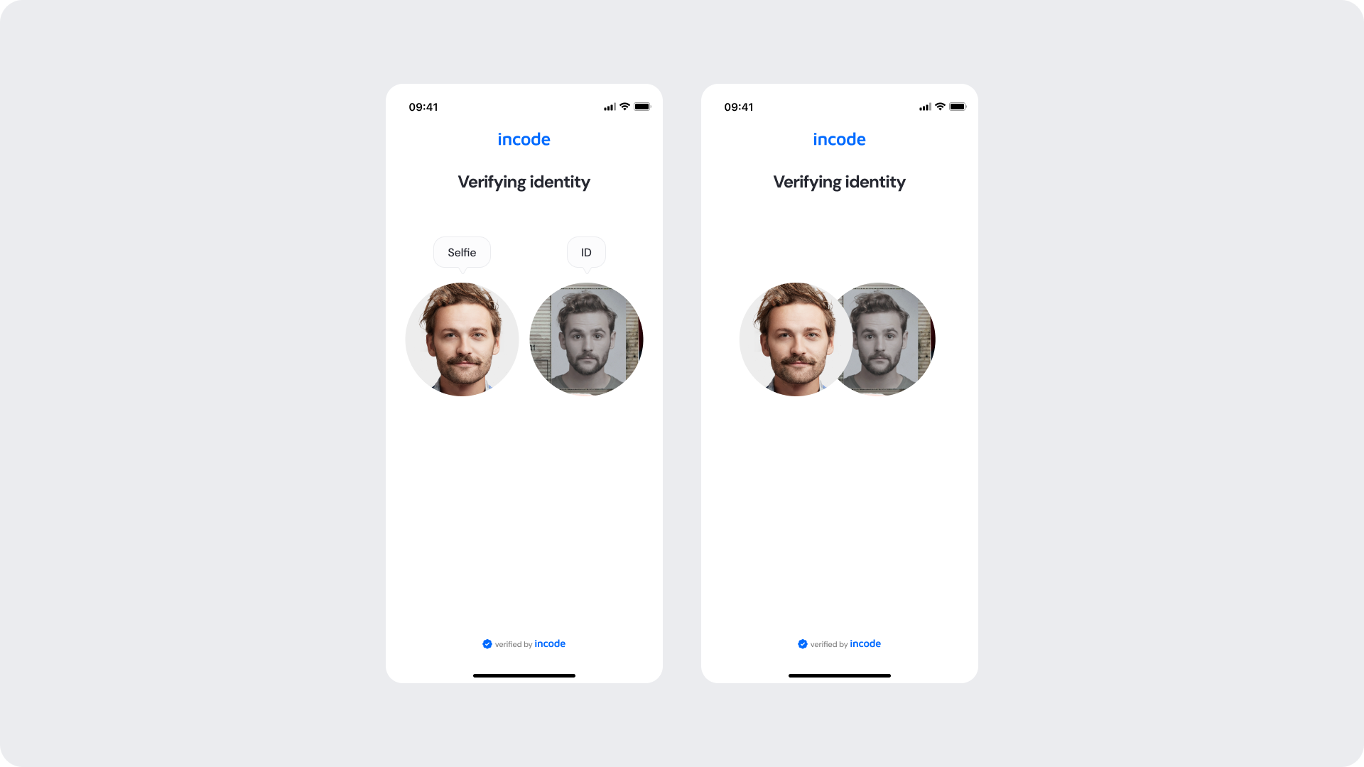
Comparison Screen
The entry screen shows the selfie and ID portrait side by side under a clear heading. Header, text, and label styling can be branded, while the two source images and their layout stay fixed so users always understand what is being compared.
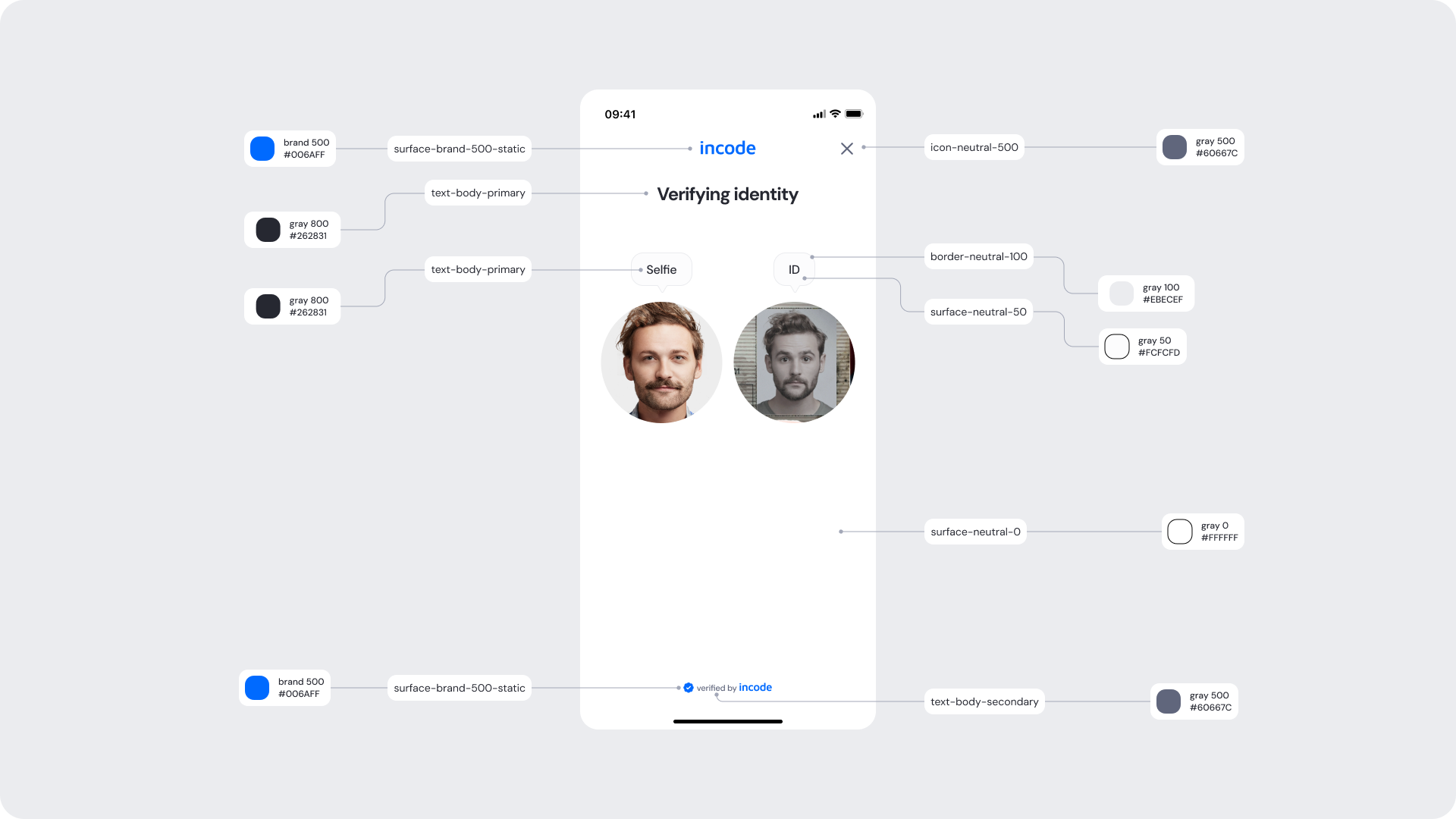
Customizable Elements
| Area |
What can be customized |
Notes |
| Text |
Title (“Verifying identity”), Selfie/ID labels |
Fully localizable |
| Brand Colors |
Logo/header tint, label and text accents |
Uses brand tokens |
| Footer |
“Verified by Incode” line |
Optional but recommended |
Fixed Elements
| Element |
Why it is fixed |
| Side-by-side image layout |
Ensures users understand which images are compared |
| Image crop & shape |
Standardized circular crops for consistency |
| Text hierarchy |
Optimized for readability |
| WCAG minimum contrast |
Mandatory |
Token Reference
| UI Element |
Token |
Value |
| Background |
Surface/Neutral/0 |
#FFFFFF |
| Logo / header |
Brand/500 |
#006AFF |
| Title text |
Text/Body/800 (Primary) |
#262831 |
| Label text |
Text/Body/500 (Secondary) |
#60667C |
| Footer text |
Text/Body/500 (Secondary) |
#60667C |
Design Notes
- Keep the title short and reassuring.
- Maintain a clear visual distinction between the Selfie and ID labels.
- Ensure both images remain clearly visible and balanced.
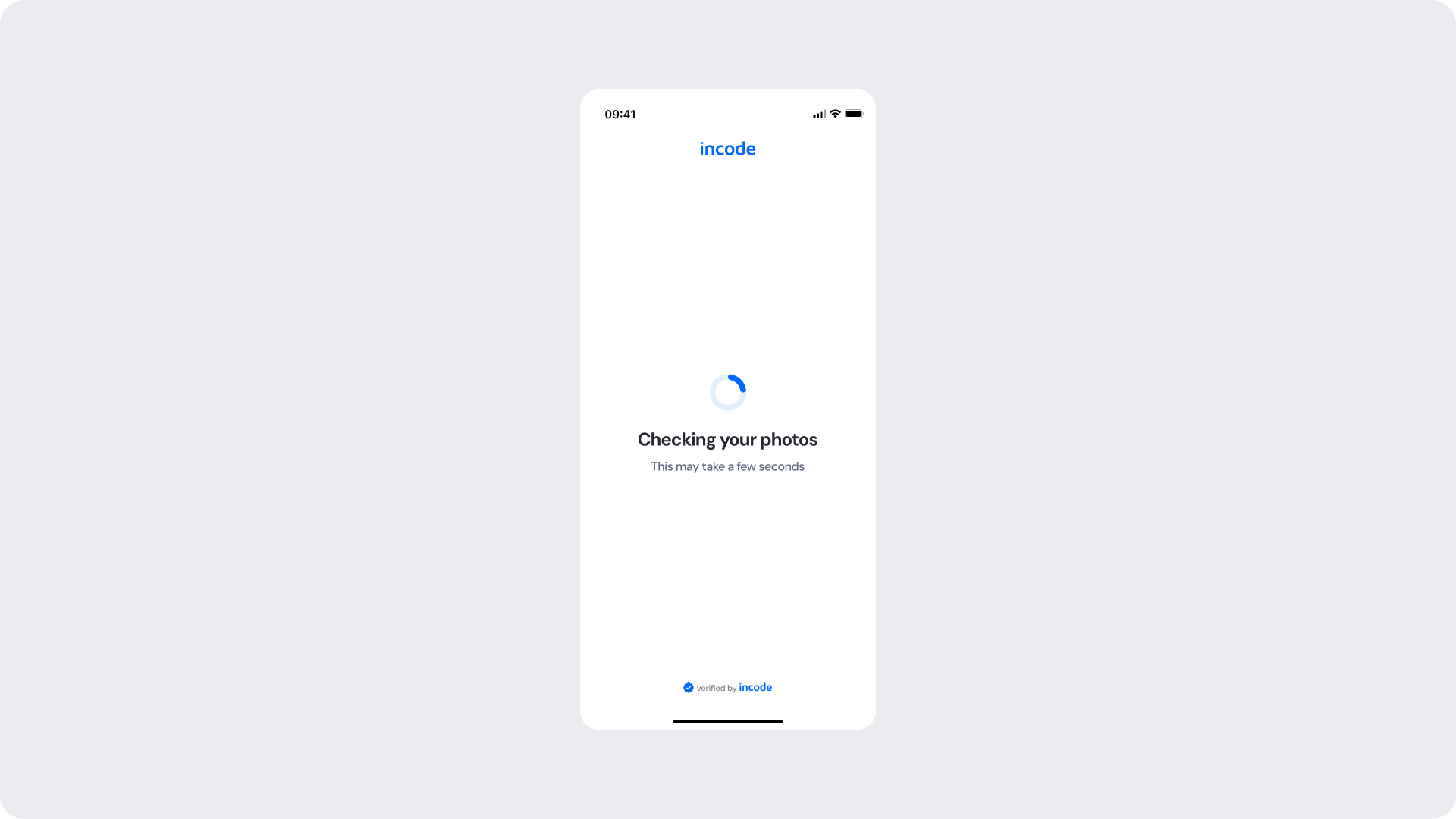
Checking Photos
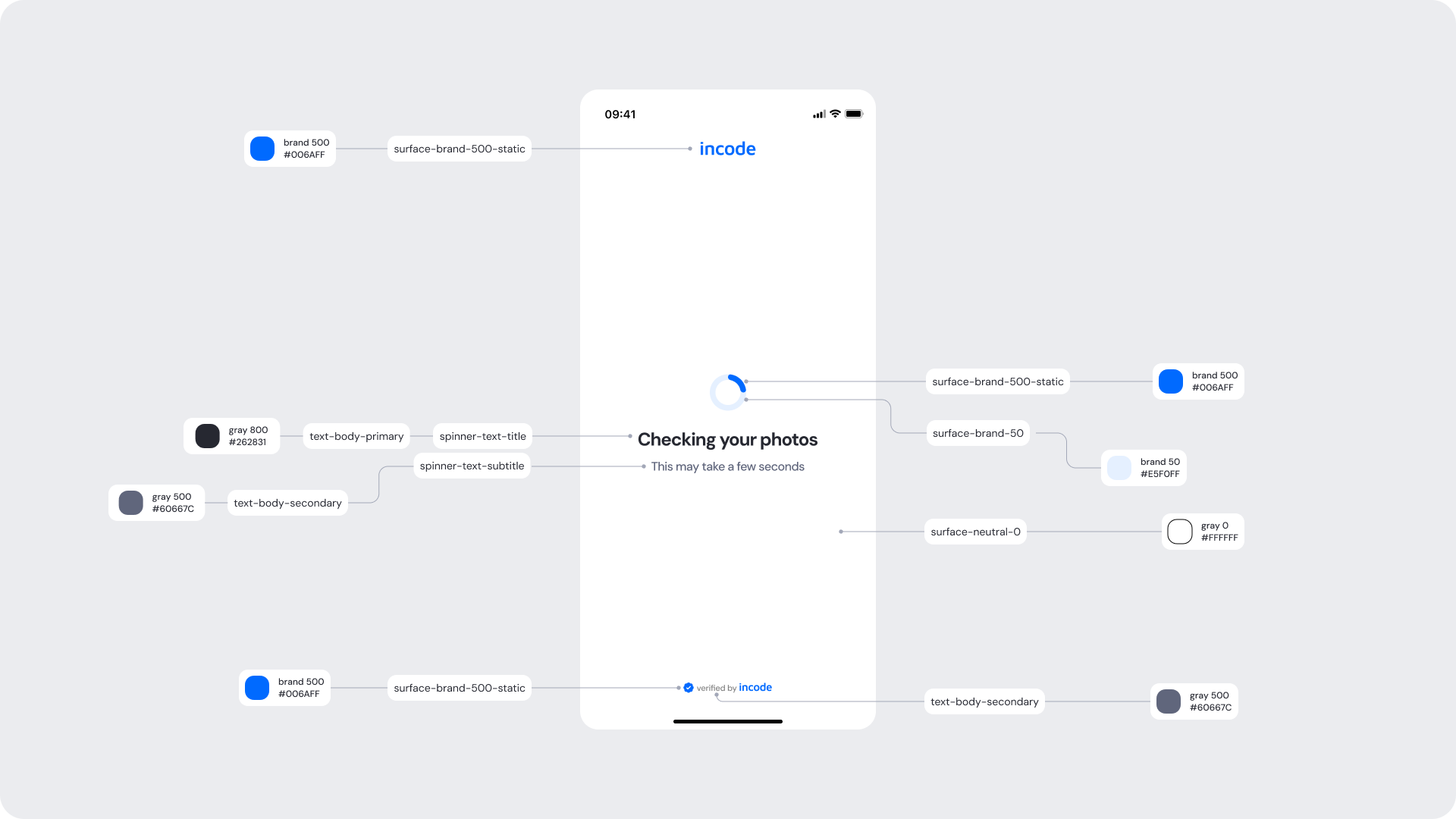
The processing state reassures the user while the comparison runs. The loading indicator color and supporting text can be branded; the animation behavior and timing remain fixed.
Customizable Elements
| Area |
What can be customized |
Notes |
| Text |
“Checking your photos”, supporting line |
Fully localizable |
| Brand Colors |
Spinner / progress indicator color |
Control via tokens |
| Footer |
“Verified by Incode” line |
Optional |
Fixed Elements
| Element |
Why it is fixed |
| Spinner behavior & timing |
Ensures consistent feedback cadence across modules |
| Layout structure |
Standardized for predictability |
| Minimum contrast |
Required for WCAG AA |
Token Reference
| UI Element |
Token |
Value |
| Spinner (arc) |
Spinner/Surface/Primary |
#006AFF |
| Spinner (track) |
Spinner/Surface/Secondary |
#E5F0FF |
| Title text |
Text/Body/800 (Primary) |
#262831 |
| Supporting text |
Text/Body/500 (Secondary) |
#60667C |
| Background |
Surface/Neutral/0 |
#FFFFFF |
Design Notes
- Keep messaging short and neutral so users feel reassured.
- Do not allow interaction during this step.
- Maintain consistent ring thickness to preserve visual rhythm across modules.
Matched (Success)
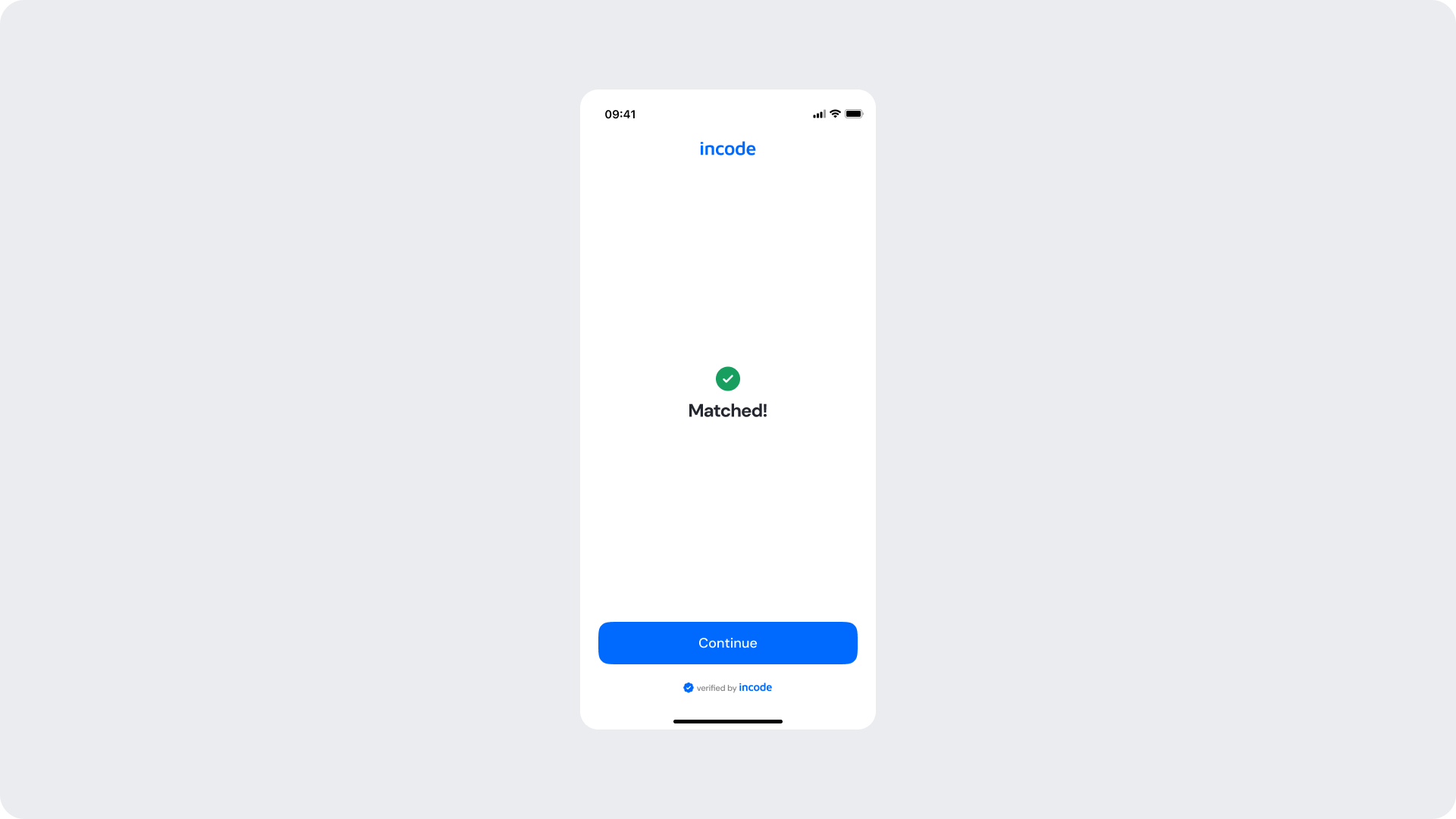
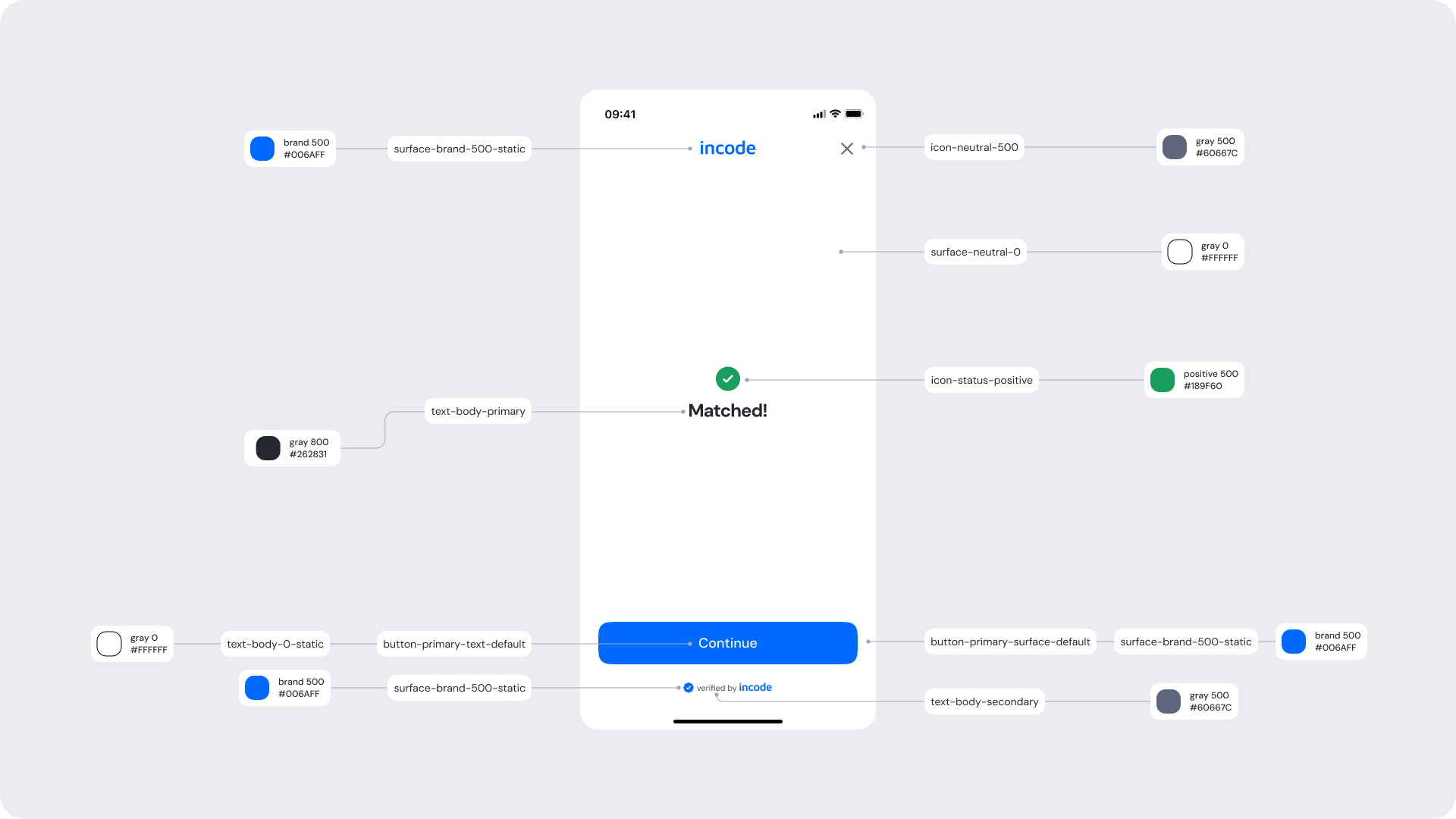
The success state confirms a positive match. The confirmation icon accent, success text, and the primary CTA can be branded, while the result icon shape and layout stay fixed.
Customizable Elements
| Area |
What can be customized |
Notes |
| Text |
“Matched!”, body text, CTA label (“Continue”) |
Fully localizable |
| Buttons |
Label, color, radius |
Must follow platform guidelines |
| Brand Colors |
Success icon accent, CTA color |
Uses brand tokens |
| Footer |
“Verified by Incode” line |
Optional |
Fixed Elements
| Element |
Why it is fixed |
| Result icon shape |
Ensures immediate recognition across modules |
| Success timing |
Prevents premature transitions |
| Layout structure |
Standardized for readability |
| Minimum contrast |
Required for WCAG AA |
Token Reference
| UI Element |
Token |
Value |
| Success icon |
Icon/Status/Positive |
#189F60 |
| Title text |
Text/Body/800 (Primary) |
#262831 |
| CTA background |
Button/Primary/Surface/Default |
#006AFF |
| CTA text |
Button/Primary/Text/Default |
#FFFFFF |
| Background |
Surface/Neutral/0 |
#FFFFFF |
Design Notes
- Keep the confirmation message short and positive.
- Ensure the success accent remains accessible and high-contrast.
- “Continue” should read as the clear primary action.
Faces Do Not Match (Error)
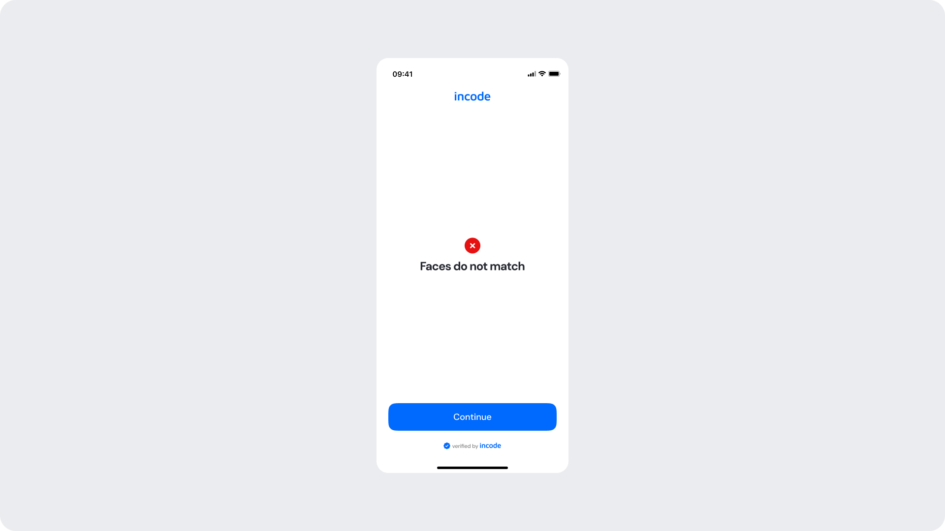
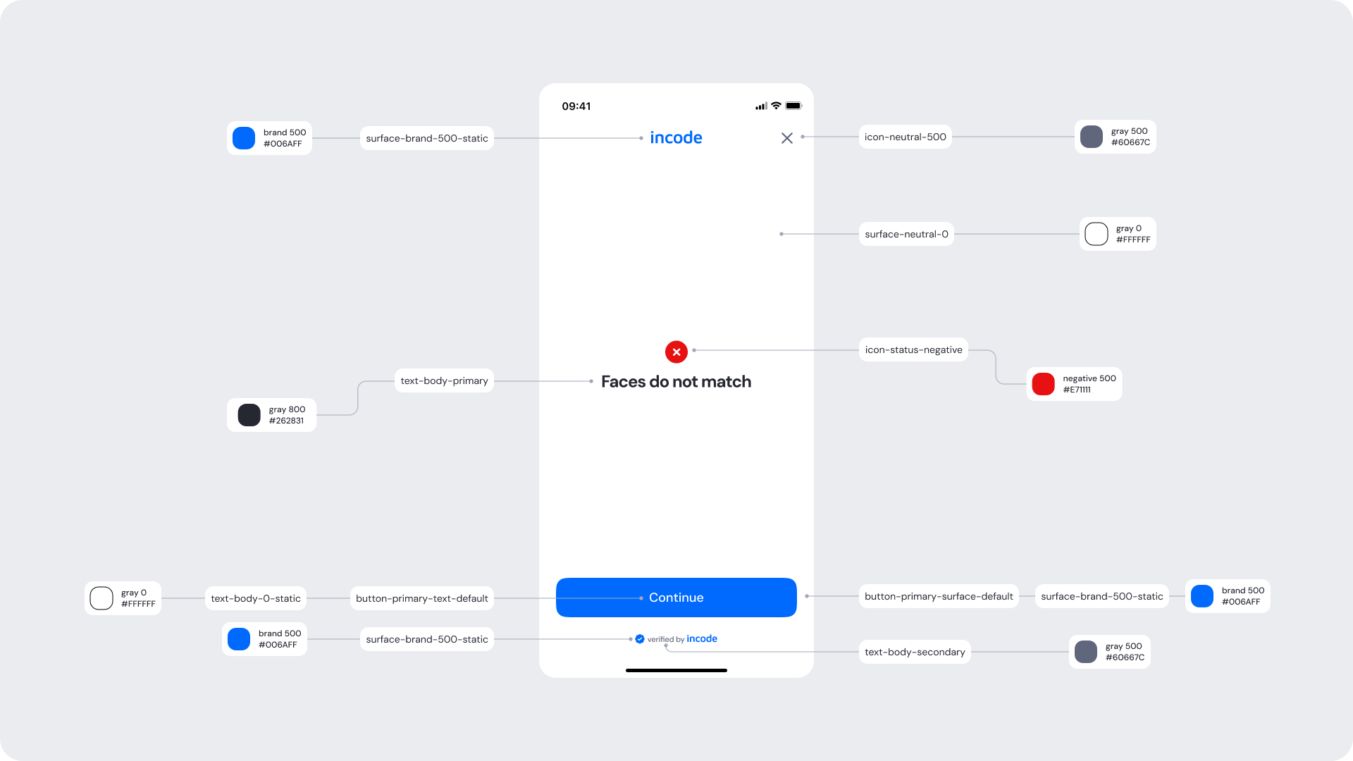
The error state communicates a failed comparison. Text, the error icon color, and the CTA can be branded, while the error icon shape and the result behavior remain fixed.
Customizable Elements
| Area |
What can be customized |
Notes |
| Text |
Error title (“Faces do not match”), description, CTA label |
Fully localizable |
| Buttons |
Label, color, radius |
Keep primary hierarchy |
| Brand Colors |
Header / text accents, CTA color |
Follows brand token system |
| Icons |
Icon color (error) |
Only color, not shape |
Fixed Elements
| Element |
Why it is fixed |
| Error icon shape |
Ensures immediate recognition and consistency |
| Error screen layout |
Preserves visual predictability |
| Result behavior |
Must hand off to the application’s downstream logic |
| Accessibility contrast |
Required to meet WCAG AA |
Token Reference
| UI Element |
Token |
Value |
| Error icon (circle) |
Icon/Status/Negative |
#E71111 |
| Error icon (x-mark) |
Icon/Neutral/0 |
#FFFFFF |
| Title text |
Text/Body/800 (Primary) |
#262831 |
| Description text |
Text/Body/500 (Secondary) |
#60667C |
| CTA background |
Button/Primary/Surface/Default |
#006AFF |
| CTA text |
Button/Primary/Text/Default |
#FFFFFF |
Design Notes
- Keep error messaging clear, direct, and non-technical.
- Use a meaningful error color (red) for the icon.
- Always provide a clear way to continue.