This section outlines the elements you can customize within the Face Capture module to match your brand while preserving Incode’s core UX. It clarifies which areas are flexible, such as text, illustrations, and brand colors and which elements remain fixed to ensure consistency, accessibility, and optimal capture performance across platforms.
Tutorial Screen
The Tutorial Screen prepares the user for the Face Capture step. It introduces the action, provides the necessary context, and sets expectations before the camera is activated.
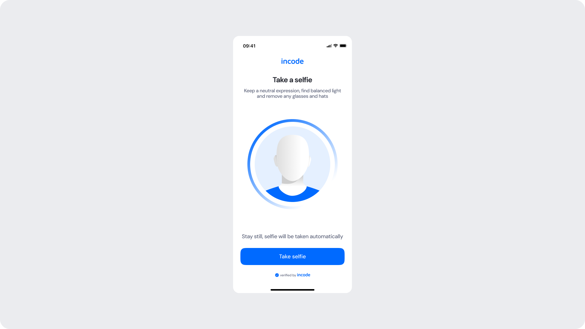
Customizable Elements
| Area |
What can be customized |
Notes |
| Text |
Title, subtitle, body text |
Fully localizable; tone can be adapted |
| Illustration |
Full replacement |
Must remain clear and represent a face |
| Brand Colors |
Header, highlight elements, illustration ring, button |
Uses brand tokens |
| Buttons |
Label, color, radius |
Must follow platform guidelines |
| Footer |
“Verified by Incode” line |
Optional but recommended |
Fixed Elements
| Element |
Why it is fixed |
| Layout structure |
Ensures consistency across modules |
| Silhouette style |
Must remain consistent with global UX |
| Spacing & safe areas |
Required for device compatibility |
| Text hierarchy |
Optimized for readability |
| Close icon position |
Standardized for user familiarity |
| WCAG minimum contrast |
Mandatory |
Token Reference
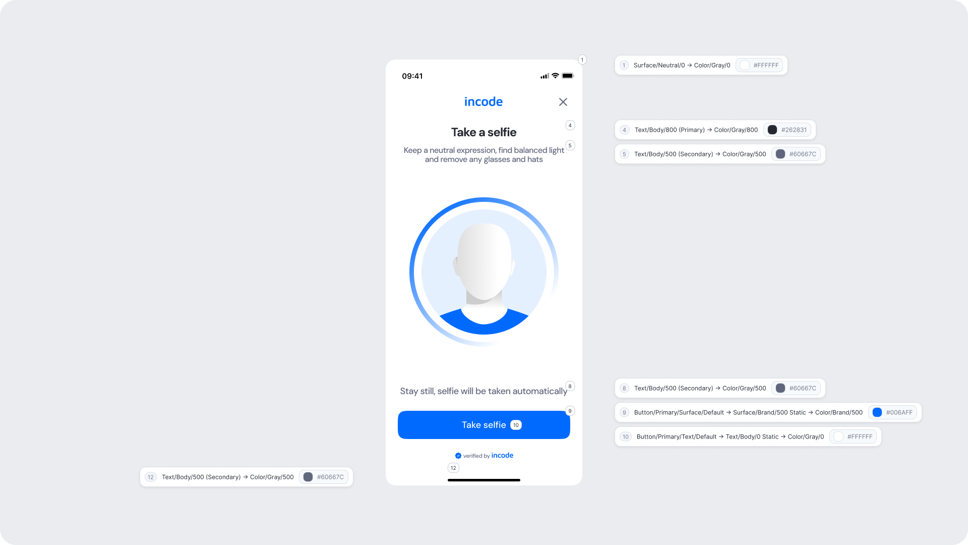
| UI Element |
Token |
Value |
| Background |
Surface/Neutral/0 |
#FFFFFF |
| Title text |
Text/Body/800 (Primary) |
#262831 |
| Subtitle text |
Text/Body/500 (Secondary) |
#60667C |
| Disclaimer |
Text/Body/500 (Secondary) |
#60667C |
| Button background |
Button/Primary/Surface/Default |
#006AFF |
| Button text |
Button/Primary/Text/Default |
#FFFFFF |
| Footer text |
Text/Body/500 (Secondary) |
#60667C |
Design Notes
- Keep copy short to minimize cognitive load.
- The illustration can be customized using color tokens on Web. For Native platforms, reach out so we can provide a tailored solution.
- Ensure tap targets meet accessibility guidelines.
- Maintain clear focus states for keyboard and screen reader users (Web).
Fake Permission Screen
The Fake Permission Screen is shown before the operating system displays its native camera permission modal. It prepares the user, explains why camera access is required, and significantly reduces the likelihood of users denying permission. This step increases trust and prevents interruptions during the selfie flow.
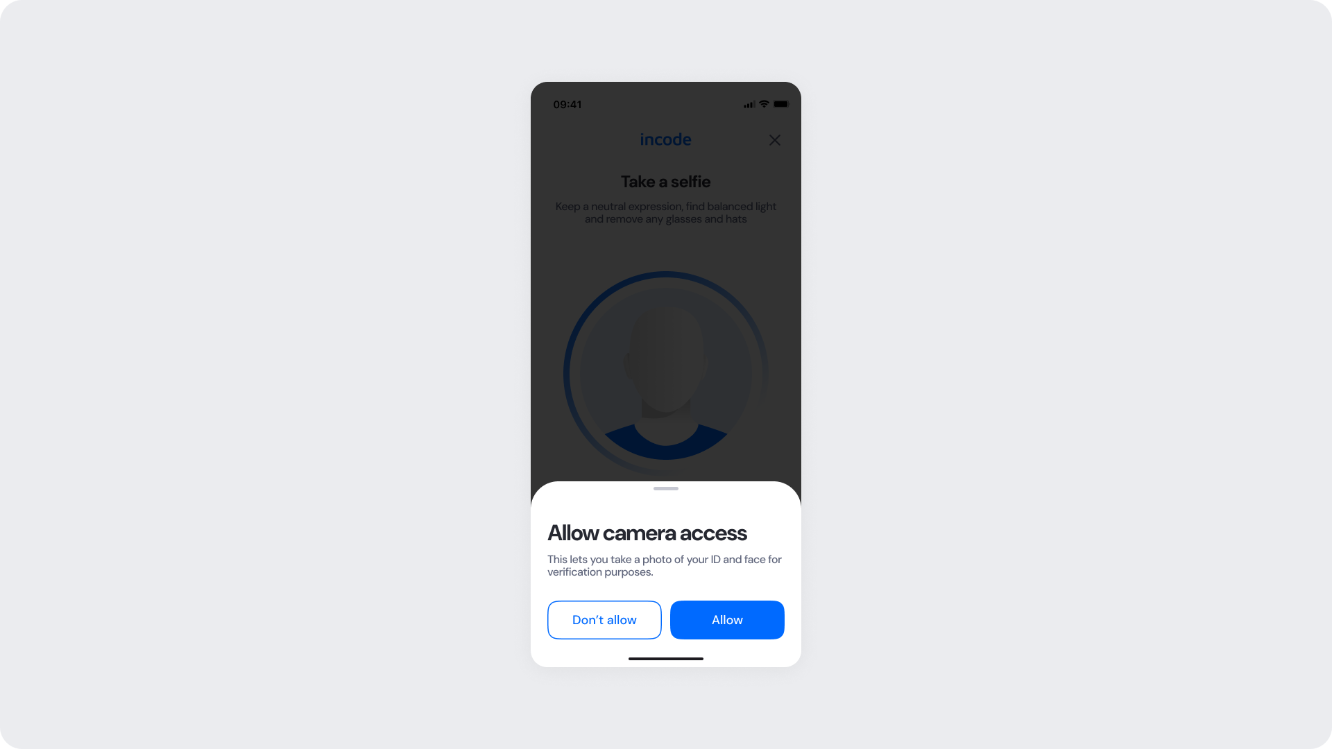
Customizable Elements
| Area |
What can be customized |
Notes |
| Text |
Title, subtitle, permission explanation |
Fully localizable; tone should remain reassuring |
| Buttons |
Label (“Allow”, “Don’t allow”), color, radius |
Must maintain primary/secondary hierarchy |
| Brand Colors |
Button accents, icon color, text accents |
Uses brand tokens |
| Modal Surface |
Background color, elevation, corner radius |
Must remain high-contrast and readable |
| Link/Help Text |
“Learn more” or similar supportive text |
Optional; can adapt tone based on compliance needs |
Fixed Elements
| Element |
Why it is fixed |
| Background dim opacity |
Indicates OS-level permission flow; needed for clarity |
| Modal position |
Standardized centered layout for all modules |
| Button hierarchy |
Mirrors OS expectations; prevents accidental “Don’t allow” taps |
| Safety text hierarchy |
Ensures user comprehension before OS prompt |
| Spacing & safe areas |
Required for device consistency |
| WCAG minimum contrast |
Mandatory |
Token Reference
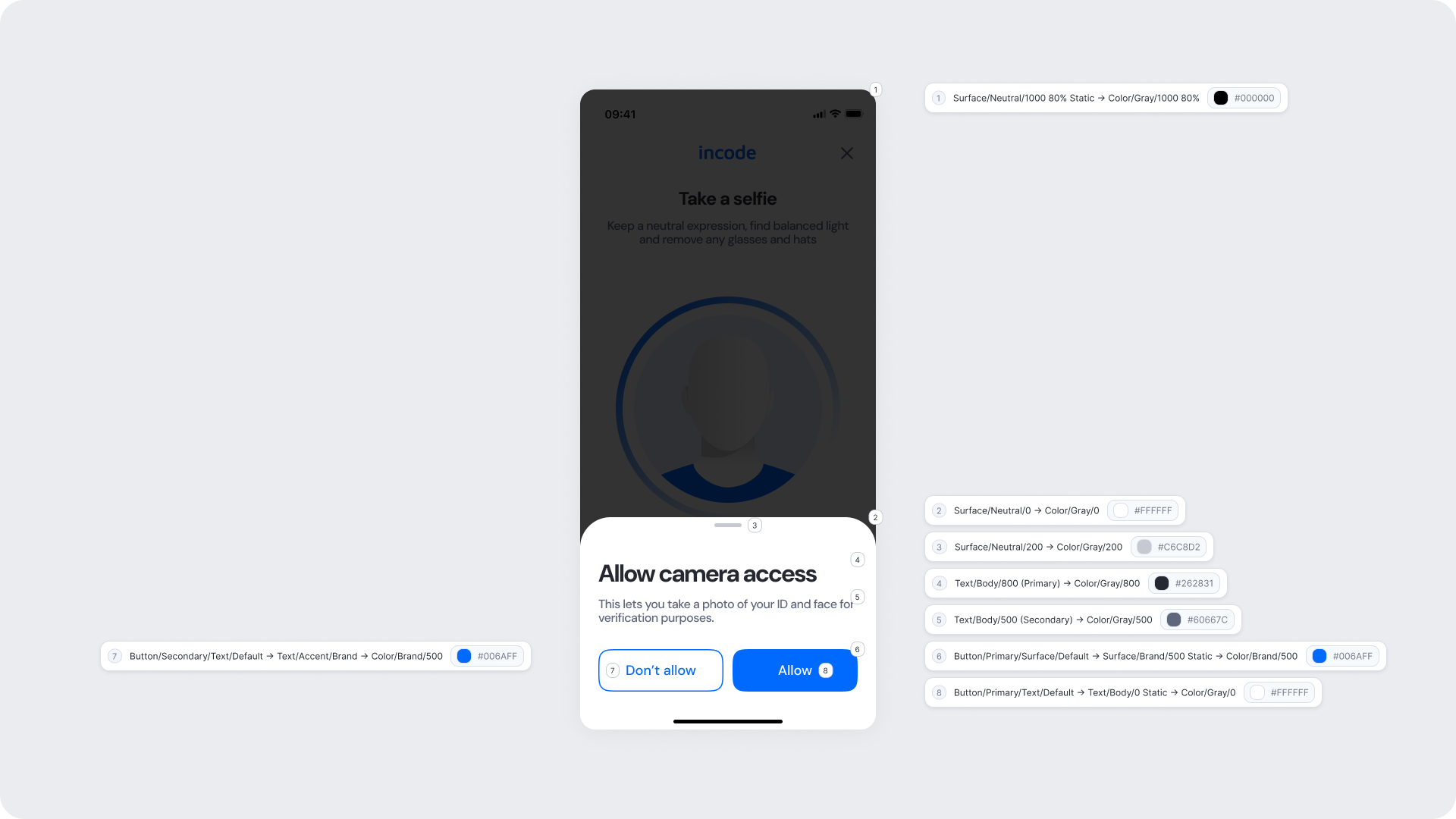
| UI Element |
Token |
Value |
| Dimmed background |
Surface/Neutral/1000 80% Static |
#000000 80% |
| Modal background |
Surface/Neutral/0 |
#FFFFFF |
| Title text |
Text/Body/800 (Primary) |
#262831 |
| Subtitle text |
Text/Body/500 (Secondary) |
#60667C |
| Primary button (Allow) |
Button/Primary/Surface/Default |
#006AFF |
| Primary button text |
Button/Primary/Text/Default |
#FFFFFF |
| Secondary button |
Button/Secondary/Border/Default |
#006AFF |
| Secondary button text |
Button/Secondary/Text/Default |
#006AFF |
Design Notes
- The pre-permission modal reduces drop-off by providing context before the OS permission.
- Maintain a clear hierarchy between primary (Allow) and secondary (Don’t allow) actions.
- Keep the dim overlay consistent to align with OS modal expectations.
- Ensure high contrast between modal, text, and background elements.
- Avoid adding extra steps or interaction on this screen.
Capture Screens
During capture, the user aligns their face within the silhouette, and the system evaluates real-time conditions such as lighting, alignment, and distance. Once requirements are met, the photo is taken automatically. Colors and on-screen text can be customized to match your brand, while the silhouette itself is fixed, as it plays an essential role in helping users position their face correctly.
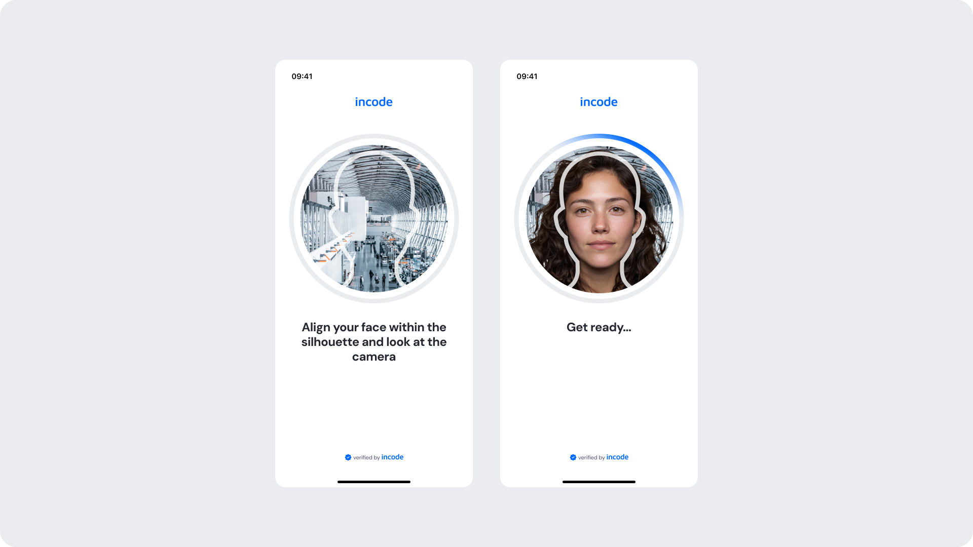
Customizable Elements
| Area |
What can be customized |
Notes |
| Text |
Instruction text (“Align your face…”, “Get ready…”) |
Fully localizable |
| Brand Colors |
Progress indicator, icon colors, header color |
Control via tokens |
| Illustration |
Silhouette outline color |
Color only — shape cannot change |
| Background |
Neutral/light surfaces |
Must maintain contrast |
| Footer |
“Verified by Incode” line |
Optional |
Fixed Elements
| Element |
Why it is fixed |
| Silhouette shape |
Essential for proper face alignment |
| Auto-capture behavior |
Ensures consistency and accuracy across devices |
| Detection logic |
Required for system-level validation (lighting, distance, etc.) |
| Layout & hierarchy |
Preserves visual consistency across modules |
| Minimum contrast |
Mandatory to meet accessibility standards |
| Progress indicator arc |
Behavior and animation timing remain fixed |
Token Reference
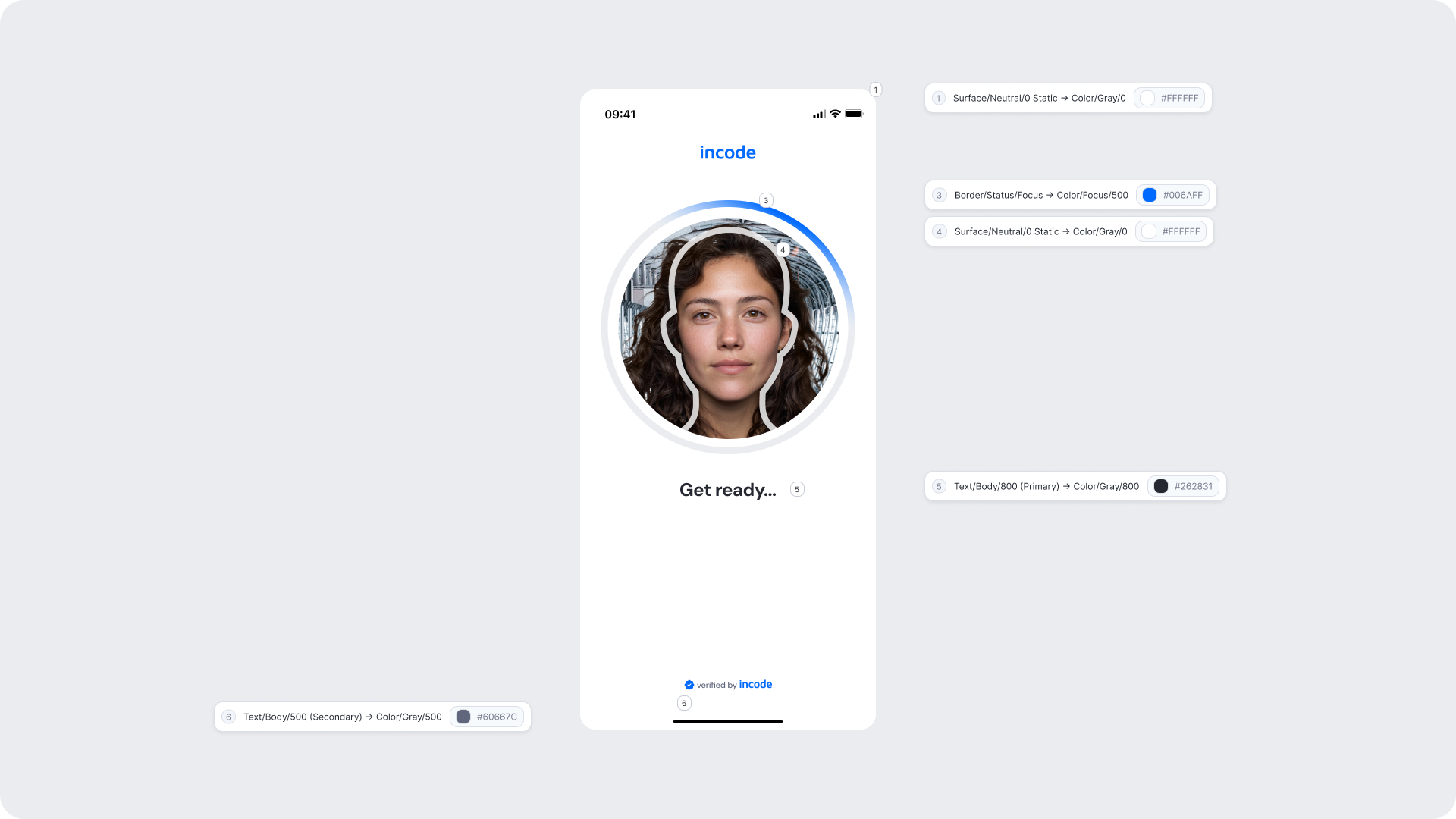
| UI Element |
Token |
Value |
| Instruction text |
Text/Body/800 (Primary) |
#262831 |
| Silhouette ring (outer) |
Border/Neutral/100 |
#EBECEF |
| Silhouette arc progress |
Border/Status/Focus |
#006AFF |
| Background |
Surface/Neutral/0 Static |
#FFFFFF |
| Footer text |
Text/Body/500 (Secondary) |
#006AFF |
Design Notes
- The silhouette cannot be altered in shape, only color, as it ensures correct face alignment.
- The progress arc represents detection readiness; its behavior should remain consistent to avoid confusing users.
- Use brand colors subtly to avoid distracting from the user’s face.
- Keep instruction text short and focused to reduce cognitive load.
- Maintain clear focus states and large tap areas (for accessibility on Web).
Manual Capture
Manual capture is triggered after a period of inactivity (default: 30 seconds) when automatic detection conditions are not met. In this mode, the user aligns their face within the silhouette and presses the capture button manually. This ensures the user can still complete the verification even in low-light, complex backgrounds, or edge-case scenarios.
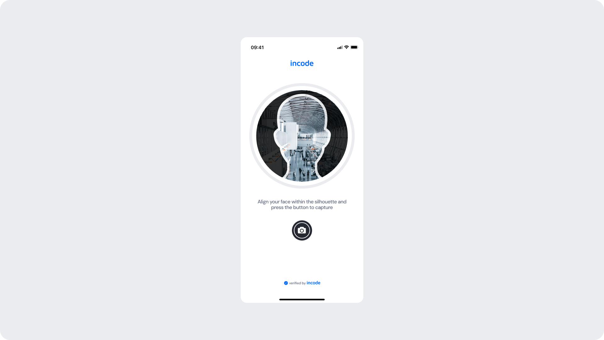
Customizable Elements
| Area |
What can be customized |
Notes |
| Text |
Instructional text (“Align your face… and press the button…”) |
Fully localizable |
| Button |
Label, color, radius, icon color |
Must follow platform accessibility & tap-target rules |
| Brand Colors |
Header, accent rings, button background, icon accents |
Driven by brand tokens |
| Silhouette Color |
Outer ring color only |
Shape/size cannot change |
| Background |
Light/neutral backgrounds |
Must maintain contrast with silhouette |
| Footer |
“Verified by Incode” line |
Optional |
Fixed Elements
| Element |
Why it is fixed |
| Silhouette shape |
Core UX element ensuring proper face alignment |
| Camera button placement |
Ensures reachability and consistency across platforms |
| Detection logic fallback |
Manual mode must always follow auto mode |
| Layout spacing & safe areas |
Required for compatibility across device sizes |
| Accessibility contrast |
Must meet WCAG AA requirements |
| Tap target size for button |
Required for usability and accessibility |
Token Reference
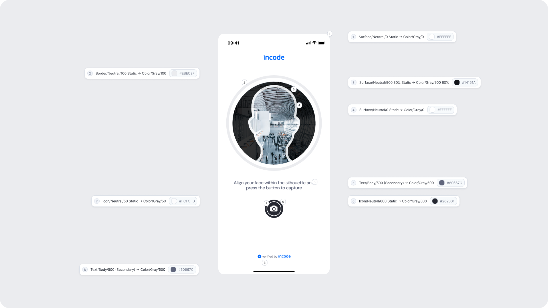
| UI Element |
Token |
Value |
| Silhouette border |
Border/Neutral/100 |
#EBECEF |
| Silhouette background |
Surface/Neutral/900 80% Static |
#14151A |
| Button icon |
Icon/Neutral/50 Static |
#FCFCFD |
| Button background |
Icon/Neutral/800 Static |
#262831 |
| Instruction text |
Text/Body/500 (Secondary) |
#60667C |
| Background |
Surface/Neutral/0 Static |
#FFFFFF |
| Footer text/link |
Text/Body/500 (Secondary) |
#60667C |
Design Notes
- Manual mode provides a fail-safe capture method when automatic detection is not possible.
- Ensure the camera button remains highly visible against any background.
- Keep instructional text concise and actionable to reduce friction.
- The silhouette must remain visible at all times; avoid color changes that reduce contrast.
- Button must preserve accessible tap size (minimum 44×44 px on mobile).
Capture Complete (Uploading & Success)
Once the selfie is captured, either automatically or manually, the user transitions into the Uploading and Success states. These screens reassure the user that the capture is being processed and provide a clear confirmation when the image is accepted. Both the loading ring and the confirmation colors can be branded to match your product’s identity.
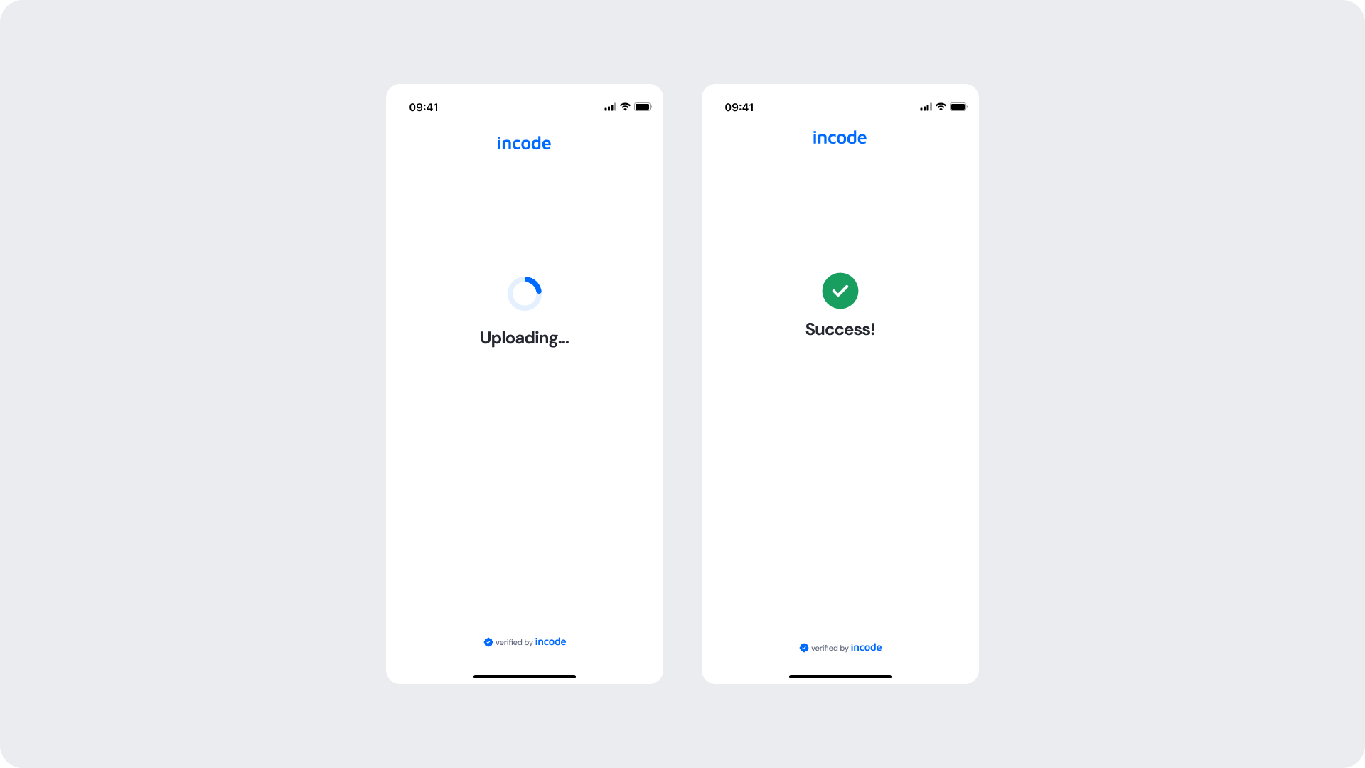
Customizable Elements
| Area |
What can be customized |
Notes |
| Text |
“Uploading…”, “Success!”, body text |
Fully localizable |
| Brand Colors |
Progress ring, outline, success colors |
Should follow brand tokens |
| Surfaces |
Background, circular surface |
Must ensure contrast and clarity |
| Footer |
“Verified by Incode” |
Optional |
| Animation |
Progress ring color transitions |
Only color; timing/behavior is fixed |
Fixed Elements
| Element |
Why it is fixed |
| Progress ring behavior |
Ensures consistent feedback cadence across all modules |
| Success timing |
User feedback consistency / prevents premature transitions |
| Layout structure |
Standardized for readability and predictability |
| Minimum contrast |
Required for WCAG AA compliance |
| Loading animation arc |
Behavior cannot be modified to maintain UX continuity |
Token Reference
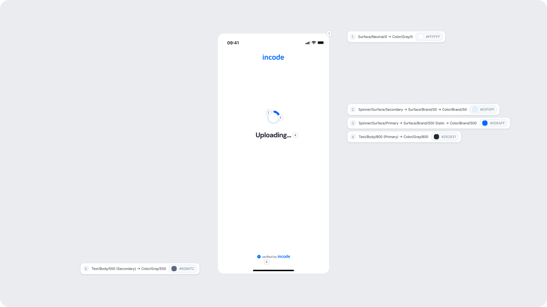
| UI Element |
Token |
Value |
| Loading ring (outer) |
Spinner/Surface/Primary |
#006AFF |
| Loading ring (inner) |
Spinner/Surface/Secondary |
#E5F0FF |
| Text (“Uploading…”) |
Text/Body/800 (Primary) |
#262831 |
| Background |
Surface/Neutral/0 |
#FFFFFF |
| Footer text |
Text/Body/500 (Secondary) |
#60667C |
Design Notes
- Keep messaging short and neutral, users should feel reassured, not overwhelmed.
- The green ring color communicates a positive state; ensure it remains accessible and high-contrast.
- Background should remain clean and unobtrusive to keep focus on the processing state.
- Avoid adding interaction in these screens; the user should not be able to interrupt this step.
- Maintain consistent ring thickness and spacing to preserve visual rhythm across modules.
Error Screens
Error screens appear when an issue occurs during capture, such as face misalignment, incorrect lighting, occlusions, or when all attempts have been exhausted. These screens help guide users back into the flow by providing corrective instructions or informing them that manual review will be needed. While text and styling can be branded, error types cannot be removed, as they correspond to specific detection events within the experience.
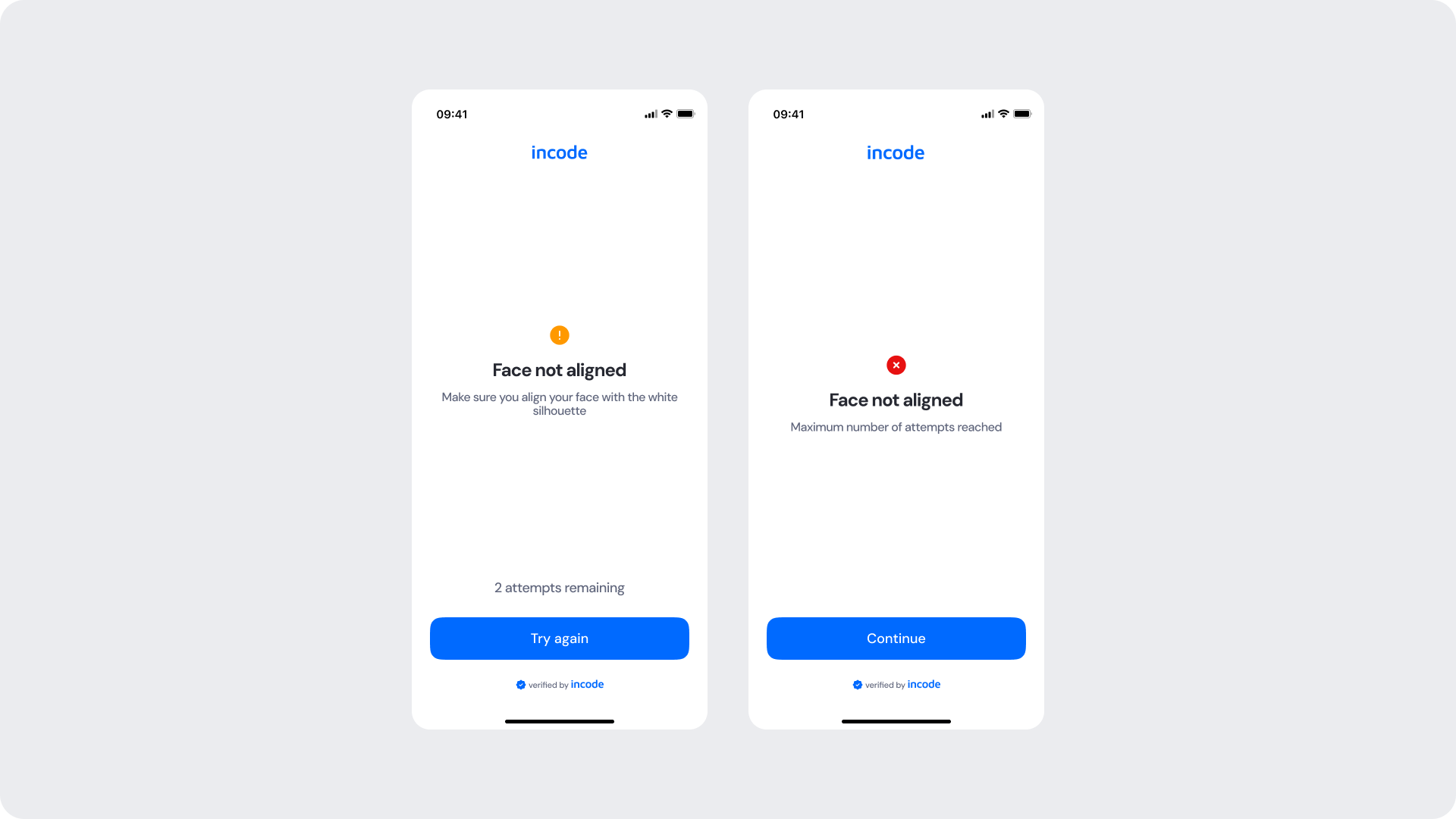
Customizable Elements
| Area |
What can be customized |
Notes |
| Text |
Error title, description, remaining attempts label |
Fully localizable |
| Buttons |
CTA labels (“Try again”, “Continue”), button color, radius |
Must keep primary/secondary hierarchy |
| Brand Colors |
Header, accent colors, button colors |
Follows brand token system |
| Icons |
Icon color (warning, error) |
Only color, not shape |
| Background |
Neutral/light surfaces |
Must maintain strong contrast with text + icon |
Fixed Elements
| Element |
Why it is fixed |
| Error event types |
Linked to detection logic; cannot be removed or reordered |
| Error icon shapes |
Ensures immediate recognition and consistency across modules |
| Error screen layout |
Preserves visual predictability |
| “Attempts remaining” logic |
Required for accuracy and flow integrity |
| Final error behavior |
Must proceed to next step with manual review |
| Accessibility contrast |
Required to meet WCAG AA |
Token Reference
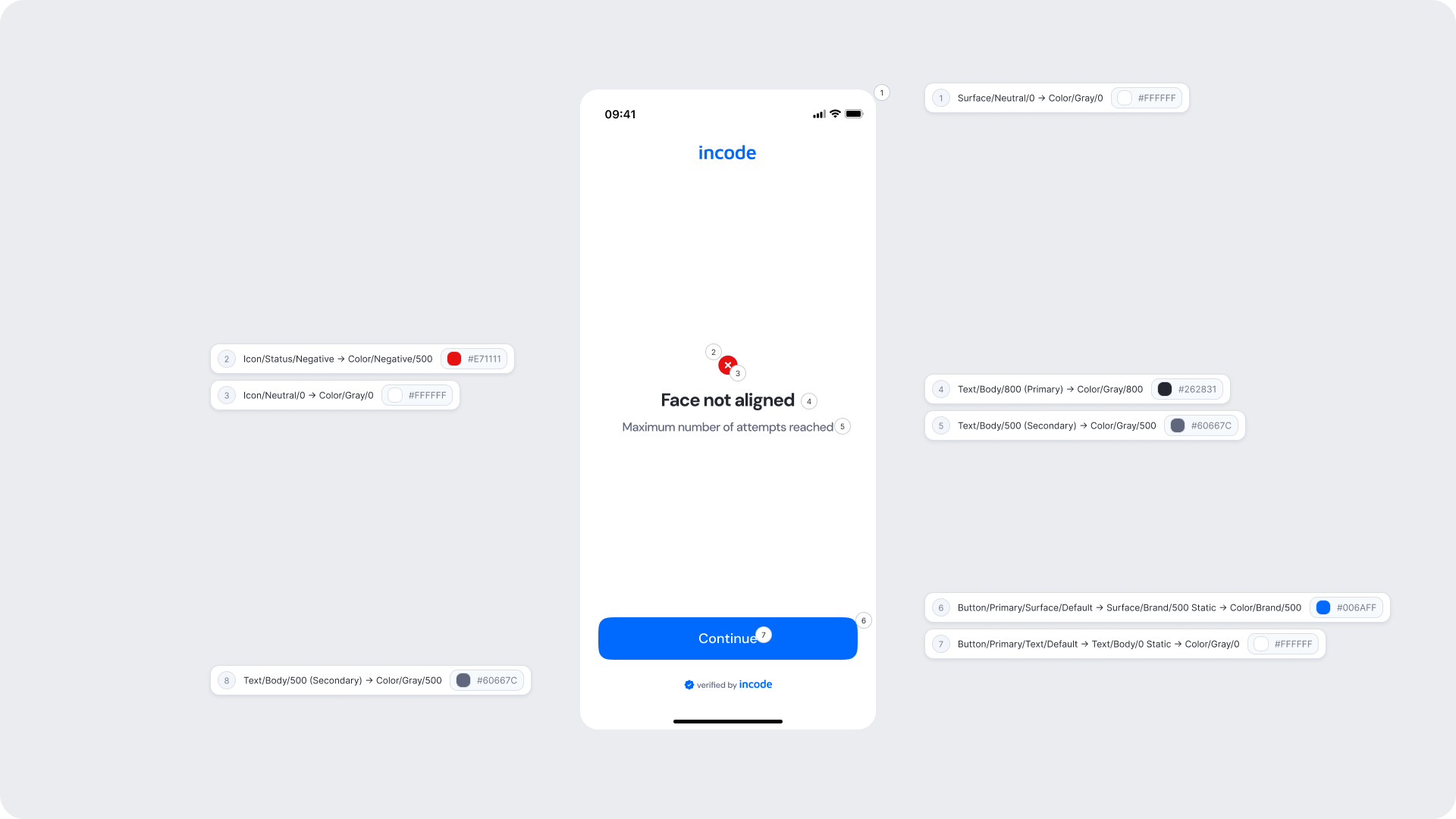
| UI Element |
Token |
Value |
| Icon (error circle) |
Icon/Status/Negative |
#E71111 |
| Icon (x-mark) |
Icon/Neutral/0 |
#FFFFFF |
| Title text |
Text/Body/800 (Primary) |
#262831 |
| Description text |
Text/Body/500 (Secondary) |
#60667C |
| Background |
Surface/Neutral/0 |
#FFFFFF |
| CTA background |
Button/Primary/Surface/Default |
#006AFF |
| CTA text |
Button/Primary/Text/Default |
#FFFFFF |
| Footer text |
Text/Body/500 (Secondary) |
#006AFF |
Design Notes
- Error messaging should remain clear, direct, and action-oriented.
- Use meaningful icon colors (yellow for warnings, red for errors).
- Maintain consistent spacing and visual hierarchy for readability.
- “Try again” should always feel like the primary action when applicable.
- Final error screens should not offer a retry, only a “Continue” action guiding users into manual review logic.
- Avoid long or overly technical messages; users should understand the issue at a glance.