This section outlines the elements you can customize within the Document Capture module to match your brand while preserving Incode’s core UX. It clarifies which areas are flexible, such as text, illustrations, and brand colors and which elements remain fixed to ensure consistency, accessibility, and optimal capture performance across platforms.
Document Capture Tutorial
The Document Capture Tutorial Screen introduces users to the document verification process before capture begins. It explains the available upload methods and prepares users for the next steps in the flow.
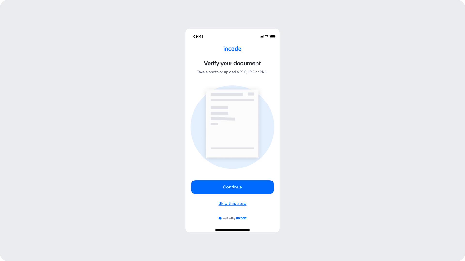
Customizable Elements
| Area |
What can be customized |
Notes |
| Title text |
“Verify your document” |
Fully localizable. |
| Subtitle text |
Supporting instructional copy |
Can reference supported upload formats. |
| Illustration |
Document placeholder illustration |
Can be adapted to match brand style. |
| Primary button |
Label, color, radius |
Used for the main capture/upload action. |
| Secondary action |
“Skip this step” |
Optional depending on flow requirements. |
| Footer |
“verified by incode” |
Optional but recommended. |
| Brand colors |
Accent and CTA colors |
Uses brand tokens. |
Fixed Elements
| Element |
Why it is fixed |
| Tutorial structure |
Standardized onboarding step before document capture. |
| Illustration placement |
Maintains visual consistency across modules. |
| Action hierarchy |
Primary action remains visually prioritized. |
| Spacing & safe areas |
Required for responsive compatibility. |
| Accessibility contrast requirements |
Mandatory for compliance. |
Token Reference
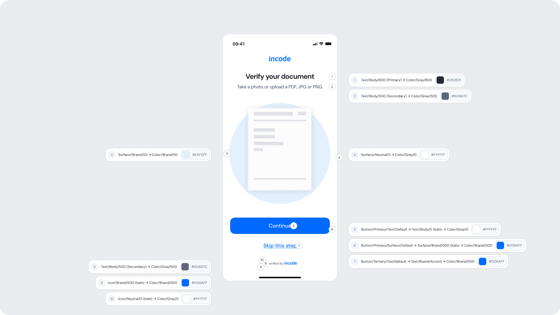
| UI Element |
Token |
Value |
| Title text |
Text/Body/800 (Primary) → Color/Gray/800 |
#262831 |
| Subtitle text |
Text/Body/500 (Secondary) → Color/Gray/500 |
#60667C |
| Screen background |
Surface/Neutral/0 → Color/Gray/0 |
#FFFFFF |
| Primary button text |
Button/Primary/Text/Default → Text/Body/0 Static → Color/Gray/0 |
#FFFFFF |
| Primary button background |
Button/Primary/Surface/Default → Surface/Brand/500 Static → Color/Brand/500 |
#006AFF |
| Secondary action text |
Button/Tertiary/Text/default → Text/Brand/Accent → Color/Brand/500 |
#006AFF |
| Footer text (“verified by incode”) |
Text/Body/500 (Secondary) → Color/Gray/500 |
#60667C |
| Footer brand icon |
Icon/Brand/500 Static → Color/Brand/500 |
#006AFF |
| Footer icon |
Icon/Neutral/0 Static → Color/Gray/0 |
#FFFFFF |
Design Notes
- Keep instructional messaging concise and action-oriented.
- Ensure upload methods are easy to understand before starting capture.
- The illustration should support comprehension without distracting from the CTA.
- Preserve strong visual emphasis on the primary action.
- Secondary actions should remain accessible but visually less prominent.
Document Verification Method
The document verification method selection allows users to choose how they want to provide their document for verification, including taking a photo, selecting an image from the camera roll, or uploading a file..
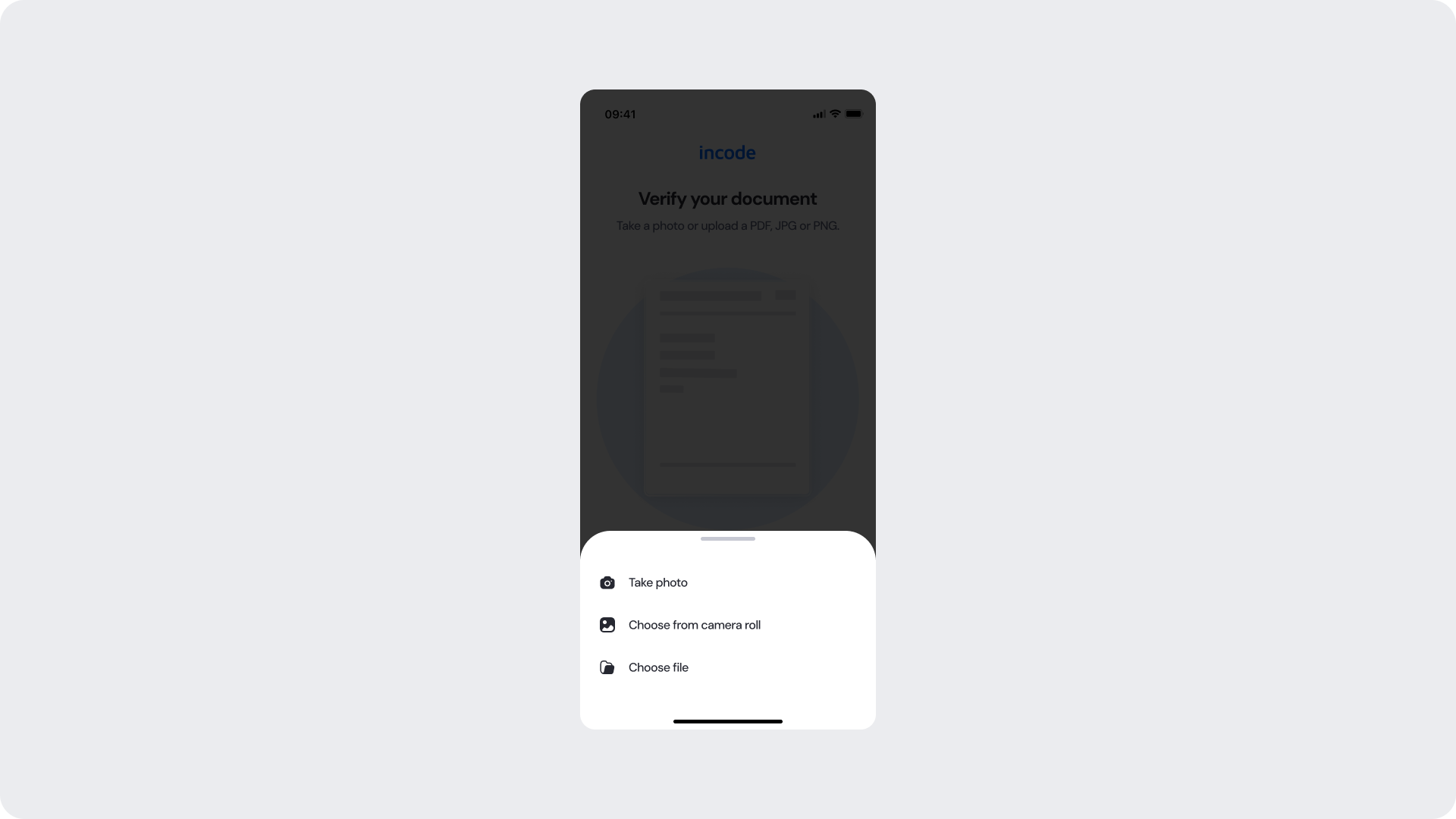
Customizable Elements
| Area |
What can be customized |
Notes |
| Sheet background |
Bottom sheet styling |
Must preserve readability and elevation. |
| Option labels |
Upload method labels |
Fully localizable. |
| Icons |
Upload method icons |
Can be customized while preserving semantic meaning. |
| Brand colors |
Accent colors if applicable |
Must remain accessible. |
Fixed Elements
| Element |
Why it is fixed |
| Bottom sheet behavior |
Native interaction pattern consistency. |
| Action layout |
Standardized spacing and touch target sizing. |
| Safe area spacing |
Required for device compatibility. |
| Overlay interaction |
Prevents accidental interaction with background content. |
| Accessibility touch targets |
Required for usability compliance. |
Token Reference
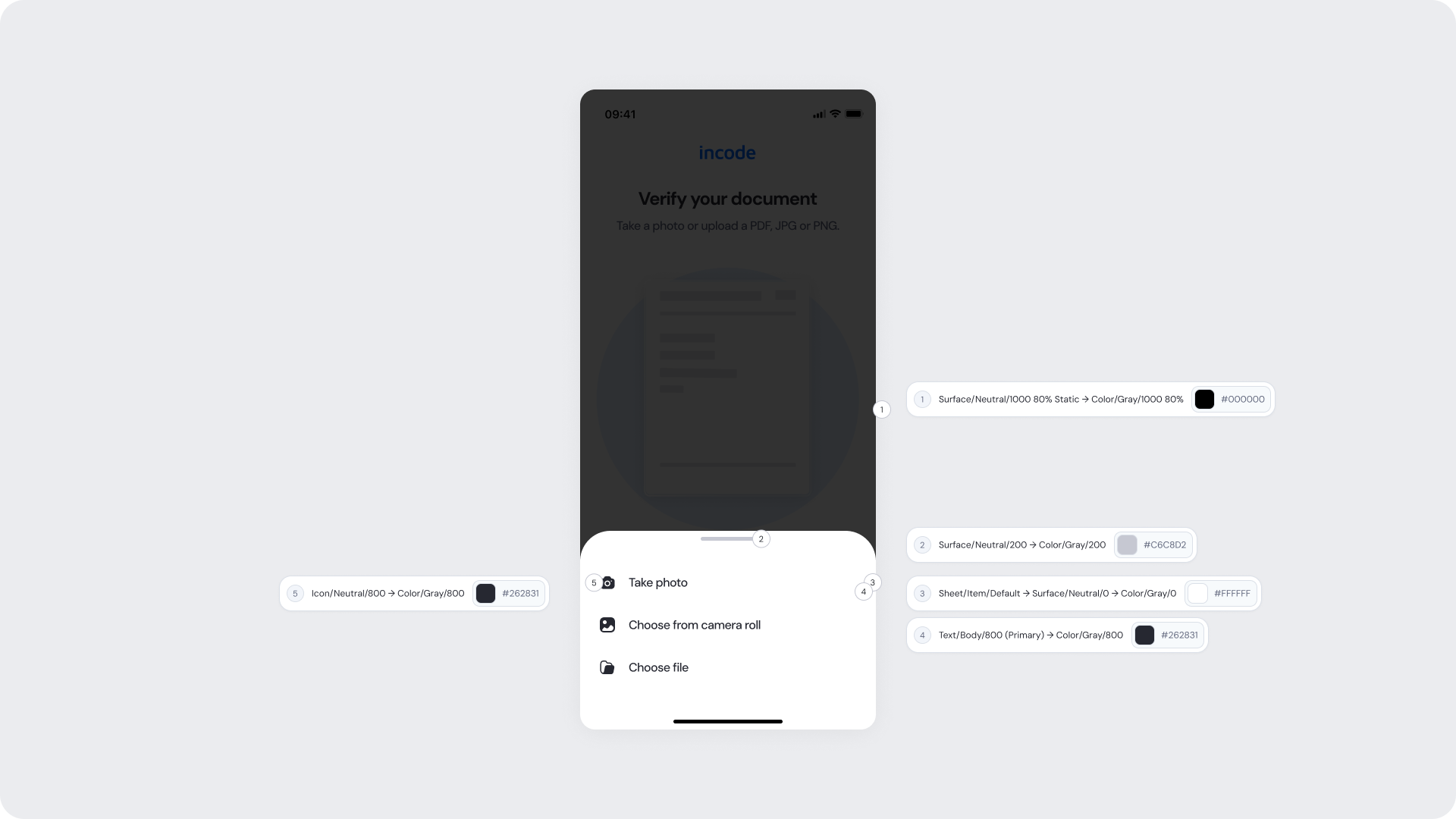
| UI Element |
Token |
Value |
| Overlay background |
Surface/Neutral/1000 80% Static → Color/Gray/1000 80% |
#000000 |
| Bottom sheet background |
Sheet/Item/Default → Surface/Neutral/0 → Color/Gray/0 |
#FFFFFF |
| Drag handle |
Surface/Neutral/200 → Color/Gray/200 |
#C6C8D2 |
| Option text |
Text/Body/800 (Primary) → Color/Gray/800 |
#262831 |
| Option icons |
Icon/Neutral/800 → Color/Gray/800 |
#262831 |
Design Notes
- Keep option labels short and scannable.
- Maintain familiar mobile bottom sheet interaction patterns.
- Ensure icons clearly represent each upload method.
- Preserve sufficient contrast between overlay and sheet.
- Touch targets should remain large enough for accessibility.
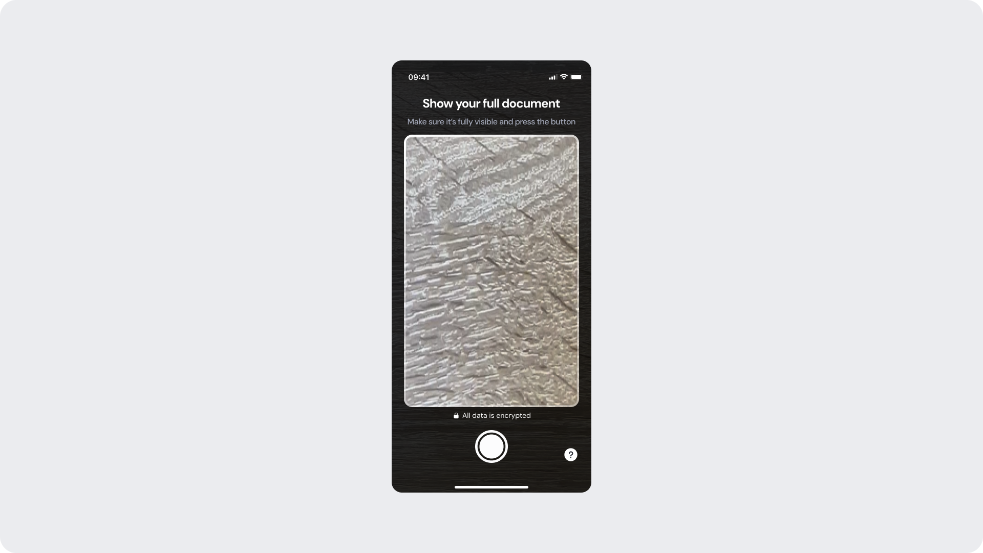
Capture Screen
The Capture Screen enables users to capture a clear image of their document using the device camera.
Customizable Elements
| Area |
What can be customized |
Notes |
| Title text |
“Show your full document” |
Fully localizable. |
| Subtitle text |
Capture guidance copy |
Should remain short and instructional. |
| Capture frame styling |
Border radius and color |
Must preserve visibility and guidance clarity. |
| Capture button styling |
Shape, border, color |
Must remain recognizable as capture action. |
| Help icon |
Help/support trigger icon |
Optional depending on flow requirements. |
Fixed Elements
| Element |
Why it is fixed |
| Camera preview behavior |
Controlled by native device. |
| Capture interaction |
Standardized camera experience. |
| Frame positioning |
Ensures optimal document detection. |
| Safe area handling |
Required for responsive compatibility. |
| Accessibility contrast requirements |
Mandatory for compliance. |
Token Reference
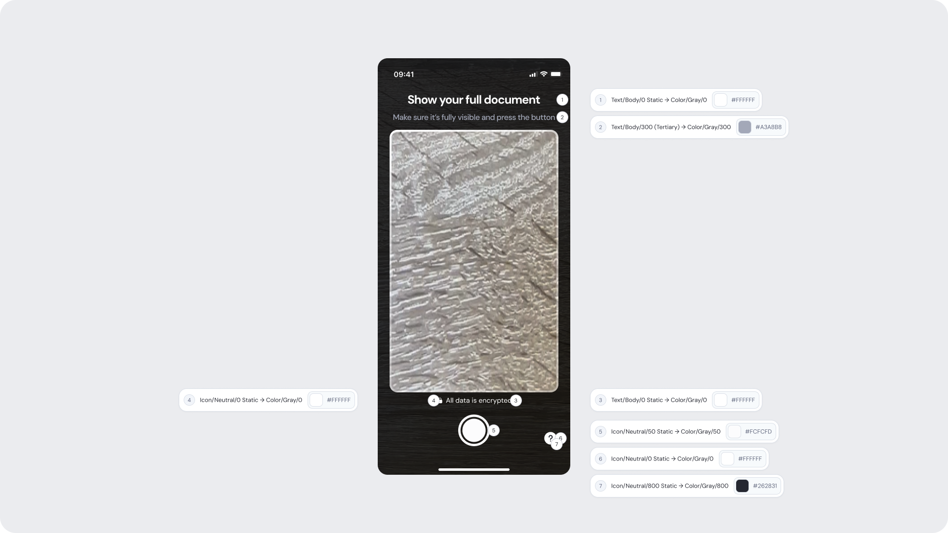
| UI Element |
Token |
Value |
| Title text |
Text/Body/0 Static → Color/Gray/0 |
#FFFFFF |
| Subtitle text |
Text/Body/300 (Tertiary) → Color/Gray/300 |
#A3A8B8 |
| Footer text (“All data is encrypted”) |
Text/Body/0 Static → Color/Gray/0 |
#FFFFFF |
| Footer lock icon |
Icon/Neutral/0 Static → Color/Gray/0 |
#FFFFFF |
| Capture button inner fill |
Icon/Neutral/50 Static → Color/Gray/50 |
#FCFCFD |
| Capture button outer ring |
Icon/Neutral/0 Static → Color/Gray/0 |
#FFFFFF |
| Help icon background |
Icon/Neutral/0 Static → Color/Gray/0 |
#FFFFFF |
| Help icon symbol |
Icon/Neutral/800 Static → Color/Gray/800 |
#262831 |
Design Notes
- Keep instructions visible but lightweight over the camera feed.
- Ensure the capture frame clearly communicates required positioning.
- Footer reassurance messaging should not obstruct capture interactions.
- Maintain high contrast for all overlay UI elements.
- Camera controls should remain large and easy to tap.
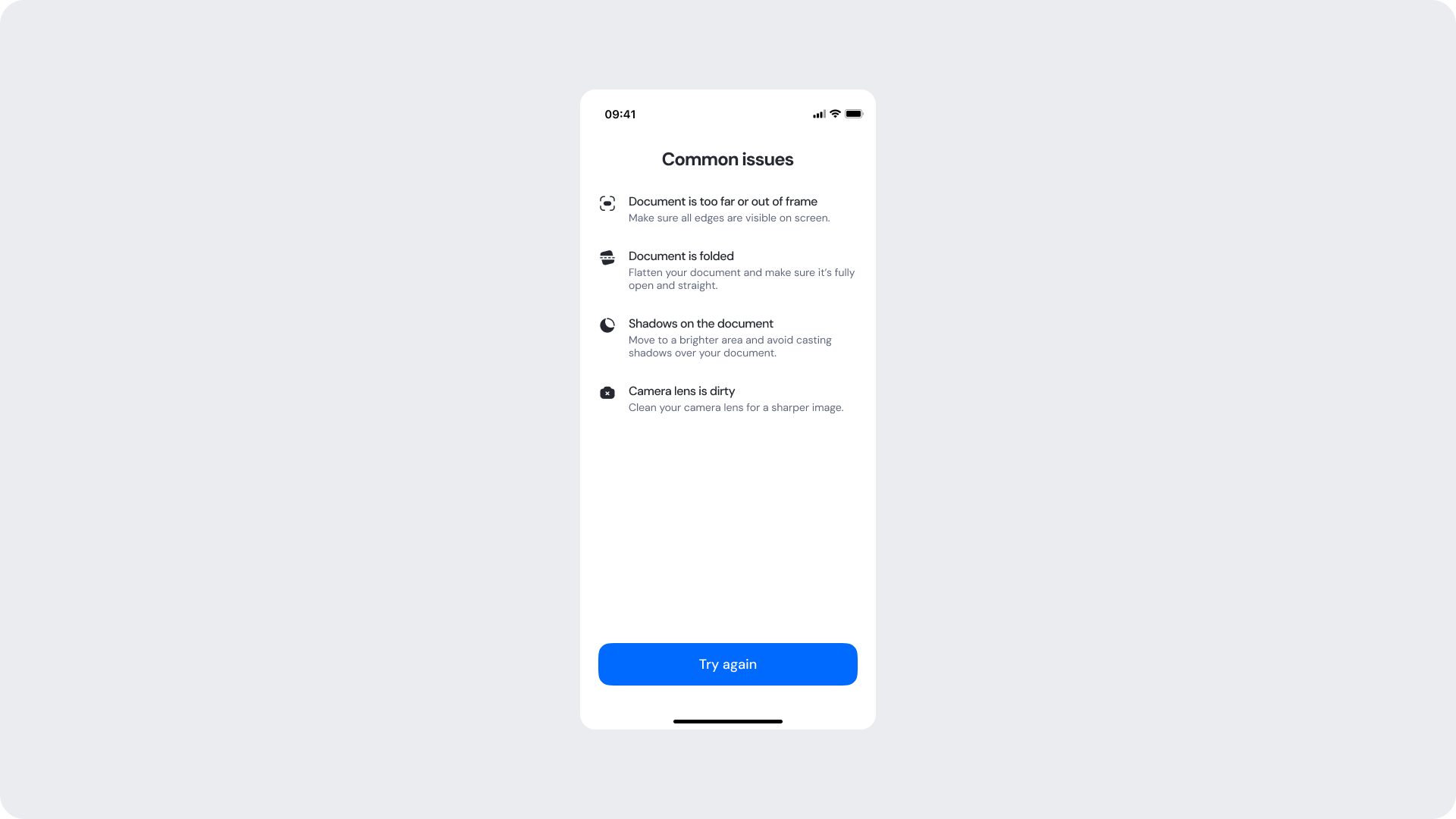
Common Issues
The Common Issues Screen provides guidance when users tap the help icon during document capture. It explains common document capture problems and helps users understand how to achieve a successful capture.
Customizable Elements
| Area |
What can be customized |
Notes |
| Title text |
“Common issues” |
Fully localizable. |
| Issue titles |
Problem descriptions |
Should remain concise and easy to scan. |
| Issue descriptions |
Supporting guidance copy |
Can be adapted to client tone of voice. |
| Issue icons |
Visual indicators for each issue |
Must preserve semantic meaning. |
| Primary button |
Retry action styling |
Used for recapture flow. |
Fixed Elements
| Element |
Why it is fixed |
| Issue list structure |
Optimized for readability and troubleshooting. |
| Retry flow behavior |
Required for verification continuity. |
| Button hierarchy |
Maintains consistency across modules. |
| Spacing & alignment |
Required for responsive behavior. |
| Accessibility requirements |
Mandatory for compliance. |
Token Reference
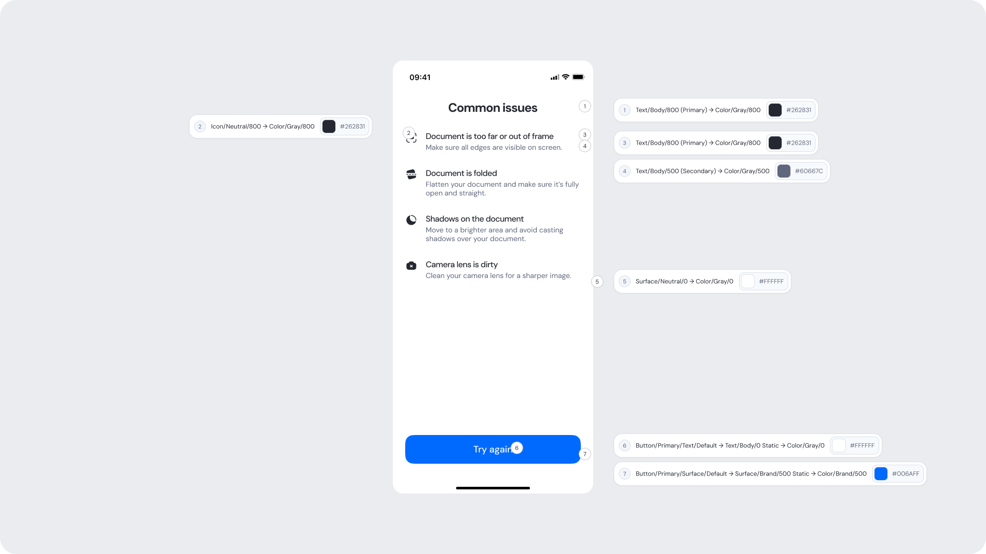
| UI Element |
Token |
Value |
| Title text |
Text/Body/800 (Primary) → Color/Gray/800 |
#262831 |
| Issue icons |
Icon/Neutral/800 → Color/Gray/800 |
#262831 |
| Issue title text |
Text/Body/800 (Primary) → Color/Gray/800 |
#262831 |
| Issue description text |
Text/Body/500 (Secondary) → Color/Gray/500 |
#60667C |
| Screen background |
Surface/Neutral/0 → Color/Gray/0 |
#FFFFFF |
| Primary button text |
Button/Primary/Text/Default → Text/Body/0 Static → Color/Gray/0 |
#FFFFFF |
| Primary button background |
Button/Primary/Surface/Default → Surface/Brand/500 Static → Color/Brand/500 |
#006AFF |
Design Notes
- Keep troubleshooting content actionable and easy to skim.
- Avoid technical or overly complex explanations.
- Icons should support fast visual recognition of problems.
- Ensure enough spacing between issue rows for readability.
- Maintain clear emphasis on the retry action.
Capture Review Screen
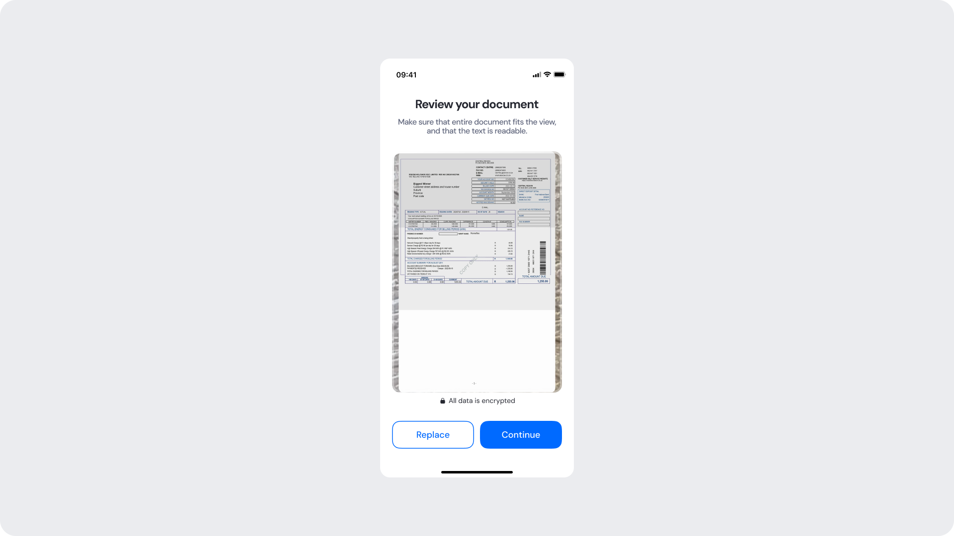
The Capture Review Screen allows users to review the captured document image before submitting it for verification. Users can confirm that the document is fully visible and readable or retake the photo if needed.
Customizable Elements
| Area |
What can be customized |
Notes |
| Title text |
“Review your document” |
Fully localizable. |
| Subtitle text |
Supporting instructional copy |
Should remain concise and easy to understand. |
| Primary button |
Label, color, radius |
Used to continue the verification flow. |
| Secondary button |
Label, color, radius |
Used to retake the document image. |
| Document container styling |
Border radius, shadows |
Must preserve document visibility. |
| Footer |
“All data is encrypted” |
Optional but recommended. |
Fixed Elements
| Element |
Why it is fixed |
| Document preview behavior |
Ensures users can properly validate the captured image. |
| Action hierarchy |
Continue action remains visually prioritized. |
| Button placement |
Standardized across modules for consistency. |
| Spacing & safe areas |
Required for responsive compatibility. |
| Accessibility contrast requirements |
Mandatory for compliance. |
Token Reference
| UI Element |
Token |
Value |
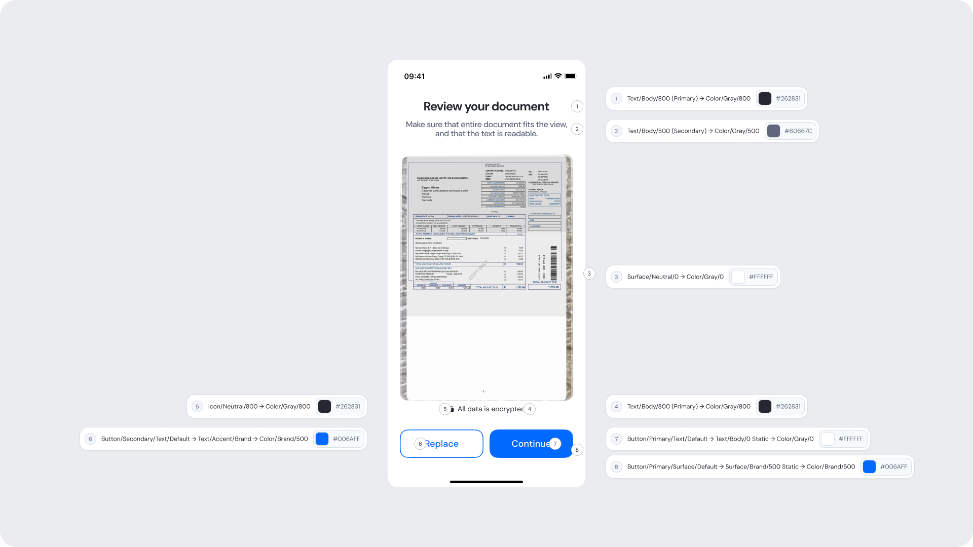
| Title text |
Text/Body/800 (Primary) → Color/Gray/800 |
#262831 |
| Subtitle text |
Text/Body/500 (Secondary) → Color/Gray/500 |
#60667C |
| Background |
Surface/Neutral/0 → Color/Gray/0 |
#FFFFFF |
| Primary button background |
Button/Primary/Surface/Default → Surface/Brand/500 Static → Color/Brand/500 |
#006AFF |
| Primary button text |
Button/Primary/Text/Default → Text/Body/0 Static → Color/Gray/0 |
#FFFFFF |
| Secondary button text |
Button/Secondary/Text/Default → Text/Brand/Accent → Color/Brand/500 |
#006AFF |
| Secondary button border |
Border/Brand/500 → Color/Brand/500 |
#006AFF |
| Footer text (“All data is encrypted”) |
Text/Body/500 (Secondary) → Color/Gray/500 |
#60667C |
| Footer lock icon |
Icon/Neutral/500 → Color/Gray/500 |
#60667C |
Design Notes
- Ensure the document preview remains large and readable.
- Keep instructions concise and action-oriented.
- Maintain clear visual distinction between primary and secondary actions.
- Avoid obstructing the document image with overlays or excessive UI.
- Footer reassurance messaging should remain subtle and non-disruptive.
Image Upload Screens
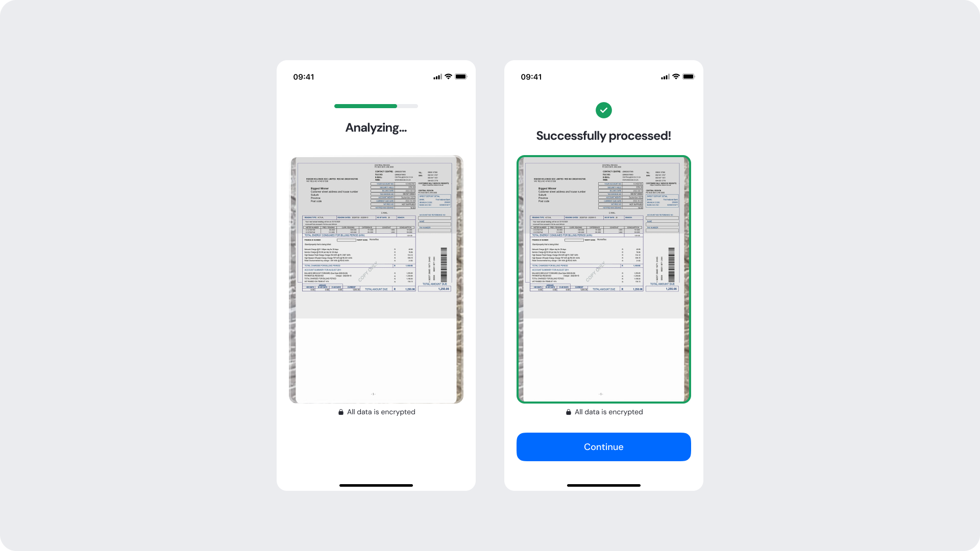
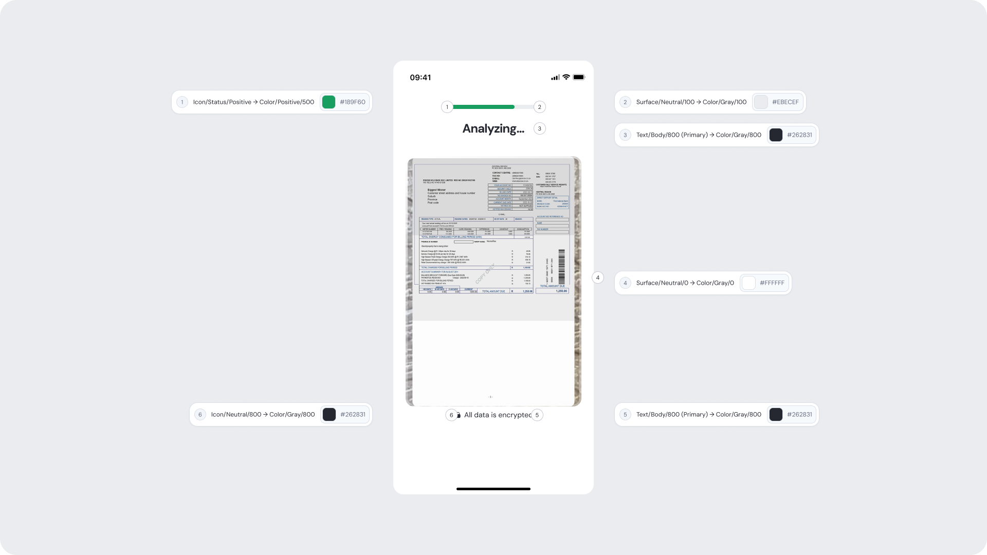
These screens guide users through the upload flow after capturing a document image. These states provide clear feedback while the document is being processed and confirm when the upload is successful.
Customizable Elements
| Area |
What can be customized |
Notes |
| Title text |
“Uploading your document” |
Fully localizable. |
| Subtitle text |
Processing guidance copy |
Should remain short and reassuring. |
| Loading indicator |
Spinner or progress animation styling |
Must remain clearly visible. |
| Background styling |
Background colors and surfaces |
Must preserve accessibility contrast. |
| Brand colors |
Accent and loader colors |
Uses brand tokens. |
Fixed Elements
| Element |
Why it is fixed |
| Processing behavior |
Reflects real-time upload and verification progress. |
| Loading state interaction |
Prevents accidental interruption during upload. |
| Content hierarchy |
Keeps focus on upload progress feedback. |
| Spacing & safe areas |
Required for responsive compatibility. |
| Accessibility requirements |
Mandatory for compliance. |
Token Reference
| UI Element |
Token |
Value |
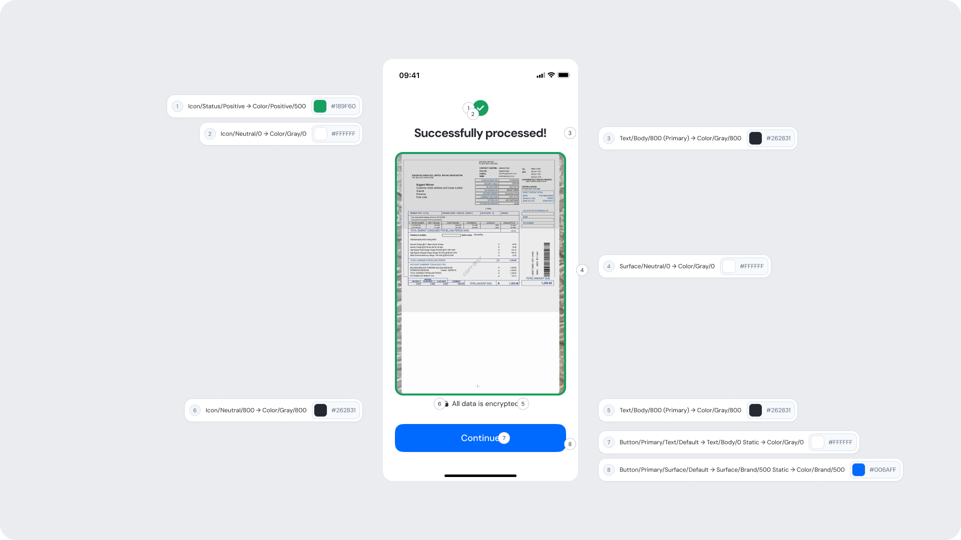
| Title text |
Text/Body/800 (Primary) → Color/Gray/800 |
#262831 |
| Subtitle text |
Text/Body/500 (Secondary) → Color/Gray/500 |
#60667C |
| Success icon |
Icon/Status/Positive → Color/Green/500 |
#17B26A |
| Background |
Surface/Neutral/0 → Color/Gray/0 |
#FFFFFF |
| Primary button background |
Button/Primary/Surface/Default → Surface/Brand/500 Static → Color/Brand/500 |
#006AFF |
| Primary button text |
Button/Primary/Text/Default → Text/Body/0 Static → Color/Gray/0 |
#FFFFFF |
| UI Element |
Token |
Value |
| Title text |
Text/Body/800 (Primary) → Color/Gray/800 |
#262831 |
| Subtitle text |
Text/Body/500 (Secondary) → Color/Gray/500 |
#60667C |
| Background |
Surface/Neutral/0 → Color/Gray/0 |
#FFFFFF |
| Loading indicator |
Surface/Brand/500 → Color/Brand/500 |
#006AFF |
| Footer text (“All data is encrypted”) |
Text/Body/500 (Secondary) → Color/Gray/500 |
#60667C |
| Footer lock icon |
Icon/Neutral/500 → Color/Gray/500 |
#60667C |
Design Notes
- Success messaging should feel clear and reassuring.
- Avoid overly celebratory language or animations.
- Ensure the next action is immediately visible.
- Keep the layout lightweight and easy to scan.
- Maintain accessible contrast and readable typography.
Upload Review Screen
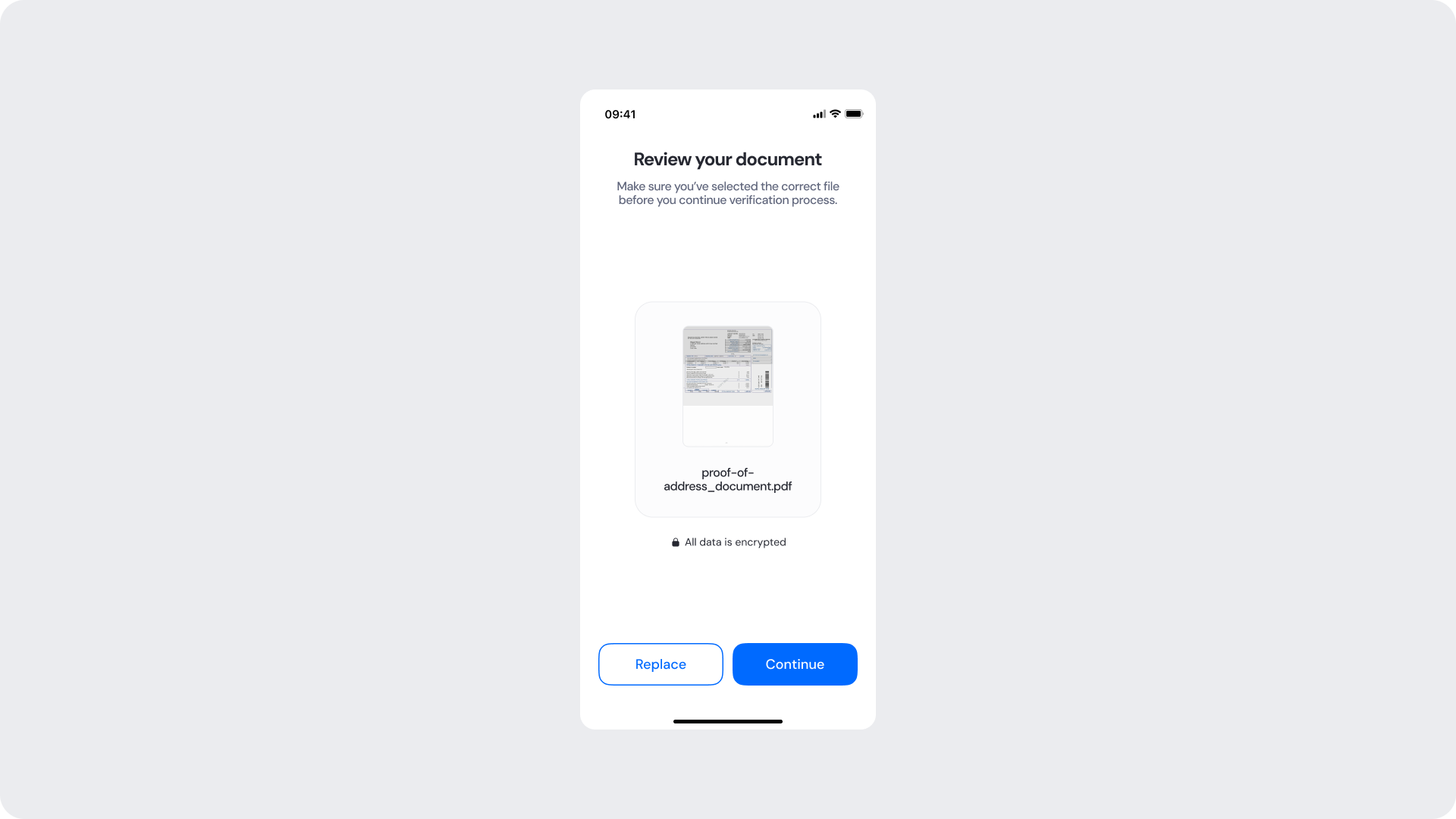
The Upload Review Screen allows users to confirm that they selected the correct document before uploading it for verification. The screen displays the document file name alongside a small preview of the selected file.
Customizable Elements
| Area |
What can be customized |
Notes |
| Title text |
“Review your upload” |
Fully localizable. |
| Subtitle text |
Supporting review instructions |
Should remain concise and instructional. |
| Document preview container |
Border radius, background |
Must preserve readability and visibility. |
| Document filename styling |
Typography and color |
Must remain legible. |
| Primary button |
Label, color, radius |
Used to confirm and upload the document. |
| Secondary button |
Label, color, radius |
Used to replace or select another file. |
Fixed Elements
| Element |
Why it is fixed |
| Preview behavior |
Ensures users can validate selected content before upload. |
| Document filename visibility |
Required for upload confirmation clarity. |
| Action hierarchy |
Upload action remains visually prioritized. |
| Spacing & safe areas |
Required for responsive compatibility. |
| Accessibility requirements |
Mandatory for compliance. |
Token Reference
| UI Element |
Token |
Value |
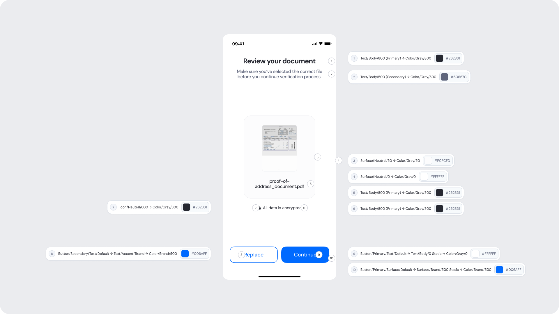
| Title text |
Text/Body/800 (Primary) → Color/Gray/800 |
#262831 |
| Subtitle text |
Text/Body/500 (Secondary) → Color/Gray/500 |
#60667C |
| Document filename |
Text/Body/800 (Primary) → Color/Gray/800 |
#262831 |
| Preview container background |
Surface/Neutral/50 → Color/Gray/50 |
#F7F8FA |
| Preview container border |
Border/Neutral/200 → Color/Gray/200 |
#C6C8D2 |
| Background |
Surface/Neutral/0 → Color/Gray/0 |
#FFFFFF |
| Primary button background |
Button/Primary/Surface/Default → Surface/Brand/500 Static → Color/Brand/500 |
#006AFF |
| Primary button text |
Button/Primary/Text/Default → Text/Body/0 Static → Color/Gray/0 |
#FFFFFF |
| Secondary button text |
Button/Secondary/Text/Default → Text/Brand/Accent → Color/Brand/500 |
#006AFF |
| Footer text (“All data is encrypted”) |
Text/Body/500 (Secondary) → Color/Gray/500 |
#60667C |
Design Notes
- Ensure the document filename is easy to read and truncate gracefully if needed.
- Keep the document preview visible but secondary to the confirmation action.
- Maintain strong visual emphasis on the upload action.
- Avoid cluttering the screen with unnecessary metadata.
- Ensure secondary actions remain accessible but visually less prominent.
Consecutive Pages Tutorial
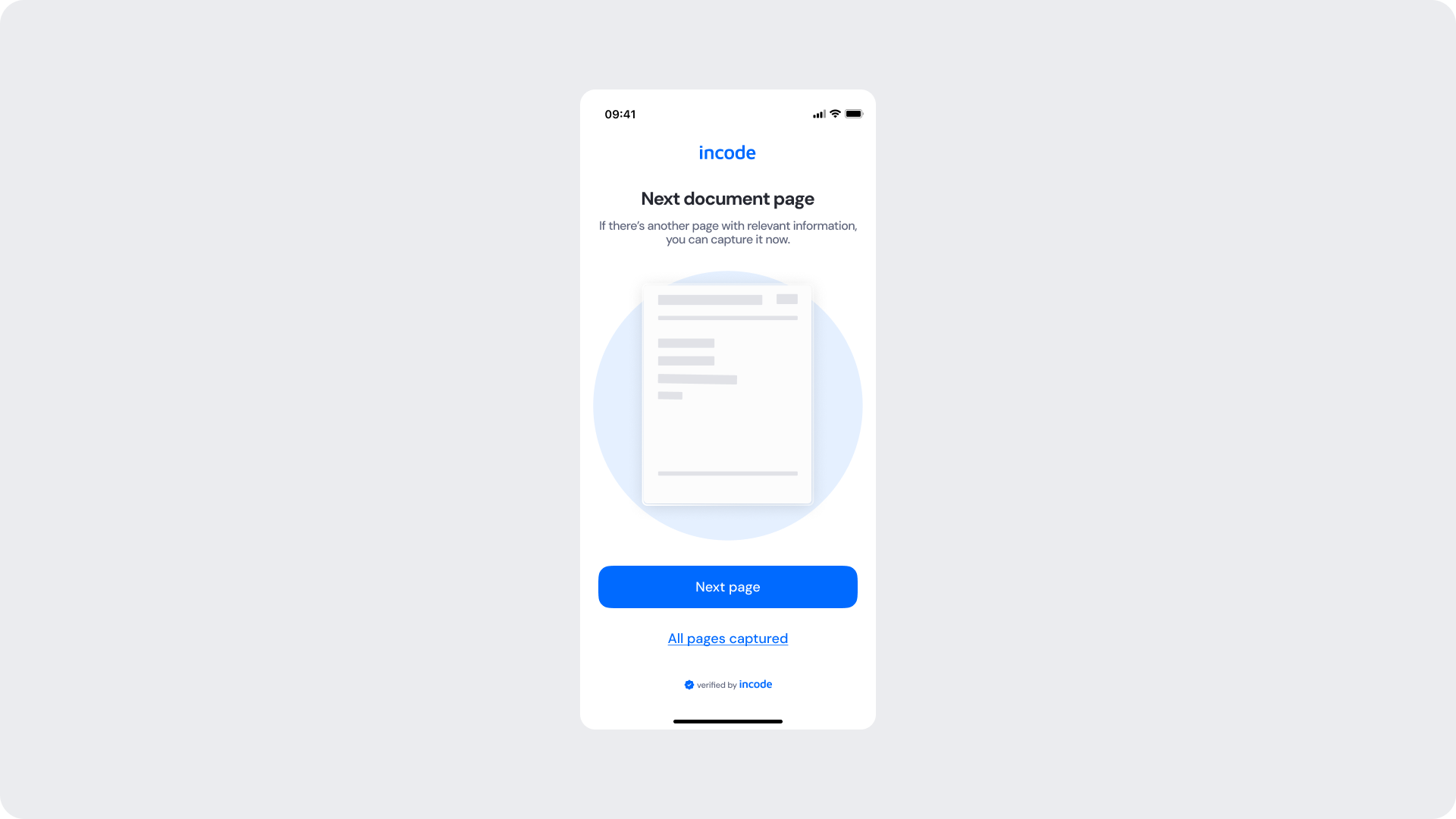
The Consecutive Pages Tutorial informs users that additional pages are required for verification. This step can be optional or mandatory depending on the document type and workflow configuration.
Customizable Elements
| Area |
What can be customized |
Notes |
| Title text |
Tutorial title |
Fully localizable. |
| Subtitle text |
Instructional guidance |
Can explain why additional pages are required. |
| Illustrations |
Multi-page guidance visuals |
Can be adapted to match brand style. |
| Primary button |
Label, color, radius |
Used to continue the capture flow. |
| Secondary action |
Optional skip action |
Available only in optional flows. |
| Brand colors |
Accent and CTA colors |
Uses brand tokens. |
| Footer |
“verified by incode” |
Optional but recommended. |
Fixed Elements
| Element |
Why it is fixed |
| Tutorial structure |
Standardized onboarding for multi-page capture flows. |
| Illustration placement |
Preserves visual consistency. |
| Action hierarchy |
Primary action remains visually prioritized. |
| Spacing & safe areas |
Required for responsive compatibility. |
| Accessibility requirements |
Mandatory for compliance. |
Token Reference
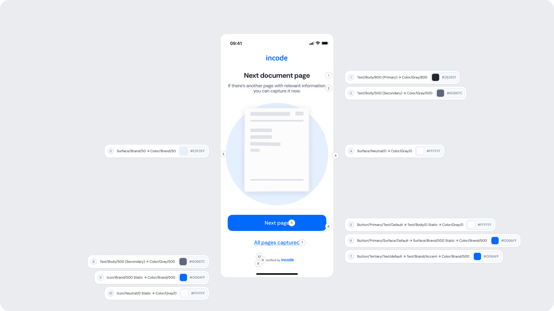
| UI Element |
Token |
Value |
| Title text |
Text/Body/800 (Primary) → Color/Gray/800 |
#262831 |
| Subtitle text |
Text/Body/500 (Secondary) → Color/Gray/500 |
#60667C |
| Illustration accents |
Surface/Brand/500 → Color/Brand/500 |
#006AFF |
| Background |
Surface/Neutral/0 → Color/Gray/0 |
#FFFFFF |
| Primary button background |
Button/Primary/Surface/Default → Surface/Brand/500 Static → Color/Brand/500 |
#006AFF |
| Primary button text |
Button/Primary/Text/Default → Text/Body/0 Static → Color/Gray/0 |
#FFFFFF |
| Secondary action text |
Button/Tertiary/Text/default → Text/Brand/Accent → Color/Brand/500 |
#006AFF |
| Footer text (“verified by incode”) |
Text/Body/500 (Secondary) → Color/Gray/500 |
#60667C |
Design Notes
- Clearly communicate whether additional pages are required or optional.
- Keep instructional copy concise and easy to scan.
- Illustrations should reinforce sequential page capture behavior.
- Maintain strong emphasis on the primary CTA.
- Avoid excessive explanations or technical terminology.
Error Screen
The Error Screen appears when the uploaded document cannot be processed successfully. By default, users have 3 attempts available to retry the document upload.
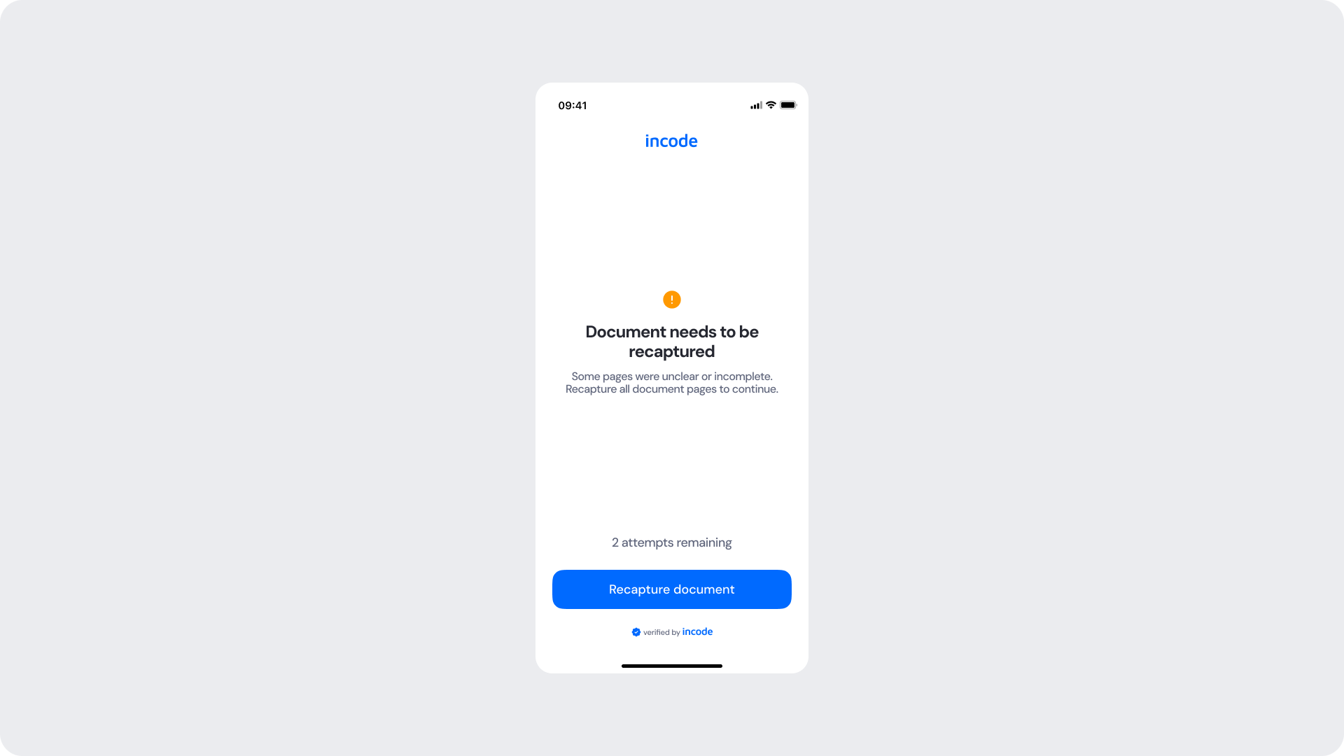
Customizable Elements
| Area |
What can be customized |
Notes |
| Title text |
Error title |
Fully localizable; should remain neutral and actionable. |
| Description text |
Supporting explanation |
Can be adapted to client tone of voice. |
| Status icon |
Error indicator |
Can be customized while preserving semantic meaning. |
| Primary button |
Label, color, radius |
Used for retry action. |
| Attempt counter text |
“2 attempts remaining” |
Fully localizable. |
| Background styling |
Background colors and surfaces |
Must preserve accessibility contrast. |
| Footer |
“verified by incode” |
Optional but recommended. |
Fixed Elements
| Element |
Why it is fixed |
| Error logic |
Must accurately reflect backend validation failures. |
| Attempt counter behavior |
Controlled by backend retry configuration. |
| Action hierarchy |
Retry action remains visually prioritized. |
| Button placement |
Standardized across modules. |
| Spacing & safe areas |
Required for responsive compatibility. |
| Accessibility requirements |
Mandatory for compliance. |
Token Reference
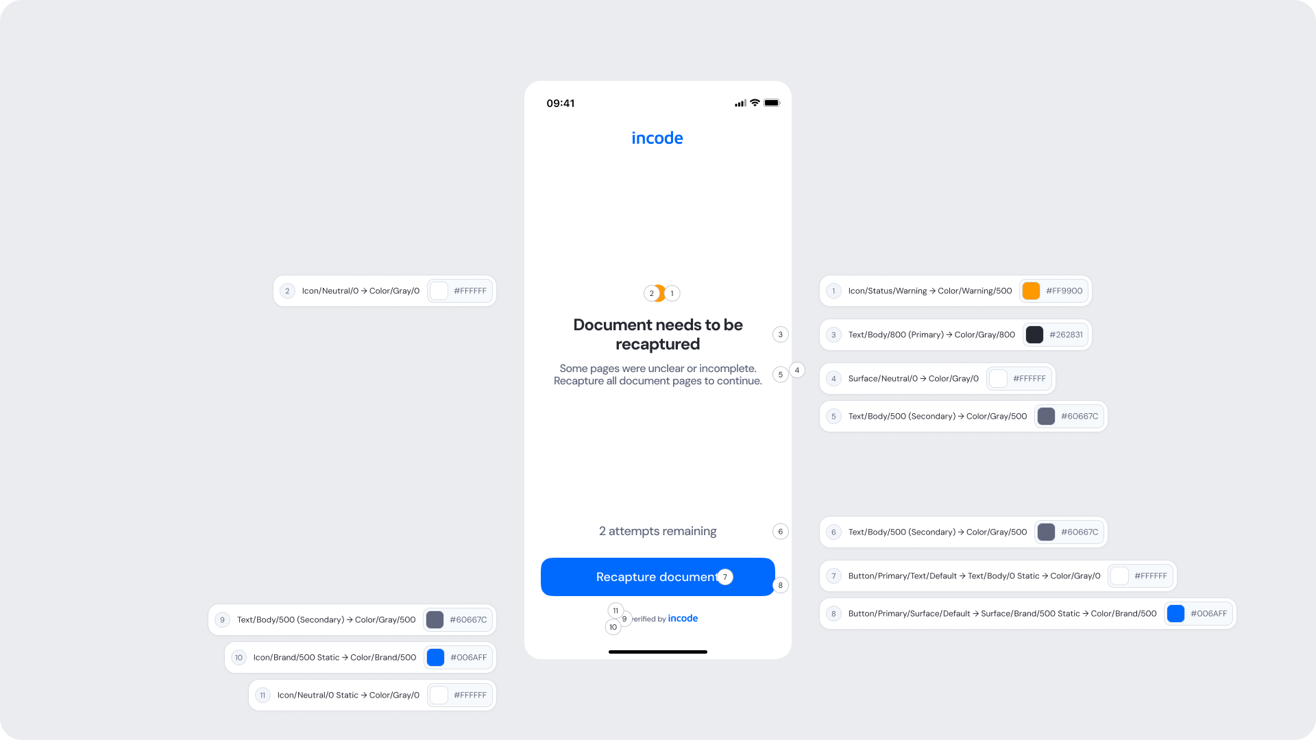
| UI Element |
Token |
Value |
| Title text |
Text/Body/800 (Primary) → Color/Gray/800 |
#262831 |
| Description text |
Text/Body/500 (Secondary) → Color/Gray/500 |
#60667C |
| Error icon |
Icon/Status/Negative → Color/Red/500 |
#E71111 |
| Attempt counter text |
Text/Body/500 (Secondary) → Color/Gray/500 |
#60667C |
| Background |
Surface/Neutral/0 → Color/Gray/0 |
#FFFFFF |
| Primary button background |
Button/Primary/Surface/Default → Surface/Brand/500 Static → Color/Brand/500 |
#006AFF |
| Primary button text |
Button/Primary/Text/Default → Text/Body/0 Static → Color/Gray/0 |
#FFFFFF |
| Close icon |
Icon/Neutral/500 → Color/Gray/500 |
#60667C |
| Footer text (“verified by incode”) |
Text/Body/500 (Secondary) → Color/Gray/500 |
#60667C |
Design Notes
- Error messaging should remain clear, concise, and actionable.
- Avoid technical or overly alarming language.
- Clearly communicate the remaining retry attempts.
- Maintain strong emphasis on the retry action.
- Ensure error states remain visually distinct and accessible.