This section outlines the elements you can customize within the Data Sharing Consent module to align with your brand while preserving Incode’s core UX. It clarifies which areas are flexible, such as consent copy, illustrations, and brand colors, and which elements remain fixed to ensure transparency, compliance, accessibility, and a consistent user experience across platforms.
Consent Screen
The Consent Screen presents the data sharing request and helps users understand what information will be shared, why it is needed, and how it will be used. It promotes transparency, supports informed decision-making, and ensures users can provide consent with confidence before continuing the verification process.
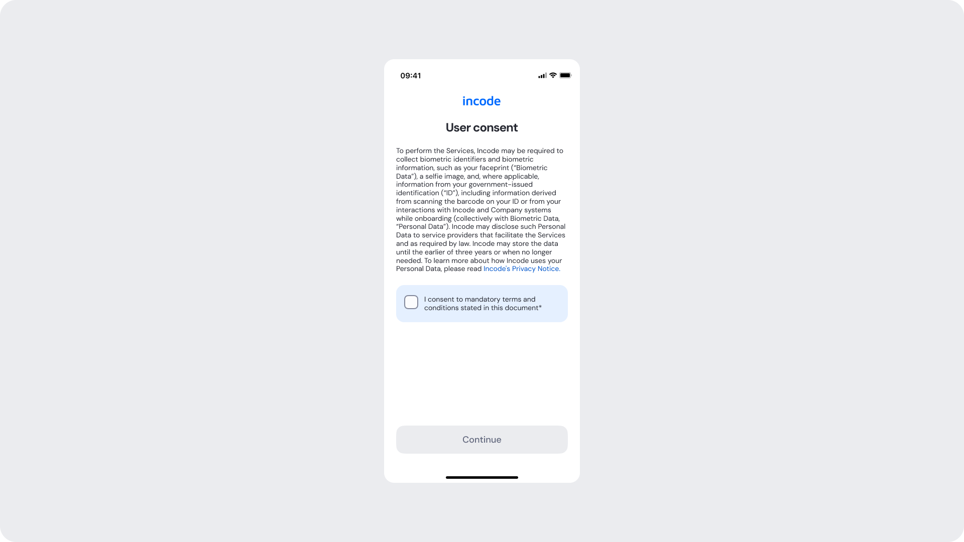
Customizable Elements
| Area |
What can be customized |
Notes |
| Text |
Title, subtitle, consent description, checkbox label |
Fully localizable; tone can be adapted to compliance and brand requirements |
| Brand Colors |
Logo, links, checkbox, button, accent elements |
Uses brand tokens |
| Buttons |
Label, color, radius |
Must follow platform guidelines and maintain primary/secondary hierarchy |
| Consent Checkbox |
Label text, selected state color |
Checkbox is required; must remain clearly visible and accessible |
| Card Surface |
Background color, corner radius, elevation |
Must maintain readability and WCAG contrast requirements |
| Footer |
"Verified by Incode" line |
Optional but recommended |
Fixed Elements
| Element |
Why it is fixed |
| Consent flow structure |
Ensures users review and acknowledge consent information before proceeding |
| Consent checkbox requirement |
Required to capture explicit user consent and meet compliance requirements |
| Layout structure |
Ensures consistency across modules and platforms |
| Text hierarchy |
Optimized for readability and comprehension of consent information |
| Spacing & safe areas |
Required for device compatibility and accessibility |
| WCAG minimum contrast |
Mandatory to ensure accessibility compliance |
Token Reference
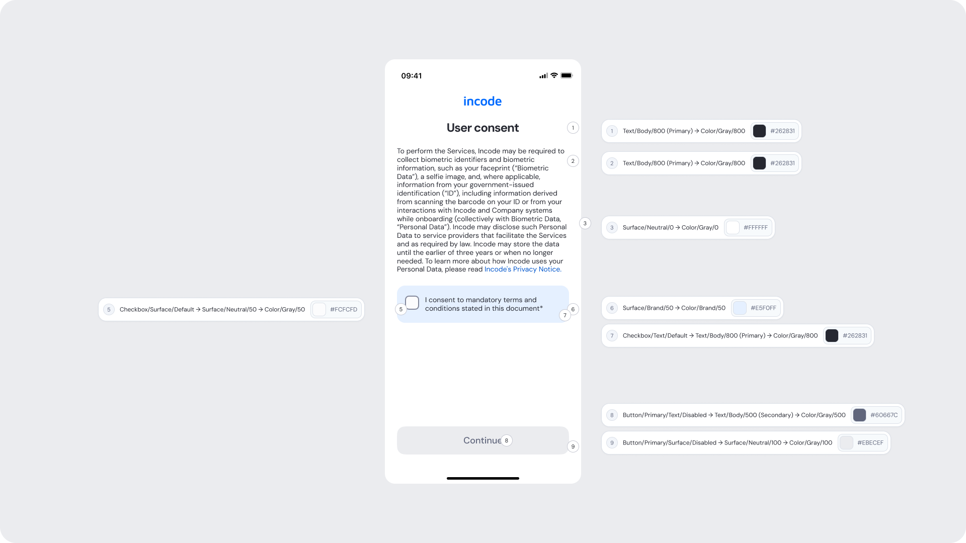
| # |
UI Element |
Token |
Value |
| 1 |
Title |
Text/Body/800 (Primary) → Color/Gray/800 |
#262831 |
| 2 |
Consent summary text |
Text/Body/800 (Primary) → Color/Gray/800 |
#262831 |
| 3 |
Screen background |
Surface/Neutral/0 → Color/Gray/0 |
#FFFFFF |
| 5 |
Checkbox surface |
Checkbox/Surface/Default → Surface/Neutral/50 → Color/Gray/50 |
#FCFCFD |
| 6 |
Consent card background |
Surface/Brand/50 → Color/Brand/50 |
#E5F0FF |
| 7 |
Checkbox label text |
Checkbox/Text/Default → Text/Body/800 (Primary) → Color/Gray/800 |
#262831 |
| 8 |
Disabled button text |
Button/Primary/Text/Disabled → Text/Body/500 (Secondary) → Color/Gray/500 |
#60667C |
| 9 |
Disabled button background |
Button/Primary/Surface/Disabled → Surface/Neutral/100 → Color/Gray/100 |
#EBECEF |
Design Notes
- Keep consent messaging concise and easy to scan.
- Consent copy, title, description, and checkbox label can be customized to meet branding and compliance requirements.
- Ensure the consent checkbox remains clearly visible and accessible across all states.
- Maintain sufficient color contrast and tap target sizes to meet accessibility guidelines.
- Provide clear focus indicators and screen reader support for interactive elements (Web).
Consented Screen
The Consented Screen is displayed after the user has successfully granted consent to share their data. It confirms that consent has been recorded, reassures the user that their authorization was successfully received, and clearly indicates that the verification process can continue. This step provides confirmation, reinforces transparency, and helps users proceed with confidence.
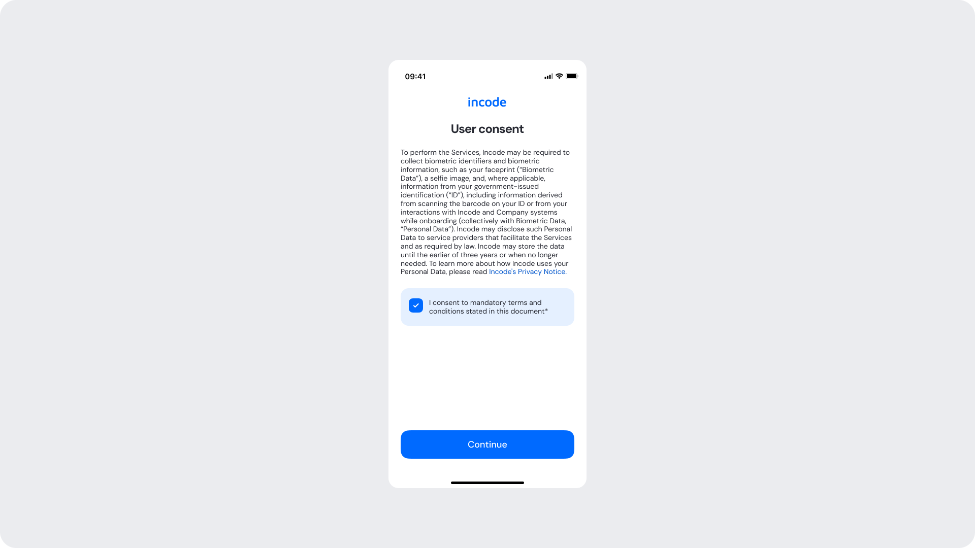
Customizable Elements
| Area |
What can be customized |
Notes |
| Text |
Title, subtitle, consent description, checkbox label |
Fully localizable; tone can be adapted to compliance and brand requirements |
| Brand Colors |
Logo, links, checkbox, button, accent elements |
Uses brand tokens |
| Buttons |
Label, color, radius |
Must follow platform guidelines and maintain primary/secondary hierarchy |
| Consent Checkbox |
Label text, selected state color |
Checkbox is required; must remain clearly visible and accessible |
| Card Surface |
Background color, corner radius, elevation |
Must maintain readability and WCAG contrast requirements |
| Footer |
"Verified by Incode" line |
Optional but recommended |
Fixed Elements
| Element |
Why it is fixed |
| Consent flow structure |
Ensures users review and acknowledge consent information before proceeding |
| Consent checkbox requirement |
Required to capture explicit user consent and meet compliance requirements |
| Layout structure |
Ensures consistency across modules and platforms |
| Text hierarchy |
Optimized for readability and comprehension of consent information |
| Spacing & safe areas |
Required for device compatibility and accessibility |
| WCAG minimum contrast |
Mandatory to ensure accessibility compliance |
Token Reference
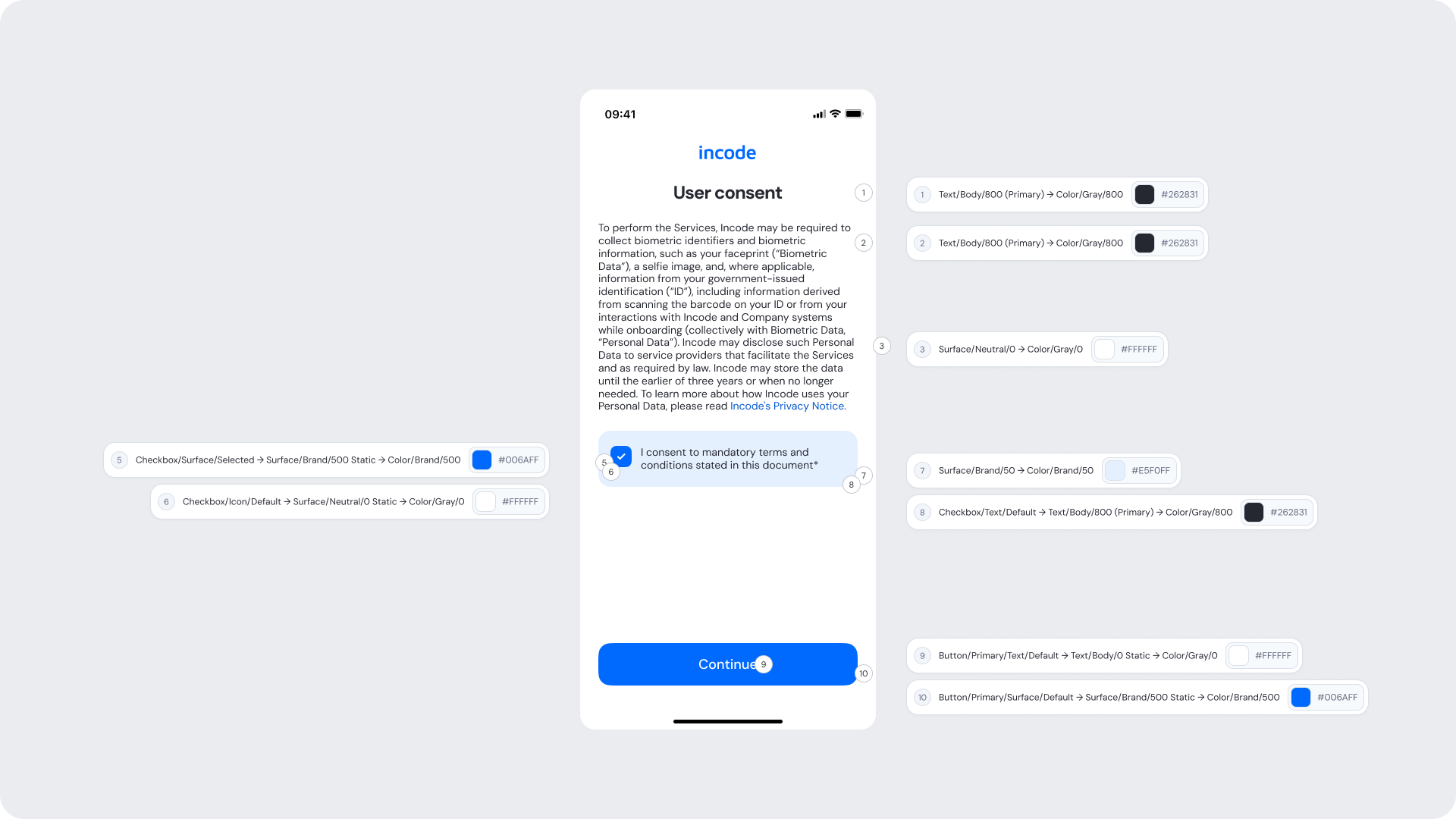
| # |
UI Element |
Token |
Value |
| 1 |
Title |
Text/Body/800 (Primary) → Color/Gray/800 |
#262831 |
| 2 |
Consent summary text |
Text/Body/800 (Primary) → Color/Gray/800 |
#262831 |
| 3 |
Screen background |
Surface/Neutral/0 → Color/Gray/0 |
#FFFFFF |
| 5 |
Selected checkbox surface |
Checkbox/Surface/Selected → Surface/Brand/500 Static → Color/Brand/500 |
#006AFF |
| 6 |
Checkbox icon |
Checkbox/Icon/Default → Surface/Neutral/0 Static → Color/Gray/0 |
#FFFFFF |
| 7 |
Consent card background |
Surface/Brand/50 → Color/Brand/50 |
#E5F0FF |
| 8 |
Checkbox label text |
Checkbox/Text/Default → Text/Body/800 (Primary) → Color/Gray/800 |
#262831 |
| 9 |
Primary button text |
Button/Primary/Text/Default → Text/Body/0 Static → Color/Gray/0 |
#FFFFFF |
| 10 |
Primary button background |
Button/Primary/Surface/Default → Surface/Brand/500 Static → Color/Brand/500 |
#006AFF |
Design Notes
- Keep consent messaging concise and easy to scan.
- Consent copy, title, description, and checkbox label can be customized to meet branding and compliance requirements.
- Ensure the consent checkbox remains clearly visible and accessible across all states.
- Maintain sufficient color contrast and tap target sizes to meet accessibility guidelines.
- Provide clear focus indicators and screen reader support for interactive elements (Web).