This section outlines the elements you can customize within the Watchlist for business module to match your brand while preserving Incode’s core UX. It clarifies which areas are flexible, such as text, illustrations, and brand colors and which elements remain fixed to ensure consistency, accessibility, and optimal capture performance across platforms.
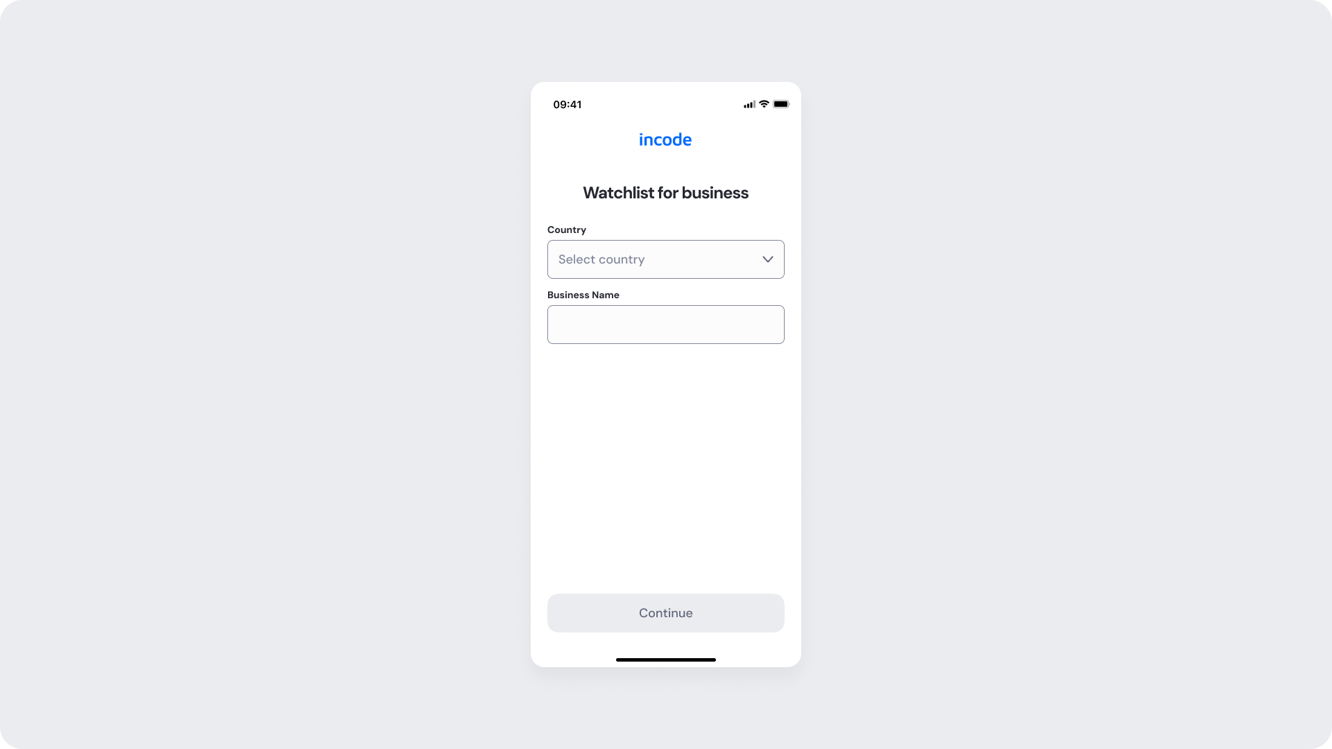
Watchlist Empty
Entry point of the Watchlist for Business module. This screen allows users to enter the business name and select the country before starting the screening process against sanctions lists, Politically Exposed Persons (PEPs), and compliance watchlists.
Customizable Elements
| Area |
What can be customized |
Notes |
| Text |
Screen title, field labels, placeholders, helper text, validation messages, button text, processing and success messages |
Fully localizable; tone and terminology can be adapted to align with brand voice and compliance requirements. |
| Field Set |
Business name field, country selector, optional business identifiers |
Configurable depending on onboarding and compliance requirements; core flow structure remains consistent. |
| Input States |
Helper text, inline validation messaging, disabled and focus states |
Validation logic remains fixed to preserve consistency and usability standards. |
| Background Color |
Screen background color |
Must maintain sufficient contrast with text, inputs, and CTAs to support accessibility compliance. |
| Buttons (CTA) |
Button labels, background color, text color, disabled state styling |
Uses brand tokens while preserving visibility and accessibility across states. |
| Brand Colors |
Accent colors, input focus state, loading indicator, success state colors |
Applied via design tokens; avoid reducing clarity in validation, processing, or success states. |
| Loading State |
Processing message, spinner style, loading animation behavior |
Customizable within approved accessibility and motion guidelines. |
| Success State |
Confirmation message, success icon styling |
Messaging should remain concise, clear, and compliant with regulatory communication standards. |
Fixed Elements
| Element |
Why it is fixed |
| Processing flow behavior |
Prevents duplicate submissions and manages loading states during signature capture. |
| Text hierarchy |
Maintains clear task communication and visual clarity within the flow. |
| WCAG contrast requirements |
Mandatory for accessibility compliance and inclusive user experience. |
Token Reference
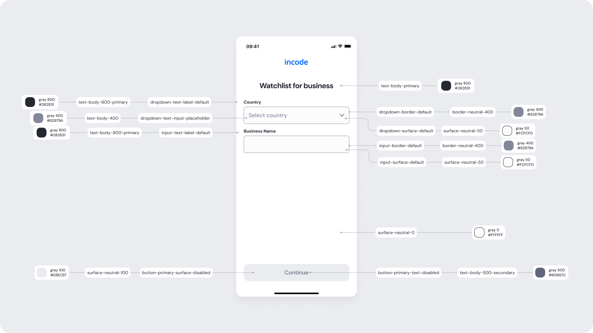
| UI Element |
Token |
Raw Value |
| Screen background |
surface-neutral-0 |
#FFFFFF |
| Header title text |
text-body-primary |
#262831 |
| Country label text |
dropdown-text-label-default |
#262831 |
| Country placeholder text |
dropdown-text-input-placeholder |
#B2879A |
| Dropdown border |
dropdown-border-default |
#B2879A |
| Dropdown background |
dropdown-surface-default |
#FCFCDD |
| Business name label text |
input-text-label-default |
#262831 |
| Input border |
input-border-default |
#B2879A |
| Input background |
input-surface-default |
#FCFCDD |
| Continue button background |
button-primary-surface-disabled |
#EBECEF |
| Continue button text |
button-primary-text-disabled |
#60667C |
| Primary body text |
text-body-800-primary |
#262831 |
| Secondary body text |
text-body-400 |
#B2879A |
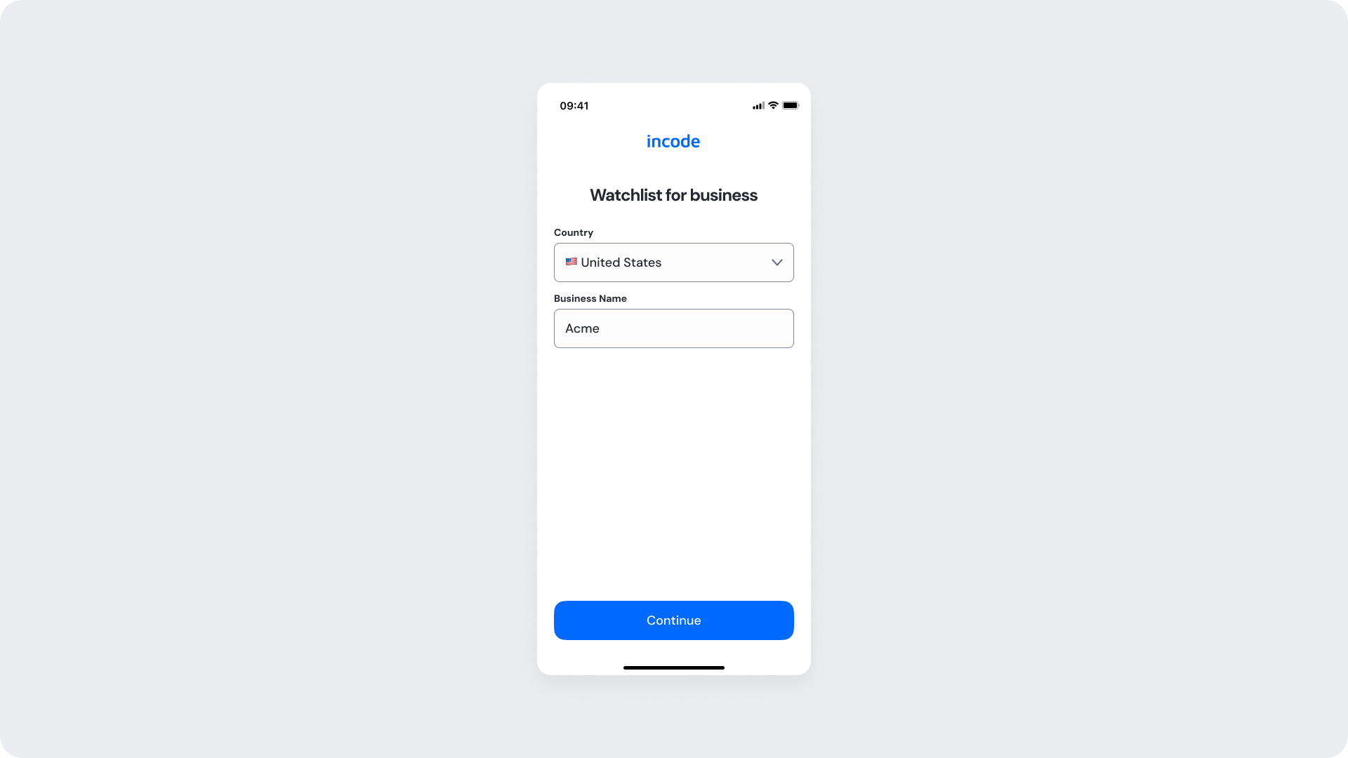
Watchlist Filled
State displayed after the user has entered the required business information, including the business name and country, and before the watchlist screening process begins.
Customizable Elements
| Area |
What can be customized |
Notes |
| Text |
Screen title, field labels, placeholders, helper text, validation messages, button text, processing and success messages |
Fully localizable; tone and terminology can be adapted to align with brand voice and compliance requirements. |
| Field Set |
Business name field, country selector, optional business identifiers |
Configurable depending on onboarding and compliance requirements; core flow structure remains consistent. |
| Input States |
Helper text, inline validation messaging, disabled and focus states |
Validation logic remains fixed to preserve consistency and usability standards. |
| Background Color |
Screen background color |
Must maintain sufficient contrast with text, inputs, and CTAs to support accessibility compliance. |
| Buttons (CTA) |
Button labels, background color, text color. |
Uses brand tokens while preserving visibility and accessibility across states. |
| Brand Colors |
Accent colors, input focus state, loading indicator, success state colors |
Applied via design tokens; avoid reducing clarity in validation, processing, or success states. |
Fixed Elements
| Element |
Why it is fixed |
| Processing flow behavior |
Prevents duplicate submissions and manages loading states during signature capture. |
| Text hierarchy |
Maintains clear task communication and visual clarity within the flow. |
| WCAG contrast requirements |
Mandatory for accessibility compliance and inclusive user experience. |
Token Reference
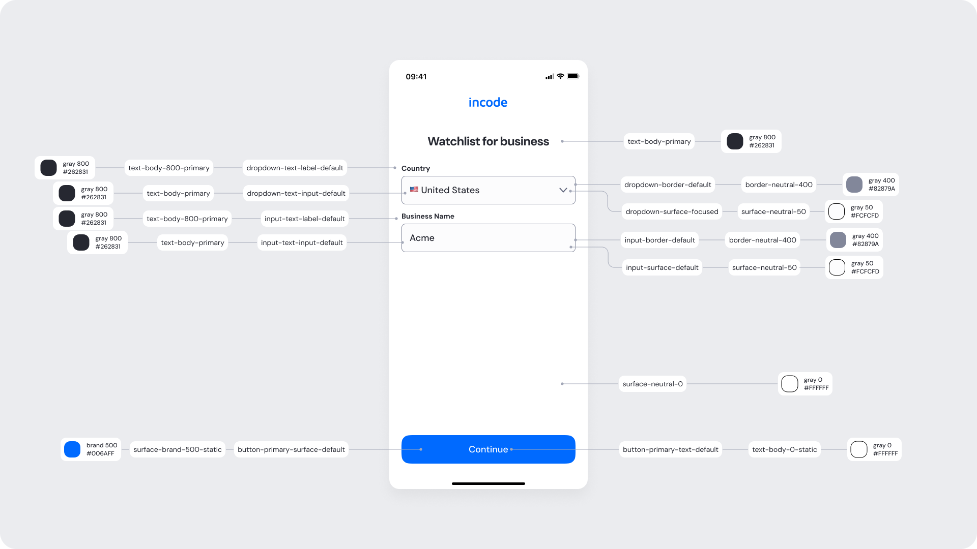
| UI Element |
Token |
Raw Value |
| Screen background |
surface-neutral-0 |
#FFFFFF |
| Header title text |
text-body-primary |
#262831 |
| Country label text |
dropdown-text-label-default |
#262831 |
| Country filled text |
dropdown-text-input-default |
#262831 |
| Dropdown border |
dropdown-border-default |
#B2879A |
| Dropdown background |
dropdown-surface-focused |
#FCFCDD |
| Business name label text |
input-text-label-default |
#262831 |
| Business name input text |
input-text-input-default |
#262831 |
| Input border |
input-border-default |
#B2879A |
| Input background |
input-surface-default |
#FCFCDD |
| Continue button background |
button-primary-surface-default |
#006AFF |
| Continue button text |
button-primary-text-default |
#FFFFFF |
| Primary body text |
text-body-800-primary |
#262831 |
| Brand primary surface |
surface-brand-500-static |
#006AFF |
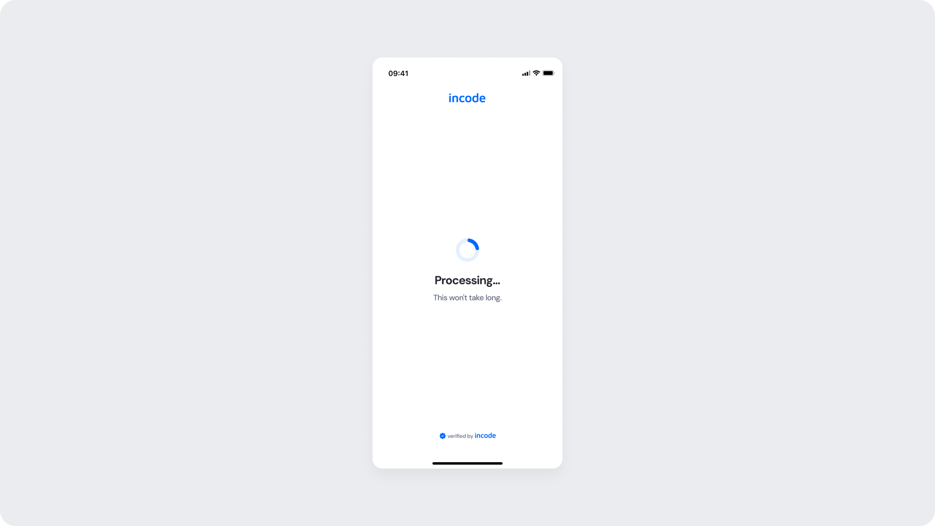
Watchlist Processing
Processing state of the Watchlist for Business module. This screen informs the user that the submitted business information is being processed and screened against sanctions lists, Politically Exposed Persons (PEPs), and compliance watchlists. A loading indicator communicates that the verification is currently in progress while temporarily preventing duplicate submissions or interruptions.
Customizable Elements
| Area |
What can be customized |
Notes |
| Text Elements |
Processing title, status message, helper text |
Fully localizable. Tone and terminology can align with brand and compliance requirements. |
| Color Styling |
Background color, text color, loading indicator color, status icon color |
Applied via design tokens. Must preserve accessibility contrast across all states. |
| Branding |
Logo placement, typography styles, accent colors |
Branding updates should maintain readability and consistency throughout the verification flow. |
| Localization |
All textual content and regional formatting |
Supports localization and translation. Layout should account for text expansion across languages. |
| Loading Indicator |
Spinner style and animation behavior |
Customizable within approved motion and accessibility guidelines. |
Fixed Elements
| Element |
Why it is fixed |
| Processing flow behavior |
Prevents duplicate submissions and manages loading states during signature capture. |
| Text hierarchy |
Maintains clear task communication and visual clarity within the flow. |
| WCAG contrast requirements |
Mandatory for accessibility compliance and inclusive user experience. |
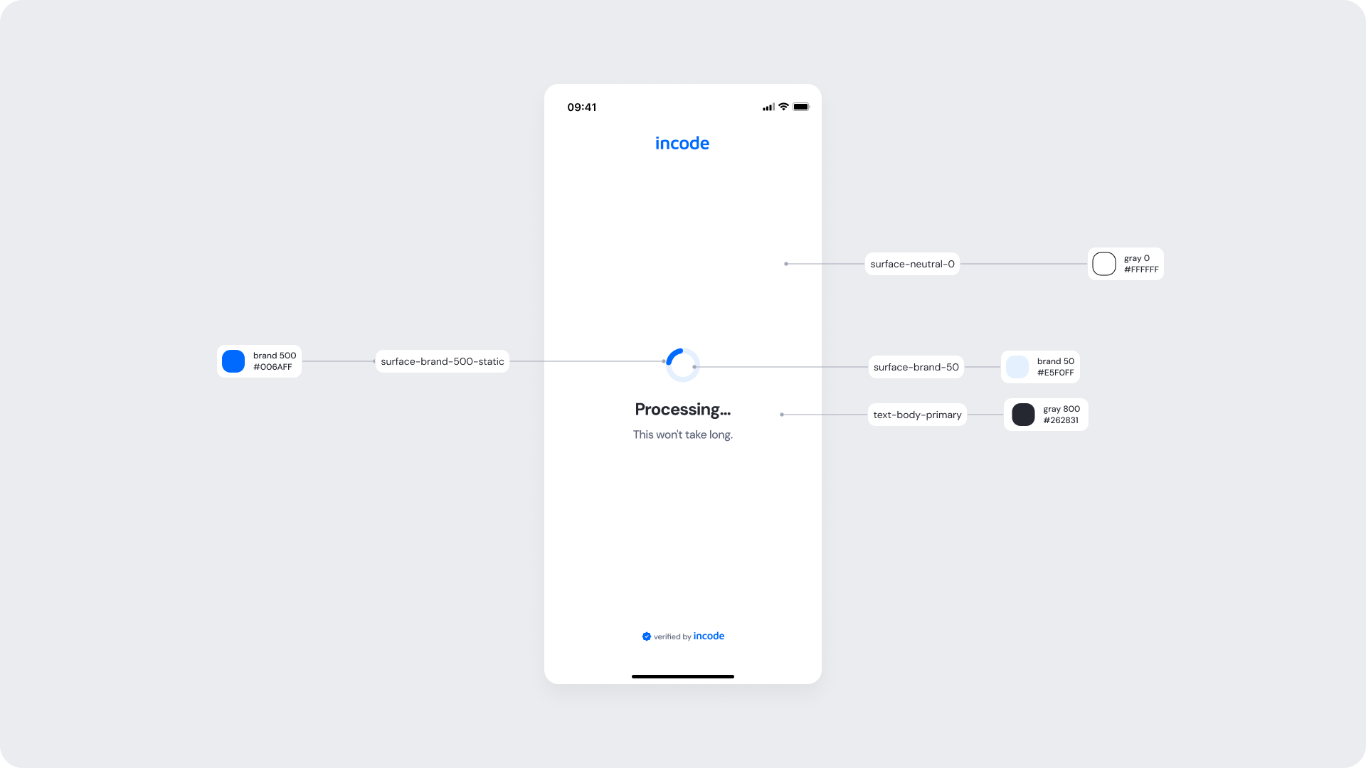
Token Reference
| UI Element |
Token |
Raw Value |
| Screen background |
surface-neutral-0 |
#FFFFFF |
| Processing spinner |
surface-brand-400 |
#3388FF |
| Processing title text |
text-body-primary |
#262831 |
| Processing helper text |
text-body-secondary |
#60667C |
| Success icon background |
icon-status-positive |
#1E7F11 |
| Success icon (check) |
icon-neutral-0 |
#FFFFFF |
| Success title text |
text-body-primary |
#262831 |
Design Notes
- Keep processing and success messaging concise to reduce cognitive load during verification.
- Preserve sufficient color contrast across all states, including processing, success, disabled, and error states.
- Maintain consistent spacing, typography, and iconography across all watchlist states to reinforce flow continuity.
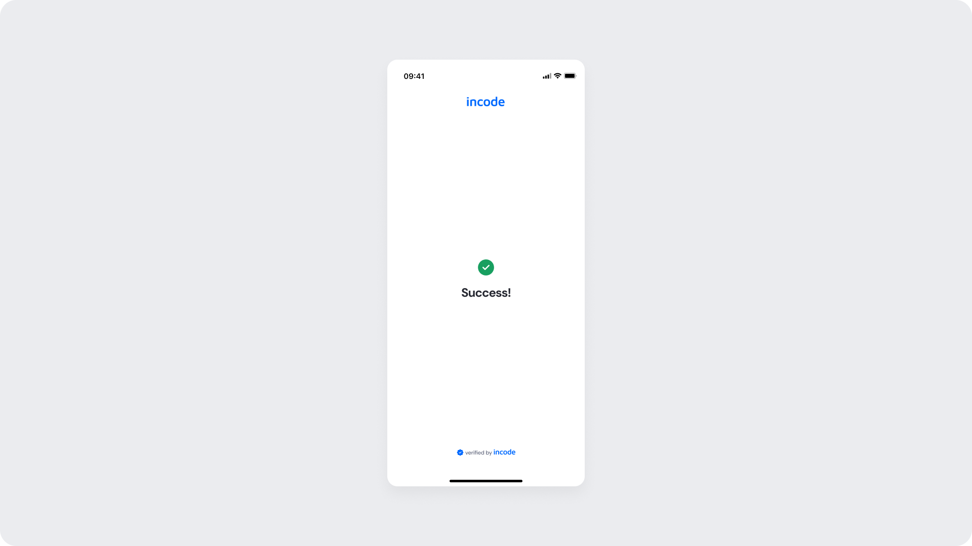
Watchlist Success
The screen displays a success indicator and confirmation message, communicating that the business information has been successfully screened against sanctions lists, Politically Exposed Persons (PEPs), and compliance watchlists, allowing the user to proceed to the next step of the onboarding flow..
Customizable Elements
| Area |
What can be customized |
Notes |
| Text Elements |
Success title, confirmation message, helper text |
Fully localizable. Messaging can align with brand tone and compliance communication standards. |
| Color Styling |
Background color, text color, success icon color, accent colors |
Applied via design tokens. Must preserve accessibility contrast across all states. |
| Localization |
All textual content and regional formatting |
Supports localization and translation. Layout should account for text expansion across languages. |
| Success Indicator |
Success icon style and animation behavior |
Customizable within approved accessibility and motion guidelines. |
| Status Messaging |
Success confirmation copy |
Messaging should remain concise, clear, and compliant with regulatory communication requirements. |
Fixed Elements
| Element |
Why it is fixed |
| Component spacing & safe areas |
Ensures cross-device consistency and accessibility. |
| Text hierarchy |
Maintains clear task communication and visual structure. |
| WCAG contrast requirements |
Mandatory for accessibility compliance. |
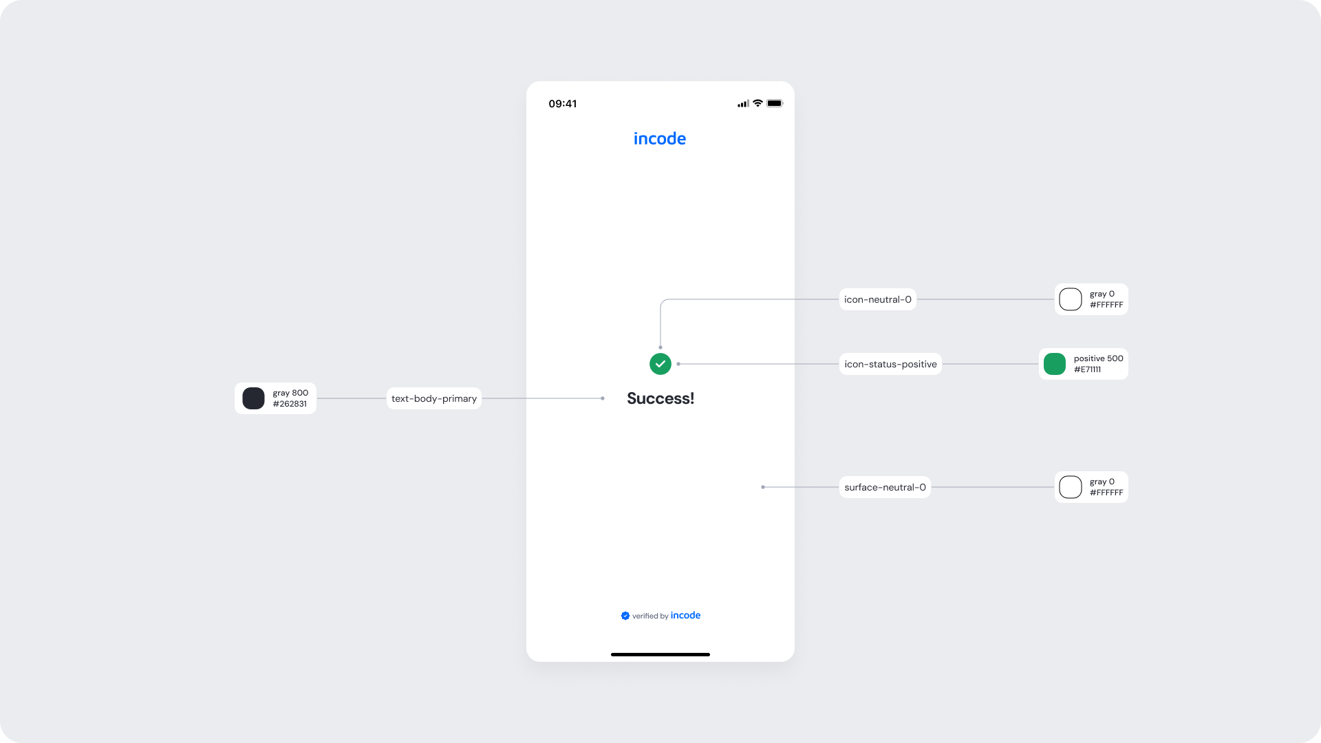
Token Reference
| UI Element |
Token |
Raw Value |
| Screen background |
surface-neutral-0 |
#FFFFFF |
| Success title text |
text-body-primary |
#262831 |
| Success icon background |
icon-status-positive |
#1E7F11 |
| Success icon (check) |
icon-neutral-0 |
#FFFFFF |
Design notes
- Keep the layout clear, vertically structured, and easy to scan to reduce cognitive load.