This section outlines the elements you can customize within the OCR Review module to match your brand while preserving Incode's core UX. It clarifies which areas are flexible, such as text, illustrations, and brand colors, and which elements remain fixed to ensure consistency, accessibility, and optimal capture performance across platforms.
OCR Review
This screen allows users to review and edit the information extracted from the identity document before continuing the verification process. In the editable state, users can update inaccurate or incomplete fields such as full name, date of birth, gender, document number, and expiration date to ensure the captured data is correct.
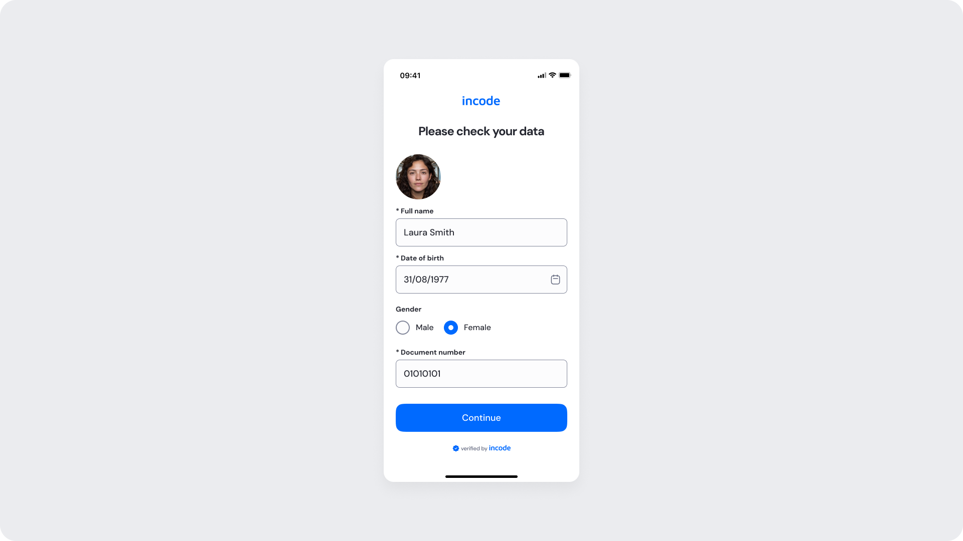
Customizable Elements
| Area |
What can be customized |
Notes |
| Text |
Screen title, field labels, placeholders, validation messages, button text |
Fully localizable; tone and terminology can be adapted to align with brand voice and compliance requirements. |
| Editable fields |
Fields such as full name, date of birth, gender, document number, and expiration date |
Field availability and edit permissions can vary depending on onboarding and compliance requirements. |
| Input States |
Helper text, inline validation messaging, focus states |
Validation logic remains fixed to preserve consistency and usability standards. |
| Radio buttons |
Selected and unselected surface colors, icon and text colors |
Applied through design tokens; selected state must remain clearly distinguishable. |
| Background Color |
Screen background color |
Must maintain sufficient contrast with text, inputs, and CTAs to support accessibility compliance. |
| Buttons (CTA) |
Button labels, background color, text color |
Applied through design tokens to maintain a consistent user experience. |
| Brand Colors |
Accent colors, input focus state, radio button selected state |
Applied via design tokens; avoid reducing clarity in validation or selection states. |
| Footer |
"Verified by Incode" line |
Optional but recommended. |
Fixed Elements
| Element |
Why it is fixed |
| Text hierarchy |
Maintains clear task communication and visual clarity within the flow. |
| User photo |
Automatically pulled from the document capture; cannot be replaced. |
| Field structure |
Required fields are defined by onboarding configuration and cannot be removed from the layout. |
| WCAG contrast requirements |
Mandatory for accessibility compliance and inclusive user experience. |
Token Reference
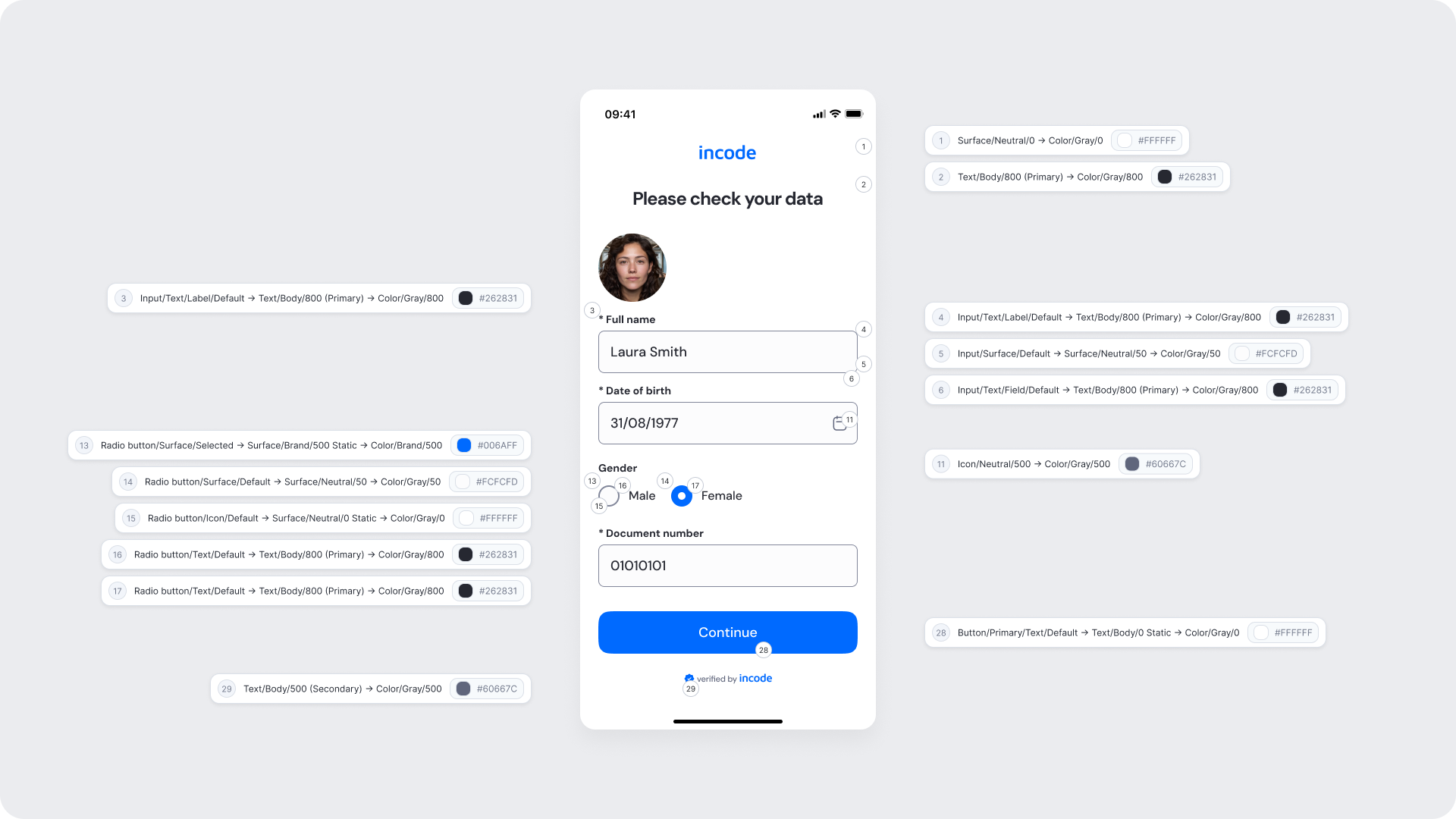
| UI Element |
Token |
Value |
| Background |
Surface/Neutral/0 → Color/Gray/0 |
#FFFFFF |
| Title text |
Text/Body/800 (Primary) → Color/Gray/800 |
#262831 |
| Input label text |
Input/Text/Label/Default → Text/Body/800 (Primary) → Color/Gray/800 |
#262831 |
| Input background |
Input/Surface/Default → Surface/Neutral/50 → Color/Gray/50 |
#FCFCFD |
| Input field text |
Input/Text/Field/Default → Text/Body/800 (Primary) → Color/Gray/800 |
#262831 |
| Date picker icon |
Icon/Neutral/500 → Color/Gray/500 |
#60667C |
| Radio button selected surface |
Radio button/Surface/Selected → Surface/Brand/500 Static → Color/Brand/500 |
#006AFF |
| Radio button unselected surface |
Radio button/Surface/Default → Surface/Neutral/50 → Color/Gray/50 |
#FCFCFD |
| Radio button icon (default) |
Radio button/Icon/Default → Surface/Neutral/0 Static → Color/Gray/0 |
#FFFFFF |
| Radio button label text |
Radio button/Text/Default → Text/Body/800 (Primary) → Color/Gray/800 |
#262831 |
| Radio button label text (selected) |
Radio button/Text/Default → Text/Body/800 (Primary) → Color/Gray/800 |
#262831 |
| Continue button background |
Button/Primary/Surface/Default → Surface/Brand/500 Static → Color/Brand/500 |
#006AFF |
| Continue button text |
Button/Primary/Text/Default → Text/Body/0 Static → Color/Gray/0 |
#FFFFFF |
| Footer text |
Text/Body/500 (Secondary) → Color/Gray/500 |
#60667C |
Design Notes
- Required fields are marked with an asterisk (*) and must remain clearly distinguishable from optional fields.
- The radio button selected state must use a color with sufficient contrast against the unselected state to remain accessible.
- Ensure tap targets for radio buttons and date pickers meet accessibility minimum sizes.
OCR Review - Non Editable
This screen shows the same OCR Review layout in a read-only or non-editable state, where fields are pre-populated but not editable by the user. This state is used when the data has already been confirmed or when edit permissions are restricted based on onboarding configuration.
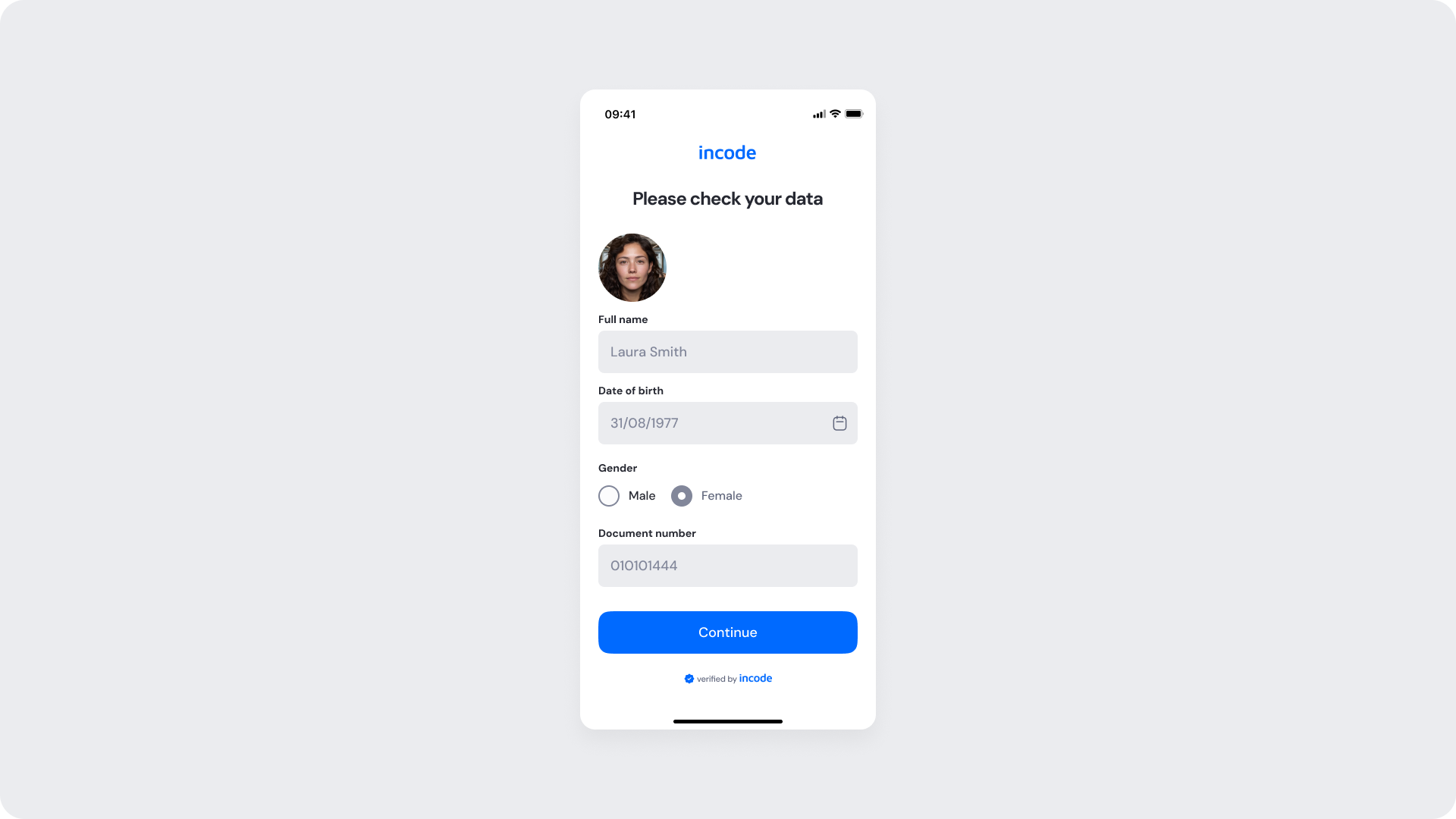
Customizable Elements
| Area |
What can be customized |
Notes |
| Text |
Screen title, field labels, button text |
Fully localizable. |
| Background Color |
Screen background color |
Must maintain sufficient contrast with text and fields. |
| Buttons (CTA) |
Button labels, background color, text color |
Applied through design tokens. |
| Brand Colors |
Accent colors |
Applied via design tokens. |
| Footer |
"Verified by Incode" line |
Optional but recommended. |
Fixed Elements
| Element |
Why it is fixed |
| Disabled field appearance |
Must remain visually consistent to communicate non-editable state clearly. |
| Field values |
Pre-populated from OCR extraction; cannot be overridden when in read-only mode. |
| User photo |
Automatically pulled from the document capture; cannot be replaced. |
| WCAG contrast requirements |
Mandatory for accessibility compliance and inclusive user experience. |
Token Reference
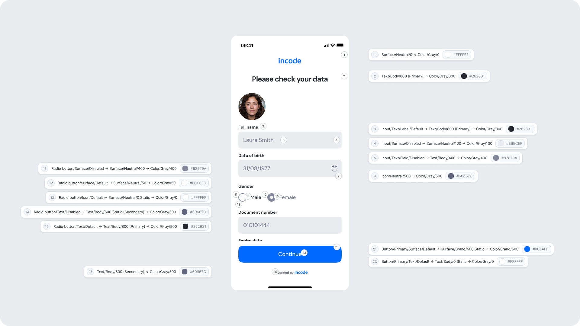
| UI Element |
Token |
Value |
| Background |
Surface/Neutral/0 → Color/Gray/0 |
#FFFFFF |
| Title text |
Text/Body/800 (Primary) → Color/Gray/800 |
#262831 |
| Input label text |
Input/Text/Label/Default → Text/Body/800 (Primary) → Color/Gray/800 |
#262831 |
| Input background (disabled) |
Input/Surface/Disabled → Surface/Neutral/100 → Color/Gray/100 |
#EBECEF |
| Input field text (disabled) |
Input/Text/Field/Disabled → Text/Body/400 → Color/Gray/400 |
#82879A |
| Date picker icon |
Icon/Neutral/500 → Color/Gray/500 |
#60667C |
| Radio button disabled surface |
Radio button/Surface/Disabled → Surface/Neutral/400 → Color/Gray/400 |
#82879A |
| Radio button unselected surface |
Radio button/Surface/Default → Surface/Neutral/50 → Color/Gray/50 |
#FCFCFD |
| Radio button icon (default) |
Radio button/Icon/Default → Surface/Neutral/0 Static → Color/Gray/0 |
#FFFFFF |
| Radio button label text (disabled) |
Radio button/Text/Disabled → Text/Body/500 Static (Secondary) → Color/Gray/500 |
#60667C |
| Radio button label text |
Radio button/Text/Default → Text/Body/800 (Primary) → Color/Gray/800 |
#262831 |
| Continue button background |
Button/Primary/Surface/Default → Surface/Brand/500 Static → Color/Brand/500 |
#006AFF |
| Continue button text |
Button/Primary/Text/Default → Text/Body/0 Static → Color/Gray/0 |
#FFFFFF |
| Footer text |
Text/Body/500 (Secondary) → Color/Gray/500 |
#60667C |
Design Notes
- The disabled state must be visually distinct from the active/editable state to prevent user confusion.
- Disabled fields should not use the same background as active fields — the lighter gray surface communicates non-interactivity clearly.
- The Continue button remains active in the read-only state, allowing the user to proceed without making edits.