This section outlines the elements you can customize within the eKYC module to match your brand while preserving Incode’s core UX. It clarifies which areas are flexible, such as text, illustrations, and brand colors and which elements remain fixed to ensure consistency, accessibility, and optimal capture performance across platforms.
Enter your details
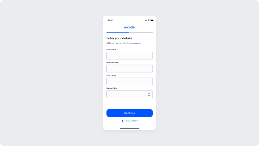
The image below shows the Enter your details form in its empty state. First name, Last name, and Date of Birth are required fields marked with an asterisk. Middle name is optional. Continue submits the step.
Customizable Elements
| Area |
What can be customized |
Notes |
| Text Elements |
Title, subtitle, field labels, button text, footer copy |
Fully localizable. Wording can align with brand tone and regulatory language. |
| Color Styling |
Background, input surfaces, text color, focus and CTA colors |
Applied via design tokens. Must maintain accessibility contrast. |
| CTA Label |
Continue button label |
Editable; action meaning must remain consistent with flow behavior. |
| Icons & Logo |
Date picker icon, brand logo, and footer “verified by” lockup |
Visual style may follow brand guidelines; placement remains consistent. |
| Date of Birth control |
Calendar icon and date-entry presentation |
Visual style may follow brand; date format and picker behavior stay consistent. |
| Localization |
All on-screen text |
Supports full translation. Layout should account for text expansion. |
Fixed Elements
| Element |
Why it is fixed |
| Required field rules |
First name, Last name, and Date of Birth are mandatory; required markers cannot be removed. |
| Optional middle name |
Middle name stays optional; it cannot be marked required. |
| Empty-state input behavior |
Fields start empty and remain editable in this state. |
| Field order |
First name, Middle name, Last name, and Date of Birth stays standardized. |
| Form structure hierarchy |
Title, subtitle, fields, Continue, and footer remain in a fixed vertical order. |
| CTA role |
Continue submits the step and advances to Driver’s License details. |
| Date of Birth input type |
Date entry stays a date control; it cannot be replaced with a free-text field. |
| Footer placement |
The “verified by” lockup stays at the bottom. |
| Component spacing & safe areas |
Guarantees cross-device consistency and accessibility across screen sizes. |
| Text hierarchy |
Maintains clear task communication and visual clarity within the flow. |
| WCAG contrast requirements |
Mandatory for accessibility compliance and inclusive user experience. |
Token Reference
| UI Element |
Token |
Raw Value |
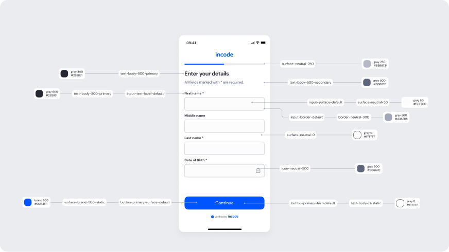
| Title text (Enter your details) |
text-body-800-primary |
#262831 |
| Subtitle text |
text-body-500-secondary |
#60667C |
| Input label text |
input-text-label-default |
#262831 |
| Input border (default) |
input-border-default / border-neutral-300 |
#A3A8B8 |
| Input surface (default) |
input-surface-default / surface-neutral-50 |
#FCFCFD |
| Input placeholder |
input-text-field-placeholder |
#A3A8B8 |
| Date picker icon |
icon-neutral-500 |
#60667C |
| Progress track (inactive) |
surface-neutral-250 |
#B5B8C5 |
| Primary button surface (Continue) |
button-primary-surface-default / surface-brand-500-static |
#0054FF |
| Primary button text (Continue) |
button-primary-text-default / text-body-0-static |
#FFFFFF |
| Background surface |
surface-neutral-0 |
#FFFFFF |
| Screen background |
surface-neutral-0 |
#FFFFFF |
Design notes
- Keep field labels and helper text concise to reduce cognitive load.
- Use brand colors sparingly for focus states and primary CTAs to maintain clarity.
- Preserve sufficient color contrast across all states (idle, focus, error, disabled).
Enter your details - Filled
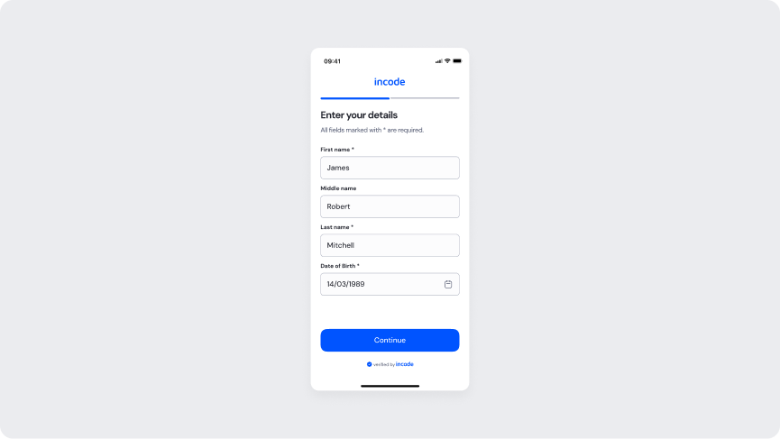
The image below shows the Enter your details form with First name, Last name, and Date of Birth filled in. Continue advances to Driver’s License details.
Customizable Elements
| Area |
What can be customized |
Notes |
| Text Elements |
Title, subtitle, field labels, filled values, button text, footer copy |
Fully localizable. Wording can align with brand tone and regulatory language. |
| Color Styling |
Background, filled input surfaces, text color, focus and CTA colors |
Applied via design tokens. Must maintain accessibility contrast standards. |
| CTA Label |
Continue button label |
Editable; action meaning must remain consistent with flow behavior. |
| Icons & Logo |
Date picker icon, brand logo, and footer “verified by” lockup |
Visual style may follow brand guidelines; placement remains consistent. |
| Localization |
All on-screen text |
Supports full localization. Layout should accommodate text expansion. |
Fixed Elements
| Element |
Why it is fixed |
| Filled-state input behavior |
Fields show entered values and remain editable; they are not locked in this state. |
| Required field rules |
First name, Last name, and Date of Birth remain mandatory; required markers cannot be removed. |
| Optional middle name |
Middle name stays optional even when filled. |
| Field order |
First name, Middle name, Last name, and Date of Birth stays standardized. |
| Form structure hierarchy |
Title, subtitle, fields, Continue, and footer remain in a fixed vertical order. |
| CTA role |
Continue submits the details and advances to Driver’s License details. |
| Date of Birth input type |
Date entry stays a date control; format is system-defined. |
| WCAG contrast requirements |
Mandatory for accessibility compliance. |
Token Reference
| UI Element |
Token |
Raw Value |
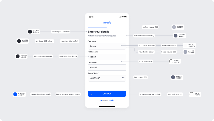
| Title text (Enter your details) |
text-body-800-primary |
#262831 |
| Subtitle text |
text-body-500-secondary |
#60667C |
| Input label text |
input-text-label-default |
#262831 |
| Input field text (filled) |
input-text-field-default / text-body-800-primary |
#262831 |
| Input border (default) |
input-border-default / border-neutral-300 |
#A3A8B8 |
| Input surface (default) |
input-surface-default / surface-neutral-50 |
#FCFCFD |
| Date picker icon |
icon-neutral-500 |
#60667C |
| Progress track (inactive) |
surface-neutral-250 |
#B5B8C5 |
| Primary button surface (Continue) |
button-primary-surface-default / surface-brand-500-static |
#0054FF |
| Primary button text (Continue) |
button-primary-text-default / text-body-0-static |
#FFFFFF |
| Background surface |
surface-neutral-0 |
#FFFFFF |
| Input field text (date of birth) |
input-text-field-default / text-body-800-primary |
#262831 |
| Date picker icon (DOB) |
icon-neutral-500 |
#60667C |
| Screen background |
surface-neutral-0 |
#FFFFFF |
Design notes
- Keep the layout clear and vertically structured to reduce cognitive load.
- The “focused” token reference indicates an actively selected input field (user tap/click), providing visual feedback during data entry.
Driver’s License Details
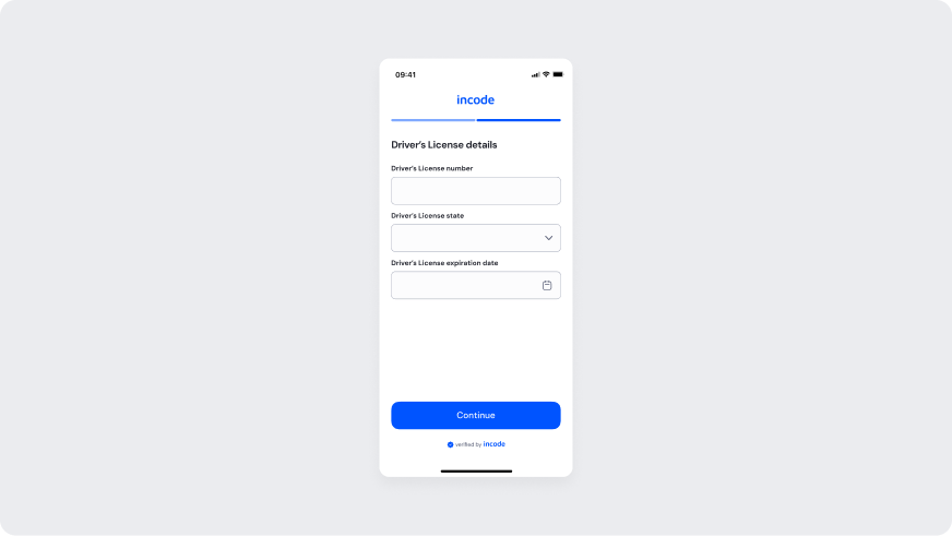
The image below shows the Driver’s License details form in its empty state. Driver's License number, Driver's License state, and Driver's License expiration date are all required. Continue submits the step.
Customizable Elements
| Area |
What can be customized |
Notes |
| Text Elements |
Title, field labels, placeholders, Continue, footer copy |
Fully localizable. Wording can align with brand tone and regulatory language. |
| Color Styling |
Background, input surfaces, text color, focus and CTA colors |
Applied via design tokens. Must maintain accessibility contrast. |
| CTA Label |
Continue button label |
Editable; action meaning must remain consistent with flow behavior. |
| Icons & Logo |
Dropdown chevron, date picker icon, brand logo, and footer “verified by” lockup |
Visual style may follow brand guidelines; placement remains consistent. |
| Localization |
All on-screen text |
Supports full translation. Layout should account for text expansion. |
Fixed Elements
| Element |
Why it is fixed |
| Required field rules |
Driver's License number, Driver's License state, and Driver's License expiration date are mandatory; this screen has no required asterisks. |
| Empty-state input behavior |
Fields start empty and remain editable in this state. |
| Field order |
Driver's License number, Driver's License state, then Driver's License expiration date stays standardized. |
| Form structure hierarchy |
Title, fields, Continue, and footer remain in a fixed vertical order. |
| CTA role |
Continue submits the license details and advances to processing. |
| Issuing state control |
Driver's License state stays a dropdown; it cannot be replaced with a free-text field. |
| Expiration date input type |
Driver's License expiration date stays a date control; it cannot be replaced with a free-text field. |
| Footer placement |
The “verified by” lockup stays at the bottom. |
| WCAG contrast requirements |
Mandatory for accessibility compliance and inclusive user experience. |
Token Reference
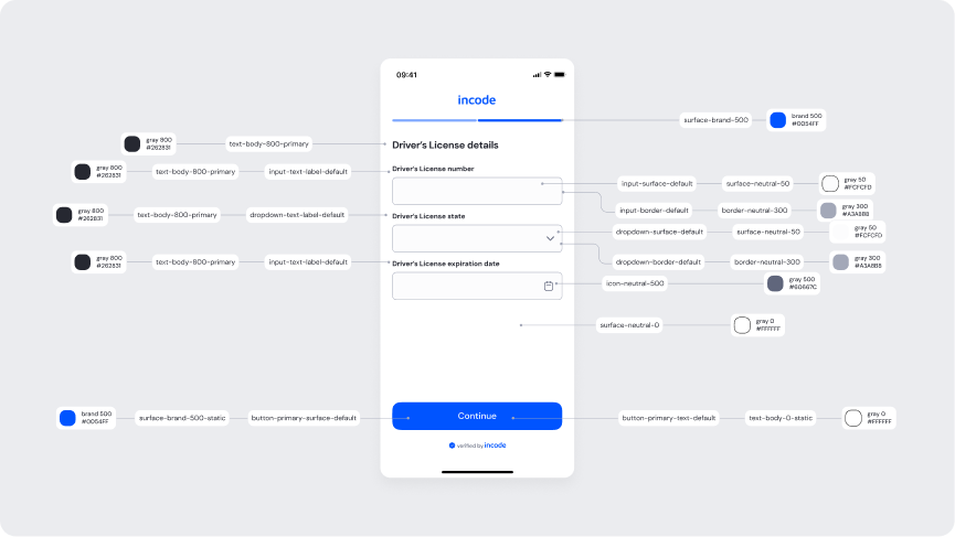
| UI Element |
Token |
Raw Value |
| Title text (Driver’s License details) |
text-body-800-primary |
#262831 |
| Input label (Driver’s License number) |
input-text-label-default / text-body-800-primary |
#262831 |
| Dropdown label (State) |
dropdown-text-label-default / text-body-800-primary |
#262831 |
| Input label (expiration date) |
input-text-label-default / text-body-800-primary |
#262831 |
| Input surface (default) |
input-surface-default / surface-neutral-50 |
#FCFCFD |
| Input border (default) |
input-border-default / border-neutral-300 |
#A3A8B8 |
| Dropdown surface (State) |
dropdown-surface-default / surface-neutral-50 |
#FCFCFD |
| Dropdown border (State) |
dropdown-border-default / border-neutral-300 |
#A3A8B8 |
| Dropdown chevron |
icon-neutral-500 |
#60667C |
| Date picker icon |
icon-neutral-500 |
#60667C |
| Progress track (active) |
surface-brand-500 |
#0054FF |
| Screen background |
surface-neutral-0 |
#FFFFFF |
| Primary button surface (Continue) |
button-primary-surface-default / surface-brand-500-static |
#0054FF |
| Primary button text (Continue) |
button-primary-text-default / text-body-0-static |
#FFFFFF |
| Input surface (expiration date) |
input-surface-default / surface-neutral-50 |
#FCFCFD |
Design notes
- Disable inputs and CTA interaction during processing.
- Preserve layout stability when switching to loading state.
- Maintain accessible contrast for spinner and disabled elements.
Driver’s License Details- Filled
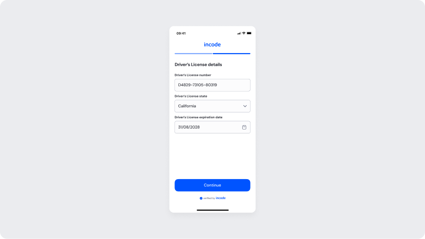
The image below shows the Driver's License details form with Driver's License number, Driver's License state, and Driver's License expiration date filled in. Continue submits the step.
The primary CTA remains disabled until all validation errors are resolved.
Customizable Elements
| Area |
What can be customized |
Notes |
| Text Elements |
Title, field labels, filled values, Continue, footer copy |
Fully localizable. Wording can align with brand tone and regulatory language. |
| Color Styling |
Background, filled input surfaces, text color, focus and CTA colors |
Applied via design tokens. Must maintain accessibility contrast standards. |
| CTA Label |
Continue button label |
Editable; action meaning must remain consistent with flow behavior. |
| Icons & Logo |
Dropdown chevron, date picker icon, brand logo, and footer “verified by” lockup |
Visual style may follow brand guidelines; placement remains consistent. |
| Localization |
All on-screen text |
Supports full localization. Layout should accommodate text expansion. |
Fixed Elements
| Element |
Why it is fixed |
| Filled-state input behavior |
Fields show entered values and remain editable; they are not locked in this state. |
| Required field rules |
Driver's License number, Driver's License state, and Driver's License expiration date remain mandatory; this screen has no required asterisks. |
| Field order |
Driver's License number, Driver's License state, then Driver's License expiration date stays standardized. |
| Form structure hierarchy |
Title, fields, Continue, and footer remain in a fixed vertical order. |
| CTA role |
Continue submits the license details and advances to processing. |
| Issuing state control |
Driver's License state stays a dropdown; the selected value remains editable until submit. |
| Expiration date input type |
Driver's License expiration date stays a date control; format is system-defined. |
Token Reference
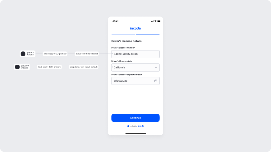
| UI Element |
Token |
Raw Value |
| Title text (Driver’s License details) |
text-body-800-primary |
#262831 |
| Input label text |
input-text-label-default |
#262831 |
| Input field text (filled) |
input-text-field-default / text-body-800-primary |
#262831 |
| Input border (default) |
input-border-default / border-neutral-300 |
#A3A8B8 |
| Input surface (default) |
input-surface-default / surface-neutral-50 |
#FCFCFD |
| Dropdown text (filled) |
dropdown-text-input-default / text-body-800-primary |
#262831 |
| Dropdown chevron / date icon |
icon-neutral-500 |
#60667C |
| Primary button surface (Continue) |
button-primary-surface-default / surface-brand-500-static |
#0054FF |
| Primary button text (Continue) |
button-primary-text-default / text-body-0-static |
#FFFFFF |
Processing Screen
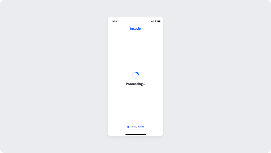
A full-screen processing state shown right after submission. The screen reads “Processing…” while the request is in flight.
Customizable Elements
| Area |
What can be customized |
Notes |
| Heading Text |
“Processing…” message |
Fully localizable. Wording can align with brand tone. |
| Color Styling |
Background, logo color, text color |
Applied via design tokens. Must maintain accessibility contrast. |
| Spinner Style |
Spinner design and accent color |
Animation behavior remains fixed; visual style may align with brand. |
| Brand Logo |
Logo appearance |
Must follow brand guidelines; placement remains consistent. |
| Localization |
All textual content |
Supports translation; layout must account for text expansion. |
Fixed Elements
| Element |
Why it is fixed |
| Processing behavior logic |
Controlled by backend verification services. |
| Interaction lock |
Prevents navigation or modification during verification. |
| Minimum display duration |
Avoids flicker and ensures perceived stability. |
| Spinner animation behavior |
Standardized motion timing for consistency. |
| Screen layout hierarchy |
Maintains vertical alignment and focus on status message. |
| WCAG contrast compliance |
Required for accessibility across themes. |
Token Reference
| UI Element |
Token |
Raw Value |
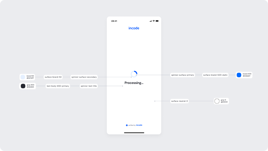
| Spinner primary accent |
spinner-surface-primary |
#0054FF |
| Spinner secondary surface |
spinner-surface-secondary |
#E5F0FF |
| Processing text |
spinner-text-title |
#262831 |
| Screen background |
surface-neutral-0 |
#FFFFFF |
Design notes
- The spinner must provide immediate feedback after submission.
- Maintain layout simplicity to reduce cognitive load during waiting states.
- Keep messaging concise to avoid uncertainty.
Success
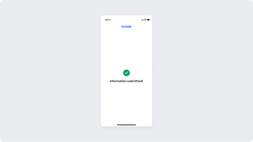
The success state that closes the flow. Shows an “Information submitted!” message confirming the eKYC verification was successful.
Customizable Elements
| Area |
What can be customized |
Notes |
| Text Elements |
Success title (e.g., “Information submitted!”) |
Fully localizable. Wording can align with brand tone while remaining a success confirmation. |
| Color Styling |
Background, success icon color, title color |
Applied via design tokens. Success color must remain clearly positive. |
| Success icon |
Checkmark or equivalent success icon |
Visual style may follow brand guidelines; meaning must remain success. |
| Icons & Logo |
Close icon, brand logo, and footer “verified by” lockup |
Visual style may follow brand guidelines; placement remains consistent. |
| Localization |
All on-screen text |
Supports full translation. Layout should account for text expansion. |
Fixed Elements
| Element |
Why it is fixed |
| Success messaging |
Screen must communicate successful submission (“Information submitted!”). It cannot be framed as an error. |
| No retry CTA |
This state has no Try again action; recovery belongs on the error screen. |
| Positive status color usage |
Standardized semantic mapping for success states. |
| Screen layout hierarchy |
Close control, success icon, title, and footer remain in a fixed vertical order. |
| WCAG contrast requirements |
Success state must meet accessibility standards. |
Token Reference
| UI Element |
Token |
Raw Value |
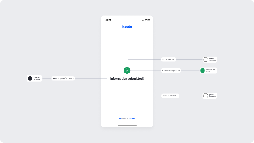
| Success icon |
icon-status-positive |
#189F60 |
| Success icon inner |
icon-neutral-0 |
#FFFFFF |
| Success title (Information submitted!) |
text-body-800-primary |
#262831 |
| Close icon |
icon-neutral-500 |
#60667C |
| Screen background |
surface-neutral-0 |
#FFFFFF |
| Background surface |
surface-neutral-0 |
#FFFFFF |
Design notes
- Keep confirmation messaging short and clear.
- Use positive status color exclusively for successful outcomes.
- Do not offer a retry action; this state confirms completion.
Error
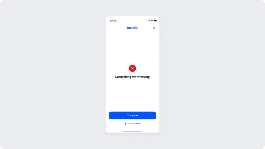
Shown when eKYC verification fails due to backend validation or service errors. Shows a “Something went wrong” message and a Try again button to let the user restart the attempt.
Customizable Elements
| Area |
What can be customized |
Notes |
| Text Elements |
Error title, Try again label, and footer copy |
Fully localizable. Wording can align with brand tone while remaining an error recovery state. |
| Color Styling |
Background, error icon color, title color, CTA colors |
Applied via design tokens. Error color must remain clearly negative. |
| CTA Label |
Try again button label |
Editable; action meaning must remain a retry of the failed submission. |
| Error icon |
Warning or equivalent error icon |
Visual style may follow brand guidelines; meaning must remain failure. |
| Localization |
All on-screen text |
Supports full translation. Layout should account for text expansion. |
Fixed Elements
| Element |
Why it is fixed |
| Failure messaging |
Screen must communicate that something went wrong. It cannot be framed as success. |
| Retry CTA role |
Try again retries the submission. This action cannot be removed from the error state. |
| Negative status color usage |
Standardized to maintain consistent semantic meaning. |
| Screen layout hierarchy |
Error icon, title, Try again, close control, and footer remain in a fixed vertical order. |
| Footer placement |
The “verified by” lockup stays at the bottom. |
| WCAG contrast requirements |
Error state must meet accessibility standards. |
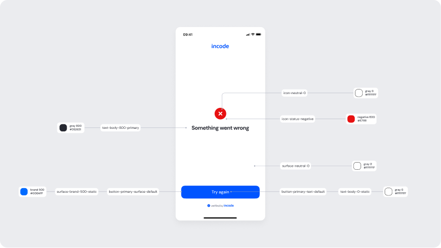
Token Reference
| UI Element |
Token |
Raw Value |
| Error icon |
icon-status-negative |
#E71111 |
| Error icon inner |
icon-neutral-0 |
#FFFFFF |
| Failure title (Something went wrong) |
text-body-800-primary |
#262831 |
| Primary button surface (Try again) |
button-primary-surface-default / surface-brand-500-static |
#0054FF |
| Primary button text (Try again) |
button-primary-text-default / text-body-0-static |
#FFFFFF |
| Screen background |
surface-neutral-0 |
#FFFFFF |
Design notes
- Communicate the failure clearly and concisely, without blame.
- Use negative status color consistently to signal the error state.
- Make Try again the clear, primary recovery action.